
Overview
As websites strive for optimal performance and adaptability across various devices, understanding the intricacies of handling images becomes paramount. There is an abundance of resources available on this topic, but the implementation of this feature can be more intricate than it seems. This technical blog post aims to explore both the challenges and solutions to achieve robust image responsiveness.
Responsive HTML images offer a dual promise - performance and robustness. Getting a resized image directly from HTML amps up performance, while the flexibility to employ lazy/eager loading and fetch priority mechanisms mirrors the traditional img tag.
A refresher on the pros and cons of responsive HTML images, before delving into the ‘how’:
Pros
Performance: Easily obtain a resized image directly from HTML, which is very useful to keep your LCP (Largest Contentful Paint) tight.
Robustness: Leverage browser lazy/eager loading and fetch priority mechanisms that hint the browser on your optimal assets loading sequence, similar to standard img tags.
Cons
Complexity: Here lies the crux of our journey, the reason for this post.
Fragility: Changes in page design may disrupt responsive images, requiring adjustments each time your website evolves. I'll address this challenge in a successive post.
Deep Dive into Responsive HTML
Let's explore a common example of the img tag:
<img style="max-width:100%" srcset="w_500/superman.jpg 500w, w_1000/superman.jpg 1000w"
   sizes="(max-width: 600px) 500px, 1000px" src="w_1000/superman.jpg"
   alt="It's a Bird... It's a Plane... It's Superman" />
Note: 'w' denotes intrinsic pixel width in srcset; all other units (or unitless) use CSS pixels.Key
Questions
How do I determine the right numbers in the sizes and srcset attributes for my image?
How are different DPRs (device pixel ratios) treated?
How do I test a responsive image?
Let's answer these questions one by one, see some unexpected results when answering the third question, and later answer a hidden question.
1.
The first thing to agree on is that art-direction is out-of-scope. All we care about here is to get a sensible number of pixels under any viewport. Now we can focus on the srcset and sizes attributes:
Srcset - In the example above we've two Superman images, with the intrinsic sizes of 500w, 1000w which we match to the intrinsic width of 500w, 1000w (by using a space in the srcset attribute). This is fairly simple. Usually, you would like to have 5 - 20 breakpoints, and there are many automation solutions for image resizing. I'll use the Cloudinary notation throughout this post.
For advanced breakpoints generation, based on the bytes size of the image rather than static width steps, you could use the Cloudinary Responsive Breakpoints Generator.
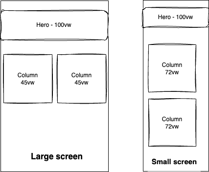
Sizes - The media queries in the sizes attributes should correlate to the media queries in your main CSS. Let's explore a scenario: imagine a webpage with a 2-column layout above 600px and a single-column layout for smaller viewports. The hero image spans the entire width for all forms.
In the 2-column layout, each column occupies half the page, and the images within take up 90% of the column width (equivalent to 45% of the entire viewport). In the single-column layout, the column spans 90% of the page width, and the image uses 80% of the column width (or 72% of the viewport).
For this layout, the sizes attribute for column images would be (min-width: 600px) 45vw, 72vw, and the hero image would have sizes="100vw".
Here is a visual representation:
You may wonder how come the neat common example had 500, and 1000 in both the srcset and sizes have diverged. In fact, you shouldn't expect such a correlation. It is possible that your image doesn't need any media query. Let's say that you have a banner of 100% of the viewport across all layouts, then sizes="100vw" is the exact match.
2.
Different DPRs are handled automatically by the browser. CSS units and intrinsic width (w) are converted seamlessly according to the device characteristics. If the common example is used with a DPR 2 screen, it will try to match images of 1000w and 2000w.
Sometimes, you’ll need greater control over your images than the img tag offers. This is where the picture tag is handy—for instance, if you wish to limit the DPR factor to 2, ensuring optimal pixel delivery for large screens without compromising performance on smaller screens with higher DPR values. Let's take the example of a hero image with a layout of 100vw that is mapped to 1200w and 1800w. A DPR 2 desktop with 900px viewport can get 2400w, but for a mobile device with DPR 3 and a 600px viewport you want to deliver 1200w favoring performance over being pixel-perfect.
While we simplify matters by not delving into the picture tag, the principle remains—strategically control image delivery for an optimal visual experience.
3.
Testing is challenging because of two reasons:
Judging if an image has enough pixels or not requires visual concentration, and is slow. I searched for a fine-detailed image to make it easier but it was still eye-straining and slow. So I created a synthetic test image (later below).
Browser cache images aggressively, and just hard-refresh or disabling caching on devtools is not enough to actually re-render an image when you downsize the viewport. I built a CSB project that you can use as well.
Let’s deep dive into how I created an intuitive online tester (or skip to the link at the end of this section).
For a synthetic test pattern that would ease visualizing pixels’ density changes, I decided I'll take vertical interleaved stripes starting from 1px width and slowly increasing to 6px width. It sounds like a very simple SVG
<svg width="300" height="150" viewport="0 0 100 100" xmlns="http://www.w3.org/2000/svg">
   <defs>
       <pattern id="verticalLines" x="0" y="0" width="3" height="100%" patternUnits="userSpaceOnUse">
           <line x1="0" y1="0" x2="0" y2="150" stroke="red" stroke-width="1" />
           <line x1="1" y1="0" x2="1" y2="150" stroke="green" stroke-width="1" />
           <line x1="2" y1="0" x2="2" y2="150" stroke="blue" stroke-width="1" />
       </pattern>
   </defs>
   <rect width="100%" height="100%" fill="url(#verticalLines)" />
</svg>
Unfortunately, the result was poor. The first line came up splitter to white on its left and red on its right. It's possible on a DPR 2 screen, but that wasn't my intention.
So I went creating a PNG, finally coding :)
"""
Script to generate synthetic test images for responsive HTML testing.
Uses the PIL library for image manipulation.
"""

from PIL import Image, ImageDraw  # pip install Pillow

def create_lines_image(width, height, colors, line_width, max_width, filename):
   image = Image.new("RGB", (width * max_width, height))
   draw = ImageDraw.Draw(image)
   colors_num = len(colors)

   for h in range(0, max_width):
       for x in range( width * h, width * (h + 1), line_width + h):
           draw.line([(x, 0), (x, height)], \
           fill=colors[(int(x / (h + 1))) % colors_num], width=line_width + h)


   image.save(filename)

create_lines_image(360, 150, "red,blue,green".split(','), 1, 6, 'rgb.png')
create_lines_image(360, 150, "cyan,magenta,yellow".split(','), 1, 6, 'cmy.png')
Then I created a naive HTML page, which already gave some encouraging results:
<!DOCTYPE html>
<html lang="en">
<head>
   <meta charset="UTF-8">
   <meta name="viewport" content="width=device-width, initial-scale=1.0">
   <title>Responsive HTML demo</title>
   <link rel="icon" type="image/x-icon" href="https://www.cloudinary.com/images/favicon.ico">
   <style>
      img {
         max-width: 100%;
         min-height: 75px;
      }
   </style>

</head>
<body>
   <h1>Resize the window and hard-refresh to test responsive HTML</h1>
   <div>
   <strong>Static 1080w</strong><br>
   <img width="1080" src="https://papish.cloudinary.us/w_1080/cmy.png" alt="Static 1080w">
   <br><strong>Static 2160w</strong><br>
   <img width="1080" src="https://papish.cloudinary.us/w_2160/cmy.png" alt="Static 2160w">
   <br><strong>Responsive W</strong><br>
   <img width="1080" src="https://papish.cloudinary.us/w_1080/cmy.png" alt="Responsive W"
srcset="https://papish.cloudinary.us/w_2160/cmy.png 2160w, https://papish.cloudinary.us/w_1620/cmy.png 1620w, https://papish.cloudinary.us/w_1080/cmy.png 1080w, https://papish.cloudinary.us/w_540/cmy.png 540w"
sizes="100vw">
   <br><strong>Responsive X</strong><br>
   <img width="1080" src="https://papish.cloudinary.us/w_1080/cmy.png" alt="Responsive x"
srcset="https://papish.cloudinary.us/w_2160/cmy.png 2x, https://papish.cloudinary.us/w_1620/cmy.png 1.5x, https://papish.cloudinary.us/w_1080/cmy.png 1x, https://papish.cloudinary.us/w_540/cmy.png 0.5x">
   </div>
</body>
</html>
Small viewport
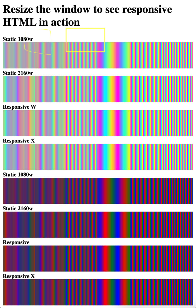
Large viewport
Testing was still slow, as I was fooled again and again by the Google Chrome caching, so I added text overlays on the images, to be absolutely sure that I know which image is used. Then I added a cache busting on resize event, and also added on-screen metrics. And then added SEO suffices, so it's easy to see in the network tab which image rendition is used. All of these are super-easy with Cloudinary URL-based syntax.
Now that the demo page is bloated with JS, it allows you to resize the viewport, and see what happens both visually and numerically.
Feel free to explore the impact of viewport resizing and observe the changes both visually and numerically. Visit the demo page: Interactive Responsive Images Demo
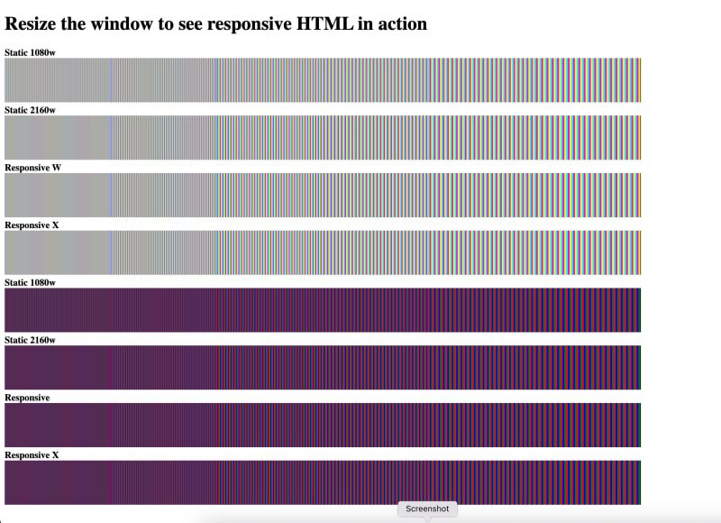
Medium viewport
Mobile emulated
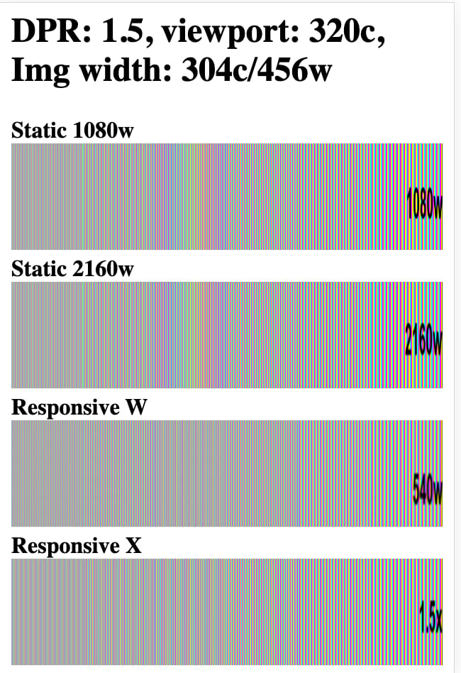
Note the mobile, 1.5x is the 1620px which is way more than needed for a 320x480x1.5 screen. It means that the 'x' descriptor is useful only for a limited use case of a fixed CSS width design, because it ignores the viewport size. Using only 'w' would cover all bases, and don't hesitate to use a trivial sizes attribute like a sizes="50vw".
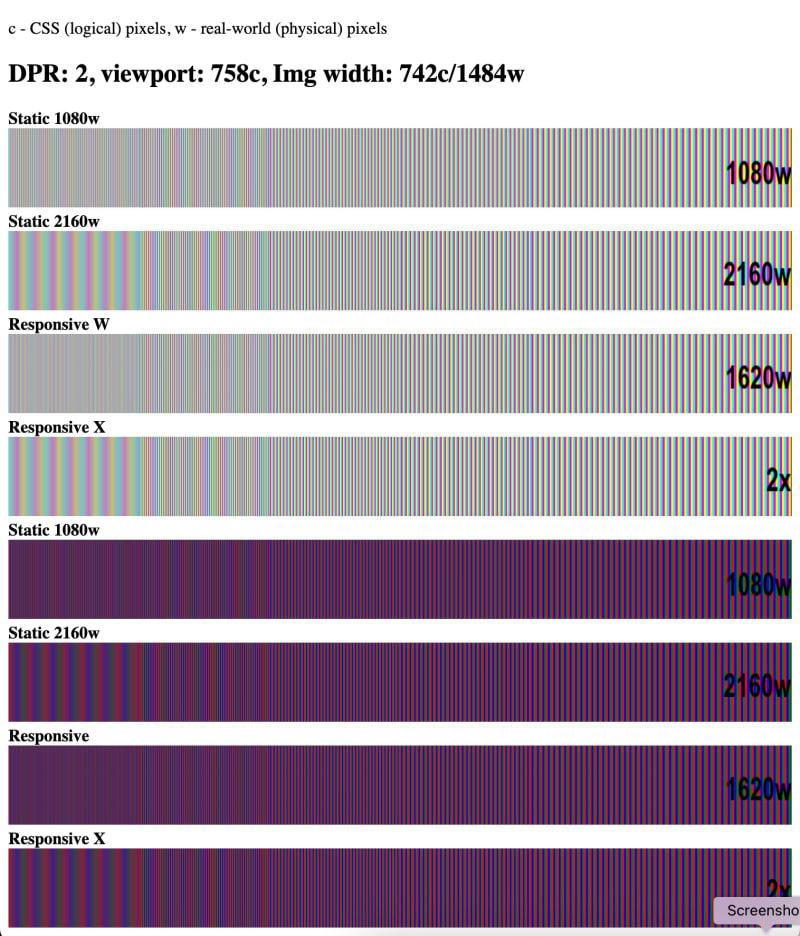
Only after I was able to play with the window and see the numeric results interactively, I understood that Chrome selected the 1620w when the image was rendered below 1840w. With Firefox the threshold was at 1590w. Safari had the threshold at 1588w (round with a bite :) . The HTML spec doesn't define how to choose the image candidates and Chrome would deliver lower-res images than other browsers (if I may over-conclude). Keep it in mind when you compare browsers' performance, and when looking for pixel-perfect results.
Summary
Responsive images with HTML can greatly benefit your webpage, as long as they are coherent with the webpage layout. You should evaluate each image slot with each possible layout of the page, and correlate the image responsiveness to the different layouts. Testing across multiple devices and viewports is paramount, while asserting that the browser’s cache doesn’t obfuscate the real user’s experience.


Top comments (0)