
Clustering Example
❓ What is clustering?
Clustering is the method of identifying similar groups of data in a dataset in such a way that objects in the same group (called a cluster) have the same property.
Clustering is unsupervised learning since a label is not required for each object.
Use cases for clustering include:
- Anomaly detection such as fraud detection, detecting defective mechanical parts
- Customer segmentation for marketing purposes
- Rideshare data analysis
🛣️ Clustering methods
- Auto clustering in Power BI
- 2-dimension: Scatter plot
- Multi-dimension: Table
- Python/R
- Visualization
- Transformation
📥 Get data
The dataset I will use is the Mall Customer Segmentation Data. It contains basic data about shop customers like Customer ID, age, gender, annual income, and spending score.
Kaggle: Your Home for Data Science
_Kaggle is the world's largest data science community with powerful tools and resources to help you achieve your data…_www.kaggle.com
After downloading data, get csv data to Power BI.
Next, you will see 3 methods for clustering in Power BI
🧩 Method 1: Auto clustering in Power BI
This method is the easiest one but it comes with some limitations.
First, let’s see how to perform clustering for 2 parameters/dimensions
2-dimension: Scatter plot
In the Visualizations plain on the right-hand side, click on a scatter plot icon.

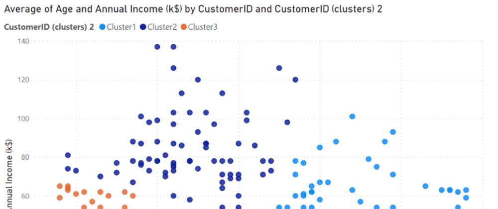
Drag 3 parameters to visualization fields as shown below (The Values is required for clustering!!). I will cluster data based on Age and Annual Income in this example.

A scatter plot will be generated.

Click on the 3-dot icon on the corner of the scatter chart (usually at the upper right corner) and select Automatically find clusters.

In the pop-up box, you can name your cluster and select the number of clusters. I will not select the number of cluster in this case and let Power BI does the job.

The data is divided into 3 clusters which Power BI think is the best number of clusters. Each cluster is illustrated by its color. You can see that customers in the same cluster are plotted close to each other.
The new cluster parameter is automatically created in the Legend field. You can also use this parameter for further analysis.

Then, what if you want to cluster more than 2 parameters/dimensions. You may not be able to visualize it like a scatter plot but you can do it in the Table.
Multi-dimension: Table
Firstly, click on the table icon in the Visualizations plain.

Drag the parameters you want to cluster to the Values field.

A table will be created.

Repeat the same step as the scatter plot (Automatically find clusters).

Done!! Clustering is completed.
Limitations
- Clusters don’t update on data refresh. New data will go into a blank cluster.
- You have to deal with missing values and scale the values so that each parameter has the same range.
- The clustering algorithm used in Power BI is the scalable EM algorithm (Thank you Calvin Nurge for providing the reference). It may not perform well on some type of data and you can’t adjust it.
🤖 Method 2: Python/R
This method may be more complex but more flexible. You can write Python or R to perform clustering any way you want.
With this method, The cluster can be refreshed when there is new data and you can adjust the clustering algorithm.
In this article, I will show you only the Python method. However, R implementation does not much differ from Python.
You can read how to use Python in Power BI below.
Python in Power BI
_Increase the power of the Power BI dashboard by integrating Python. Step by step to use Python to acquire, transform, and…_medium.com
If you finish setting Python, Let’s start clustering.
There are 2 ways to perform clustering with Python: Visualization and Transformation.
📊 Visualization
Using Python visualization will create a graph in the dashboard. With this method, you will have a clustered graph and can adjust this graph with Python code but you can’t use cluster anywhere else.
In the Visualization plain, click the Py icon (abbreviation of Python).

You will see an empty Python script editor area. Select the columns you want to visualize (Annual Income and Spending Score in this example).

You will see an empty coding area. Write the code below.
1. Import libraries
from sklearn.cluster import KMeans
import matplotlib.pyplot as plt
2. Perform K-mean clustering
Perform clustering on Annual Income and Spending Score.
Divide into 5 clusters.
Use fit_predict to perform clustering.
X = dataset[['Annual Income (k$)','Spending Score (1-100)']]
kmeansmodel = KMeans(n_clusters= 5, init='k-means++', random_state=0)
y_kmeans = kmeansmodel.fit_predict(X)
3. Visualization
Creating a scatter plot and color by cluster.
plt.scatter(X.iloc[y_kmeans == 0, 0], X.iloc[y_kmeans == 0, 1], s = 100, c = 'tomato', label = 'Cluster 1')
plt.scatter(X.iloc[y_kmeans == 1, 0], X.iloc[y_kmeans == 1, 1], s = 100, c = 'dodgerblue', label = 'Cluster 2')
plt.scatter(X.iloc[y_kmeans == 2, 0], X.iloc[y_kmeans == 2, 1], s = 100, c = 'palegreen', label = 'Cluster 3')
plt.scatter(X.iloc[y_kmeans == 3, 0], X.iloc[y_kmeans == 3, 1], s = 100, c = 'violet', label = 'Cluster 4')
plt.scatter(X.iloc[y_kmeans == 4, 0], X.iloc[y_kmeans == 4, 1], s = 100, c = 'sandybrown', label = 'Cluster 5')
plt.scatter(kmeansmodel.cluster_centers_[:, 0], kmeansmodel.cluster_centers_[:, 1], s = 300, c = 'yellow', label = 'Centroids')
plt.title('Clusters of customers')
plt.xlabel('Annual Income (k$)')
plt.ylabel('Spending Score (1-100)')
plt.legend()
plt.show()
The graph is illustrated below.

This graph will be updated once there is new data.
🔄 Transformation
This method is the most flexible one. You will perform clustering in the data transformation step and you can use the generated cluster in the dashboard.
- Click Transform data

- Select the query you want to transform

- In the Transform tab, click Run Python script

- You will see a new Run Python script window. Copy the code below and click ok.
from sklearn.cluster import KMeans
import matplotlib.pyplot as plt
X = dataset[['Annual Income (k$)','Spending Score (1-100)']]
kmeansmodel = KMeans(n_clusters= 5, init='k-means++', random_state=0)
dataset['Cluster'] = kmeansmodel.fit_predict(X)
This code will run K-mean and create 5 clusters. A new column ‘Cluster’ will be created to store the generated cluster.
- The result will be a table. Click to expand the table. Make sure that ‘Use original column name as prefix’ is not checked.


- Yeah!! The Cluster column is created. This column is range from 0–4 which is 5 clusters specified in step 4.

- Click Close & Apply in the Home tab.

⚠️ Make sure that after clustering, you change the column to the appropriate type.
The Cluster column will automatically refresh when you refresh the data.
You can use this Cluster parameter anywhere in the dashboard. Mostly, it will be used as a legend or filter.
This article is quite long since I want to cover all clustering methods in Power BI.
Hope you enjoy reading this article. Please follow me for more data analytic content.


Top comments (0)