
Welcome to the second part of our detailed series on the Xela Design System for Figma. Our initial exploration brought forward several pivotal components that can elevate your design and coding processes. Now, we'll delve deeper into an array of additional components that promise to streamline your project execution.
As a special thank you for joining us in this exploration, we have a unique surprise for our readers. Ensure you stick around till the end to discover an exclusive promo code offering a discount on any of our offerings.
In this exploration, we'll concentrate on the following noteworthy components:
- Toggle
- Slider Input
- Range Slider Input
- Segmented Control
- Tooltips
- Tables
- Badge
- Alert
- Steps
- Chips
Diving Deeper into Xela Components
Let's dive in and discover the potential these components can bring to your design:
Toggle:
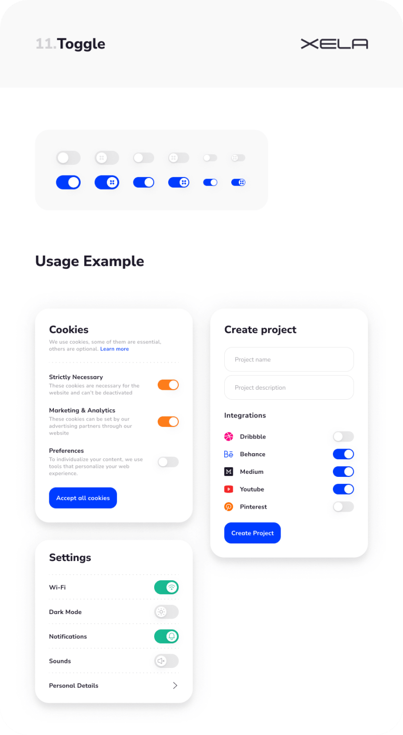
With 12 different forms, our Toggle component is a sleek and user-friendly tool for binary inputs. This versatile component can be customized by size, style, and state.
Slider Input:

This interactive component, available in 60 versions, provides an engaging way for users to pick a value from a range. Slider Input also supports tooltips and progress indication.
Range Slider Input:

Offering an impressive 400 variants, the Range Slider Input extends beyond the basic slider by allowing a range of values selection.
Segmented Control:

Our Segmented Control component, with its 66 versions, provides a logical way to organize multiple interconnected buttons, enhancing your application's navigation.
Tooltips:

Tooltips are essential for offering contextual assistance to users. With 13 versions to choose from, you can customize the tooltip that best fits your application's aesthetics.
Tables:

Our Tables component comes in multiple layouts, perfect for clearly presenting data, making it digestible and accessible to your users.
Badge:

Available in 16 different styles, the Badge component is excellent for highlighting notifications, statuses, or supplemental information linked to your content.
Alert:

The Alert component, with its 16 styles, is designed to inform users about crucial information or changes within the application.
Steps:

Our Steps component, available in 128 variations, is perfect for illustrating progression or a sequence of tasks in an understandable format.
Chips:

The Chips component, with its 144 variations, is designed to showcase complex entities in a compact, user-friendly format.
Propel Your Design and Coding Workflow with the Xela Design System
Harness the power of the Xela Design System and elevate your design and coding workflows to a new level. To celebrate our readers, we're gifting an exclusive 25% discount on any of our products. Simply use the code 4EOJFLM at checkout.
Look out for the next articles in this series as we'll be inspecting the blocks and templates of the Xela Design System. Discover the potency of our design system today by visiting XelaUI.com.
Embark on this thrilling journey and share your experiences and feedback with us. Step into the future of design and coding with the Xela Design System!

Top comments (0)