
Welcome to the first part of our series, where we explore the intricate details of the Xela Design System for Figma. For developers in need of an all-encompassing UI Design Kit, or designers seeking a well-structured design system, Xela Design System is the key to transforming your design and coding workflow.
As a token of our appreciation for joining us on this journey, we have a special gift for our readers. Make sure you read through to the end to find an exclusive promo code for a discount on any of our products.
In this article, we'll be exploring these powerful components:
- Typography
- Colors
- Buttons
- Select
- Text Input
- Number Input
- Textarea
- User Avatar
- Radio Button
- Checkbox
Exploring the Efficiency of Xela Components
Each component in the Xela Design System is designed to enhance your project's visual appeal and functionality. Here's how:
Typography:

The Typography component allows you to create uniform and visually pleasing text styles across your project. With a broad spectrum of font styles like Title 1, Title 2, Headline, Body and more, this component ensures elegance and visual consistency.
Colors:

The Colors component brings your application to life with beautifully curated colors, hues, and gradients. Create engaging and visually appealing interfaces with a wide array of color options at your disposal.
Buttons:

The Buttons component, featuring a staggering 288 variations, ensures you can craft the perfect call-to-action elements for every scenario.
Select:

The Select component, with its 24 Input Select and 22 Dropdown Item options, offers a simple and efficient way for users to input data, enhancing user experience.
Text Input:

Our Text Input component is designed to streamline form creation. With 96 variations, it provides a seamless user interaction experience while maintaining aesthetic appeal.
Number Input:

The Number Input component, with its 72 variations, simplifies numerical data input for users. Control states, labels, helper text, and icon positions for a personalized user experience.
Textarea:

The Textarea component ensures smooth text input across your application. With 48 variations, this component provides a highly customizable input field for users.
User Avatar:
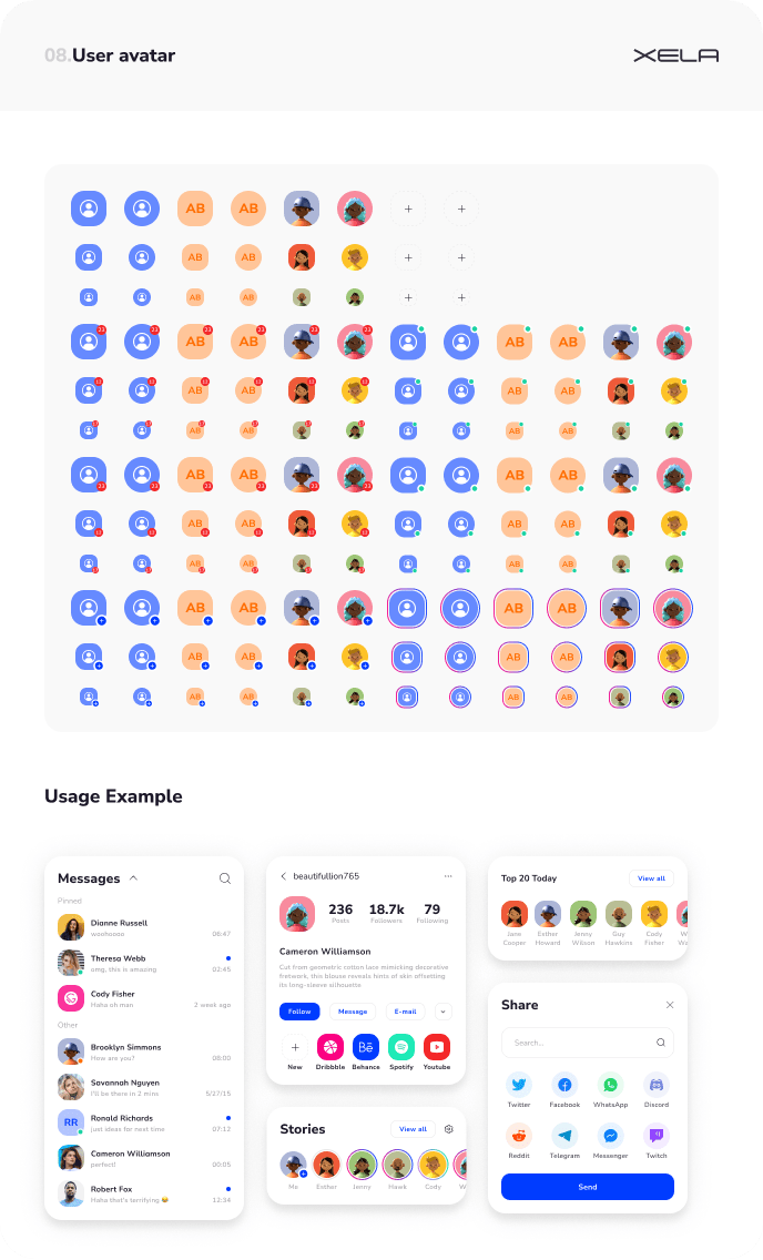
The User Avatar component adds a personalized touch to user profiles. It offers 132 variations, including size, style, type, counter text position, indicator, and decoration.
Radio Button:

Our Radio Button component simplifies user choices with an easy-to-use design. This component offers 60 variations, all customizable to suit the needs of your project.
Checkbox:

The Checkbox component facilitates multiple user choices. With 84 customizable variants, this component ensures your checkboxes align with the rest of your design.
Discover the Power of Xela Design System Today!
As a token of our appreciation, we're offering an exclusive 25% discount on any of our products. Just use the code 4EOJFLM at checkout. Transform your digital experiences with the Xela Design System today!
Keep an eye out for the next parts of this series where we dive into the blocks and templates of the Xela Design System. Visit our website XelaUI.com and begin your journey towards efficient design and coding with Xela Design System!
Join us on this exciting journey, and don't hesitate to share your thoughts and feedback with us!

Top comments (0)