
Welcome Back!
In the previous article, we got started in the FERN stack. We developed our Express Server and API, which we integrated with Firebase Real Time Database. We created our React front-end, setting it up with some very basic visuals with Material UI, and enabled users to sign up with Auth provided from Firebase.
In this post, we’re going to dive a bit more deeply into some of the data manipulation methods, including Edit and Delete, making use of the Tanstack Reacy Query library; we’re going to get into a bit more of the theming available with Material UI, and we’ll explore some other cool features contained within the React Router library.
If you followed along with the previous tutorial (or cloned the repository), open up your IDE and give in an npm run start , then open up another terminal and run in cd client && npm run dev. You should be greeted with your lovely startup messages, and when you open up your browser on the specified port (default 5173), you should be greeted with this page:

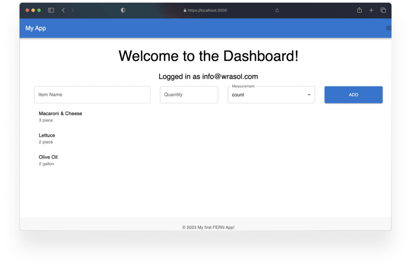
Head over to /dashboard! If you entered in any grocery items last time, they’ll still be proudly on display. If your session has expired, you’ll have to log back in. Once you do, you should be looking at something like this:
We have our checklist and we can add items. Now let’s look at manipulating them further. We’ll start with the most obvious. We want to check items off of our list!
Now, if I’m out grocery shopping, I probably don’t want the items to be deleted once I check them off. We’re going to instead look at how we structure our data, and how that impacts the way we display it.
Let’s take another look at what we’re seeing here.
We have our Dashboard:
// Dashboard.jsx
import React, {useContext} from 'react';
import {Box, Typography} from '@mui/material';
import GroceryItemInputForm from '../components/GroceryItemInputForm';
import GroceryList from '../components/GroceryList';
import {getAuth} from 'firebase/auth';
import { useQueryClient } from 'react-query';

const Dashboard = () => {
  const {currentUser} = getAuth ();
  const queryClient = useQueryClient()
  const token = currentUser.accessToken;
  return !currentUser
    ? ''
    : <Box display="flex" flexDirection="column" alignItems="center">
        <Typography variant="h3" mb={3}>
          Welcome to the Dashboard!
        </Typography>
        <Typography variant="h5" mb={2}>
          {currentUser ? \`Logged in as ${currentUser.email}\` : ''}
        </Typography>
        <GroceryItemInputForm token={token} queryClient={queryClient}/>
        <GroceryList token={token} />
      </Box>;
};

export default Dashboard;
Which contains our GroceryItemInputForm, we’re pretty happy with that for now, and then we have our GroceryList:
// GroceryList.jsx
import React from 'react';
import {useFetchGroceryItems} from '../hooks/useFetchGroceryItems';
import {
  CircularProgress,
  ListItem,
  ListItemText,
  Typography,
  Grid,
  List,
} from '@mui/material';

const GroceryList = ({token}) => {
  const {data: groceryItems, error, isLoading} = useFetchGroceryItems (token);
  if (isLoading || !groceryItems) {
    return (
      <Grid container py={4}>
        <Grid item xs={12} textAlign={'center'}>
          <CircularProgress />
        </Grid>
      </Grid>
    );
  }
  if (error) {
    return (
      <Grid container py={4}>
        <Grid item xs={12} textAlign={'center'}>
          <Typography variant="h6" color="error">
            Error: {error.message}
          </Typography>
        </Grid>
      </Grid>
    );
  }
  if (groceryItems)
    return (
      <Grid container>
        <Grid item component={List} container>
          {Object.values (groceryItems).map (item => (
            <Grid item xs={12} component={ListItem} key={item.id}>
              <ListItemText
                primary={item.name}
                secondary={\`${item.quantity} ${item.measurement}\`}
              />
            </Grid>
          ))}
        </Grid>
      </Grid>
    );
};

export default GroceryList;
Checking items off
Our components are still relatively straightforward. There is absolutely some room for improvement, but we’re happy with it for right now. Our main focus right now is to add a check button, and build out the handling. Let’s start with the button. Here, we can start to take a look at some of the power of Material UI. We’ll begin by updating our imports to include the following:
// GroceryList.jsx
import React from 'react';
import {useFetchGroceryItems} from '../hooks/useFetchGroceryItems';
import {
  CircularProgress,
  ListItem,
  ListItemText,
  Typography,
  Grid,
  List,
  IconButton
} from '@mui/material';
import CheckIcon from '@mui/icons-material/Check';
And then we’re going to take advantage of the grid structure, and we’ll at our button to the end of our page:
{/*Other Code...*/}
<Grid item xs={9} sm={10} component={ListItem} key={item.id}>
    <ListItemText
        primary={item.name}
        secondary={\`${item.quantity} ${item.measurement}\`} />
</Grid>
<Grid item xs={3} sm={2} component={IconButton} onClick={handleItemCheck}>
    <CheckIcon/>
</Grid>
Now, if you’re using VSCode, and you just put that code in, you’re probably seeing a whole bunch of red squiggles right now. To fix this, we can wrap the above in a JSX Fragment, which can be written as <Fragment>{//...more JSX}</Fragment>, or by simply writing <>{//...more JSX}</> . The important takeaway from this is that React only allows you to return one Element per component. Right now, we’re trying to return two. Usually, if you’re trying to return two components, you’re better off creating a new child component.
Right now, there is a component that is very easy for us to extract:
//GroceryList.jsx
{/*Other Code...*/}
<Grid container>
    <Grid item component={List} container>
      {Object.values (groceryItems).map (item => (
        <>
          <Grid item xs={9} sm={10} component={ListItem} key={item.id}>
            <ListItemText
              primary={item.name}
            secondary={\`${item.quantity} ${item.measurement}\`}
                    />
        </Grid>
        <Grid item xs={3} sm={2} component={IconButton} onClick={handleItemCheck}>
          <CheckIcon/>
        </Grid>
      </>
     ))}
  </Grid>
</Grid>
We’re going to take everything inside the JSX fragment, and extract that into a new component called “ListItem”. Create components/GroceryListItem.jsx, and enter the component from above, passing in the necessary props:
//GroceryListItem.jsx

import {Grid, ListItemText, IconButton, ListItem} from '@mui/material';
import CheckIcon from '@mui/icons-material/Check';

const GroceryListItem = ({item, handleitemcheck}) => {
  return (
    <Grid container>
      <Grid item xs={9} sm={10} component={ListItem} key={item.id}>
        <ListItemText
          primary={item.name}
          secondary={\`${item.quantity} ${item.measurement}\`}
        />
      </Grid>
      <Grid item xs={3} sm={2} component={IconButton} onClick={handleitemcheck}>
        <CheckIcon color='success'/>
      </Grid>
    </Grid>
  );
};
export default GroceryListItem;
And we can now clean up GroceryList.jsx, importing our Items and mapping the items into them:
// GroceryList.jsx
import React from 'react';
import {useFetchGroceryItems} from '../hooks/useFetchGroceryItems';
import {
  CircularProgress,
  Typography,
  Grid,
  List,
} from '@mui/material';
import GroceryListItem from './GroceryListItem';

const GroceryList = ({token}) => {
  const {data: groceryItems, error, isLoading} = useFetchGroceryItems (token);
  const handleItemCheck = () => {
    console.log ('Hi');
    return;
  };
  if (isLoading || !groceryItems) {
    return (
      <Grid container py={4}>
        <Grid item xs={12} textAlign={'center'}>
          <CircularProgress />
        </Grid>
      </Grid>
    );
  }
  if (error) {
    return (
      <Grid container py={4}>
        <Grid item xs={12} textAlign={'center'}>
          <Typography variant="h6" color="error">
            Error: {error.message}
          </Typography>
        </Grid>
      </Grid>
    );
  }
  if (groceryItems)
    return (
      <Grid container>
        <Grid item component={List} xs={12}>
          {Object.values (groceryItems).map (item => (
            <GroceryListItem
              item={item}
              handleitemcheck={handleItemCheck}
              key={item.id}
            />
          ))}
        </Grid>
      </Grid>
    );
};

export default GroceryList;
Now wait. We just built a new component. We’re mapping info into it, it’s not that different from before, but we also did a couple of other cool things here. In our GroceryListItem, you might have noticed this:
<Grid item xs={9} sm={10} component={ListItem} key={item.id}>
{/*...*/}
<Grid item xs={3} sm={2} component={IconButton} onClick={handleitemcheck}>
Specifically, we’re using the sm property. This is the first time we’ve used a very powerful Material UI feature called Breakpoints. Making use of the Material UI Grid and Breakpoints, we can quickly and easily define resizing rules depending on different screen sizes. In this case, we are making use of the xs and sm breakpoints. The default breakpoints are as follows:
xs: 0px, sm: 600px, md: 900px, lg: 1200px, xl: 1536px
Components are defined by the minimum defined breakpoint up to the next defined breakpoint. Most commonly, you will design with Mobile/Non-Mobile in mind, and xs/sm will suit the majority of your needs. In this example, the ListItem component will occupy 9 grid columns on screens on screens up to 600px, after which point it will occupy 10, whereas the IconButton will occupy 3 columns on screens up to 600px, and beyond it will occupy 2.
If you followed along with the above, your app should be looking something like this:

Let’s apply our breakpoints a bit more, and make this just a little bit prettier:
// GroceryList.jsx

{/* ...Imports */}

const GroceryList = ({token}) => {
{/* ...Other code */}
  if (groceryItems)
    return (
      <Grid container>
        <Grid item component={List} xs={12} sm={8} sx={{margin:'0 auto'}}>
          {Object.values (groceryItems).map (item => (
            <GroceryListItem
              item={item}
              handleitemcheck={handleItemCheck}
              key={item.id}
            />
          ))}
        </Grid>
      </Grid>
    );
};

export default GroceryList;
Here, we’re maxing it out at 8 of 12 columns (2/3rds), and centring the component using margin: '0 auto'. With that, we should have a nice and simple list:

Make the buttons work
Ok, awesome! Now let’s add some handling logic! As I said previously, we don’t want these “gone” once we’ve checked them off, we just need them out of the way. That way, we can quickly scan previous items, see if we accidentally clicked something and recover it, etc.
We can do this a couple of ways. We could add a call to immediately add a {checked: true} prop to the item in Realtime Database. It’s real time after all. But we do like to avoid API traffic if we can. A local state will likely do the trick here.
Here’s what we’re going to do:
- Create a list of items that have been selected
- Display them in a distinct manner, separate from the remaining items
In GroceryList.jsx, add the state:
const GroceryList = ({token}) => {
  const [checkedItems, setCheckedItems] = useState([]);
  const {data: groceryItems, error, isLoading} = useFetchGroceryItems (token);
  const handleItemCheck = (id) => {
       setCheckedItems(items => [...items, id]);
  };
Now in order to display these distinctly, without repeating a lot a lot of code, we can actually reuse our existing components, and then modify them based on our needs.
//GroceryList.jsx
{/* Other code*/}
return (
      <Grid container>
        <Grid item component={List} xs={12} sm={8} sx={{margin: '0 auto'}}>
          {Object.values (groceryItems)
            .filter (item => !checkedItems.includes (item.id))
            .map (item => (
              <GroceryListItem
                item={item}
                handleitemcheck={handleItemCheck}
                key={item.id}
              />
            ))}
        </Grid>
        {checkedItems.length > 0 &&
          <Grid variant="h6" component={Typography} item xs={12} sm={8} sx={{margin:'0 auto'}}>
            Checked Items
          </Grid>}
        <Grid item component={List} xs={12} sm={8} sx={{margin: '0 auto'}}>
          {Object.values (groceryItems)
            .filter (item => checkedItems.includes (item.id))
            .map (item => (
              <GroceryListItem
                item={item}
                handleitemcheck={handleItemCheck}
                key={item.id}
                checked
              />
            ))}
        </Grid>
      </Grid>
    );
};

export default GroceryList;
Here, we’re mapping the items into two separate arrays of the GroceryListItem component. In the first, we verify that the item’s ID doesn’t match any IDs that are in the checkedItems array, then rendering the list of items. Then, we conditionally render our “Checked Items” title (checkedItems.length > 0) and the groceryItems for items that are listed in ‘Checked items’, and render those items. Note that here, we are passing the checked boolean prop, which we’ll use to differentiate checked items from unchecked ones.
//GroceryListItem.jsx
import {Grid, ListItemText, IconButton, ListItem} from '@mui/material';
import CheckIcon from '@mui/icons-material/Check';

const GroceryListItem = ({item, handleitemcheck, checked}) => {
  const isCheckedColor = checked ? 'rgba(28,46,18,.6)' : 'unset';
  return (
    <Grid container>
      <Grid item xs={9} sm={10} component={ListItem} key={item.id}>
        <ListItemText
          primary={item.name}
          secondary={checked ?  '' : \`${item.quantity} ${item.measurement}\`}
          sx={{color:isCheckedColor}}
        />
      </Grid>
      <Grid item xs={3} sm={2} component={IconButton}  onClick={() => handleitemcheck(item.id)}>
        <CheckIcon color='success'/>
      </Grid>
    </Grid>
  );
};
export default GroceryListItem;
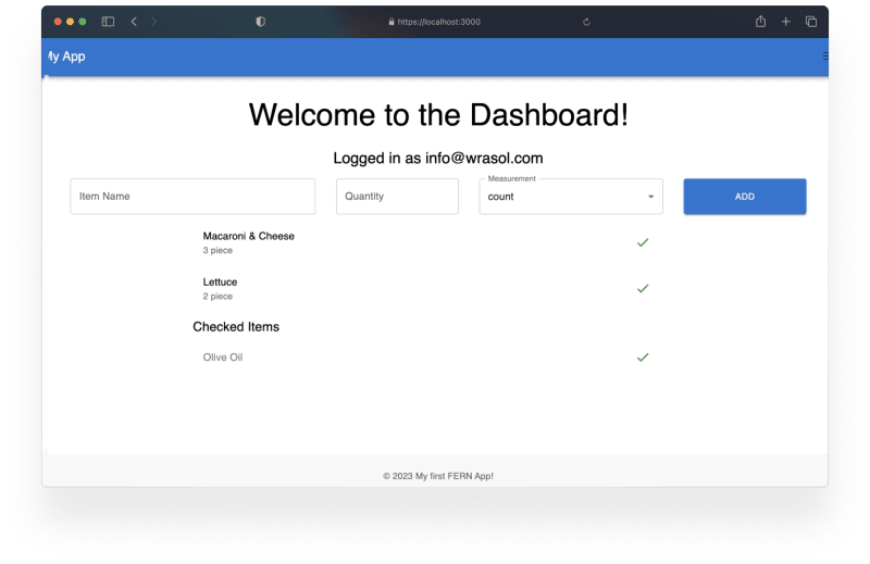
Here, we’re looking at the checked prop, and using that to conditionally change the colour of the checked items. You’ll notice that we also have hidden the secondary on items that have been checked off. If you’ve followed along until now, you should be able to click on one of the checks, and your screen will look something like this:
Ok but actually make the buttons work
Awesome! Now we have our main list, our checked off items are separated as we click on them. But we’re using state, which means every time we refresh the page, our checked items go back to the list. That’s not going to work. We really want to minimize API impact,
We’re going to take advantage of React Query again. First, in ‘api’, make a new file called modifyChecked.js, which will host our update function:
//modifyChecked.js
export const modifyChecked = async (groceryItem, token) => {
  const response = await fetch('/api/data', {
    method: 'PUT',
    headers: {
      'Content-Type': 'application/json',
      'Authorization': `Bearer ${token}`,
    },
    body: JSON.stringify({updatedData:{...groceryItem}}),
  });

  if (!response.ok) {
    throw new Error(`Error adding grocery item: ${response.statusText}`);
  }

  const data = await response.json();
  return data;
};
Now that we have our fetch function, we’re going to need to have the corresponding route in the backend. In the server, update ‘userRoutes.js’ to include a PUT route, used for updating records:
//userRoutes.js
import {ref, set, get, update} from 'firebase/database';

//...Other routes

router.put('/data', async (req, res, next) => {
  const { userId, updatedData } = req.body;
  try {
    await update(ref(db, \`users/${userId}/${updatedData.id}\`), updatedData)
      .then(() => {
        res.status(200).json({...updatedData});
      })
      .catch(e => {
        throw e;
      });
  } catch (error) {
    next(new Error(error.message));
  }
});
export default router;
There, we have defined the destination for PUT requests to ‘/data’. It pulls the userId (injected from the verifyToken middleware) and the item we want to update, from the request body. We then specify in the request that we are using the Firebase ‘update’ function, and then returning the object.
Now, much like we did previously when adding items to the list, we can define our side-effects and take advantage of opportunistic updating!
//...useModifyChecked.js

import {useMutation} from 'react-query';
import {modifyChecked} from '../api/modifyChecked';

export const useModifyChecked = (token, queryClient) => {
  const mutation = useMutation({
    mutationFn: (groceryItem) => modifyChecked({...groceryItem}, token),
    onMutate: async (groceryItem, isChecked) => {
      await queryClient.cancelQueries({queryKey : ['groceryItems']});
      const prevItems = queryClient.getQueryData(['groceryItems']);
      queryClient.setQueryData(['groceryItems'], (old) => {old, old[groceryItem.id] = {...groceryItem, checked: groceryItem.isChecked}});
      return {prevItems}
    },
    onError: (error, groceryItem, context) => {
      console.log ('An error occurred while checking off the grocery item: ', groceryItem, 'Error: ', error);
      queryClient.setQueryData(['groceryItems'], context.prevItems)
      return context.prevItems
    },
    onSuccess: (data  ) => {
      console.log ('Grocery checked off successfully:', data);
      },
      onSettled: () => {
        queryClient.invalidateQueries({queryKey: ['groceryItems']})
      }
  })
  return mutation;
}
Here, we have updated the list item, making and updated the main ‘groceryList’ by invalidating and old queries to it. We’re also ensuring that if something goes wrong, we roll back to the pervious version of the list. We’ve also maintained flexibility to use it for either addition or subtraction from the list! Now let’s hook this up to the front end!
// GroceryList.jsx
import React, {useMemo} from 'react';
import {useFetchGroceryItems} from '../hooks/useFetchGroceryItems';
import {CircularProgress, Typography, Grid, List} from '@mui/material';
import GroceryListItem from './GroceryListItem';
import {useModifyChecked} from '../hooks/useModifyChecked';
import { useQueryClient } from 'react-query';

const GroceryList = ({token}) => {
  const {data: groceryItems, error, isLoading} = useFetchGroceryItems (token);

  const queryClient = useQueryClient();
  const modifyChecked = useModifyChecked(token, queryClient);

  const handleItemCheck = item => {
    console.log(checkedItems?.includes (item))
    if (checkedItems?.includes (item)) {
      modifyChecked.mutate ({...item, checked: false});
    } else {
      modifyChecked.mutate ({...item, checked: true});
    }
  };

  const checkedItems = useMemo(() => {
    if (!groceryItems) {
      return [];
    }
    return Object.values(groceryItems).filter((item) => item.checked === true);
  }, [groceryItems]);

  if (isLoading || !groceryItems) {
    return (
      <Grid container py={4}>
        <Grid item xs={12} textAlign={'center'}>
          <CircularProgress />
        </Grid>
      </Grid>
    );
  }
  if (error) {
    return (
      <Grid container py={4}>
        <Grid item xs={12} textAlign={'center'}>
          <Typography variant="h6" color="error">
            Error: {error.message}
          </Typography>
        </Grid>
      </Grid>
    );
  }
  if (groceryItems)
    return (
      <Grid container>
        <Grid item component={List} xs={12} sm={8} sx={{margin: '0 auto'}}>
          {Object.values (groceryItems)
            .filter (item => !item.checked)
            .map (item => (
              <GroceryListItem
                item={item}
                handleitemcheck={handleItemCheck}
                key={item.id}
              />
            ))}
        </Grid>
        {checkedItems.length > 0 &&
          <Grid
            variant="h6"
            component={Typography}
            item
            xs={12}
            sm={8}
            sx={{margin: '0 auto'}}
          >
            Checked Items
          </Grid>}
        <Grid item component={List} xs={12} sm={8} sx={{margin: '0 auto'}}>
          {checkedItems.map (item => (
              <GroceryListItem
                item={item}
                handleitemcheck={handleItemCheck}
                key={item.id}
                checked
              />
            ))}
        </Grid>
      </Grid>
    );
};

export default GroceryList;
Ok, that’s a big update. What have we done here? First, we have updated our imports to include out new custom hook, as well as the newly necessary useQueryClient. We’re passing the necessary token and queryClient into the custom hooks, and then we define our “handleItemClick” to use the hooks as required.
You’ll also notice that we’re taking advantage of the React useMemo hook to define our checkedItems list. This allows us to limit expensive re-renders.
You may be noticing some sub-optimal behaviours at this point, most notable, the entire page appear to refresh every time we change our list. The reason for this is how we are invalidating our queries in our Optimistic Updating.
Up to this point, all of our optimistic updates have been preformed at the list level. Meaning that when we update, we’ve been invalidating the entire list. This results in unwanted re-fetching and poor user experience. Let’s look at how we can fix it!
We’ll start in our useModifyChecked custom hook. Specifically, we’re going to be looking at the side effects.
const mutation = useMutation({
    mutationFn: (groceryItem) => modifyChecked({...groceryItem}, token),
    onMutate: async (groceryItem, isChecked) => {
      await queryClient.cancelQueries({queryKey : ['groceryItems']});
      const prevItems = queryClient.getQueryData(['groceryItems']);
      queryClient.setQueryData(['groceryItems'], (old) => {old, old[groceryItem.id] = {...groceryItem, checked: groceryItem.isChecked}});
      return {prevItems}
    },
    onError: (error, groceryItem, context) => {
      console.log ('An error occurred while checking off the grocery item: ', groceryItem, 'Error: ', error);
      queryClient.setQueryData(['groceryItems'], context.prevItems)
      return context.prevItems
    },
    onSuccess: (data  ) => {
      console.log ('Grocery checked off successfully:', data);
      },
      onSettled: () => {
        queryClient.invalidateQueries({queryKey: ['groceryItems']})
      }
  })
Right now, when we call the useModifyChecked hook, we are immediately telling the queryClient to cancel any outbound queries to the ‘groceryItems’ list, and pushing our updated list. But we’re only updating 1 item. We can be that specific in our hook!
const mutation = useMutation({
    mutationFn: (groceryItem) => modifyChecked({...groceryItem}, token),
    onMutate: async (groceryItem) => {
      await queryClient.cancelQueries({queryKey : ['groceryItems', groceryItem.id]});
      const prevItem = queryClient.getQueryData(['groceryItems', groceryItem.id]);
      queryClient.setQueryData(['groceryItems', groceryItem.id], groceryItem);
      return {prevItem, groceryItem}
    },
    onError: (error, groceryItem, context) => {
      console.log ('An error occurred while checking off the grocery item: ', groceryItem, 'Error: ', error);
      queryClient.setQueryData(['groceryItems', groceryItem.id], context.prevItem)
      return context.prevItem
    },
    onSuccess: (data) => {
      console.log ('Grocery checked off successfully:', data);
      },
      onSettled: () => {
        queryClient.invalidateQueries({queryKey: ['groceryItems']})
      }
  })
  return mutation;
Now, when we add an item to the checked off list, the whole page doesn’t re-render, and our code is much nicer to look at! With these changes, your updates will be much cleaner, and will not cause jarring visual changes.
Finally, let’s change the icon we use when items are checked off.
//GroceryListItem.jsx
import {Grid, ListItemText, IconButton, ListItem} from '@mui/material';
import CheckIcon from '@mui/icons-material/Check';
import AutoRenewIcon from '@mui/icons-material/Autorenew';

const GroceryListItem = ({item, handleitemcheck, checked}) => {
  const isCheckedColor = checked ? 'rgba(28,46,18,.6)' : 'unset';
  return (
    <Grid container>
      <Grid item xs={9} sm={10} component={ListItem} key={item.id}>
        <ListItemText
          primary={item.name}
          secondary={checked ?  '' : \`${item.quantity} ${item.measurement}\`}
          sx={{color:isCheckedColor}}
        />
      </Grid>
      <Grid item xs={3} sm={2} component={IconButton}  onClick={() => handleitemcheck(item)}>
        {item.checked ? <AutoRenewIcon color='warning'/>:<CheckIcon color='success'/>}
      </Grid>
    </Grid>
  );
};
export default GroceryListItem;
Great! Now we’ll have a yellow icon that provides a bit more context to our users! If you’ve followed along, you should be looking something like this!

Deleting items
Awesome! Now, something we’ll want to do is actually remove these items! Let’s add a way for our users to confirm that they’re done their shopping trip, and remove the items that we’ve checked off! We’ll start by creating our front end function and hook, just as we’ve done in the past, let’s create a removeGroceryItems.js file in the ‘api’ folder:
export const removeGroceryItems = async (items, token) => {
    const response = await fetch('/api/data', {
      method: 'DELETE',
      headers: {
        'Content-Type': 'application/json',
        'Authorization': \`Bearer ${token}\`,
      },
      body: JSON.stringify({items}),
    });

    if (!response.ok) {
      throw new Error(\`Error deleting grocery items: ${response.statusText}\`);
    }

    const data = await response.json();
    return data;
  };
We’ve defined the function, now we can create our custom hook to use it!
import { useMutation } from 'react-query';
import { removeGroceryItems } from '../api/removeGroceryItems';

export const useRemoveItems = (token, queryClient) => {
  const mutation = useMutation((items) => removeGroceryItems(items, token), {
    onMutate: async (items) => {
      const prevItems = queryClient.getQueryData('groceryItems');
      items.forEach((item) => {
        queryClient.setQueryData(['groceryItems', item.id], (old) => ({
          ...old,
          isDeleting: true,
        }));
      });
      return { prevItems };
    },
    onError: (error, items, context) => {
      console.error(
        'An error occurred while removing grocery items:',
        items,
        'Error:',
        error
      );
      context.prevItems.forEach((item) => {
        queryClient.setQueryData(['groceryItems', item.id], item);
      });
    },
    onSettled: (data, error, items) => {
      items.forEach((item) => {
        queryClient.removeQueries(['groceryItems', item.id]);
      });
      queryClient.invalidateQueries('groceryItems');
    },
  });

  return mutation;
};
Awesome! So here, you can see that we’ve created a custom useRemoveItems hook which also returns an ‘isDeleting’ prop, which we can use to provide feedback to the users as the deletion takes place. Let’s add a “Complete Trip” button, conditional upon there being groceries checked off, which makes use of this hook. Before we get to far into that. Let’s work on cleaning up some of our GroceryList.jsx file.
Create a new CheckedItems.jsx file in the components folder, and we’ll extract the checked items in it’s own component.
// CheckedItems.jsx

import {Grid, Typography, List} from '@mui/material';
import GroceryListItem from './GroceryListItem';

const CheckedItems = ({items, handleItemCheck}) => {
  const header = items.length > 0
    ? <Grid
        variant="h6"
        component={Typography}
        item
        xs={12}
        sm={8}
        sx={{margin: '0 auto'}}
      >
        Checked Items
      </Grid>
    : '';
  return (
    <Grid container>
      {header}
      <Grid item component={List} xs={12} sm={8} sx={{margin: '0 auto'}}>
        {items.map (item => (
          <GroceryListItem
            item={item}
            handleitemcheck={handleItemCheck}
            key={item.id}
            checked
          />
        ))}
      </Grid>
    </Grid>
  );
};
export default CheckedItems;
And now we can import it into our GroceryList, and use it as it’s own component!
import CheckedItems from './CheckedItems';
{/* Other imports */}

const GroceryList = ({token}) => {
    {/* Handlers, hooks, Error, and Loading*/}
if (groceryItems)
    return (
      <Grid container>
        <Grid item component={List} xs={12} sm={8} sx={{margin: '0 auto'}}>
          {Object.values (groceryItems)
            .filter (item => !item.checked)
            .map (item => (
              <GroceryListItem
                item={item}
                handleitemcheck={handleItemCheck}
                key={item.id}
              />
            ))}
        </Grid>
        <CheckedItems items={checkedItems} handleItemCheck={handleItemCheck}/>

      </Grid>
    );
};

export default GroceryList;
Great! Now that it’s cleaner, we can import our useRemoveItems hook, and create our button!
import { useRemoveItems } from '../hooks/useRemoveItems';
{/* Other imports */}

const GroceryList = ({token}) => {

const removeItems = useRemoveItems(token, queryClient);

const handleRemoveClick = () => {
    removeItems.mutate(checkedItems)
  }

{/* Handlers, hooks, Error, and Loading*/}

if (groceryItems)
    return (
      <Grid container>
        <Grid item component={List} xs={12} sm={8} sx={{margin: '0 auto'}}>
          {Object.values (groceryItems)
            .filter (item => !item.checked)
            .map (item => (
              <GroceryListItem
                item={item}
                handleitemcheck={handleItemCheck}
                key={item.id}
              />
            ))}
        </Grid>
        <CheckedItems items={checkedItems} handleItemCheck={handleItemCheck}/>
                <Grid container justifyContent={'center'} py={2}>
          <Grid item component={Button} disabled={!checkedItems.length} xs={2} variant='outlined' p={2} onClick={handleRemoveClick}>Complete Trip</Grid>
        </Grid>
      </Grid>
    );
};

export default GroceryList;
Here, we have taken our hook, passed it the necessary token and client, and added the logic to our button! Now, if you give it a click…404!
We didn’t set up our back-end logic yet. Head over to userRoutes.js, and create your ‘DELETE’ route!
router.delete('/data', async (req, res, next) => {
  const { userId, items } = req.body;
  console.log(items)
  try {
    for (const item of items) {
      const itemRef = ref(db, \`users/${userId}/${item.id}\`);
      await remove(itemRef)
    }
    res.status(200).json({ message: 'Items deleted successfully' });
  } catch (error) {
    next(new Error(error.message));
  }
});
Here, we’re accepting the items array that we passed in our ‘removeGroceryItems’ function, and removing each one in sequence. Once that’s in place, you should be all set up!

We have now created an App which is capable of Creating, Reading, *Updating, and **D*eleting from our Realtime database, with authentication!
Editing and Removing items
Now that we have our CRUD logic fully set up, it’s incredibly easy to set up new ways to manipulate our items. Let’s take a look at how we can quickly edit the quantity of items.
Let’s take another look at our useModifyChecked function. When we wrote it, we really only were thinking about updating if an item was checked off or not.
//...useModifyChecked.js

import {useMutation} from 'react-query';
import {modifyChecked} from '../api/modifyChecked';

export const useModifyChecked = (token, queryClient) => {
  const mutation = useMutation({
    mutationFn: (groceryItem) => modifyChecked({...groceryItem}, token),
    onMutate: async (groceryItem) => {
      await queryClient.cancelQueries({queryKey : ['groceryItems', groceryItem.id]});
      const prevItem = queryClient.getQueryData(['groceryItems', groceryItem.id]);
      queryClient.setQueryData(['groceryItems', groceryItem.id], groceryItem);
      return {prevItem, groceryItem}
    },
    onError: (error, groceryItem, context) => {
      console.log ('An error occurred while checking off the grocery item: ', groceryItem, 'Error: ', error);
      queryClient.setQueryData(['groceryItems', groceryItem.id], context.prevItem)
      return context.prevItem
    },
    onSuccess: (data) => {
      console.log ('Grocery checked off successfully:', data);
      },
      onSettled: () => {
        queryClient.invalidateQueries({queryKey: ['groceryItems']})
      }
  })
  return mutation;
}
When we wrote the the modifyChecked function, however, we were incredibly ambiguous, as we only pass it the object and the token:
//modifyChecked.js
export const modifyChecked = async (groceryItem, token) => {
  const response = await fetch('/api/data', {
    method: 'PUT',
    headers: {
      'Content-Type': 'application/json',
      'Authorization': \`Bearer ${token}\`,
    },
    body: JSON.stringify({updatedData:{...groceryItem}}),
  });

  if (!response.ok) {
    throw new Error(\`Error adding grocery item: ${response.statusText}\`);
  }

  const data = await response.json();
  return data;
};
This is great! We can re-use a lot of our code. Let’s start by renaming ‘modifyChecked’ to ‘modifyItem’
And we’ll rename ‘useModifyChecked’ to ‘useModifyItem’, and make some slight changes to our code:
//...useModifyItem.js

import { useMutation } from 'react-query';
import { modifyChecked } from '../api/modifyChecked';

export const useModifyItem = (token, queryClient) => {
  const mutation = useMutation({
    mutationFn: ({ id, updateData }) => modifyChecked({ id, ...updateData }, token),
    onMutate: async ({ id, updateData }) => {
      await queryClient.cancelQueries({ queryKey: ['groceryItems', id] });
      const prevItem = queryClient.getQueryData(['groceryItems', id]);
      const newItem = { ...prevItem, ...updateData };
      queryClient.setQueryData(['groceryItems', groceryItemId], newItem);
      return { prevItem, newItem };
    },
    onError: (error, { id }, context) => {console.log('An error occurred while updating the grocery item: ',id,'Error: ',error);
      queryClient.setQueryData(['groceryItems', groceryItemId], context.prevItem);
      return context.prevItem;
    },
    onSuccess: (data) => {console.log('Grocery item updated successfully:', data);},
    onSettled: () => {
      queryClient.invalidateQueries({ queryKey: ['groceryItems'] });
    },
  });
  return mutation;
};
And then we can update our items like so: mutation.mutate({ groceryItemId: 123, updateData: { checked: true } });
Let’s take a look at our updated GroceryList.jsx
// GroceryList.jsx
{/* Other imports*/}
import { useModifyItem } from '../hooks/useModifyItem';
import { useRemoveItems } from '../hooks/useRemoveItems';

const GroceryList = ({token}) => {
  const {data: groceryItems, error, isLoading} = useFetchGroceryItems (token);

  const queryClient = useQueryClient();
  const modifyItem = useModifyItem(token, queryClient);
  const removeItems = useRemoveItems(token, queryClient);

    const checkedItems = useMemo(() => {
    if (!groceryItems) {
      return [];
    }
    return Object.values(groceryItems).filter((item) => item.checked === true);
  }, [groceryItems]);

    const handleItemCheck = item => {
    if (checkedItems?.includes (item)) {
      modifyItem.mutate ({...item, updateData:{checked: false}});
    } else {
      modifyItem.mutate ({...item, updateData:{checked: true}});
    }
     };

  const handleRemoveClick = () => {
    removeItems.mutate(checkedItems)
    }

{/* Loading, Errors */}

if (groceryItems)
return (
      <Grid container>
        <Grid item component={List} xs={12} sm={8} sx={{margin: '0 auto'}}>
          {Object.values (groceryItems)
            .filter (item => !item.checked)
            .map (item => (
              <GroceryListItem
                item={item}
                handleitemcheck={handleItemCheck}
                key={item.id}
                handleRemoveClick={handleRemoveClick}
              />
            ))}
        </Grid>
        <CheckedItems items={checkedItems} handleItemCheck={handleItemCheck} handleRemoveClick={handleRemoveClick}/>
        <Grid container justifyContent={'center'} py={2}>
          <Grid item component={Button} disabled={!checkedItems.length} xs={6} sm={2} variant='outlined' p={2} onClick={() => handleRemoveClick(checkedItems)}>Complete trip</Grid>
        </Grid>
      </Grid>
    );
};

export default GroceryList;
Great! As you can see here, we can pass whatever kind of data we want! Let’s add some logic in each item to be able to edit them.
//GroceryListItem.jsx

import {useState} from 'react';
import {
  Grid,
  ListItemText,
  IconButton,
  ListItem,
  TextField,
  MenuItem,
} from '@mui/material';
import CheckIcon from '@mui/icons-material/Check';
import AutoRenewIcon from '@mui/icons-material/Autorenew';
import EditIcon from '@mui/icons-material/Edit';
import ClearIcon from '@mui/icons-material/Clear';
import PublishedWithChangesIcon from '@mui/icons-material/PublishedWithChanges';
import commonMeasurements from '../utils/commonMeasures.js';

const GroceryListItem = ({
  item,
  handleitemcheck,
  checked,
  handleRemoveClick,
}) => {
  const [isEditable, setIsEditable] = useState (false);
  const isCheckedColor = checked ? 'rgba(28,46,18,.6)' : 'unset';
  const handleEdit = () => {
    setIsEditable (!isEditable);
  };
  const handleClick = () => {
    if (isEditable) {
      handleRemoveClick ([item]);
      return;
    }
    handleitemcheck (item);
  };
  return (
    <Grid container>
      <Grid item xs={1} component={IconButton} onClick={handleEdit}>
        {!isEditable ? <EditIcon /> : <PublishedWithChangesIcon color='success'/>}
      </Grid>
      <Grid item xs={8} sm={9} component={ListItem} key={item.id}>
        {!isEditable
          ? <ListItemText
              primary={item.name}
              secondary={checked ? '' : \`${item.quantity} ${item.measurement}\`}
              sx={{color: isCheckedColor}}
            />
          : <Grid container spacing={1}>
              <Grid item component={TextField} value={item.name} />
              <Grid item component={TextField} value={item.quantity} />
              <Grid item component={TextField} select value={item.measurement}>
                {commonMeasurements.map (unit => (
                  <MenuItem key={unit} value={unit}>
                    {unit}{item.quantity > 1 ? 's' : ''}
                  </MenuItem>
                ))}
              </Grid>
            </Grid>}
      </Grid>
      <Grid item xs={3} sm={2} component={IconButton} onClick={handleClick}>
        {isEditable
          ? <ClearIcon color="error" />
          : item.checked
              ? <AutoRenewIcon color="warning" />
              : <CheckIcon color="success" />}
      </Grid>
    </Grid>
  );
};
export default GroceryListItem;
Wow that’s a big change. But I trust you’re far along enough to know what we’re doing here. We’re passing in our props and the new new deletion handler. We’re also creating an isEditable state, and creating an associated handler to set the state.
Then, we put in an Edit button, that displays conditionally upon state as either a “publish” button or the edit icon.
We’ve also changed the way we handle the Check icon. We’ve added another conditional render, if it’s in edit mode, we now render a Deletion icon, and we also now use the handleClick handler. If isEditable === true, it will use the handleRemoveClick passed in from GroceryList.
I also want to quickly shout out that I have moved commonMeasurements from GroceryItemInputForm.jsx into it’s own file called /utils/commonMeasures.js
Now, we’re going to have to make some changes to GroceryList to update how we handle our removal logic.
//GroceryList.jsx

{/* imports */}

const GroceryList = ({token}) => {
    {/* Hooks */}

const handleItemCheck = item => {
    if (checkedItems?.includes (item)) {
      modifyItem.mutate ({...item, updateData:{checked: false}});
    } else {
      modifyItem.mutate ({...item, updateData:{checked: true}});
    }
  };

  const handleRemoveClick = (items) => {
    removeItems.mutate(items)
  }
{/* other code, Loading, Errors */}
return (
      <Grid container>
        <Grid item component={List} xs={12} sm={8} sx={{margin: '0 auto'}}>
          {Object.values (groceryItems)
            .filter (item => !item.checked)
            .map (item => (
              <GroceryListItem
                item={item}
                handleitemcheck={handleItemCheck}
                key={item.id}
                handleRemoveClick={handleRemoveClick}
              />
            ))}
        </Grid>
        <CheckedItems items={checkedItems} handleItemCheck={handleItemCheck} handleRemoveClick={handleRemoveClick}/>
        <Grid container justifyContent={'center'} py={2}>
          <Grid item component={Button} disabled={!checkedItems.length} xs={6} sm={2} variant='outlined' p={2} onClick={() => handleRemoveClick(checkedItems)}>Complete trip</Grid>
        </Grid>
      </Grid>
    );
You can see we’ve updated our handleRemoveClick to be a bit more ambiguous, and we’re passing the items directly in, rather than calling the checkedItems state array. This allows some flexibility.
With those changes made, your dashboard should look a bit like this!

Lets add a bit more logic to the GroceryListItem, which will enable users the ability to cancel their modifications, as well as the actual handling of the editing logic.
const GroceryListItem = ({
  item,
  handleitemcheck,
  checked,
  handleRemoveClick,
}) => {
  const [isEditable, setIsEditable] = useState (false);
  const [inputValues, setInputValues] = useState ({
    name: item.name,
    quantity: item.quantity,
    measurement: item.measurement,
  });

  const handleChange = e => {
    setInputValues (prevValues => ({
      ...prevValues,
      [e.target.id || 'measurement']: e.target.value,
    }));
  };

    const handlePublishChanges = () => {
    onEdit (item, {
      name: inputValues.name || item.name,
      quantity: inputValues.quantity || item.quantity,
      measurement: inputValues.measurement || item.measurement,
    });
    setIsEditable (false);
  };

return (
    <Grid container alignItems={'center'}>
      <Grid item xs={2}>
        <Grid container>{isEditable &&
            <Grid item xs={12} sm={6} component={IconButton} onClick={handleEdit}>
              <ClearIcon />
            </Grid>}
          <Grid item xs={12} sm={6} component={IconButton} onClick={!isEditable ? handleEdit : handlePublishChanges}>
            {!isEditable
              ? <EditIcon />
              : <PublishedWithChangesIcon color="success" />}
          </Grid>
        </Grid>
{//...}
Alright so so far, we have created a handler to publish the changes we make, it passes the item, and our updatedData as an object into the handleItemEdit function from our GroceryList.jsx, which we are passing into the GroceryListItem as ‘onEdit’.
That function looks like this:
const handleItemEdit = (item, updateData) => {
    modifyItem.mutate({...item, updateData:{...updateData}})
  }
Ok…We need to extract some code from our GroceryListItem component. Let’s take the Grid item after our buttons, which contains the form and item text, and create a new component called ListItemForm.jsx
//ListItemForm.jsx

import {Grid, TextField, ListItem, ListItemText, MenuItem} from '@mui/material';
import {commonMeasurements} from '../utils/commonMeasures';

const ListItemForm = ({
  item,
  inputValues,
  handleChange,
  isEditable,
  checked,
}) => {
  const isCheckedColor = checked ? 'rgba(28,46,18,.6)' : 'unset';

  return (
    <Grid item xs={8} sm={8} component={ListItem} key={item.id}>
      {!isEditable
        ? <ListItemText
            primary={item.name}
            secondary={checked ? '' : \`${item.quantity} ${item.measurement}\`}
            sx={{color: isCheckedColor}}
          />
        : <Grid container spacing={1}>
            <Grid
              item
              component={TextField}
              id="name"
              value={inputValues.name}
              onChange={handleChange}
            />
            <Grid
              item
              component={TextField}
              id="quantity"
              value={inputValues.quantity}
              onChange={handleChange}
              flex={'1 1 100px'}
            />
            <Grid
              item
              component={TextField}
              select
              id="measurement"
              value={inputValues.measurement}
              onChange={handleChange}
            >
              {commonMeasurements.map (unit => (
                <MenuItem key={unit} value={unit}>
                  {unit}{item.quantity > 1 ? 's' : ''}
                </MenuItem>
              ))}
            </Grid>
          </Grid>}
    </Grid>
  );
};
export default ListItemForm;
Ok, that cleans up the GroceryListItem component significantly, the entire return body is now:
//GroceryListItem.jsx

return (
    <Grid container alignItems={'center'}>
      <Grid item xs={2}>
        <Grid container>{isEditable &&
            <Grid item xs={12} sm={6} component={IconButton} onClick={handleEdit}>
              <ClearIcon />
            </Grid>}
          <Grid item xs={12} sm={6} component={IconButton} onClick={!isEditable ? handleEdit : handlePublishChanges}>
            {!isEditable
              ? <EditIcon />
              : <PublishedWithChangesIcon color="success" />}
          </Grid>
        </Grid>
      </Grid>
      <ListItemForm item={item} inputValues={inputValues} handleChange={handleChange} isEditable={isEditable}/>
      <Grid item xs={2} component={IconButton} onClick={handleClick}>
        {isEditable
          ? <ClearIcon color="error" />
          : item.checked
              ? <AutoRenewIcon color="warning" />
              : <CheckIcon color="success" />}
      </Grid>
    </Grid>
  );
And make sure you pass the handlers into the CheckedItems from the GroceryList, too:
// GroceryList.jsx

if (groceryItems)
    return (
      <Grid container>
        <Grid item component={List} xs={12} sm={8} sx={{margin: '0 auto'}}>
          {Object.values (groceryItems)
            .filter (item => !item.checked)
            .map (item => (
              <GroceryListItem
                item={item}
                handleitemcheck={handleItemCheck}
                key={item.id}
                handleRemoveClick={handleRemoveClick}
                onEdit={handleItemEdit}
              />
            ))}
        </Grid>
        <CheckedItems items={checkedItems} handleItemCheck={handleItemCheck} handleRemoveClick={handleRemoveClick} onEdit={handleItemEdit}/>
        <Grid container justifyContent={'center'} py={2}>
          <Grid item component={Button} disabled={!checkedItems.length} xs={6} sm={2} variant='outlined' p={2} onClick={() => handleRemoveClick(checkedItems)}>Complete trip</Grid>
        </Grid>
      </Grid>
    );
If you followed along, you should now have a fully editable grocery list app that looks like this!

Wrapping up and next steps!
In this walkthrough we went a bit deeper into the FERN Stack with help from React Query and Material UI. We created our Check Items functionality, exploring the basics of how to edit a record, as well as our Complete Trip functionality, which brought us into how to remove items.
Then we dove a bit deeper into that functionality, and discovered how we can use ambiguous functions to serve our needs again and again.
We’re still not done. I’m going to keep exploring the stack in more depth, and I hope you’ll follow me along as we get this closer to a production-ready web app!

Top comments (4)
I skimmed the whole thing wanting to know how to actually deploy this stack but didn’t find it.
Hey Andrew, thanks for reading! I haven’t gotten to deployment quite yet, but I promise it’s coming.
I hope you follow along.
Hey @marchingband, I just published the latest post in the series, where I cover containerization and deployment! dev.to/wra-sol/fully-fernished-mat...
Let me know your thoughts, if there’s anything you’d like clarified, if you have any questions, or if there’s anything you’d like to see in the next post!