I was reviewing a new canonical (not master, please) slide deck.
I had all my usual comments –
- Make the font bigger
- Please put a Twitter handle on every slide
- Code is hard to read, more contrast
- Yes, the font should be even bigger
- Look, put the slide on your monitor and then stand on the other side of your kitchen. Is it big enough? I didn’t think so.
I realized a conflict that I’ve been having with designers for a while now, and I thought I’d share it with you. It’s not the designer’s fault, to be clear — I have been stating my needs poorly.
Designers (appear to) think: Ah! We will have a variety of 8 backgrounds, and then I will use those backgrounds and make some slides from them, and people will copy the whole slide and thus they will get the positioning and font and color and everything right, they just have to replace the text and image, easy-peasy! And thus they name the slide layouts things like “stars” and “blue 2”. And the slide layout for “blue 2” maybe gets used as the background for a code sample page, and a heading page, etc.
What I want: I am either creating a new slide deck, or updating an existing one so it looks right. I have applied the corporate theme. Now I will get going. First, a title slide!
1) Add new slide
2) Search for slide layout named “title”
3) Find slide layout named… “stars”
4) Sigh heavily, go open another tab? Window? Which contains an existing deck of the right style and era, one hopes. Copy title slide. Change text. Change speaker notes. etc.
What if, at step 2, I actually found a layout with a semantically meaningful name, like “Title”? And what if there were others like “Section heading” and “Quote page light” and “Summary slide”? And what if each of those layouts already had the text positioned in the spiffy designed way as intended? Then I could just, y’know, put headings in, and then go back and put in images and speaker notes.
AND (here’s where we get into really USEFUL semantics), what if… what IF those layout slide names were meaningful and persistent, and even if there was a massive rebrand, I could just apply the new corporate theme, and every slide changed how it looked but not what content it held? What if we decouple presentation and meaning? It’s almost 5 on a Friday, and I’m a little punchy, so I sound sarcastic, but I’m serious.
Unlinking presentation and meaning is at the heart of semantic work — I don’t care what your HTML H1 renders as on your page, I care that if we take the same content and render it on a different page, the meaning, the significance is not lost. Yours may be purple and flashing. Mine may be rendered by the voice of Idris Elba talking louder than usual, it doesn’t matter, because we are using meta-information to indicate what the significance of the content is.
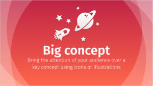
The thing is, Google Slides, and I think PowerPoint and Keynote already have this concept. When you use a standard template, you get Title and Section Header and Main Point slide layouts. It’s just that something gets lost in translation when designers are optimizing for reusability or efficiency or something. Even SlidesCarnival, which I wholeheartedly recommend, is creating a bunch of different slide styles that aren’t layouts. So if you used their “Big Concept” slide, it might look like either of these, but it might also look funny because there isn’t a “Big Concept” style, it’s an overlay on the “Blank – Clouds Only” or “Blank Color” layouts. And so if I wanted to switch from one style to another, something would break, because there isn’t a “Blank – Clouds Only” style in the one that’s all in orange and red and peach.

Bianca
Alonso
There’s a whole subgenre of slide tools like reveal.js and deckset that allow you to do this with markdown. I admire that, and wish them luck. It’s not quite what I’m after.
In conclusion, it’s worth asking yourself whether your re-use pattern is about how something looks or how it is used.
I leave you with the best slide I have ever created, because it’s pretty.
 (https://www.youtube.com/watch?v=B14lIlwYrHM&list=PLs4CJRBY5F1IEFq-wumrBDRCu2EqkpY-R&index=29&t=1s)
Slide background is Iago by SlidesCarnival. Click through for my PyConAU 2020 keynote

Top comments (0)