
Welcome back! In part 5 of this series we'll cover the "front of the front-end" - the part of an application that an end user actually sees and interacts with. When I start personal projects I usually get hung up on the visuals - I want it to look good while I'm developing the application. I tried to skirt that habit with this project, and for the most part that worked! It's time to give our UI a facelift though, and we'll create a design system from scratch to do so. I'll also show you how to use Storybook to design Angular components without having to run your application, and make components interact with our API.
Other posts in this series:
- An Introduction
- Part 1: Getting Started With Nx, Angular, and NestJS
- Part 2: Creating a REST API
- Part 3: Connecting Angular to a REST API
- Part 4: Data Persistence with TypeORM and NestJS
- Part 5: Design Systems and Angular Component Development with Storybook (this post)
If you want to skip ahead to the code, you can checkout out the repository: wgd3/full-stack-todo@part-05
If you'd like access to these articles as soon as they're available, or would like to be notified when new content has been posted, please subscribe to my newsletter: The Full Stack Engineer Newsletter
Creating a Design System
If you've spent any time working on a modern web UI, you've probably heard the term "Design System" more than once. For people like myself who often hit a "writer's block" when designing UIs, it's an invaluable tool. A design system consists of:
- Color palettes
- Font families
- Page layout guidelines
- Spacing
- UI/UX rules
There are many well-established design systems available in the open source world, such as Clarity, Material, or Microsoft's Fluent. For this post however, we'll be creating a library from scratch to learn more about SCSS and how these systems integrate with applications.
Create A Shared Style Library
Time to add another library to our repository! Instead of using an Angular or Nest-based generator, we'll use Nrwl's workspace generator to create a framework-agnostic library. Since this library will only contain SCSS files we don't need to include tests, modules, or components.
$ npx nx generate @nrwl/workspace:library ui-style \
--directory=libs/client \
--skipBabelrc \
--tags=type:ui,scope:client \
--unitTestRunner=none
Creating the client-ui-style library
👉 Why are we creating another library for this?
It's not just so there's another node in Nx's pretty dependency graph, nor is it because everything in a monorepo should be a library. By creating a SCSS-only, framework-agnostic style library, we enable any application to take advantage of our designs. For instance, if you wanted to create a Vue or React-based client application in this repository, you could import the same SCSS and have consistency across applications.
One tool that's been a huge help to me when I'm working in SCSS files is Stylelint. Like ESLint, it provides feedback on the structure of SCSS files, naming conventions, and more. There is a Nx plugin available to integrate Stylelint, so let's install that:
$ npm i -D nx-stylelint
💡 Stylelint adds a recommendation to VSCode's
extensions.jsonfile. If you go to the Extensions tab, you'll see it in the recommendations list and can install it from there.
Use the newly-available generators to add CSS and SCSS linting to our style library:
$ nx g nx-stylelint:configuration --project client-ui-style

$ nx g nx-stylelint:scss --project client-ui-style
Developers have a lot of opinions on how modular SCSS files should be structured, one of the most popular being the 7-1 configuration. There's not really one correct way of implementing a modular SCSS system; ultimately it comes down to what's best for your project and what you're comfortable with.
Personally, I'm a fan of the 7-1 structure, but we don't quite have a need for all 7 of the modules described in those docs. Let's go with a 5-1 structure instead:
$ mkdir -p libs/client/ui-style/src/lib/scss/{base,components,layout,abstracts,vendors}

$ touch libs/client/ui-style/src/lib/scss/{base,components,layout,abstracts,vendors}/_index.scss

$ tree libs/client/ui-style/src/lib/scss
libs/client/ui-style/src/lib/scss
├── abstracts # all "partials" - no rules, just mixins, functions, varibles
│ └── _index.scss
├── base # normalization and typography
│ └── _index.scss
├── components # individual component styles
│ └── _index.scss
├── layout # layout styles for sections of pages
│ └── _index.scss
└── vendors # all 3rd party styles
│ └── _index.scss
├── style.scss # main entrypoint for library
💡 Every "module" in our library has a
_index.scssfile in it. This allows the top-levelstyle.scssto import by directory instead of individual files. More on index files in SASS' documentation.
Add Some Style Helpers
Before we start actually writing SCSS, there are a few helpers I want to get installed so we can include them in our vendors/_index.scss file.
$ npm i --save normalize.css nord
normalize.css provides a stylesheet which overrides a lot of browser defaults to bring them up to modern standards. It's commonly the first stylesheet included so that our custom SCSS can take priority over it.
Nord is an open-source color palette which provides muted, cool colors for both light and dark modes. As I mentioned earlier, when I start a new project I usually go down a rabbit hole of color palette generators, and lose momentum. Nord is generally regarded as being visually appealing, and it doesn't look like Bootstrap out of the box, so it's a great palette to work with.
Now that the library is set up, there are 2 files that need to be updated in the client application in order to include our design system.
...
  "stylePreprocessorOptions": {
    "includePaths": [
      "libs/client/ui-style/src/lib/scss"
    ]
  }
...
apps/client/project.json
/** References the style.scss file in the
libs/client/ui-style/src/lib/scss directory
thanks to the includePaths option specified
above 👇 */
@import 'style';
apps/client/src/styles.scss
style is not the most creative name for the top-level file in our design library, but it made sense at the time. This import can directly reference the style.scss file since Angular will now look in libs/client/ui-style/src/lib/scss for any imports. Note that in other components you can now do something like @import 'abstracts/variables' as well.
Start Defining Your Theme
The first file that gets updated is our vendor directory's index file:
@import '~normalize.css';
@import 'nord/src/sass/nord';
libs/client/ui-style/src/lib/scss/vendors/_index.scss
Second stop is a new _variables.scss file under the abstracts directory. This is the place where you'll define SCSS variables that are used in all the other stylesheets:
// Font and Text
$font-size-base: 20px;
$line-height-base: 1.2rem;
$line-height-heading: 1rem;
$letter-spacing: normal;
$font-family-sans-serif: 'Helvetica Neue', helvetica, arial, sans-serif;

// Spacing
$space-default: 24px;
$space-x-sm: calc($space-default * 0.25);
$space-sm: calc($space-default * 0.5);
$space-md: $space-default;
$space-lg: calc($space-default * 1.5);
$space-x-lg: calc($space-default * 2);
libs/client/ui-style/src/lib/scss/abstracts/_variables.scss
These variables then get used in other SCSS partials. For example, here's some of my typography stylesheet:
html {
  color: $color-text-default;
  line-height: $line-height-base;
  font-size: $font-size-base;
  background-color: $color-ui-light;
  letter-spacing: $letter-spacing;
  font-family: $font-family-sans-serif;

  @media only screen and (min-width: 1280px) {
    font-size: $font-size-base;
  }
}
libs/client/ui-style/src/lib/scss/base/_typography.scss
There's not room to show everything that I added to these stylesheets, but you can always reference the code in the GitHub repository to see where I started.
Integrating Storybook
An indispensable tool for me when working on web UIs is Storybook. It is a standalone application that provides an isolated, visual representation of components. This allows you to design components without having to run your full application, which greatly speeds up development.
$ npm install -D @nrwl/storybook
💡 The
-Dflag in the above command saves this dependency to thedevDependenciessection of yourpackage.jsonfile. By storing it there, you prevent the package from being bundled with production builds of your application.
Now with Storybook support added to the repository, we need some components to design! This project will use a ui type library dedicated to our custom components:
$ npx nx generate @nrwl/angular:library ui-components \
--directory=libs/client \
--changeDetection=OnPush \
--importPath=@fst/client/ui-components \
--prefix=fst \
--skipModule \
--standalone \
--style=scss \
--tags=type:ui,scope:client

$ npx nx generate @nrwl/angular:component ToDo \
--project=client-ui-components \
--standalone \
--changeDetection=OnPush \
--path=libs/client/ui-components/src/lib \
--selector=fst-todo
Explaining These Command Options
-
changeDetectionis a complicated subject, but the short version is that for performance reasons in large applications you want to prevent the browser from constantly re-rendering when tiny changes occur. -
prefixforces components in thisui-componentslibrary to have HTML selectors that begin withfst -
skipModule/standalonethis library will not be using a central module through which all the custom components are declared and exported. Instead, we want to be able to import individual pieces from library via paths such as@fst/client/ui-components/to-do. This pattern enables tree shaking and smaller bundle sizes. - Component name capitalization - this is a fun quirk of the CLI, and I'm not sure if it's Nx or Angular that parse it. Capital letters in names get treated as separated works:
ToDoComponentbecomesto-do.component.tsinside ato-dodirectory. Just something to keep in mind! -
selectorspecifies exactly what I want to use for the HTML tag for this component
Just like we added Stylelint integration to our ui-styles library, we need to add Storybook integration to our ui-components library.
$ npx nx g @nrwl/storybook:configuration client-ui-components \
--storybook7betaConfiguration \
--storybook7UiFramework=@storybook/angular \
--configureCypress \
--tsConfiguration \
--configureTestRunner \
--cypressDirectory=./
As you can see here, we're using a beta version of the next Storybook release - I hope this command still works when you read this!
Start Designing
Storybook reads files that it refers to as "stories". These stories usually follow a naming scheme of <component>.stories.ts and exist in the same directory as te component being designed.
The beta generator for Storybook 7 didn't appear to create stories for my components automatically, so I had to manually run:
$ npx nx generate @nrwl/angular:stories client-ui-components
After that, update build-storybook target just like the application's project.json so Storybook is aware of our SCSS:
    "build-storybook": {
      "executor": "@storybook/angular:build-storybook",
      "outputs": [
        "{options.outputDir}"
      ],
      "options": {
        "outputDir": "dist/storybook/client-ui-components",
        "configDir": "libs/client/ui-components/.storybook",
        "browserTarget": "client-ui-components:build-storybook",
        "compodoc": false,
        "styles": [
          "apps/client/src/styles.scss"
        ],
        "stylePreprocessorOptions": {
          "includePaths": [
            "libs/client/ui-style/src/lib/scss"
          ]
        }
      },
      "configurations": {
        "ci": {
          "quiet": true
        }
      }
    },
libs/client/ui-components/project.json
$ npx nx run client-ui-components:storybook

Finally ready to design components!
Using Real Data While Designing
In my local instance of the application, at the time of writing, I only had the gimmicky "write another post!" to-do item in my database. When designing things visually, it helps to use "real" data to see how your component would act in various situations.
My go-to library for generating random data is Falso from the ngneat team.
$ npm i -D @ngneat/falso
Now the ToDoComponent needs a way to have data passed into it. Angular makes this very simple:
@Component({
  selector: 'fst-todo',
  standalone: true,
  imports: [CommonModule],
  templateUrl: './to-do.component.html',
  styleUrls: ['./to-do.component.scss'],
  changeDetection: ChangeDetectionStrategy.OnPush,
})
export class ToDoComponent {
  @Input() todo: ITodo | undefined;
}
libs/client/ui-components/src/lib/to-do/to-do.component.ts
💡 If you're new to Angular, then the
@Input()decorator is new to you as well! In short, when naming this component in a template you can pass in data ("data binding") via it's HTML tag.
I'd like to point out (again!) a place where our shared data structure ITodo is used. If the underlaying interface ever sees any updates, both client and server applications will stay in sync.
The story for ToDoComponent needs some data, which we can generate on-the-fly in the story file:
/**
 * Falso's `randTodo` function is perfect, but it wasn't as visually
 * pleasing to see filler text while designing. Instead, this uses
 * legitimate English language for the to-do item, and insert a random
 * `completed` value
 */
const randTodo = () => {
  const { id, title, description } = randProduct();
  return {
    id,
    title,
    description,
    completed: randBoolean(),
  };
};

export const Primary = {
  render: (args: ToDoComponent) => ({
    props: args,
  }),
  args: {
    todo: randTodo(),
  },
};
libs/client/ui-components/src/lib/to-do/to-do.component.stories.ts
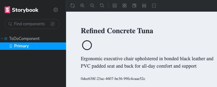
The component's template can now refer to the todo passed into it:
<ul *ngIf="todo">
  <li>ID: {{ todo.id }}</li>
  <li>Title: {{ todo.title }}</li>
  <li>Description: {{ todo.description }}</li>
  <li>Completed: {{ todo.completed }}</li>
</ul>
libs/client/ui-components/src/lib/to-do/to-do.component.html
If you left Storybook running in the background then you'll see the page live-reload with the new template, displaying our random data:

💡 Why Not Use Our Own API For Data?
In short, Storybook should be able to run completely isolated. In it's current form, I could run
build-storybookand host the static site somewhere with no external API dependencies.
Changing The Look
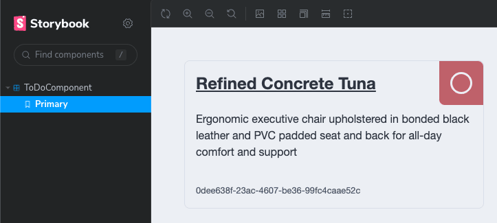
We have a design system in a style library, a set of colors to work with (Nord), and a framework for designing and testing in isolation.
💡 I did some behind-the-scenes work to install and integrate the Angular-native FontAwesome packages for these icons. Instructions for getting up and running can be found at the project's GitHub repository
<div class="todo" *ngIf="todo">
  <div class="todo__header">
    <h2 class="todo__title">{{ todo.title }}</h2>
    <div class="todo__completed" [class.todo__completed--true]="todo.completed">
      <fa-stack>
        <fa-icon [icon]="faCircleOutline" stackItemSize="2x"></fa-icon>
        <fa-icon
          [icon]="faCheck"
          stackItemSize="1x"
          *ngIf="todo.completed"
        ></fa-icon>
      </fa-stack>
    </div>
  </div>

  <div class="todo__body">
    <p class="todo__description">{{ todo.description }}</p>
  </div>

  <div class="todo__footer">
    <small class="todo__id">{{ todo.id }}</small>
  </div>
</div>
libs/client/ui-components/src/lib/to-do/to-do.component.html
You'll see in the caption for the following code block - this code is not going in the stylesheet to-do.component.scss. Instead, it lives in the components directory of our design system. Putting these styles in the component's specific stylesheet prevents them from being used in other (potential) applications.
// custom, local SCSS variable
$todo-border-radius: 8px;

.todo {
  font-family: 'Helvetica Neue', Helvetica, Arial, sans-serif;
  width: 100%;
  height: 100%;
  border: 1px solid $color-ui-border;
  border-radius: $todo-border-radius;
  padding: $space-default;
  display: grid;
  grid-template-rows: repeat(3, 1fr);
  row-gap: calc($space-default / 2);
}

.todo__header {
  display: flex;
  align-items: center;
  justify-content: space-between;

  .todo__title {
    text-decoration: underline;
  }
}

.todo__body {
  p {
    margin: 0;
  }
}

.todo__footer {
  display: flex;
  align-items: flex-end;
  justify-content: space-between;

  .todo__id {
    display: flex;
    align-items: flex-end;
    justify-content: flex-start;
    color: $color-text-label;
  }
}

.todo__completed {
  width: calc($space-default * 4);
  height: calc($space-default * 4);
  margin-top: calc($space-default * -1);
  margin-right: calc($space-default * -1);
  background-color: $color-status-danger;
  border-end-start-radius: $todo-border-radius;
  border-start-end-radius: $todo-border-radius;
  display: flex;
  flex-direction: column;
  align-items: center;
  justify-content: center;
  color: $color-text-inverse;

  // use a modifier of the class to change the state of the element
  &--true {
    background-color: $color-status-success;
    color: $color-text-default;
  }
}
libs/client/ui-style/src/lib/scss/components/_todo.scss
Make The Component Interactive
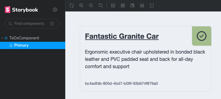
So far the component just displays the current state - there's no way to alter the state in the UI. Let's add some buttons for interactivity.

@Output() properties are added for the 3 buttons on the component. This decorator is attached to EventEmitter objects - a type of RxJs Subject that allows parent components to listen for actions.
  @Output() toggleComplete = new EventEmitter<boolean>();
  @Output() editTodo = new EventEmitter<ITodo>();
  @Output() deleteTodo = new EventEmitter<ITodo>();
libs/client/ui-components/src/lib/to-do/to-do.component.ts
And event binding is used in the template to link DOM events with component logic:
<div class="todo__footer">
    <div class="todo__actions">
      <button class="btn btn--primary" (click)="triggerEdit()">
        <fa-icon [icon]="faPencil"></fa-icon>
      </button>
      <button class="btn btn--danger" (click)="triggerDelete()">
        <fa-icon [icon]="faTrashCan"></fa-icon>
      </button>
    </div>
  </div>
libs/client/ui-components/src/lib/to-do/to-do.component.html
Wire up Storybook Actions so we know the interactions are working as expected:
...
  argTypes: {
    triggerDelete: {
      action: 'delete',
    },
    triggerEdit: {
      action: 'edit',
    },
    triggerToggleComplete: {
      action: 'toggleComplete',
    },
  },
} as Meta<ToDoComponent>;
libs/client/ui-components/src/lib/to-do/to-do.component.stories.ts

Clicking on the buttons in the component now logs to this console tab!
Using The New Component
The ToDoComponent has now been created with proper inputs and outputs, is fully styled, and ready to be used in a template. Our FeatureDashboardComponent should be updated to import the standalone component, and the template updated to use it.
@Component({
  selector: 'full-stack-todo-feature-dashboard',
  standalone: true,
  imports: [
    CommonModule,
    // Our standalone component!
    ToDoComponent
  ],
  templateUrl: './feature-dashboard.component.html',
  styleUrls: ['./feature-dashboard.component.scss'],
})
export class FeatureDashboardComponent {
  ...
}
libs/client/feature-dashboard/src/lib/feature-dashboard/feature-dashboard.component.ts
<div class="page" *ngIf="todoItems$ | async as todos">
  <div class="incomplete-column">
    <h1>Incomplete</h1>
    <ng-container *ngFor="let todo of todos">
      <fst-todo [todo]="todo" *ngIf="!todo.completed"></fst-todo>
    </ng-container>
  </div>

  <div class="complete-column">
    <h1>Completed</h1>
    <ng-container *ngFor="let todo of todos">
      <fst-todo [todo]="todo" *ngIf="todo.completed"></fst-todo>
    </ng-container>
  </div>
</div>
libs/client/feature-dashboard/src/lib/feature-dashboard/feature-dashboard.component.html
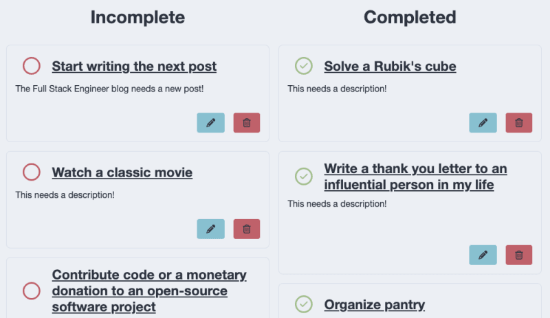
Dashboard received some extra styles for this layout
Interact With The Component
Our dashboard now contains 2 lists, the completed and incomplete. We know thanks to Storyboard that our buttons work, but currently the @Output() properties of the ToDoComponent are not used. The dashboard template needs to be updated to use these properties:
<div class="page" *ngIf="todos$ | async as todos">
  <div class="incomplete-column">
    <h1>Incomplete</h1>
    <ng-container *ngFor="let todo of todos; trackBy: trackTodo">
      <fst-todo
        [todo]="todo"
        *ngIf="!todo.completed"
        (toggleComplete)="toggleComplete($event)"
        (deleteTodo)="deleteTodo($event)"
      ></fst-todo>
    </ng-container>
  </div>

  <div class="complete-column">
    <h1>Completed</h1>
    <ng-container *ngFor="let todo of todos; trackBy: trackTodo">
      <fst-todo
        [todo]="todo"
        *ngIf="todo.completed"
        (toggleComplete)="toggleComplete($event)"
        (deleteTodo)="deleteTodo($event)"
      ></fst-todo>
    </ng-container>
  </div>
</div>
libs/client/feature-dashboard/src/lib/feature-dashboard/feature-dashboard.component.html
Angular Template Data and Event Binding
In the above code, the
ToDoComponentbeing created has a lot going on. Here's the breakdown:
*ngIfin the highest-level element tells the template to render it's child nodes only whentodos$is defined. In the component, it's defined as soon as the component is initialized, so this will always be true. Theasync as todosallows us to usetodosas a regular array instead of requiring multipleasyncpipes within child nodes.[todo]passes in the item's data to theToDoComponent*ngIffilters based on thecompletedstatus(toggleComplete)and(deleteTodo)are theEventEmitterproperties of theToDoComponent. They call a method in theFeatureDashboardComponentwith the same name. Since we know the@Output()fromToDoComponentcontainsITodo-structured data. That's passed to methods with the$eventvariable. Technically$eventcould be named anything, this is just a common convention.
In the component itself, we define the functions to be called in the template:
export class FeatureDashboardComponent implements OnInit {
  private readonly apiService = inject(ApiService);

  todos$ = new BehaviorSubject<ITodo[]>([]);

  trackTodo(idx: number, todo: ITodo) {
    return todo.id;
  }

  ngOnInit(): void {
    this.refreshItems();
  }

  refreshItems() {
    this.apiService
      .getAllToDoItems()
      .pipe(take(1))
      .subscribe((items) => this.todos$.next(items));
  }

  toggleComplete(todo: ITodo) {
    this.apiService
      .updateToDo(todo.id, { completed: !todo.completed })
      .pipe(take(1))
      .subscribe(() => {
        this.refreshItems();
      });
  }

  deleteTodo({ id }: ITodo) {
    this.apiService
      .deleteToDo(id)
      .pipe(take(1))
      .subscribe(() => {
        this.refreshItems();
      });
  }
}
💡 Notice the
trackByspecified in the template! Without it, everytimerefreshItems()is called (which updates the BehaviorSubject and triggers change detection in the template), allToDoComponentelements get re-rendered. Providing a way to uniquely identify objects inside ofngForloops means that Angular knows whichToDoComponentwas updated, and only re-renders that specific one. For larger arrays this can make a huge performance difference.
Summary
If you're still reading, thanks for sticking with me through this post! You now have the basis for a custom design system, an isolated toolset for designing components, and functional components in the client application!
Here's a look at our dependency graph with the 2 new libraries:

Implicit dependencies were defined for client-ui-components so we know it needs the style library. This graph groups the nodes based on folder structure.
The code for this post can be found in the GitHub repository: wgd3/full-stack-todo@part-05
Speed Bumps
ToDoComponent Outputs Updated
Towards the end of this post once everything was wired up, I realized that to best provide context for the parent component, the toggleComplete output from the ToDoComponent should emit an ITodo just like the other emitters.
Storybook 7 Beta
I found out the hard way that Storybook 6.5.x does not support Angular 15 or the version of zone.js that Angular 15 requires. This situation is discussed in this GitHub issue. I followed Nx's documentation for getting set up with a beta release of Storybook 7, and things seemed to go smoothly after that.
References
- Style library structure inspiration: Simple SCSS Playbook A Modern SASS Folder Structure Official SASS Guidelines
- Nord Color Scheme
- Clarity Design System

Top comments (0)