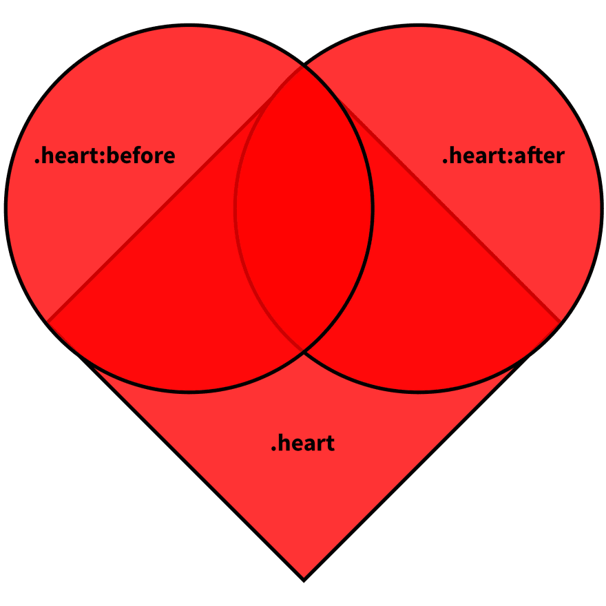
A problem came up when I was trying to draw a heart using CSS following this guide.
You draw a box first. And then you draw two circles attached to two adjacent sides of the box. Finally, you rotate the square by -45 degrees to get the heart upright (but the box is standing on its foot).
The whole idea is presented fairly straightforwardly by this diagram:
For learning purposes, I tried to figure out which side is which alright. So I went ahead and changed the colors of my ::before and ::after:
.heart:before {
  top: -15px;
  background-color: pink;
}
.heart:after {
  right: -15px;
  background-color: teal;
}

It looks like that my ::before (pink) is on the left, my ::after (teal) is on the right, and my heart is rotated counter-clockwise because ::before is supposed to have a negative top offset, and ::after is supposed to have a negative right offset.
To verify this idea, I decided to take out the line that rotates the heart:
.heart {
  /* transform: rotate(-45deg); */
}
I would expect my heart to lie down, right, something like this:

But, uh, no. Not exactly. Once I remove that line and hit "refresh". My heart is broken 😱. Or to be more precise, torn apart.
Before I go on explaining what went wrong, I have a couple of confessions to make.
First, I did not follow the guide exactly. If you copy-and-pasted the code, you'd notice that the one of the rounded side does not show up. This is because it is missing the offset definition for the ::after pseudo-element.
But I assume you'd figured that out according to the diagram by yourself, too.
Second, I gave my .heart element a margin offset so that it displays in the center of my screen:
.heart {
  margin: 100px auto 0;
}
Without this line, the result would look a bit different, but equally wrong.
Now let's try to fix it together.
Attempt Fix
It seems to me that my torn apart heart has the ::before and ::after pseudo-elements positioned with respect to the viewport, not their parent, which is the square .heart.
If you are not familiar with this, I encourage you to read the CSS Specification Visual Formatting Model. And I quote here in section 9.8.4 Absolute positioning that absolute positioned boxes are:
... positioned with respect to its containing block. The containing block for a positioned box is established by the nearest positioned ancestor (or, if none exists, the initial containing block).
In human language (with a bit loss of precision), absolute positioned boxes are placed with repect to its nearest ancestor with position: relative. And if such ancestor does not exist, they are positioned with respect to the root element, which is (roughly) the viewport.
So it seems that my ::before and ::after pseudo-elements could not find their position: relative ancestor, and so are placed with respect to the viewport. They both have a negative offset equal to half of their diameters, so I have them neatly cut in half by the edges of my viewport.
Knowing this, I should be able to fix this by adding the position: relative to my .heart element:
.heart {
  /* transform: rotate(-45deg); */
  position: relative;
}
And, expectedly, my heart is fixed, and is lied down, CodePen: position: relative Establishes Containing Block for Descendants:
The missing position: relative
An immediate question followed up: Have I not initially put position: relative to my .heart? No, right? How come initially the heart was intact?
The only line of code I changed was:
.heart {
  transform: rotate(-45deg);
}
So something else must have happened in between. What if I try transform: rotate(0deg), without position: relative, and see what happens?
.heart {
  transform: rotate(0deg);
  /* position: relative; */
}
I have a lied-down heart exactly like my previous fix! CodePen: Transform Establishes A Containing Block for All Descendants
transform other than none establishes a containing block
Turns out that:
any value other than
nonefor the transform property also causes the element to establish a containing block for all descendants.
Says section 3 The Transform Rendering Model of CSS Transforms Module Level 1.
What happens when you transform a box other than the transformation itself?
If you transform something, would you expect whatever inside to be transformed together? If you do, you'd share the same intuition with CSS's intention. This includes:
- Establishes a containing block: (again with some loss of precision) absolute positioned children will offset according to it, width / height will be calculated according to it, etc.
-
Creates a stacking context: you may not make something look "inserted" to the stacking context even if you set a
z-indexthat falls in the range, because anything inside that stacking context shall be atomic with respect to its outside.
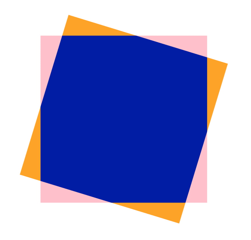
And finally, the transformation may extend, but not shrink, the size of the overflow area. Intuitively, what this is saying is that if you transform a box, whatever was visible will remain visible after the transformation. In this illustration below, the orange part will be the extended (visible) overflow area.
Specs Reading
I hope the exploration of this problem makes it easier for you to read the following sections of the CSS Specifications!

Top comments (5)
I really like the write-up, the process of exploring specs and behaviour is super fun. Also, I had no idea that
transformdoes that! I'm now wondering to go through some of my past projects and see if I ever implicitly relied on it.Thanks! I'm reading the specs recently so likely I'll be writing more with similar fashion :]
Would you also like to write some posts under #specsreading to make this topic more active? I'm doing this because I find reading the specs so helpful and I really want to share about this process itself, too.
#specsreading sounds good, I'll see what I can add from my explorations!
You say:
But I keep reading:
Haha yeah after looking at it for so long it starts to look like other things to me as well like
.ice-cream🍦