
Get notified when new tutorials are published. Subscribe to our newsletter.
Don’t forget to subscribe to our YouTube channel to stay up-to-date.
Below are the show notes for the first video in a series on building a Drupal site using layout builder and Bootstrap. To help with the build process we’re going to follow a template and in each live stream session, we’ll build a component from the template.
And the plan is to have a semi-complete website after a few live streams.
In this first video, we’re focusing on the three-card components below the homepage carousel.

We built the three-card components using a custom block type and layout builder. We’re not using paragraphs in this video.
So here are the show notes for the video.
💻 Get a copy of the built site from GitHub.
Project Set-Up
Download Drupal
First go download Drupal using Composer.
composer create-project drupal/recommended-project FOLDER_NAME --no-interaction
Set Up Lando
In this video, we used Lando for our local environment.
lando init --source cwd --recipe drupal8 --name bs-build --webroot web --full
Download Modules and Themes
Go download the following:
- Display Suite
- Field Group
- Bootstrap4 (Drupal theme)
- Drush
composer require drupal/ds drupal/field_group drupal/bootstrap4 drush/drush
Install Modules
Install the following modules:
- Layout Builder (core)
- Media Library (core)
- Field Group
- Display Suite
drush en ds field_group media_library layout_builder
Sub-theme
Generate Sub-theme
The Bootstrap 4 theme allows you to create a sub-theme in two ways; using a script or via the settings form. We’re going to look at using it via the settings form.
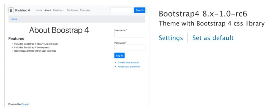
1. Install the Bootstrap4 theme
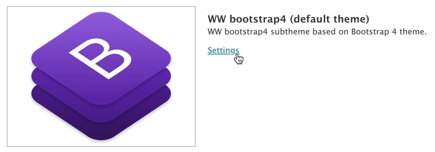
2. Click on Settings, and scroll to the bottom and expand the “Subtheme” section.
3. Enter in details into the form, then click on the Create link.

NOTE: In the video, this step didn’t work because I got a fatal error because I didn’t have the Symfony\Component\Filesystem\Filesystem library. The only way I was able to get this library was by installing Drush using Composer, composer require drush/drush.
Configure Sub-theme
Once the sub-theme has been generated go and install and set as default.
Go to the theme settings page.
Configure the settings like the image below then click on “Save configuration”.

Configure Block Placement
You’ll need to add the correct blocks into the right regions or the site will look broken.
Arrange the blocks like the image below:

Compile Sass in Sub-theme
We’ll use Laravel Mix to compile Sass which I find the easiest to set up.
Before you begin, make sure you download and install Node.js and you can run the npm command.
1. Go into your sub-theme and run the following command:
npm init -y
Just follow the prompts and you should end up with a package.json file.
2. Then install Laravel Mix with the following command:
npm install laravel-mix cross-env --save-dev
3. In the sub-theme create another file called webpack.mix.js and add the following to it:
let mix = require('laravel-mix');

mix.sass('scss/style.scss', 'css/');
mix.options({
  processCssUrls: false
});
4. Open up package.json and replace the scripts section with the one below:
  "scripts": {
    "dev": "npm run development",
    "development": "cross-env NODE_ENV=development node_modules/webpack/bin/webpack.js --progress --hide-modules --config=node_modules/laravel-mix/setup/webpack.config.js",
    "watch": "npm run development -- --watch",
    "hot": "cross-env NODE_ENV=development node_modules/webpack-dev-server/bin/webpack-dev-server.js --inline --hot --config=node_modules/laravel-mix/setup/webpack.config.js",
    "prod": "npm run production",
    "production": "cross-env NODE_ENV=production node_modules/webpack/bin/webpack.js --no-progress --hide-modules --config=node_modules/laravel-mix/setup/webpack.config.js"
  },
This adds NPM scripts which you’ll need to use to compile the Sass. You’ll need to run these commands from within the sub-theme.
The two important scripts are:
npm run watch
Use this script to automatically compile when a file is changed. This should be used locally while developing a site.
npm run production
You should run this script when you’re ready to deploy to production. It’ll minify the CSS and JavaScript file to reduce the size.
NOTE: If you’re having problems setting it up then please refer to the official documentation.
Twig Debugging
When you’re modifying templates it’s best to turn on Twig debugging so you can see where the templates are stored.
Following the steps in this link to turn on Twig debugging.
Drupal Site Building
Display Suite Settings
Before we start the site building process, go to Display Suite and configure the following:
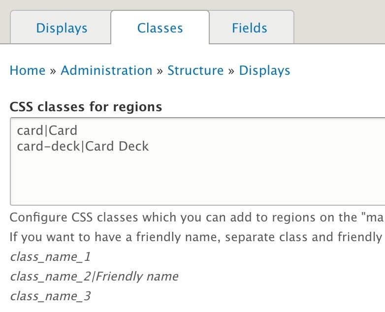
1. Go to Structure, "Display Suite", click on Settings and check "Enable Field Templates".

2. Click on the Classes tab and add the following into "CSS classes for regions":
card|Card
card-deck|Card Deck
Configure Image Media Type
We'll be using the Media field to handle the image on the Card component which we'll set up next.
But we need to make a few changes to the Image media type.
Create Bare View Mode
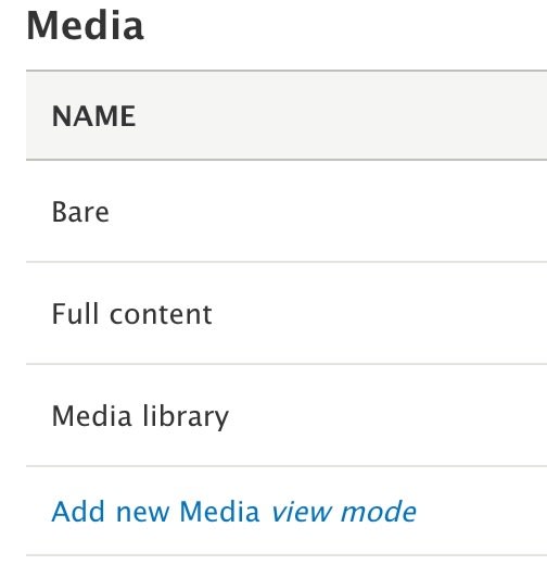
Go to Structure, "Display Modes", "View modes" and create a Bare view mode for the Media entity.
To do so, just click on "Add new Media view mode".
Configure Bare View Mode on Image Media Type
Then go ahead and configure the Bare view mode on the image media type.
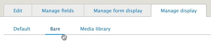
1. Go to Structure, "Media types" and click on "Manage display" on the Image row.
2. Click on "Custom display settings" and enable Bare.
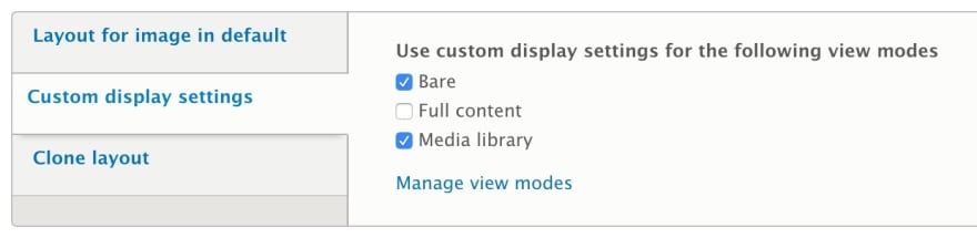
3. Once enabled click on the Bare tab.
4. Select "Reset layout" as the Display Suite layout at the bottom.

5. Scroll up and make sure the Image field is the only field in the content region. Also, click on the cog-wheel and change the "Choose a Field Template" to "Full reset".

6. Scroll down and click on Save.
The reason why we created a new view mode is that we need to remove all the markup that gets generated on fields. We only want the image element and that's it. We do not want the DIVs which wrap the fields.
Create Card Block Type
To handle the individual card component we'll create a custom block type called Card.
1. Go to Structure, "Block layout", "Custom block library" and click on "Block types".
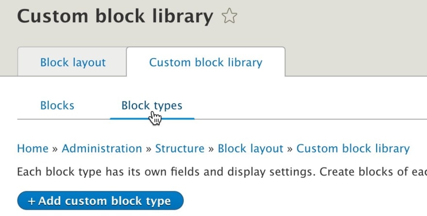
2. Click on "Add custom block type" and create the Card block type with the following fields:
- Description (field_description), Text (formatted, long)
- Image (field_image), Media (can't see the Media field? Install the Media module.)

- Title (field_title), Text (plain)

Configure Card Formatters
While on the Card block type click on "Manage display".

1. Scroll to the bottom of the page and select "One column layout" from the "Layout for card in default".

2. In the field section, move Image to top, then click on the cog-wheel and select Bare as the "View mode" and "Full reset" as the field template.

3. We need to create a DIV which will wrap the Title and Description, this will be called the "Card body". We'll create a field group for this.
Click "Add field group" at the top and select "HTML element", give the label "Card body":
- Element: div
- Extra CSS classes:
card-body(this is very important, make sure you enter in the right class)

Place the "Card body" field group below the Image field.
4. Place the Title and Description field as child element inside of "Card body".

5. Click on the Title field cog-wheel and select Expert as the field template. Check "Field item" and enter h5 into Element and card-title into Classes.

6. Click on the Description cog-wheel and select "Full reset" from the field template.

Once everything is complete make sure the formatters are configured like below:

7. Last but not least, scroll down to "Custom classes" and make sure you select the Card option in "Class for layout". (NOTE: Make sure you've added the "Card" class in the Display Suite settings.)

Layout Builder
Enable Layout Builder "Basic page" Content Type
Make sure you've enabled the Layout Builder module because we'll use it to display the cards on a page.
1. Go to Structure, "Content types" and click on "Manage display" on the "Basic page" row.
2. Scroll to the bottom and click on "Custom display settings" and enable "Full content".

3. Click on the "Full content" tab and check:
- "Use Layout Builder"
- "Allow each content item to have its layout customized."

Create Page Content
Now go to Content, "Add content", "Basic page".
Create a test page then click on "Layout".
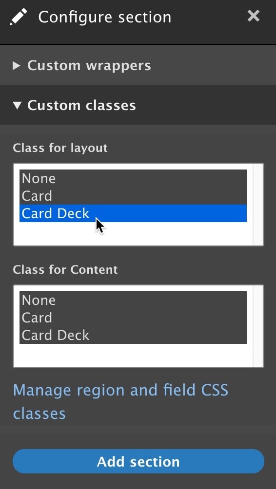
Create Card Row Section in Layout Builder
1. Click on "Add section" and select "One column layout" as the layout.

2. From the "Configure section" click on "Custom classes" and select "Card Deck" from the "Class for layout". (NOTE: Make sure you've added the "Card Deck" class in the Display Suite settings.)
Add Cards to Section
Once the section has been added, go ahead and add the cards.
1. Click on "Add block" in the section.
2. Click on "Create custom block" on the right.

3. Then click on Card.
4. Fill out the form and click on "Add block".

Override Block Template
For the cards to float next to each other correctly.
We need to override a single block template.
- Copy the block template from
/core/themes/classy/templates/block/block.html.twigand paste it into/themes/custom/ww_bootstrap4/templates/block/block--inline-block--card.html.twig.
Make sure you change the file name from block.html.twig to block--inline-block--card.html.twig.
Change it from this:
<div{{ attributes.addClass(classes) }}>
  {{ title_prefix }}
  {% if label %}
    <h2{{ title_attributes }}>{{ label }}</h2>
  {% endif %}
  {{ title_suffix }}
  {% block content %}
    {{ content }}
  {% endblock %}
</div>
To this:
{{ title_prefix }}
{% if label %}
  <h2{{ title_attributes }}>{{ label }}</h2>
{% endif %}
{{ title_suffix }}
{% block content %}
  {{ content }}
{% endblock %}
All we're doing is removing the wrapping DIVs in the template so the card deck is aligned correctly.
Summary
In this first video, we have focused on the project set up and built a Card component using custom blocks.

Top comments (2)
Some comments may only be visible to logged-in visitors. Sign in to view all comments.