It took some experimenting and creating a video, but I finally figured out what the difference is between the three types for an ion-menu component in the Ionic Framework.
The ion-menu is the Ionic component that implements a side-menu. As with most other Ionic container components, it can contain a header with a toolbar and title, along with some ion-content. The typical side-menu consists of a list of pages, made from an ion-list of ion-items.
Type
The menu can be customized with a variety of behaviors. The type is where I always get confused.
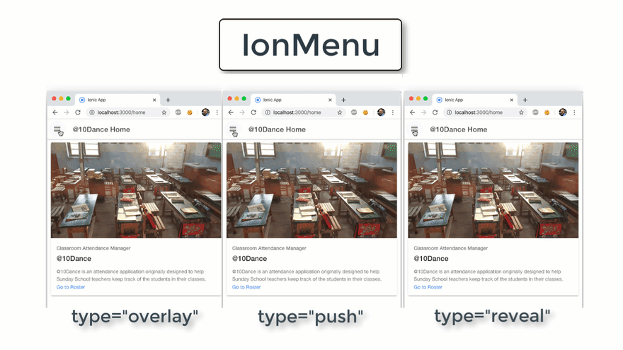
Overlay
If you want the menu to obscure the main page content when it opens, you can set its type attribute to overlay. With this option, the menu slides in from the side, covering the stationary main content.
Push
Other choices are push, which causes the page content to slide with the menu. As with overlay, the menu still slides in from the side, but it pushes the main content out of the way.
Reveal
Or you can choose reveal to achieve a similar, but opposite effect from overlay. With reveal, the menu content itself is stationary, and appears to be uncovered (or revealed) as the main contents slides out of the way.
Animated Example
Here is an animation I created to show them side-by-side. Pay close attention to which elements move, versus which ones are stationary in each example. It helps if you focus on the word Menu and the title of the main content.
Other ion-menu Options
Side
You can specify what side the menu is on by setting the side attribute to either start or end. If you choose end, make sure your menu icon is on the same side of the main content’s toolbar, or it will look weird.
Swipe Gesture
You can disable swiping the menu on mobile devices by setting swipeGesture to false.
Menu Toggle
If you want an item in your menu to close the menu when you select it, be sure to wrap it with an ion-menu-toggle component. Otherwise, the menu will stay open.
The ion-menu-toggle can also be used to open a menu (hence the name toggle). By default, it will automatically hide itself whenever it detects that its menu is disabled or being presented in a split-pane, as we will be doing here. Because of that, if you want it to be visible all the time, be sure to set its autoHide attribute to false.
Do not ask me how long it took me to debug that the first time I forgot it.
Summary
That is the basics of the ion-menu. There are other options, but those are the important ones to get you started. These are also the ones I tend to forget.

Top comments (0)