
Have you ever wished for a more intuitive and interactive way to explore your datasets?
Meet PyGWalker (called "Pig Walker" for fun) - it's about to transform your data analysis routine. The name is short for "Python binding of Graphic Walker" and it seamlessly integrates with Jupyter Notebook and other Jupyter-based environments. PyGWalker offers a Tableau-style User Interface for effortless visual exploration, making data analysis a walk in the park.
But how does it work?
First things first, you'll need to install PyGWalker. Open your terminal and run the following command:
pip install pygwalker
Once you have PyGWalker installed, you can start using it in your favorite development environment, like Visual Studio Code.
Let's dive into a quick example using PyGWalker and the popular yfinance library to visualize financial data.
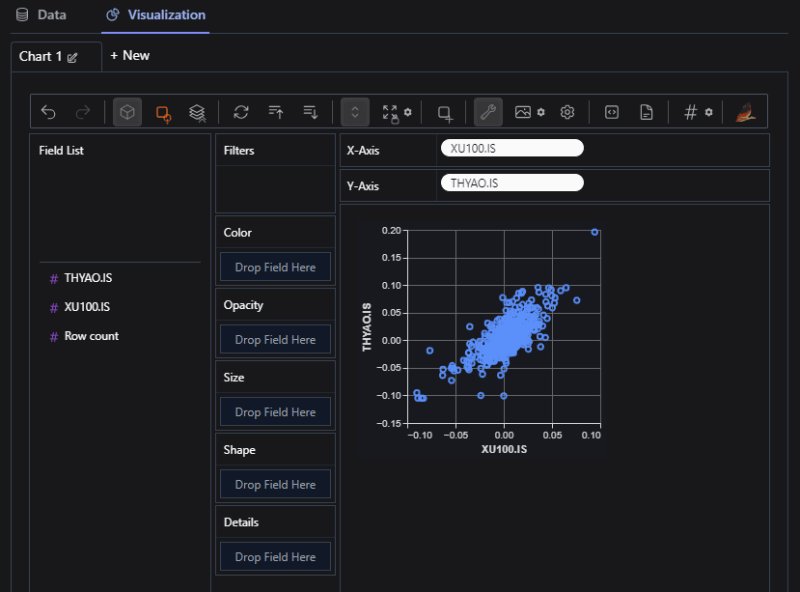
In this example, we'll take a closer look at the Istanbul Stock Exchange 100 Index (XU100.IS) and Turkish Airlines (THYAO.IS) logarithmic returns by creating a scatter plot.
Import the necessary libraries:
import yfinance as yf
import pygwalker as pyg
import numpy as np
Fetch historical stock data using yfinance:
symbols = ['XU100.IS', 'THYAO.IS']
start_date = '2021-09-16'
end_date = '2023-09-15'

data = yf.download(symbols, start=start_date, end=end_date)
Calculate the log returns for both symbols:
log_returns = np.log(data['Adj Close'] / data['Adj Close'].shift(1))
log_returns = log_returns.reset_index(drop=True)
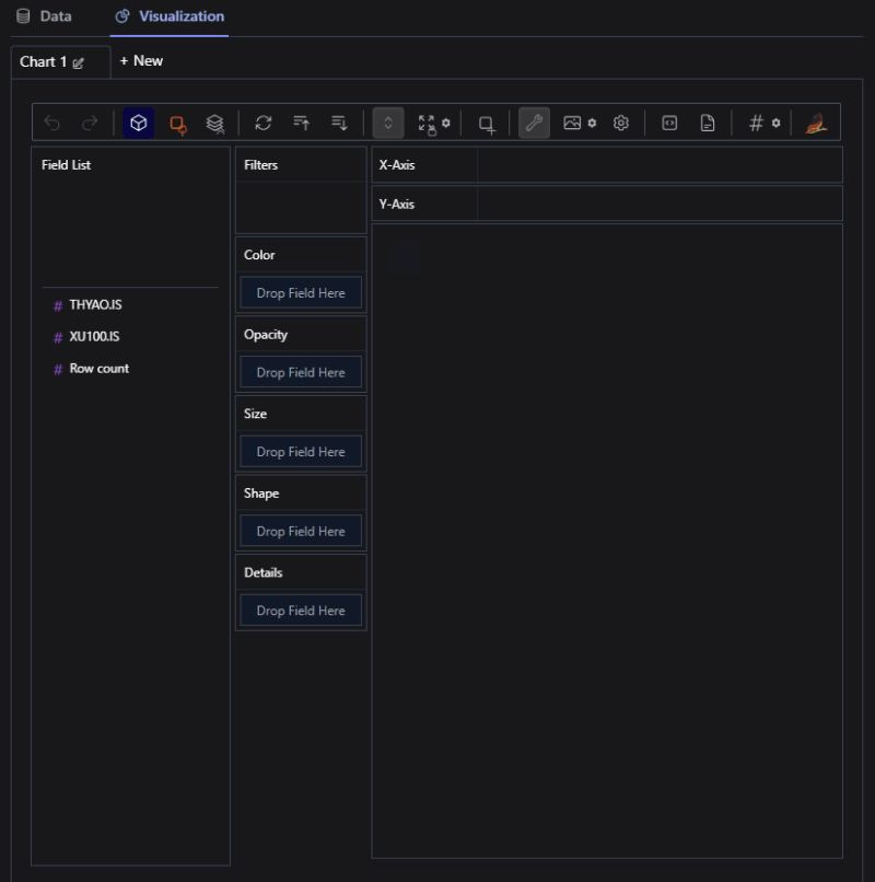
Create an interactive environment with PyGWalker:
walker = pyg.walk(log_returns)
With this simple line of code, an interactive interface will open up, allowing you to create visualizations effortlessly.
Create a scatter plot:
In this interface, you can drag and drop to build your visualizations. For our scatter plot, set the Y-axis to THYAO.IS and the X-axis to XU100.IS. Please don't forget to click on the Aggregation button in the menu. This will remove the variable values from being aggregated.
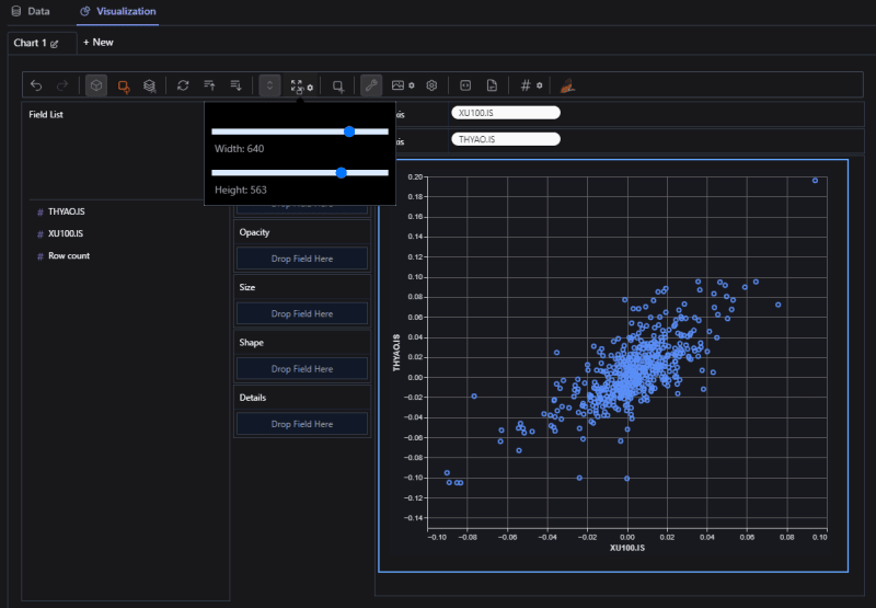
If you wish, you can adjust the height and width of the graph as shown below in the Layout Mode menu.
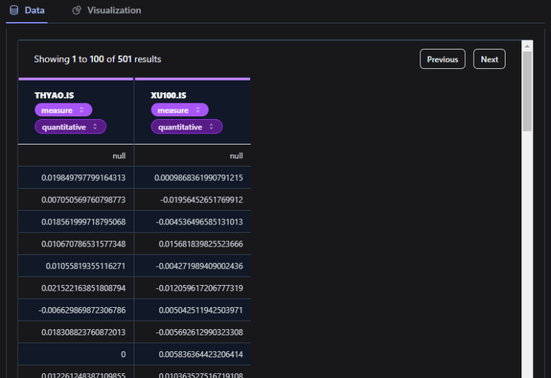
If you click on the tab labeled Data in the top left corner, you can also view the raw data.
With PyGWalker, data exploration becomes a playful and intuitive process. Bid farewell to manual coding, which is undeniably valuable, but in today's fast-paced world, efficiency is key. Say hello to a more interactive and enjoyable data analysis journey.
Happy exploring!


Top comments (0)