
Introduction
React by definition follows Component-based architecture approach where the components represent specific screens or elements in the app. This has given rise to the need of having CSS styles that can be managed in component based manner. Traditionally in a web application development, CSS has been managed in one external CSS file eg index.css or just a couple of Stylesheets (CSS Modules) which manage styling for the entire app. You would then pass the attributes as a string on the className prop.
There are some problems with this approach:
- If not properly structured, CSS stylesheet or module can become too large and complex as the app grows which makes the app styles difficult to manage.
- Since the stylesheet is large and complex, its difficult to refactor and remove unnecessary styles that are not in use.
- It is easy to have clashing class names for complex app.
- Its due to the issues above and the need to have a component-based way of managing CSS that styled components come in handy.
If you would prefer to follow this tutorial on YouTube its available at the link below.
A complete working solution is available on Github
 tndungu
/
Styled-components-React
tndungu
/
Styled-components-React
Show the use of styled components in React
Styled Components - All you need to know
This project has the final app after modification as per the YouTube tutorial video below.
Local Setup
- Clone the Repository using the following command: git clone https://github.com/tndungu/Styled-components-React.git
- Open the Repository using your favorite text editor. I use Visual Studio Code as a personal preference.
- Open terminal and run the following: npm install
- Run the project using npm start. This will open the project in http://localhost:3000
Video
There is a step by step guide on building the project on YouTube.

Styled components
Styled components is a library for styling React app, allows use of CSS-in-JavaScript. Using styled components has the following key advantages:
- By focusing on single use case, the developer has a better experience managing CSS.
- The users experience is enhanced, styled-components keeps track of the components that are being rendered on page and injects their styles and nothing else. Combined with code splitting, the app will load faster.
- Easier deletion of unused CSS - Maintenance of CSS is easy, its easy to see which styles are not in use and delete them.
Installation
with npm
npm install --save styled-components
with yarn
yarn add styled-components
Getting Started
styled-components uses tagged template literals to style the components. The created styles are normal React components that has styles attached to it.
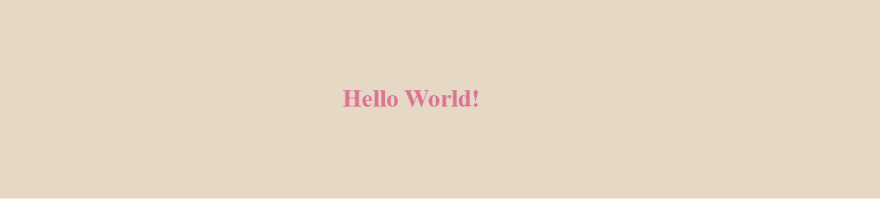
The example below creates a wrapper and a title components with styles attached to it:
import styled from "styled-components";

// Create a Title component that'll render an <h1> tag with some styles
const Title = styled.h1`
  font-size: 1.5em;
  text-align: center;
  color: palevioletred;
`;

// Create a Wrapper component that'll render a <section> tag with some styles
const Wrapper = styled.section`
  padding: 4em;
  background: #e5d9c5;
`;

const App = () => {

  return (
    <Wrapper>
    <Title>
      Hello World!
    </Title>
  </Wrapper>
  );
};

export default App;
Output
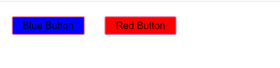
Adapting Based on Props
You can pass a function (interpolated function) to styled component's template literal to adapt it based on component props. This means if you have a blue button and now you need a red one, there is no need of having 2 components you can conditionally adapt based on component's props. See below example.
import styled from "styled-components";

const Button = styled.button`
  /* Adapt the background colors based on backgroundColor prop */
  background: ${props => props.backgroundColor === 'blue' ? "blue" : "red"};

  font-size: 1em;
  margin: 1em;
  padding: 0.25em 1em;
  border: 2px solid palevioletred;
  border-radius: 3px;
`;

const App = () => {

  return (
    <div>
    <Button backgroundColor='blue'>Blue Button</Button>
    <Button backgroundColor='red'>Red Button</Button>
  </div>
  );
};

export default App;
Output
Extending Styles
Occasionally you might need to use an existing style but make some change for one instance. Since its a single case, you don't need to use interpolated function like we did above, its better to make a new component that inherits styling of another component. This is done by wrapping it in the styled() constructor as shown below.
import styled from "styled-components";

const Button = styled.button`
  background: yellow;
  font-size: 1em;
  margin: 1em;
  padding: 0.25em 1em;
  border: 2px solid black;
  border-radius: 3px;
`;

const TomatoButton = styled(Button)`
background: tomato;
`
const App = () => {
  return (
    <div>
    <Button>Yellow Button</Button>
    <TomatoButton>Tomato Button</TomatoButton>
  </div>
  );
};

export default App;
Output

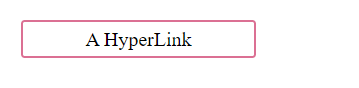
The "AS" Polymorhic Prop
Sometime you might need to change the final tag or component that is rendered. You might for instance have a button component that you would like to be rendered as a hyperlink with an tag.
import styled from "styled-components";

const Button = styled.button`
  display: flex;
  align-content:center;
  justify-content:center;
  color: black;
  margin: 1em;
  padding: 0.25em 1em;
  width:10%;
  text-decoration:none;
  border: 2px solid palevioletred;
  border-radius: 3px;
`;

const App = () => {
  return (
    <div>
    <Button as='a' href='#'>A HyperLink</Button>
  </div>
  );
};

export default App;
Output
scss-like syntax
styled-components uses stylis preprocessor which supports scss-like syntax. This provides support for advanced selector patterns, For example.
import styled from "styled-components";

const StyledCard = styled.div`
  border: 1px solid black;
  display: flex;
  align-items: center;
  flex-direction: column;
  width: 20%;
  > .name {
    font-size: 22px;
    color: black;
    transition: 0.5s;

    &:hover {
      color: red;
    }

    + .surname {
      color: #b30e16;
    }
  }
`;

const Container = styled.div`
  display: flex;
  align-items: center;
  justify-content: center;
`;

const App = () => {
  return (
    <Container>
      <StyledCard>
        <h1 className="name">Antony</h1>
        <p className="surname">Ndungu</p>
      </StyledCard>
    </Container>
  );
};

export default App;
Animations
Styled components have keyframes that creates animation keyframes. The key frames are not specific to the component which means they can be exported anywhere within the app.
import styled, { keyframes } from "styled-components";
const rotate = keyframes`
from {
transform: rotate(0deg);
}
to {
transform: rotate(360deg);
}
`
const Rotate = styled.div`
display:inline-block;
animation: ${rotate} 2s linear infinite;
padding: 2rem 1rem;
font-size:1.2rem
`
const App = () => {
return (
<Rotate>< 💅🏾 ></Rotate>
);
};
export default App;
Conclusion
This tutorial covers most of the styled components features that you will need in your day to day development. Important to define styled component outside the render method. This is to ensure component is not recreated on every render pass. It also ensures caching is working correctly else the rendering speed will be slowed down.
In addition, not everything need to be styled component. There is a risk of over-engineering your application if you overuse the styled components.
Feel free to comment below should you need to discuss further.

Top comments (0)