
Speedy access to the latest, local COVID-19 data with a familiar interface: the Globe
Stable version c19-viz3d
 ladybug-tools
/
spider-covid-19-viz-3d
ladybug-tools
/
spider-covid-19-viz-3d
Speedy access to the latest, local COVID-19 data with a familiar interface: the Globe
You are now in a GitHub source code view - click this link to view Read Me file as a web page
COVID-19 Viz3D Read Me
Full Screen stable: covid 19 viz3d
Full Screen latest: covid 19 viz3d/dev
Cookbook
- Demos of the various modules used to build the viewer
Archive Gallery 2
- Files for every daily project update since 200-03-19. Some files are better than others.
Archive Gallery 1
- Files from the first day of the project
Concept
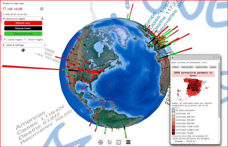
The concept of the web page is to show you the current COVID-19 situation around the entire world in 3 seconds or less.
- View the latest COVID-19 data from John Hopkins University GitHub repository with interactive 3D
- Provide entry-level programming code - plain-vanilla JavaScript - anybody can copy and make better
- Display all the data in seconds on any device then zoom and rotate and click to see the cases in 3D
…
Features
- Realtime 3D interaction with three.js and real-time data harvesting from Wikipedia Coronavirus Pandemic
- Statistics for 230 countries & states with timely access via GitHub & Wikipedia APIs
- Compare world pandemic case data in seconds on computer, tablet or phone
- Frequent program versions with the entire archive of daily releases online & viewable
- Plain vanilla Javascript, single dependency, JSON data, GitHub pages hosted
Background
This project started on March 15 - a few days after the self quarantine started here in San Francisco. While looking for trackers and finding the Johns Hopkins University (JHU) COVID-19 Dashboard, I discovered that JHU was making their COV1D-19 data readily available at no charge via their GitHub repository. A great feature of the JHU data is its inclusion of latitude and longitude for each location - making the data easy to add to a map. A second feature is that the data, being from a reliable academic source, may be considered true and authoritative - no fake news here.
On the other hand there are a number of issues with the JHU website. In 2D maps, locations with big circles quickly overwhelm the locations with little circles. Looking at the charts, although you can tell which are the biggest or smallest quite easily, trying to compare the numbers for locations that are neighbors in the real world (for example: Argentina and Uruguay ) requires a lot of clunky scrolling.
So, because of the 1. break from the normal rhythm of life, 2. opportunity to use my time in new ways, 3. easy access to great data and 4. issues with existing visualizations, my objective became quickly clear: design a way of tracking the COVID-19 data that is fast, easy and works wherever & whenever.
Given the isolation, the project also needed to be engaging and enjoyable. A fun thing is to have results appear quickly, so I embarked on a mission to create a new version or release every day. The mantras have been along the lines "Release early - release often", "Move fast and break things" and "Full speed ahead - damn the torpedoes." Six weeks into the project there have been commits every day and new versions almost every day.
The current status is that technically the project is beginning to settle down. With the assistance and guidance of - Tania, Cynthia, Paul, @Harald, Michal, Terry and others - a good number of the desired features are in place and beginning to work without too many issues. From a human experience point of view the "Interactive legend" and the pop-ups that appear when you touch a country are beginning to work as you might expect. Upcoming versions will be concentrating on increasing the display of frames per second and making more data appear "in-world".
There is, however, another aspect to the project that arrived as a "bolt from the blue" that changed everything and - to this day - remains to be tackled in a proper way. This insight arrived as a GitHub issue posted by Oleg Lavrovsky from Bern, Switzerland. The title of his message is "Expressions of Hope" and contains the following words: "I wonder if we could show positive tweets and expressions of hope and gratitude for the courage of health workers around the world."
Oleg's message reimagines the project. The project must be more than a number delivery system. What you see must be better than just a list of quantities; what you see must provide insights into qualities. Now that we have a working technical foundation and reasonable workflow, we can begin to respond to Oleg's wish list. We want to go from "What you see is what you get" to "What you want to see is what you hoped for". Fingers crossed.

Top comments (0)