
Aahhh, computer color. Red, green and blue phosphors illuminated by an electron guided by a carefully-controlled
magnetic field, quick enough so that the human eye doesn't see the previous image dim down before the next is sent through... Wait this ins't the 80s anymore you say?
What is color, anyway?
Our eyes work in a fascinating way. Nature has devised a way to count how many photons enter it (though not literally, reality is much more nuanced). Whats more is that they don't count all photons the same way - we have different receptors for different frequencies of light - 4 of them in fact: Rods which react to pretty much any light ray in the visible spectrum, and Long , Medium and Short cones which react respectively to short, medium and long frequencies of light.
No, that's not confusing because when talking about light, we often use the term "wavelength" instead of frequency; and since the wavelength of a light ray is inversely proportional to its frequency, Short cones are sensitive to short wavelengths, and so on.
These cones each contribute a part of what we see as "color", while the rods in our eye sense more of a general brightness. The Short cone sense what we perceive as blue, the Medium cone if for greens, and the Long cone is all about the red color.
Formalizing color: XYZ
Back before any of this computery stuff had been thought of, in 1931, the Commission Internationale de l'Éclairage (International Commission for Illumination, abbreviated as CIE) ran a survey on vision and ended up on a method to map out spectral data (the intensity of light rays at a given wavelength, formally named Spectral Power Distribution or SPD) into how much each of our cones respond; and thus, the CIE XYZ color space was born.
The XYZ color space maps out spectral data by using color matching functions which represent the sensitivity of each color component to the spectrum of light. We can then calculate how much of the X, Y and Z components a particular SPD gives, and get a good estimation of the excitation level of each cone. This is useful in, for example, representing Black-body radiation on a computer monitor.
In more formal math terms, this means we integrate a product of our SPD and each of the color-matching functions over the entire spectrum to get an intensity of each channel. We can form a 3-dimensional vector with the resulting values, which we can then work on, and formalize the notion of color as a vector in a vector space with the "traditional" addition and products - encoding mathematically the notion of the additivity of color.
The idea of chromaticity and working with xyY
In the XYZ color space, because our Medium cones (green colors) is much more sensitive and covers a greater range of the visible light, the Y component works really well in approximating brightness (though, not quite, see LAB later). Therefore we can generate another color space that separates "colorfulness" and "brightness" - the result is still 3 components (forming a 3D vector still), but it has the added benefit that since brightness is kind of arbitrary, we can focus on the more interesting property of light: its colorfulness, or formally, its chromaticity (because we like big words!).
In other words, we can only work with XZ values by scaling the XYZ color so that the Y component is exactly 1.0, and we end up with a xyY space, which we usually only plot the x and y values into a 2D graph, as they are much easier to work with. What we end up with, is the famous (maybe?) "horseshoe" diagram, or gamut diagram:
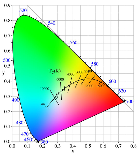
The outer edge of the diagram, making out the horse-shoe shape, is the spectral locus, sometimes also called the monochromatic locus. They're basically the chromaticity values lasers of each wavelength would take. Inside, each chromaticity value corresponds to a color the human eye can see - outside this edge are colors we can't see, or at least not fully. If the chromaticity value is negative in either direction, the color is called "imaginary" - it can't be made in real life (it'd have a negative SPD, and negative intensities don't strictly exist).
The line in the middle with colors in the Kelvin scale is the Plankian locus - its the chromaticities of objects emitting black-body radiation - like our star, the Sun. The Sun emits a warm 5800 K which if you look it up on the gamut diagram, translates to a slightly yellow white. The Sun isn't white!
Note: the xy chromaticities have a third component, z, defined such that x + y + z = 1. This is a point that has some
value
in the
next section.
Making out color from primaries: RGB colors
It turns out, you can make all the colors in the above diagram by taking 3 chromaticities that aren't aligned - this corresponds to taking 3 colors such that the third can't be made by mixing the other two. So if you've ever had an argument in whether green or yellow is a primary color; well the answer is both and neither, at the same time. This because you can take 3 xy points such that they for a triangle, and call that a color space - wether it's red-green-blue or red-yellow-blue or orange-turquoise-purple, they're all valid primaries, and therefore all valid color spaces.
There's an added complexity, though. Because the xy plane only defines color, we have lost the definition of black and white. If there is sort of a white color appearing in the above gamut, it's because it's the point where the x and y values are equal - but this does not define what "white" is.
Instead, this is left to us to define what we will consider as white, and out of the many definitions of white these 3 are the most used:
- Illuminant E: E stands for Equal-energy and is the point where the x, y, and z chromaticity components are all equal at 1/3 - this is maybe the most natural white point given the gamut diagram, however it gives a warmer tint to the color space as the equal-energy point feels itself as having a blue tint.
- Illuminant D65: D stands for Daylight, and 65 is for taking a blackbody radiating at 6500 K as the white point. This is also the color of the overcast sky.
- Illuminant D50: A warmer Daylight white point taken as the blackbody radiation of 5000 K.
There are other categories and other illuminants, but these are the most used ones.
Choosing these 4 values (the red, green, blue and white points) is important as they define the amount of colors the color space can reproduce. Indeed, only colors inside the "gamut triangle" formed by the primaries can be encoded and reproduced.
An example: sRGB
sRGB is the standard color space devised by HP and Microsoft in 1996 and went on to be, as the name suggest, the standard color space of monitors, images and printers.
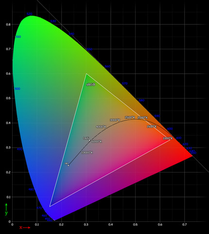
Out of the all the colors you can make, sRGB can only encode a small amount of them, which doesn't make it a very good color space. However at the time, CRT monitors were the best technology there was, and these were the colors they could reproduce.
The catch: RGB colors are not linear
The human eye is, unfortunately, far from perfect. Not only do you only see "correctly" for only 2° around the center of your vision, that your peripheral vision is only in black-and-white, but you don't perceive colors linearly. Indeed, if you have one light-bulb turned on, and you turn a second one on, suddenly everything is twice as bright. But if you turn on a 3rd one, the whole room is only a third brighter. However, to a camera sensor, or spectrometer, you still added one light-bulb every time.
We perceive light logarithmically, that is we are more sensitive to changes in low-light conditions than to the same changes in well-lit situations. This means, darker areas of an image would have more "brightness definition" than lighter areas. And with only 8 bits per channel to spare, this would quickly lead to artifacts in dark patches of images. Therefore, sRGB transforms the linear RGB values by gama-correcting them.
This is all fine until you want to manipulate images - as is the case with anything from adding a watermark to pictures to creating photo montages to editing blockbuster VFX on top of camera footage. Because by applying this gamma correction to our RGB values, the principle that "color is additive" is broken.
However, for a long time (and even in Photoshop at least up until recently), image manipulation programs have taken the naive approach to work on gamma-corrected color directly, leading to unnatural results when applying filters (such as blurring an image) or layering (the "Add" blending mode really isn't additive, and the "Screen" blending mode is a pale attempt at making a "visually decent" additive blending mode while still working with gamma-corrected values). Ideally, if you juxtapose a red and a green square, and blur the resulting image, ideally you should see a slight yellow tone emerge (the red color "transitions" linearly from the red square to the green square in the xy plane, therefore passing by yellow hues). Instead, when working on gamma-corrected values the naive way, the blending yields darker values. See this page for examples and a more in depth look.
More formally, gamma correction isn't a linear map, and therefore the XYZ or RGB vector space will lose the properties of additions and multiplication defined in those input spaces. Simply put, the resulting vector space is not linear, and therefore linear addition/multiplication operations will not work as expected.
Conclusion: In practice
If you worry about me researching about computer color just to write a blog post about it, don't worry - this is the compilation of the few weeks I've spent gathering around data to write a Rust crate working with raw color; and I
needed this crate for a project that I didn't really finish, but was about rendering black holes, and needed to generate colors from black body radiation, straight from spectral data, computed from Plankian equations. Fun!
All in all, computer color is a mess; and there's no sign of anything that can be done here. Given all the variables
that exist in capture, storage and display technology, getting to represent colors as accurately as they happen in
reality is something closer to black magic wizardry than engineering. This is why working with colors is so hard
, and why working as a digital artist involves complicated pipelines.
And this also means that nobody, especially myself, should do what I did: implement it all from scratch.
Appendix
Cover photo by Ajeet Mestry on Unsplash
Gamut diagram from Wikipedia
sRGB gamut diagram from Wikipedia

Top comments (0)