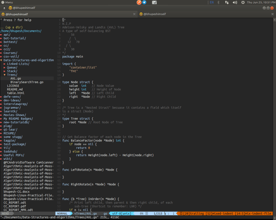
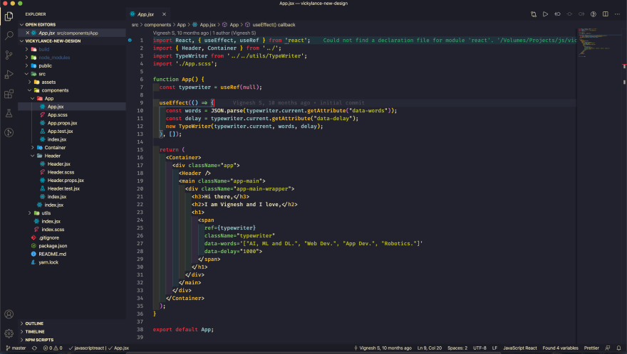
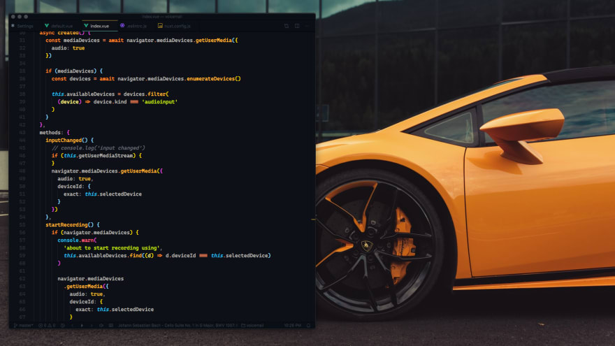
Hey folks 👋
Which theme you are currently using and feel free to share any new plugin you found recently.
Theme: DeepDark Material
Icon Theme: Material Icon
Hey folks 👋
Which theme you are currently using and feel free to share any new plugin you found recently.
Theme: DeepDark Material
Icon Theme: Material Icon
For further actions, you may consider blocking this person and/or reporting abuse

Sukhpinder Singh -

ispmanager.com -

Kuru -

Pulkit Singh -
Top comments (117)
So basically everyone is vscode gang huh ?
No love for VIM :(
Editor : NeoVim

Theme: tender
Your setup is very nice.Btw which font do you use?
Its the terminal's default font (Ubuntu Mono) 😅
Thanks)
Neovim FTW! We have similar themes -- I use Nord: github.com/arcticicestudio/nord-vim
Damn, nord looks easy on eyes.
Will try it. Thanks for sharing 🔥
ide: Atom
font: Fira Code
theme: Crucial Human (custom made by my team)
I like how you leave 1 blank line between lines in the same block, and 2 lines between blocks. It makes your code look so clean. I might experiment a bit with this, too :)
Thanks! We used to double-space and and single space, but we realized it would be better to just increase the line height to achieve the desired spacing. Our line heights are set to 2 in Atom.
How do you deal with code formatters that change the way your code is formatted?
I want this!
Currently available on Atom at the moment but will plan to make one for Code. We'll work on publishing it for public use!
This looks so clean.
Just another ViM
I have a bunch of ViM in this article series.
epsi-rns.gitlab.io/ssg/2020/01/05/...
It's blinding!
Basic vscode setup
I always cringe when I see overlapping code tabs 🤣
😬😄
Same for me :D
It soo boring
ed(1) is the standard editor. If I wanted to spend my time comparing colour schemes I'd have trained as an interior designer.
I haven't change in a while now.
Editor: Neovim
Theme: rubber-enhanced (part of my own minimalistic themes)
Editor : NeoVim + SpaceVim
Theme : dracula
Theme: Popping and Locking

Font: Fira Code
Icons: Material Icons
hey, those vertical colors for indent are because of the theme or some plug in?
It's a plug-in, rainbow indent or something similar. Probably github.com/oderwat/vscode-indent-r...
Thanks.. I will try it.
Ayu VSCode

I liked how it matched my background, so I took a pic a while ago: deviantart.com/ickz/art/Screen-Sho... 😝
which theme?
It's name is Ayu:
marketplace.visualstudio.com/items...
theme: dark lemon
font: cascadia mono
Followed Caleb Porzio 'make vscode awesome'.
Theme Github Dark
Font JetBrains Mono
JetBrains Mono is the best. I had Fira Code for a while, but JB Mono is amazingly done.
What's the screen size ?
Thinkpad T480s 1920x1080
I'm going to try out the right side bar after seeing this.
Always used on the right. On the left is unnatural: when you open/close the explorer, your code shift to the right.
I have been using it since the very start, let me know how you like it :)
How do you do that?
View > Appearance > Move sidebar right
Like that right sidebar setup. 😍
Cool i may try to set my sidebar to the right too... it seem very interesting.
Some comments may only be visible to logged-in visitors. Sign in to view all comments.