
Little Update
I have slacked a bit in writing this series, but I am back to update you all with what I have been working on. In the first section of this series, I gave a brief introduction to UX/UI and started my initial research. Since then, I have done a ton of work and had a fantastic opportunity to partake in another internship at Valley Bank. During that internship, I was a digital products intern where I got some real-life exposure to user experience design and research and product management. I wrote weekly updates about that internship in My Virtual Internship series, which you can find here.

Wireframing
Before the Valley Bank internship, I worked on basic wireframes. I followed the "Crazy 8's" methodology, which is when you fold a piece of paper into eight quadrants and brainstorm rapidly to form eight different designs.

Above is an image of the different menu solutions I came up with. After that, I wanted to get some feedback from others. One thing that satisfies me is finding creative solutions that apply to a particular situation. For example, when I presented HAX's problems, I did that in a video format since I felt like it best fit the scenario. Likewise, I wanted to do the same thing, and I had to think of a productive way to present my ideas and receive feedback. I took some time to look at all of the options and came up with a survey.
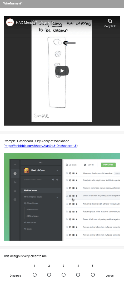
Online Survey
Ultimately, I chose Google Forms to conduct an online survey. In the survey, I asked some screener questions to get some information on the types of users. After the screener, the next set of questions was about all of the designs. For example, one wireframe would appear with a video explanation of its functions, as well as an example of a website using the same sort of menu. Next were questions answered on a Likert scale such as this design were clear to me, providing necessary functions, visually appealing, etc., where they would rate the statement from 1-5 (1 being strongly disagreed and 5 strongly agree). I followed that same format for all of the designs, and then at the end, I offered overall feedback where the user rates their top designs and any other additional comments.
Looking Back
I created that survey on June 10, 2020. Now, July 20, 2020 (more than a month later), I realized some of my mistakes when creating that survey. My internship at Valley Bank taught me a lot about user experience, especially about forming questions. I should have formatted the questions I asked differently, focusing on getting a more open-ended response rather than just a rating. Also, since the study followed the format I made with all of the same questions, it could have been repetitive for the users. If the questions were more specific and user-focused, then the results could have been more valuable. Additionally, my screener questions weren't beneficial since I only had one question, and it was very broad. If they were more detailed, I would have gotten a more useful understanding of the user groups.
Although I am very proud of the survey I made, I do have many things I wish I could change. Right now, I am in a position where I am growing and learning from my mistakes. Googling can go so far, but learning from experience is so much more beneficial. I am glad I had the experience with Valley Bank because they showed me user experience techniques and strategies. This was a trial and error moment, and I will likely have so many more of these moments, but I will learn from them and become better.

Top comments (1)
And there's nothing saying you can't refine and do an additional round of surveys :)