
More than just your average Flip Card tutorial. Don’t just flip your card on hover, use JavaScript to flip it on command. Includes instructions on how to change the reverse face to show a different face each time and tricks to give the card a nice 3D effect while flipping.
This series will be divided into three parts (plus a fun bonus):
- Part I: HTML
- Part II: CSS
- Part III: JavaScript
- Bonus: Going further into 3D space
Bonus: Going further into 3D space
The bonus part of this series will explore the possibility of giving a 3D effect to independent elements on our card. We will be having a look at the different CSS selectors and the properties that need to be added or edited. No extra JS needed.
Big shout out to Kevin Powell and his Create a 3D flipping animation with HTML and CSS youtube tutorial.
Recap
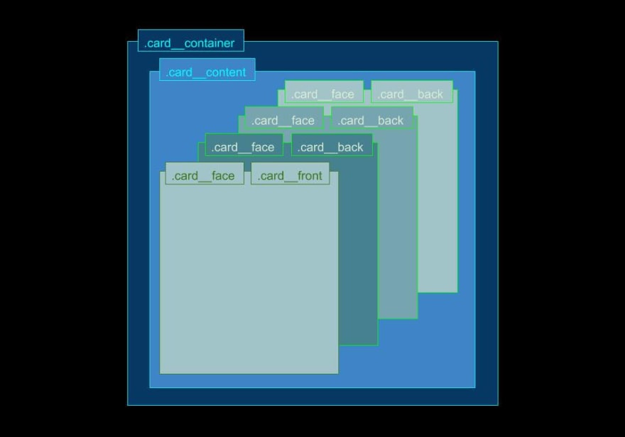
It’s important to review the structure of our HTML document in order to decide upon the appropriate styles and where to apply them. So to recap, we have a parent element named card__container, with a child named card__content. The card__container will remain in position, while the card__content does the flipping.
That last element will, in turn, have at least two children. These will be positioned one on top of the other, with the card__front staying in position and the card__back rotating 180 degrees on the y-axis. The resulting ‘card’ will show only the card__front face by default. Using JavaScript, we rotated the card__content element by adding a class to it in order to rotate our ‘card’ on the y-axis and show the card__back instead of the card__front.
As for the card__back, we could have just one, or we could have several options with a display: none; declaration. Using Javascript we can change which option to display by adding a class with display: block; to the specific card__back we want, according to whatever condition we choose. For this Stranger Things project, it will depend on which number is inserted on the <form> at the card__front.
Now, let’s get started!
.card__face
The front and the back faces of the card share similar declarations so I’ve grouped them under the .card__face selector. One thing I had to change (which I will explain later) was the transparency of the card. I could have just changed the background: rgba(10,10,10,0.8) alpha value to 1, but I decided to replace it with a gradient background instead.
A resource I enjoy using for this purpose is Gradient Magic. On this website, you have hundreds of background gradient options to choose from. Pick the one you like, hit the Copy CSS button, and paste that declaration into your CSS. Easy peasy.
Nothing else is new from the last project on this selector: we still have the transform-style: preserve-3d; to preserve the 3D look while flipping and the backface-visibility: hidden; to hide whichever part of the card is not facing us. This isn’t really necessary when the card’s background image has no transparency, but it doesn’t hurt to have it.
.card__face {   // -or- .card__front, .card__back {
  position: absolute;
  width: 100%;
  height: 100%;
// remove line
  // background: rgba(10,10,10,0.8);
// new line
  background-image: radial-gradient(circle at center center, rgb(71, 41, 41),rgb(8, 0, 0));
  box-shadow: 0 0 10px 8px rgba(255,0,0,0.75);
  border-radius: 5px;
  text-align: center;
  backface-visibility: hidden;
  transform-style: preserve-3d;
}
.card__front
The front of the card with the validating <form> is where the magic starts to happen. In comes the translateZ property value.
When we translate (or reposition) elements on the x-axis it means that we are moving those elements from side to side on the screen, on the y-axis we move them up and down the screen. If you want to take that element into a 3D space you have to move it on the z-axis.

As for removing any transparency from the background of the card, this had to do with the backface-visibility: hidden; not working on the elements that have a translateZ property on them while flipping. You could solve this by adding a backface-visibility: hidden; declaration to all the selectors that have a translateZ property, but that seems like more trouble than it’s worth so I just removed the transparency for the background color of the card.
.card__front {
  padding: 40px 20px;
}

.card__front > h2 {
  font-weight: 900;
  padding-bottom: 0.5em;
  text-align: center;
  font-size: 2rem;
  color: white;
  text-shadow: -0.05rem -0.05rem 5px rgba(237, 43, 18, 1);
  transform: translateZ(5rem);   // new line
}

.card__front > p {
  position: fixed;
  bottom: 18px;
  font-weight: 600;
  text-align: center;
  font-size: 1rem;
  color: white;
  text-shadow: -0.05rem -0.05rem 5px rgba(237, 43, 18, 1);
  transform: translateZ(3rem);   // new line
}

.card__front > form {
  margin-top: 25px;
  transform: translateZ(7rem);   // new line
}

.card__front > form input {
  padding: 10px;
  border: 1px solid rgba(0,0,0,0.1);
  background-color: #ddd;
  box-shadow: 0 0 5px 3px rgba(255,0,0,0.4);
  border-radius: 5px;
}

.card__front > form input:hover {
  background-color: #eee;
  box-shadow: 0 0 7px 5px rgba(255,0,0,0.4);
}

.btn {
  margin: 5px;
  padding: 10px;
  outline: 0;
  border: 1px solid rgba(0,0,0,0.1);
  background-color: transparent;
  box-shadow: 0 0 5px 3px rgba(255,0,0,0.4);
  color: white;
  border-radius: 10px;
}

.btn:hover {
  background-color: #000;
  box-shadow: 0 0 7px 5px rgba(255,0,0,0.4);
}

.btn:active {
  background-color: #333;
}
.card__back
The most important change for the card__back selector is choosing which elements within it we want to reposition on the z-axis, and by how much.
For aesthetic value, I have added a pseudo-element on the card__back selector. I did this because I thought it would look better to add a transform: translateZ(3rem); to a border around the image than adding this declaration to the image itself.
A transform: translateZ(5rem); added to the btn__back selector will make that button “pop” even more than the border around the image, while a transform: translateZ(7rem); added to the paragraph inside card__back__one will make that element “pop” further still.
.btn__back {
  margin: 0px;
  padding: 0.5em;
  background: rgba(10,10,10,0.8);
  position: absolute;
  top: 2.5em;
  right: 2.5em;
  transform: translateZ(5rem);   // new line
}

.card__back {
  transform: rotateY(180deg);
  display: none;
}

.card__back.display {
  display: block;
}

.card__back::before {   // new ruleset
  content: '';
  position: absolute;
  top: 0.75em;
  bottom: 0.75em;
  left: 0.75em;
  right: 0.75em;
  border: 1px solid rgb(255, 0, 0);
  border-radius: 5px;
  transform: translateZ(3rem);   // new line
}

.image__back {
  width: 100%;
  height: 100%;
  padding: 0.8em;
  border-radius: 5px;
}

#card__back__one > p {
  margin-top: -2.5em;
  color: #111;
  text-shadow: -0.05rem -0.05rem 5px rgba(237, 43, 18, 1);
  font-size: 2em;
  font-weight: 700;
  text-align: center;
  transform: translateZ(7rem);   // new line
}
.card__content
No changes are made for this selector. The only declaration I would edit would be to change up that transition: transform 2s; declaration from 2 to 3 seconds. I give you this recommendation because by slowing down the flip action the user can better appreciate the 3D effect we are trying to achieve, since this effect is only really appreciated while the card flips.
Maybe in the future when we get fancy hologram-like computers we will be able to see those elements pop out of our screens. For now, while the card lays flat we won’t be able to see the elements pop closer towards us.
.card__content {
  position: relative;
  width: 100%;
  height: 100%;
  transform-style: preserve-3d;
  transform-origin: center right;
  transition: transform 3s;   // line edit
}

.card__content.is-flipped {
  transform: translateX(-100%) rotateY(-180deg);
}
.card__container
The card__container will remain basically the same as well. The only thing I would recommend is to remove the perspective property or give it a higher value.
Why? Because the elements with a translateZ() property value will be affected by the perspective property. The lower the value of this last property, the larger the elements with a Z > 0 will appear, hence messing with the look of the card. You could keep the same perspective, but you will have to adjust all the other elements affected by this.
.card__container {
  width: 350px;
  height: 350px;
  // perspective: 350px;   // remove line  -or edit- perspective: 1000px;
}
CSS Variables (optional)
This is a good project in which to use CSS variables.
:root {
  --level-one: translateZ(3rem);
  --level-two: translateZ(5rem);
  --level-three: translateZ(7rem);
}
This way you can you can make a variable for each level you want to have, while moving on the z-axis. If you want to change the levels you only need to edit the property value in the variable rather than go one selector at a time and checking which needs editing and by how much.
Below is an example of how to use the variable we have set above.
.card__front > form {
  margin-top: 25px;
  transform: var(--level-three);
}
Demo
If you liked what you read hit that ❤️ on the left or wherever it is. If you really liked it don’t forget to share it with the community by hitting that dot-dot-dot icon near that heart.
💻 article.close()
Resources
- Create a 3D flipping animation with HTML and CSS
- Tricks for Using CSS translateZ() and perspective()
- Gradient Magic
- perspective
- Transform Function: translateZ
- Pseudo-element: ::before
- Custom Properties: CSS Variables


Top comments (0)