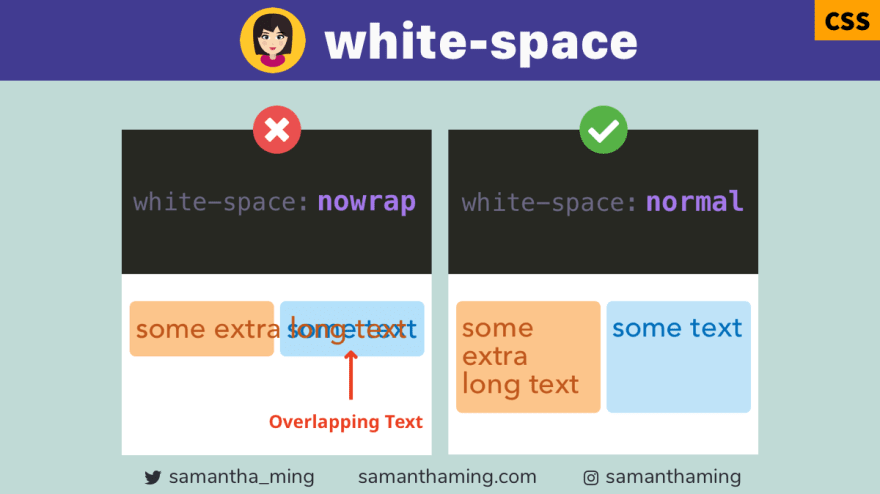
Sometimes nowrap is helpful when you don't want the text to break in an awkward spot 🔗
However, nowrap can sometimes lead to overlapping text. You can easily fix it by setting the white-space to be normal 👍
div {
  white-space: nowrap;
}
div {
  white-space: normal;
}
Why does text overlap occur?
Let's dig into it a bit deeper why text overlap occurs.
<div class="container">
  <div class="boxes">Some extra long text</div>
  <div class="boxes">Short text</div>
</div>
.container {
  display: flex;
}

.boxes {
  white-space: nowrap;
}
Even though, we have nowrap set, there is no overlapping. Great! But let's see what happen we set a fixed width on our boxes.
.boxes {
  width: 100px;
}
Oh no 😱 The overlapping is upon us! This is happening because the default is width: auto . Which means the boxes would expand based on its content. However, when we slap a fixed width, we restrict it from growing. And with no where to go, the text bleeds into its sibling box 🤭
Solution to overlapping text
We can easily fix this by changing our white-space to normal.
.container {
  display: flex;
}

.boxes {
  width: 100px;
  white-space: normal; // 👈
}
Of course, you can also fix this by removing the fixed width (ie. width: auto) if you don't mind the box expanding. Which is better? Well, it all depends on the User Interface you want to design 🙂
Use case of nowrap
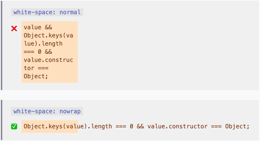
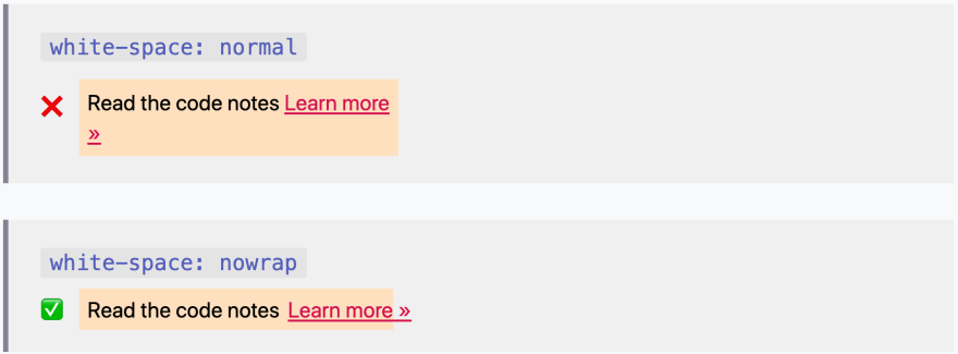
Before you jump to the conclusion that nowrap is no good because it can cause overlap. There are instances where I want to preserve the original form of my text. Because the text breaking apart would render the result unintentional effect and create an awkward user interface and hurt user experience.
Advantage of nowrap for code display
For example, in code blocks, I don't want the text to wrap. Text wrap would make the comprehension of my code example difficult. Instead, I want to preserve it on a single line and have the overflow trigger a scroll bar.
Advantage of nowrap for links
Sometimes when you create a "Learn more" or "Read more", you might append a caret "»" or "›". And you want this text to be together because breaking them apart can create an awkward result.
CSS white-space
There's more values you can set with white-space:
white-space: normal; /* default */
white-space: nowrap;
white-space: pre;
white-space: pre-wrap;
white-space: pre-line;
white-space: break-spaces;
I plan to cover each of these in great details in a future code tidbit. In the mean time, if you want a head start, check out MDN docs: white-space 👍
Assume Positive Intent When Working on Existing Code Base
So I noted that white-space: normal is the default. That means this overlap would never had happen if we didn't implement white-space: nowrap. That means someone actually wrote this style into our codebase 😳 Before you get 😡 ...
When you're working on existing codebase, we often run into code that doesn't makes sense. But before you go all git blame 😅, let's assume positive intent. As developers, we always try to plan for the edge cases. But often, we won't really know until we push up the code and let our users start using it. It's very difficult to 100% understand the full extent of our implementation. We do our best but we might miss a few spots. Quite frankly, it's why developers still have a job. Most of the time, we're doing bug fixes 🐞
We shouldn't be afraid to make changes. In fact, it's how we progress and become better. During our attempt to improve things, we're going to make mistakes. When that happens, don't spin your wheels playing the blame game or be quick to negative judgement. We need to be empathetic that we all went in with the best intention. The important thing is, we need to learn from our mistakes, fix it swiftly, and continue moving forward 💪
Community Input
@KyleDaltonSmith: text-overflow: ellipsis can also help in the right situation.
@longlho: white-space property has quirks around certain scripts that don’t use whitespaces so it’s not 100% i18n-safe.
Yup it's a pretty common problem in different standards interop (CSS - W3C, JS - ECMA262, Unicode - Unicode). If you take any sentence in Lao like ມື້ນີ້ເປັນມື້ທີ່ດີ FF & Chrome break differently. Same for other text manipulation CSS like uppercase/word-wrap/text-overflow...
Interestingly also if you look at my tweet above in FF vs Chrome u can already see the difference in wrapping when it encounters Lao. Multibyte characters like zalgo get worse.
@donut87: I always assume positive intent. Nevertheless if I do not understand something
git blameis one of the handiest tools there is. It tells me who to ask. The naming is awful, though. It has nothing to do with blaming a person for a mistake, but is rather a 'show me who is responsible'. I know people who have/had a git alias for blame and called itpraise.
Resources
- MDN: white-space
- w3schools: white-space
- CSS Tricks: whitespace
- Alligator: white-space
- CSS Reference: white-space
- CSS white-space
- GitLab: Fix overlapping string
- GitLab: Assume Positive Intent
Thanks for reading ❤
To find more code tidbits, please visit samanthaming.com
| 👩🏻💻SamanthaMing.com |


Top comments (2)
I always assume positive intent. Nevertheless if I do not understand something
git blameis one of the handiest tools there is. It tells me who to ask. The naming is awful, though. It has nothing to do with blaming a person for a mistake, but is rather a 'show me who is responsible'. I know people who have/had a git alias for blame and called itpraise.Yes! I remember when I first learned of that, I was super confused. Until I got clarification that it's used so I can reach out to the author and get understanding. Thank you for pointing that out! I definitely did not intend to worsen the misunderstanding of that git command, bad joke 😓 Let me add your comment into the code notes, I like your interpretation of that command 👏