
TRANSLATING THE GRAPHIC DESIGN GRID TO CSS GRID
This article has references to learn CSS Grid, but is not intended teach you all about CSS Grid.
This article has references to the Graphic Design Grid, but is not intended teach you all about the Graphic Design grid.
In this article, I’m going to show you how to take a design from your Graphic Illustrator app and translate it into a web page using CSS Grid.
In a previous article, I discussed the basics of the classic Grid Principles in Graphic Design and how to use those principles to design your web page. In that article, I used Flex-Box to align content to “flow-lines”. Since then, I have discovered an even more powerful web design tool, which you have probably heard of (or else why are you here?) called CSS Grid. For those of you who are unfamiliar with CSS Grid, it is awesome, plain and simple. Granted it seems a little complicated to get started, but once you learn it you will never look back. If you are looking for good reference material I highly recommend the following; The New Layout Standard For The Web: CSS Grid, Flexbox And Box Alignment, By Rachel Andrew & CSS Tricks A Complete Guide to CSS Grid.
Let’s begin first with our Graphic Editor, I use Affinity Designer, many use Sketch or Adobe Illustrator, it really doesn’t matter. The goal is to create a grid, so start by creating an Art-board. I started by creating a Template Art-board with a default website pixel ratio (if you don’t have any default templates in your app, just create an art-board that is 1300px wide by 1000px tall, it can really be anything as long as it mimics a desktop screen). Then I made a line and just copy pasted across the art board following the default grid lines as my guide. I did this horizontally and vertically. I ended up with 16 columns and 10 rows.
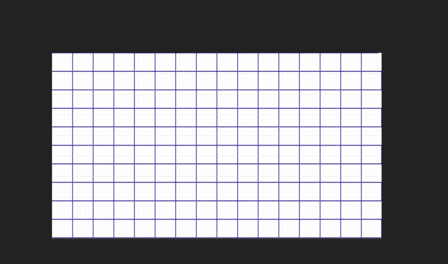
From here, I needed to see the general pixel height of my rows for use in my css grid later. It was almost 100px so I rounded to that. I just record this for later use.
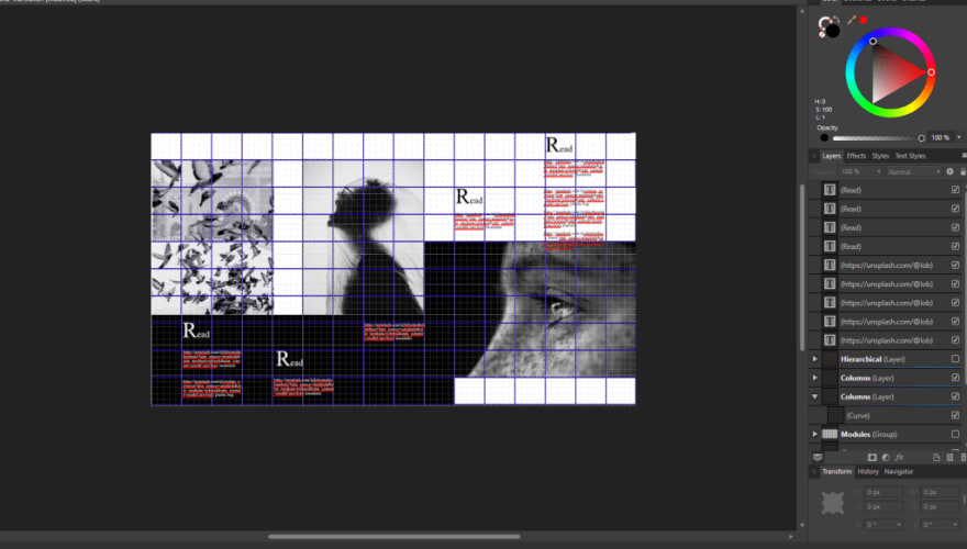
Then, I just started building a design. I wanted to do something “print-like” as that seems to be the rage these days. It’s also an excellent type of design to show you how easy it is to translate a print style design into a web page using CSS Grid. Below is what I designed with my Graphic Editor. I'm going to summarize the Graphic Design Grid here in a short list and if you look at my image you can see it follows these guidelines. If you want to learn more about the Graphic Design Grid, here is a neat article.
- Keep your content (text boxes, images, headings) inside your column and row lines
- Align your elements for the eye to follow, so text-block-one and text-block four begin on the same row line (flow-line)
AND NOW…WE TRANSLATE
So after I created my design using the Graphic Design principles of Designing in a Grid; It was time to build my virtual grid with CSS Grid. Below is the codepen where I built out the design:
Check it out on codepen here: https://codepen.io/all-mad-designs/pen/ExYQQLQ
The major things to note, are that I really relied on the “initial” or default grid values for most of my work here. I did not use any box alignment properties in this design (such as; justify-items, or align-items), in fact I really didn’t do that much. I started by setting the html tag to
box-sizing:border-box;so that the initial values for box-alignment would work as I expected. Then, I created my virtual grid, just like I did in my Editor (Illustrator App), and I already knew how many columns I needed and how large my rows should be.
My body tag has the
class=”container”, that’s because you have to set a container to display: grid; the container element which uses the display value of grid is your virtual column grid, and the child elements of the container are position-able within that grid. It’s a lot easier than it sounds, check it out:
.container {
  width:100%;
  display:grid;
  grid-template-columns: repeat(16, 1fr [col-start]);
  grid-template-rows: repeat(10, 100px [row-start]);
  background:#fff;
}
Above are my container values, notice how I set my grid-template-columns property to repeat 16 times (number sound familiar?) 16 columns with a 1fr size property, that means 1 fraction of the total container size. So my columns will size automatically and I don’t have to use absolute values.
.img-one {
  grid-column:1/ span 4;
  grid-row: 2/ span 6;
}
.img-two {
  grid-column: 6/ span 4;
    grid-row: 2/ span 6;
}
.img-three {
  grid-column: 10/span 7;
  grid-row: 7/ span 6;
  background: #000;
}
Now the styles above are the child elements of my container, and all I had to do to arrange them, was count the lines on my Graphic Editor (Illustrator App) to match my “Virtual Grid” that I turned my container into. So
.img-onebegins on the column line 1 (the edge of our window) and it spans 4 columns, it also starts on row 2 and spans 6 rows. If you are checking this out on codepen, check out how
img-oneis not first in the source order (yeah you can do whatever you want source order be damned, probably think about it though since you want your design to be accessible), but it’s still pretty cool. Just to re-iterate,
img-twostarts on column line 6 and also spans 4 columns the row starts at 2 and spans 6 rows, and finally
img-threebegins on column line 10 and spans 7 columns, it also begins on row 7 and spans 6 rows.
We follow this pattern of mimicking our grid from our illustrator app (Editor) into our “virtual grid” we created with our container element, by placing our text-blocks. Notice the text blocks placed over the black footer element have a z-index property added to them. In my opinion, layering with z-index is simplified when your design the starts with CSS Grid as it's layout standard.
.text-block-one {
  grid-column:2/ span 2;
  grid-row: 8/ span 4;
  color:#fff;
  z-index:2;
}
.text-block-two {
  grid-column:5/ span 2;
  grid-row: 9/ span 4;
  color:#fff;
  z-index:2;
}
.text-block-four {
  grid-column:8/ span 2;
  grid-row: 8/ span 4;
  color:#fff;
  z-index:2;
}
.text-block-three {
    grid-column:11/ span 2;
  grid-row: 3/ span 4;
}
.text-block-five {
      grid-column:14/ span 2;
    grid-row: 1/ span 4;
}
footer {
  grid-column:1/ span 9;
  grid-row: 7/ span 7;
  background:#000;
}
The beauty of CSS Grid is that it really simplifies layouts and layering and translates well from design to development. We end up with a pretty slick design that looks pretty much exactly like our illustration does. Maybe we could use background images to control the height and width a little better, maybe we can mess around with how these are effected by media queries, but all in all, we did this in a very short amount of time and our result is much closer to our plan than if we were using flexbox, or float layouts.

Top comments (5)
Ah, neat - I've been hearing about css grid, but haven't seen it in action yet. Thanks! I'll have to dig in a bit deeper.
Do you have a good feel for when you'd use css grid vs flexbox? I guess if you really want to lay out a grid (heh), you'd use css grid...
Also, as a side note, if you happen to want neat syntax highlighting on your css code examples, you can put
cssin after the three backticks, like this:```css .my-class {} ```and it shows up like this:
Thanks for the post!
Cool tip! Thanks! I am still partial to flex for everyday sites since I know it better and it's easy to make a site responsive with. I'm still learning grid, I need to dig into it more myself, but if I were using a page to display js events & triggered css animations I'd use grid.
That makes sense, thanks :) I need to dig in too! Going to add it to my (long) list of things to play around with 🤣
Seriously!!! Lol. My list of things to learn just gets longer. Everytime I start learning a new thing I find 10 more things to add to the list.
I would like to say that you have done a fantastic job by sharing this valuable guide. I am sharing it with my teammates at Monster Logo Design.