This time, I will tackle the title sequence from Schitt's Creek.
Schitt's Creek is a Canadian sitcom that aired on CBC Television from 2015 to 2020. The series follows the the fall from grace of the spoiled, wealthy Rose family. After their business manager embezzles money from the family business, the family loses its fortune and is forced to relocate to Schitt's Creek, a small town they once purchased as a joke. Comedy ensues.
The title sequence
The title sequence is a simple and quirky animation accompanied by a trumpet instrumental.
The words from the title are introduced by popping upright in a bouncy fashion. Then, the last 'S' in the first word turns into a dollar sign and sparkles briefly, accompanied by a bling sound effect!
Here is a video clip of the title sequence:
TLDR
Here is the codepen with the final result.
Give it a ❤️ on Codepen if you like it! 😊
Design considerations
The original typeface used is a serif font called Linotype Didot. It has a commercial license.
Like the previous title sequences I made in this series, I will not be buying any fonts! After some searching around, I found a free alternative in Playfair Display that is available on Google Fonts.
We should be able to have the title text as a h1. However, we will need to break up the text content inside of the h1 to be able style some items individually.
The style for the final letter 'S' in the first word has a few effects applied to it:
- Two bars grow to make it a dollar sign;
- It has a sparkle appear on the upper side of the letter with a slight glow surrounding the letter.
We should be able to achieve this in CSS using the ::after and ::before pseudo-elements.
I am going to use Greensock animation library (GSAP) because it will be easier to find the right easing and timing values initially. If it is straightforward enough, then I can change it to a pure CSS animation.
Basic HTML and CSS
Before we get to the animation, we need to write our HTML, and add some basic styles.
The HTML
We will want to have a margin between the words, so we want them as individual span elements. We can add a "word" class to each.
The final letter 'S' in the first word is like a superscript. It is vertically positioned to the top of the text. We need this to be a separate span also to reference it in CSS. We will add a "superscript" class to it.
<h1>
  <span class="word">Schitt<span class="superscript">s</span></span>
  <span class="word">Creek</span>
</h1>
There is no shame in adding an extra span element to use in the animation for the tricky parts of the superscript 'S', but let's see if we can stick with this. We should be able pull it off in CSS through ::after and ::before pseudo-elements.
Base CSS
We decided earlier that we would use the Playfair Display font. We should look at the font weight to decide which variant to use. If we look through the weights on Google Fonts (as per screenshot below), the SemiBold 600 variant looks the best match.
You can load the font through the Google Fonts API. Generally, I prefer to bypass third-party stuff like this to reduce bloat and avoid any unsavory snooping. Typically, I host the font and load it through by the @font-face CSS ruleset. However, I will use the Google Fonts API here for simplicity.
You can generate the code snippet in their web app by selecting the font family variant you want. We will use the following:
@import url("https://fonts.googleapis.com/css2?family=Playfair+Display:wght@600");
If you wanted to use this in a production website, you should chose a font loading strategy that minimizes the side-effects from loading that can cause the font to be unstyled initially or swapped out later, which would make the animation look bad.
First, lets add the basic styles for the text and center it as below.
To center the title, we make the body a grid container, set height: 100vh;, and place-items: center;.
body {
  display: grid;
  height: 100vh;

  background-color: black;
  place-items: center;
}

h1 {
  color: white;
  font-family: "Playfair Display", Vidaloka, serif;
  font-size: 8rem;
}

.word {
  display: block;
}

.word:nth-of-type(2) {
  color: gold;
}
We can adjust the line-height of the h1 to bring the words closer together, and we can add some left padding and right padding to make the second word more central relative to the first word.
There is something pleasing about having the letter k of the word 'Creek' nestled under the letter t of the first word with complementary curves.
These are the values that looked good.
h1 {
 line-height: 0.85;

 /*other styles excluded */
}

.word:nth-of-type(2) {
  padding: 0 2rem;

 /*other styles excluded */
}
Now we want to make the final 'S' of the first word a superscript. We can use the vertical-align property to the shift the letter up. I tried some values and text-top looked best.
Also, we include a media query to reduce the size of the title for small screens.
@media screen and (max-width: 600px) {
  h1 {
    font-size: 5rem;
  }
}
Alternatively, you could use the clamp() function with the font-size. This would allow the font to grow and shrink in size in relation to the size of the viewport, and it will limit the font size to stay within a range.
The initial state for the animation is that the text is not visible, so when we are finalizing the animation we will set that.
Animation time
I will break the animation into 3 parts. The timeline will look like this:
- Popping up of words (0s to 3s);
- Transform superscript 'S' to a dollar sign (3s to 3.5s);
- Sparkle effect for the superscript 'S' (3.5s to 3.9s).
Part 1 - Popping up of words
To pop the words upright, we want to rotate the words on the horizontal axis. We use a rotateX() transformation.
In order to see the words pop up on a decent arc, we need it to make it a 3D transformation. We need to set the perspective property on the h1 element to position it in 3D space. The strength of the effect is determined by the value of this property i.e. small values cause a large transformation. We will start with a relatively small value, say 100 pixels.
The words will start out in a rotated position. They are leaning back.
For rotateX(), positive values rotate text away from us, and negative values rotate text towards us. Therefore, we will set it to a positive value. Let's start with 120 degrees as we want it hang low.
transform: rotateX() with positive and negative values with perspective:100px set on parent elementDon't forget that we want the transform-origin to be at the bottom center (or 50% 100%) , so that it rotates along its bottom side.
We will set these values in gsap through the transform shorthands. For example, instead of the CSS declaration transform: rotateX(120deg), we use { rotationX: 120 }.
gsap.set("h1", {
  perspective: "100px",
});

gsap.set(".word", {
  rotationX: 120,
  transformOrigin: "50% 100%",
});
As you can see below, this tilts the words backwards.
For the animation, we want a tween for each word where we change the rotationX to zero. Something like this:
let tl = gsap.timeline();

tl.to(".word:nth-of-type(1)", {
  duration: 1.5,
  rotationX: 0,
});
You can run the codepen to see how it looks.
That's a pretty good start! However, it looks like the transformation is too strong.
By tweaking the perpspective and rotationX values we can get the magnitude of the transformation right. We can increase the value of perspective the transformation more subtle. A value of 500 pixels looks better, but now it is rotated too much. Lets reduce the rotationXvalue. A value of 100 looks better.
Now, we need to find the right easing to create that bouncy feel. We want the easing to start fast and end slower, we want it to "ease out".
You can use the GreenSock Ease Visualizer to explore values. Since there is a bounce value, we can try the "out" version of this first, like in the screenshot below.
We add the ease property to our tween as below:
tl.to(".word:nth-of-type(1)", {
  duration: 1.5,
  rotationX: 0,
  ease: "bounce.out"
});
This bounces back and forth too much. This easing does not accept numeric values, so we cannot tweak it. We need to move on. Lets try the elastic value, which is a function that accepts values.
tl.to(".word:nth-of-type(1)", {
  duration: 1.5,
  rotationX: 0,
  ease: "elastic.out(1, 0.3)"
});
This looks more promising. With some tweaking of the parameters, ease: "elastic.out(1, 0.8)" looks good.
To complete this part of the animation, we want to initially hide the words. We can set this in the CSS through opacity.
.words{
    opacity: 0;
}
Then, we add the a very short tween to the start of the timeline to set the opacity to 1 to make the word visible, a tiny tiny moment before we pop it up.
tl.to(".word:nth-of-type(1)", {
  duration: 0.01,
  opacity: 1,
});
tl.to(".word:nth-of-type(1)", {
  duration: 1.5,
  rotationX: 0,
    ease: "elastic.out(1, .8).out",
});
We add the same 2 tweens for the second word to the timeline, and we are done with this part.
Part 2 - Transform superscript 'S' to a dollar sign
Next, we want to create the 2 bars that transform the superscript 'S' into a dollar sign. We can use the ::before pseudo-element for these bars.
We need to change the superscript class to position: relative, so that we can position the bars relative to it. We will need to give the ::before pseudo-element a width and a height and position absolutely with top and left.
We will use a linear-gradient() with hard stops to create 2 distinct white bars.
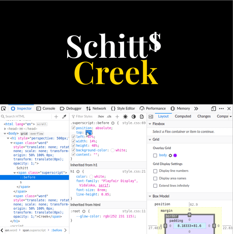
I find the easiest place to start is to give the pseudo-element a white background and then work out the dimensions and positioning. I approximate some initial values and jump into the browser devtools to play with the values to arrive at the fitting result (as in screenshot below).
Through this process, I have the following styles:
.superscript{
  position: relative;
}

.superscript::before {
  content: "";

  position: absolute;

  top: 37%;
  left: 47%;
  width: 14%;
  height: 48%;

  background-color: white;
}
Now, let's create the linear gradient.
For hard stops, the idea is that we use the same color stop position as the previous color stop to create bands that are a single color e.g. background: linear-gradient(to right, red 50%, blue 50%); creates a gradient that is exactly half red and half blue.
We want the pattern for the linear gradient to be that there are 2 white bands that have the same width, and separated by a transparent band.
linear-gradient() for the creation of the 2 bars for the ::before pseudo-elementIf we wanted each bar to have a width of 20%, then the linear gradient would look like this:
  background: linear-gradient(
    to right,
    white 20%,
    transparent 20% 80%,
    white 80%
  );
To make it easier to experiment with values, we can use a CSS variable for the width. Let's call it --bar-width and give it a percentage that we can tweak later in the browser devtools to get a value that fits. We can use calc() to create the correct color stop position for the transparent band as below:
--bar-width: 20%;

background: linear-gradient(
    to right,
    white var(--bar-width),
    transparent var(--bar-width) calc(100% - var(--bar-width)),
    white calc(100% - var(--bar-width))
);
After tweaking the value of --bar-width, it looks like 25% is a better fit!
Now, we can animate the pseudo-element. We can use the scaleY() function to scale the height from zero to its full size.
You cannot animate pseudo-elements with the base GSAP library. You need to use the CSSRulePlugin to do that. However, Greensock has deprecated this recently and recommends using CSS variables instead in the form of gsap.to("html", {"--my-variable": 100, duration: 2});.
In the CSS, we can create a CSS variable for the scaleY() value in the :root selector (that represents the html element). Let's call it --bar-scale-y: 0. We will set this as the intial value for the scaleY() transformation for the.superscript::before rule to effectively hide the bars.
:root{
    --bar-scale-y: 0;
}

/* bars */
.superscript::before {
    /* other stuff */

  transform: scaleY(var(--bar-scale-y));
}
Now, in the JavaScript. We will animate this variable.
let tl = gsap.timeline();

tl.to("html", {
  "--bar-scale-y": 1,
  duration: 0.5,
});
And here it is in action:
Part 3 - Sparkle above the superscript 'S'
We will use the ::after pseudo-element to create the sparkle that we place above the superscript S.
Below is a reference of what we want to create.
The sparkle has rays of light emanating from a central ball. To achieve this, we will make the pseudo-element a circular shape that covers the diameter of all the rays. We will use a combination of gradients to create the pattern of light. We will use a conic-gradient() to create the rays, and aradial-gradient() to create the central ball of light.
If you are not that familiar with gradients, you can see how these 2 types of gradients differ below. My shorthand for remembering which is which is: a conic-gradient() can make a pie chart (slices of a circle), whereas a radial-gradient() can make an archery target (concentric circles).
We can use a clip-path to change the shape of the pseudo-element to make some rays longer than others.
That's the overview of what we want to do. Let's go through it step by step. First, lets create a circular shape and position it above the superscript letter.
The CSS
We will position the pseudo-element absolutely. Since the sparkle is positioned just above the bars, we can use the same values for top and left as the ::before pseudo-element initially.
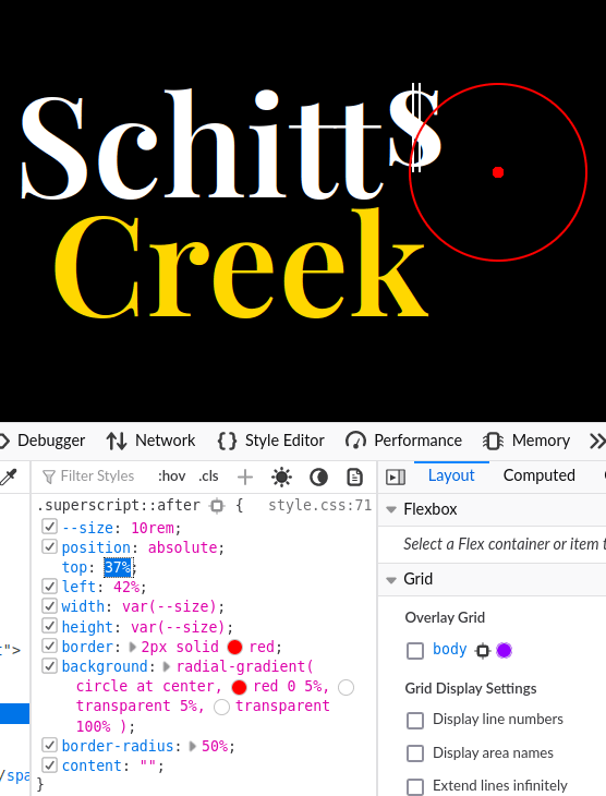
Since we must make the shape quite large to cover the longest rays, when we increase the size of the element we will need adjust the positioning also. Let's put a red border around the pseudo-element to act as a guide, and we can try to find the right values. This is what I will start with:
/* sparkle */
.superscript::after {
  --size: 10rem;

  position: absolute;

  top: 37%;
  left: 42%;

  width: var(--size);
  height: var(--size);

  border: 2px solid red;
  border-radius: 50%;

  content: "";
}
This is what the first effort looks like:
The size looks good. We don't need to be too accurate because we will be clipping it later on anyway!
Let's tweaks the value of top and left in the devtools to position the center point above the bars. What would make it easier to position it is to add a radial-gradient() that creates a red dot in the center of the pseudo-element. We just want one circle, so we will make the first color stop red, and the second color stop transparent.
/* sparkle */
.superscript::after {
  /* other stuff */

  background: radial-gradient(circle at center, red 0 5%, transparent 5% 100%);

}
It is like a sniper target!
This radial gradient is what we will adjust later to make the central ball of light.
Now that we have an accurate way to position the pseudo-element, we can just adjust the values in the devtools as below.
Here is a codepen of the correctly positioned pseudo-element.
Now, let's fix up the central ball of light. We will use a yellow tint for the color and increase the size a bit.
 background: radial-gradient(
      circle at center,
      hsla(48, 84%, 88%, 0.9) 0 7%,
      transparent 7% 100%
);
And now it looks like this:
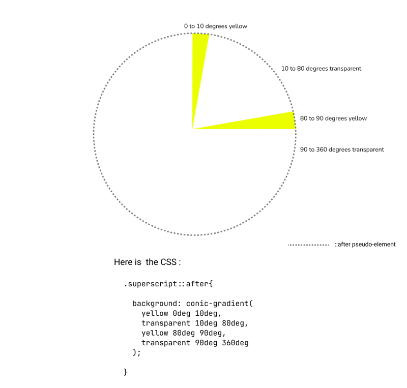
Now, let's create the rays of light using a conic-gradient. We will divide the pseudo-element like a pie. We color some slices as a yellow tint, and then it interspere those slices with transparent slices. You can see a demonstration of this in the figure below.
conic-gradient()You just have to work clockwise through the conic-gradient to create a statement for each slice. Here is what the CSS looks like for the 7 rays I created, along with the radial-gradient from earlier:
/* sparkle */
.superscript::after {
  --sparkle-color: rgb(255 247 215 / 60%);

 background: radial-gradient(
    circle at center,
      var(--sparkle-color),
      transparent 7% 100%
    ),
    conic-gradient(
      transparent 0deg 18deg,
      var(--sparkle-color) 18deg,
      transparent 20deg 40deg,
      var(--sparkle-color) 40deg,
      transparent 43deg 87deg,
      var(--sparkle-color) 87deg,
      transparent 95deg 175deg,
      var(--sparkle-color) 175deg,
      transparent 178deg 220deg,
      var(--sparkle-color) 220deg,
      transparent 222deg 270deg,
      var(--sparkle-color) 270deg,
      transparent 275deg 300deg,
      var(--sparkle-color) 300deg,
      transparent 303deg 360deg
    );

  /* other stuff */
}
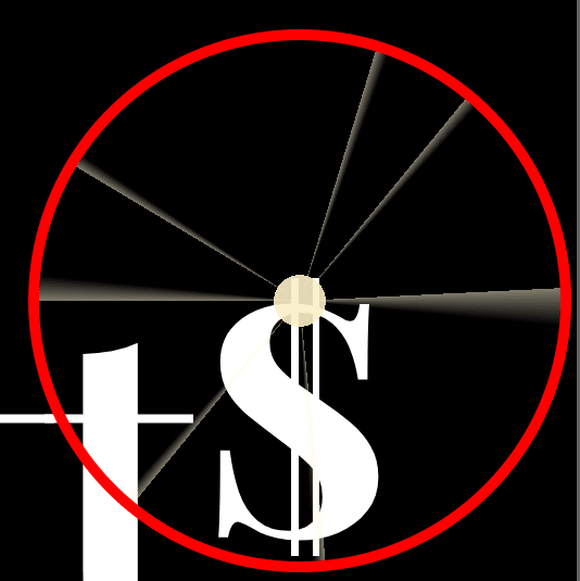
And it looks like this zoomed in:
Let's drop the border we have used as a guide. It has served its purpose!
Now, we can add a blur() filter to soften the appearance of the rays. It is suprisingly how dramatically this can transform the appearance. You can see the result of adding filter: blur(1px); below:
Looking much more like actual rays of light, right?
I'm quite happy with that. You may notice it is a bit more off center, but I will leave it as we will add some movement in the animation anyway. For quick animations that are small in scale, you don't need to be that accurate with details.
Let's reduce the length of some of the rays by adding a clip-path. to the pseudo-element.
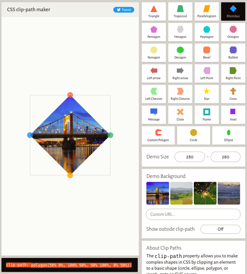
I find it easiest to grab a polygon() clip-path with a few control points from Clippy CSS clip-path maker. I will grab the Rhombus clip-path as per screenshot below .i.e. clip-path: polygon(50% 0%, 100% 50%, 50% 100%, 0% 50%); is the snippet I have copied and added to the ::after:.superscript rule.
Then, I will jump into Firefox's devtools to edit the clippath inside the browser, Chrome does not have the equivalent capability in its devtools AFAIK. You can click the blue polygon next to the clip-path in the devtool property pane and it will show a blue overlay to represent the clip path. The white dots are control points for our polygon.
Now, you can manipulate the control points to create a shape that cuts off the end of some of the rays. Double-clicking on the outline of the overlay will create a new control point. I cut 2 rays down in size by modifying the clip-path and adding 3 more points to the polygon as below:
This is the outcome with the overlay removed:
This makes the rays look a bit more natural in my opinion. This is the CSS:
.superscript::after {
  /* other stuff */

    clip-path: polygon(
    50% 0,
    59.13% 26.64%,
    85.13% -2.35%,
    100% 50%,
    50% 100%,
    0 50%,
    31.39% 34.86%
  );
}
One last consideration is how it looks on small screens. Remember we added a media query in part 1?
Well, we need to reduce the size of the sparkle to retain the same proportion relative to the size of the words. We set the size through our own --size CSS variable, so we can reduce that value until it matches the previous position.
@media screen and (max-width: 600px) {
  h1 {
    font-size: 5rem;
  }

  /* sparkle */
  .superscript::after {
    --size: 6.25rem;
  }
}
And that is the hard work done in CSS! 😅
Below is the codepen of the CSS we have so far.
We can switch our attention back to the animation.
The animation
The primary action of the animaton for this part is to scale the sparkle up. Initially, it has transform: scale(0) applied to it, so that is hidden. The action would probably be sufficient to pull off the effect, however I want to make this really shine (pardon the pun), so I will add some movement to the sparkle, and animate the text-shadow for the superscript letter also.
To make it easy to play around with values, let's create a few CSS variables for the properties we would like to animate.
We are interested in animating the following:
- the scale in
transform: scale(), - the x and y postion in
transform: translate(x, y), - the rotation in
transform: rotate().
Let's name them as follows:
:root {
  /*other vars here */
  --sparkle-scale: 0;
  --sparkle-x-position: 0;
  --sparkle-y-position: 0;
  --sparkle-rotation: 0;
}
Then, we can set use these variables in the transform property for the .superscript::after rule:
/* sparkle */
.superscript::after {

    /* other stuff */

  transform: scale(var(--sparkle-scale))
    translate(var(--sparkle-x-position), var(--sparkle-y-position))
    rotate(var(--sparkle-rotation));
}
Now, our sparkle is invisible because it has a scale of zero.
Before I go further, one thing I like to do is to add a click handler to what I'm working on to be able to replay the animation while I go:
let h1 = document.getElementsByTagName("h1")[0];
h1.addEventListener("click", () => tl.restart());
Ok, let's start by animating the scale. We will make one tween to scale it up to 1, and another to scale it down to 0 to hide it again. This will happen over 400 milliseconds. I give the first tween a label of "sparkle" that we can reference in later tweens if need be.
let tl = gsap.timeline();

tl.to(
  "html",
  {
    "--sparkle-scale": 1,
    duration: 0.25,
  },
  "sparkle"
);
tl.to("html", {
  "--sparkle-scale": 0,
  duration: 0.15,
});
This is the animation so far:
It looks quite good as it is. I'm too happy with the color, but we can get a better grasp on that when we put it altogether, and make final adjustments.
The next bit I'd like to add is some movement. The sparkle actually moves along the edge of the letter and dips slightly, like a setting sun almost. We could also rotate it slightly a slight impression of the sparkle reflecting. Let's add a tween for this.
In the tween, we can change the values of the CSS variables: --sparkle-x-position, --sparkle-y-position, and --sparkle-rotation. We want this to occur after the sparkle has scaled up a bit, say 100 milliseconds in, so we will position it in the timeline as "sparkle+=0.1.
tl.to(
  "html",
  {
    "--sparkle-x-position": "4px",
    "--sparkle-y-position": "1px",
    "--sparkle-rotation": "8deg",
    duration: 0.2,
  },
  "sparkle+=0.1"
);
Here is how it:
In particular, I think the subtle rotation adds a bit more to the effect.
The final bit is to animate the text-shadow of the superscript letter, to give it a quick shine. We will add 2 more tweens for this. One to show the text-shadow 100 milliseconds into this animation. Then, another tween to remove the text-shadow when it has finished.
tl.to(
  ".superscript",
  {
    textShadow: "0 0 8px rgb(247 241 220 / 40%)",
    duration: 0.2,
  },
  "sparkle+=0.1"
);
tl.to(
  ".superscript",
  {
    textShadow: "unset",
    duration: 0.01,
  },
  "sparkle+=0.3"
);
And here is the animation with this added:
I think that flash draws the attention to the sparkle effect that much more.
And thats it. Now, let's put all 3 parts together and do some final tweaks.
Putting it all together
I know it might not seem like it after all this discussion, but the animation is fairly short. It has 10 tweens.
We could have used 3 timelines and combined them via a master timeline. This can be an useful way to improve the readibility. I don't think it is necessary in this case.
Before we call it a day, there is one last thing I would like to do!
Adding audio
The accompanying soundtrack complements the animation sequence really well. I think it is not quite the same without it. So, lets add the song, so that it plays in sync with animation.
I will initially set the song to be muted. I do this for 2 reasons:
- To not startle someone who watches the animation! Maybe they are in a library and this song plays loudly automatically.
- Some browsers block audio that is not initiated by a user action. Leaving it to the user to unmute the song ensures that there is not an issue.
I will add a mute toggle to the top right corner of the page to facilitate unmuting of the song, as shown in the screenshot below.
I will use a checkbox (input[type="checkbox"]) but hide it, and use its related label as the interactive element that I will style. You might think why don't you just use a button?
I like to use this to leave the door open to make this a CSS only solution, and I have the code ready from a previous example!
I use the label to display one of two SVG icons depending on the checkbox state. The SVGs show a muted state or unmuted state. I add them into the label and add some classes.
<input id="mute-toggle" type="checkbox" />
<label for="mute-toggle" title="Toggle sound">
  <svg class="mute-off" viewBox="0 0 24 24">
    <path
      d="M14,3.23V5.29C16.89,6.15 19,8.83 19,12C19,15.17 16.89,17.84 14,18.7V20.77C18,19.86 21,16.28 21,12C21,7.72 18,4.14 14,3.23M16.5,12C16.5,10.23 15.5,8.71 14,7.97V16C15.5,15.29 16.5,13.76 16.5,12M3,9V15H7L12,20V4L7,9H3Z"
    ></path>
  </svg>
  <svg class="mute-on" viewBox="0 0 24 24">
    <path
      d="M12,4L9.91,6.09L12,8.18M4.27,3L3,4.27L7.73,9H3V15H7L12,20V13.27L16.25,17.53C15.58,18.04 14.83,18.46 14,18.7V20.77C15.38,20.45 16.63,19.82 17.68,18.96L19.73,21L21,19.73L12,10.73M19,12C19,12.94 18.8,13.82 18.46,14.64L19.97,16.15C20.62,14.91 21,13.5 21,12C21,7.72 18,4.14 14,3.23V5.29C16.89,6.15 19,8.83 19,12M16.5,12C16.5,10.23 15.5,8.71 14,7.97V10.18L16.45,12.63C16.5,12.43 16.5,12.21 16.5,12Z"
    ></path>
  </svg>
</label>
In the CSS, the label is postioned as fixed, because we always want it in the same position. We use top and right to place near the top right corner. The checkbox is hidden via display: none;, and we also set the width and height to zero, otherwise it can take up space still!
/* actual checkbox is hidden */
input[type="checkbox"] {
  display: none;
  width: 0;
  height: 0;
}

/* label acts as the interactive element */
label {
  --toggle-size: clamp(1.5rem, 2.5vw, 2.5rem);

  position: fixed;
  top: 1rem;
  right: 1rem;

  width: var(--toggle-size);
  height: var(--toggle-size);

  background-color: white;
  border-radius: 50%;
  cursor: pointer;
}

/* stack 2 icons inside label */
label > svg {
  position: absolute;
  top: 5%;
  left: 5%;
  width: 90%;
  height: 90%;
}
I use the checkbox hack to toggle the visibility of the images.
:checked ~ label .mute-off {
  display: block;
}

:checked ~ label .mute-on {
  display: none;
}
And that's the HTML and CSS covered. Let's move onto the JavaScript.
To interact with the song, we can use the Audio() contructor to create a HTMLAudioElement object to manage and play the song.
We want it to be muted intially, so we set its mutedproperty to true. Then, we add a click event handler to the checkbox to change this value when it is clicked.
let song = new Audio("audio/intro.mp3");
song.muted = true;

const muteToggle = document.querySelector("input");
muteToggle.addEventListener("click", toggleMute);

function toggleMute() {
  song.muted = !song.muted;
}
To integrate the song with the gsap timeline, we use the onStart callback. This callback is invoked when the animation begins.
In the callback, we play the audio through the play() method. Also, we want to ensure the currentTime property is set to zero, so that if the timeline is restarted, then the song also returns to the start.
let tl = gsap.timeline({
  onStart: () => {
    song.currentTime = 0;
    song.play();
  }
});
And now we have the song playing every time the animation runs or restarts! 🎶🌟
Final result
Here is the codepen of the completed animation.
Give it a ❤️ on Codepen if you like it! 😊
Can you make a CSS version of this?
Yes, here it is!
It is a largely faithful reproduction of the tweens I covered with GSAP. The animation is done with @keyframes in CSS. However, I have not included the playing of the soundtrack. JavaScript is required for that.
The tricky part was to convert the easing function ease: "elastic.out(1, 0.8)" used in part 1 into CSS notation. You can use the cubic-bezier() function in CSS land to create a custom easing in a similar fashion.
I used Lea Verous cubic-bezier.com to create the curve, as below.
If you compare it to what I created in GreenSock Ease Visualizer earlier (shown on right of screenshot), you can see what I created on cubic-bezier.com (left of screenshot) is an approximation of it.
You can go through the code yourself if you are interested in understanding how the animation is done in CSS.
Conclusion
I really like this title sequence and I am glad that I was able to do it justice as a web animation. I hope that you were able to follow my explanation and that it was not too long winded! Crafting beautiful animations requires considerable effort and patience, but is rewarding.
Thanks for reading!
I include the audio clip from the TV show here for the purpose of education and commentary only. The inclusion of samples will not impact the commercial opportunities of the owner, as it falls the doctrine of fair use.















Top comments (2)