
Container
- Container , is the most common and popular widget available in Flutter.
- You can think a Container as a wrapper, which wrap other widgets.
-
After wrapping your widget around the Container you can give a
color,padding,margin, etc. For example ,
Container(
    margin: const EdgeInsets.all(10.0),
    color: Colors.blue,
    width: 48.0,
    height: 48.0,
)
-
Output :

Its not required to have a child. We can create an empty container too.
- Lets discuss all the properties which is provided by the Container.
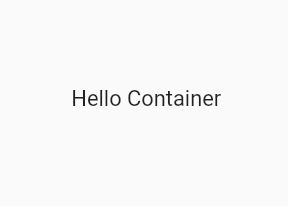
1. child :
-
The child property of a Container allows us to place our own widget inside it, so that we can decorate our widget easily . We can place any widget inside the child , for example
Text,Row,Column,Stacketc.
Container(
   child: Text("Hello Container")
)
-
Output :
2. alignment :
- The alignment property will align the child of the container in 10 different ways.
-
topLeft,topCenter,topRight,centerLeft,center,centerRight,bottomLeft,bottomCenter,bottomRight
Container(
        alignment: Alignment.bottomRight,
        color: Colors.blue,
        width: 150.0,
        height: 100.0,
        child: Text("Hello Container")
)
- Output :

3. color :
- color is another most common property of container which is used to give container a background color.
- color takes color provided by the Colors class. There are mainly two Colors class, **Material **and **CupertinoColors **class. We can use both of these classes to give color to the Container *
Container(
        alignment: Alignment.bottomRight,
        color: CupertinoColors.activeGreen, // or Colors.green
        child: Text("Hello Container")
)
-
Output :

4. constraints
- With constraints property we can tell the container to expand to fill a given sizes
-
constraints takes BoxConstraints class as an input. There are many constructor available inside the BoxModel. Some of them are
tightForFinite,loose,tight,tightFor, etc. *
Container(
        constraints: BoxConstraints.tightForFinite(width: 200.0,height:100.0),
        alignment: Alignment.center,
        color: CupertinoColors.activeGreen,
        child: Text("Hello Container")
)
-
Above code will creates a box with constraints that require the given width or height. If no
widthorheightwere given then the constraints will be infinite, it means the box will take all the available space. -
Output :

-
The
looseconstraint is nothing but an axis with a minimum constraint of 0.0. It takesSize(width,height)as an input.
Container(
        constraints: BoxConstraints.loose(Size(100.0,150.0)),
)

I'll explain more about constraints in some another blog as it is a very broad topic.
5. decoration :
- decoration is a very cool property which provides tons of features for our box. Lets explore them.
-
decoration takes
BoxDecorationclass as an input. This class provides variety of ways to draw a box. -
Box can have,
border,shadow,gradients,image,alignmentetc.
Container(
        decoration: BoxDecoration(
          // Note: You can't have a property of "color" inside a container now as you've already defined in the decoration
          color:Colors.purple,
          borderRadius: BorderRadius.circular(10.0),
          border:Border.all(color: Colors.red),
          boxShadow: [
            BoxShadow(
                      color: Colors.green,
                      blurRadius: 5.0,
                      spreadRadius: 5.0,
               ),
          ]
),

Now there are two more property remaining of BoxDecoration i.e,
gradientandimage. Lets see how to use them
*
Container(
        decoration: BoxDecoration(
          image:DecorationImage(image: NetworkImage("flutter-logo.png")),
          border:Border.all(color:Colors.black),
          gradient: LinearGradient(
                 colors: [
                     Colors.pinkAccent,
                     Colors.blueAccent
                 ])
        ),
)
-

-
gradient: There are several types of gradients, represented by the various constructors on this class. LinearGradient, SweepGradient, RadialGradient,
LinearGradient() :
colors: List of colorsbegin: Offset at which the gradient is placed.end: Offset at which the gradient stops placed.stops: A list of values from 0.0 to 1.0 that denote fractions along the gradient- Example : as explained above
RadialGradient() :
- Same as LinearGradient, But this also takes properties like
radius,focal,tileMode,colors: List of colorsstops: A list of values from 0.0 to 1.0 that denote fractions along the gradient.focal: The focal point of the gradient. If specified, the gradient will appear to be focused along the vector from center to focal.focalRadius: The radius of the focal point of gradient.radius: The radius of the gradient- Example :
Container(
        decoration: BoxDecoration(
          border: Border.all(color:Colors.black),
          gradient: RadialGradient(
            colors: [Colors.green, Colors.blue, Colors.orange, Colors.pink],
            stops: [0.2, 0.5, 0.7, 1],
            focal: Alignment(-0.1, 0.2),
            focalRadius: 1,
            radius: 0.1
        ),
),

SweepGradient() :
- Similar to Linear and Radial Gradient, however takes two different properties i.e,
startAngle,endAnglestartAngle: The angle in radians at which stop 0.0 of the gradient is placed.endAngle: The angle in radians at which stop 1.0 of the gradient is placed.- Example :
Container(
        decoration: BoxDecoration(
        border: Border.all(color:Colors.black),
        gradient: SweepGradient(
        colors: [Colors.blue, Colors.green, Colors.yellow, Colors.red, Colors.blue],
        stops: [0.0, 0.25, 0.5, 0.75, 1],
             ),
        ),
)
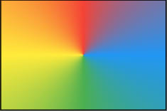
- After applying
tartAngleandendAngle -

6. margin:
- Margin is used to create space around widget
Container(
        color:Colors.teal,
        alignment: Alignment.center,
        width: 150.0,
        height: 100.0,
        margin: EdgeInsets.only(left:10.0)
)
7. padding:
- Padding is used to create space from inside of widget
Container(
        color:Colors.teal,
        alignment: Alignment.center,
        width: 150.0,
        height: 100.0,
        padding: EdgeInsets.all(10.0)
)
-
marginandpaddingtakesEdgeInsetsclass as an input. -
The
EdgeInsetshas many constructor which is helpful to give margin/padding from different sides, some of them are: -
EdgeInsets.all(): To gives space from all the sides. -
EdgeInsets.only(): To give space from perticular side i.eleft,right,top,bottom. -
EdgeInsets.symmetric(): To give spacehorizontallyandvertically
8. transform:
- This is another a cool property, which helps us to apply matrix transformation to paint our container/box as we wanted
-
transform takes
Matrix4class, which has many useful constructor like,rotationX(),rotationY(),rotationZ(),skew(),translation(), etc - Example : *
Container(
        transform: Matrix4.rotationZ(0.1),
        width:250.0,
        height:150.0,
        color:Colors.teal,
        child:Center(
        child:Text("Hello Container")
        )
)
- Output :
-

- Similarly you can apply
rotationX(),rotationY(),rotationZ(),skew(),translation()properties to see cool changes
9. foregroundDecoration:
- This property will decorate the box from in front of the child.
- The
decorationproperty decorates/paints the box from behind the child. - Lets understand what do I meant by painting from the front of the child
- If we take same snippet used in the
decorationexample , but instead of thedecorationI'm puttingforegroundDecoration.
Container(
        foregroundDecoration: BoxDecoration(
         color:Colors.purple,
          borderRadius: BorderRadius.circular(10.0),
          border:Border.all(color: Colors.red),
          boxShadow: [
            BoxShadow(
                      color: Colors.green,
                      blurRadius: 5.0,
                      spreadRadius: 5.0,
               ),
          ]
      ),
    child : //....
),
- Output :
-

- As we can see the
Textis not visible. It is because theforegroundDecorationhas painted the whole thing in-front of our child widget.

Top comments (0)