I’ve been meaning to write a Front-End Developer (FED) series for quite some time now. Having worked in many industries, building many Web Apps on different stacks and Design Systems, I’m here to share my learnings and hopefully you will get something out of it.
These days it's very easy for new developers to get up and running using tooling such as create-react-app. Tooling such as this is great as it speeds up repetitive tasks and automates all of a React's initial constructs, enabling developers to be able to build, test and deploy their applications. But, great tooling can also restrict one's knowledge of understanding what actually happens during and after its compilation.
This series will contain many episodes, each ordered with hope to equip you with a typical FED experience on how to build React Apps. As it stands the following subjects have been identified:
- Episode 1: Getting Started
- Episode 2: Theme Providers
- Episode 3: Routing
- Episode 4: Testing and Developing components
In today's episode we will bootstrap a React application going into detail during each of the steps. You will be provided a mixture of code snippets, screenshots and external references along the way.
Table of Contents:
- 💭 Mindset
- 🤔 Which UI Library?
- 🚀 Let's get started!
- ⌨️ Getting Started with Material UI
- 🔧 App Preparation
- 💆 Heads Up!
- 🙏 Closing
💭 Mindset
Does what you’re building already have an affiliated Design System (DS), or a living Style Guide, or at least some kind of Branding documentation?
If the answer is yes, that’s great, you have a basis to work from and extend off, for example if you already have a Component Library, you can start building your interface with existing Components, rather than building from scratch. My mentality in this case is
- how can I consume the existing styles with least amount of friction?
- how can I contribute back so others can benefit?
If the answer is no, that’s still okay, instead you have prime opportunity to centralize the App’s DS artifacts! My mentality in this case is a bit more involved and requires team/company wide structure to help formulate a cross functional Design → Developer process. We will cover this in more detail throughout the series.
For the rest of this series we will assume there is no DS, instead, we will build one DS alongside our functional React App! That's the cool thing about this, when you are creating a new App, it’s better practice to create one from the get-go as it helps with testing, its living documentation, it can make design discussions easier etc.
I’m flinging the word “Design System” too loose here. We’ll be creating a Living Component Library (a subset of a Design System) as trying to build full a Design System is more than code artifacts.
🤔 Which UI Library?
There has and always will be a handful of UI libraries floating around, battling for top adoption rates but before we pick a library let's be clear what a UI library is and why they are necessary.
A UI library is a central repository where both design artifacts and developed components are showcased. They contain all the essential building blocks an application requires to start it's creation, things like: Typography, Buttons, Links, Cards, Lists, Tables, Layouts, Responsive design etc. Good UI libraries make it easy for the consumer to define their own Themes and Components, are testable, are accessible and are well documented.
Do you really want to spend your valuable time re-inventing a Button every.. single.. time!?
What’s important is to understand the basis of each of the UI libraries, at the end of the day they are just that: a library. The onus is on you to determine:
- When was it created?
- What does their future roadmap entail and will they continue to support it?
- What major version is it on?
- How much community support does it have?
- What browsers do they support and does it align with yours?
- How Accessible is the library?
- What is their documentation like?
- Does it align with your tech stack (Typescript? SSR? Testable?)
- Can you contribute back?
Comparison
I’ve chosen 3 libraries to compare, each slightly different in their philosophies.
Snapshot taken as of April, 2021.
 Bootstrap |
 Material UI |
 Tailwind CSS |
|
|---|---|---|---|
| Birth | 2011 | 2014 | 2017 |
| Latest Version | 4.6.0 | 4.11.3 | 2.0.1 |
| Weekly Downloads | 2.2M | 1.3M | 530K |
| Contributors | 1150+ | 2050+ | 150+ |
| Methodology | Object Oriented CSS | Object Oriented CSS | Utility-First CSS |
| Processor | Pre Process | Pre Process | Post Process |
| Library Size | ~308kb | ~27kb | |
| React Version | ^16.8.0 | ||
| Typescript? | (v3.2+) | ||
| Browser Support | IE: 11 Edge: >= 80 Firefox:>= 60 Chrome: >= 60 Safari: >= 10 |
IE: 11 Edge: >= 14 Firefox: >= 52 Chrome: >= 49 Safari: >= 10 |
IE: Edge: Firefox: Chrome: Safari: |
| Roadmap | Github Discussions | MUI Roadmap | Github Discussions |
| Design Figma Artifacts | Figma link | Figma link | Figma link |
In all my use cases I’ve found Material UI (MUI) to have everything I need. The amount of developer tools their library provide are perfect for my React apps. So for the rest of this journey, we will be focusing on building a React App, using Material UI to help us.
❗ The point of this is to not sway you from the other UI libraries, instead, it was to get you thinking, to keep comparing and seeing what else is out there.
🚀 Let's get started!
Create React App (CRA)
CRA allow developers to get started immediately, without having to configure tooling such as Webpack or Babel. Traditionally developers would have to manually configure Webpack (or the like) with their React App which generally required substantial knowledge from the developer to understand how to:
- build the source code,
- locally host the app,
- setup testing,
- configure production vs non-production build environments
- localhost cache-management,
- configure service-worker, and much more
create-react-app --template typescript mui-app
cd mui-app
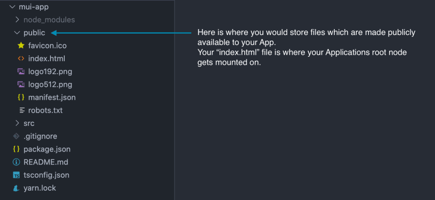
The following folder structures should be shown in your code editor (I’m using VSCode).
Public Folder
Source Folder
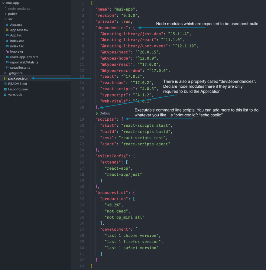
package.json file
More information on how the scripts work can be found here: https://create-react-app.dev/docs/available-scripts
⌨️ Getting Started with Material UI
Our app will be using both MUI core module as our Component Library and Theme engine, along with MUI icon module as our Icon library.
@material-ui/core
The Core library contains all your base needs, including:
- Components
- Layouts
- Inputs
- Navigation
- Surfaces
- Feedback
- Data Display
- Utils
- Lab
- Breakpoint definitions,
- Theme engine,
- Server Side Render Capability,
- A CSS-in-JS solution unlocking many great features (theme nesting, dynamic styles, self-support, etc.)
npm install @material-ui/core
@material-ui/icons
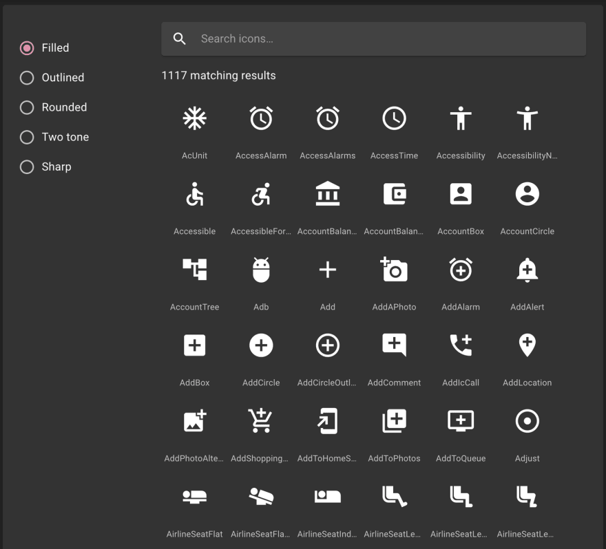
The Icons library includes over a thousand icons, conveniently exposed as SvgIcon components for your consumption. We will dive into this library next episode.
npm install @material-ui/icons
A searchable list of all their icons can be found here: https://material-ui.com/components/material-icons/
Their SVGs come available in a few variations:
| Filled | Outlined | Rounded | Two Tone | Sharp |
|---|---|---|---|---|
 |
 |
 |
 |
 |
If their SVG library does not satisfy your needs, MUI have conveniently created a component <Icon /> where you can inject any of Font Awesome classes into the component.
<Icon className="fa fa-plus-circle" />
However, if you use the <Icon /> component, be mindful of accessibility requirements. If your Icon has semantic meaning you are advised to include supporting text around it like so:
<Icon className="fa fa-plus-circle" />
<Typography variant="srOnly">Create a user</Typography>
For this series we will be using MUI Icons, which inherently use (a richer, accessible component)
🔧 App Preparation
Now that the core libraries have been installed we would then remove all the demonstration content from the src/App.tsx file. Following that, we should start to shape our App’s shell by doing the following.
CssBaseline
Use the CssBaseline component to kickstart an elegant, consistent, and simple baseline to build upon.
Edit your App.tsx file to look something like:
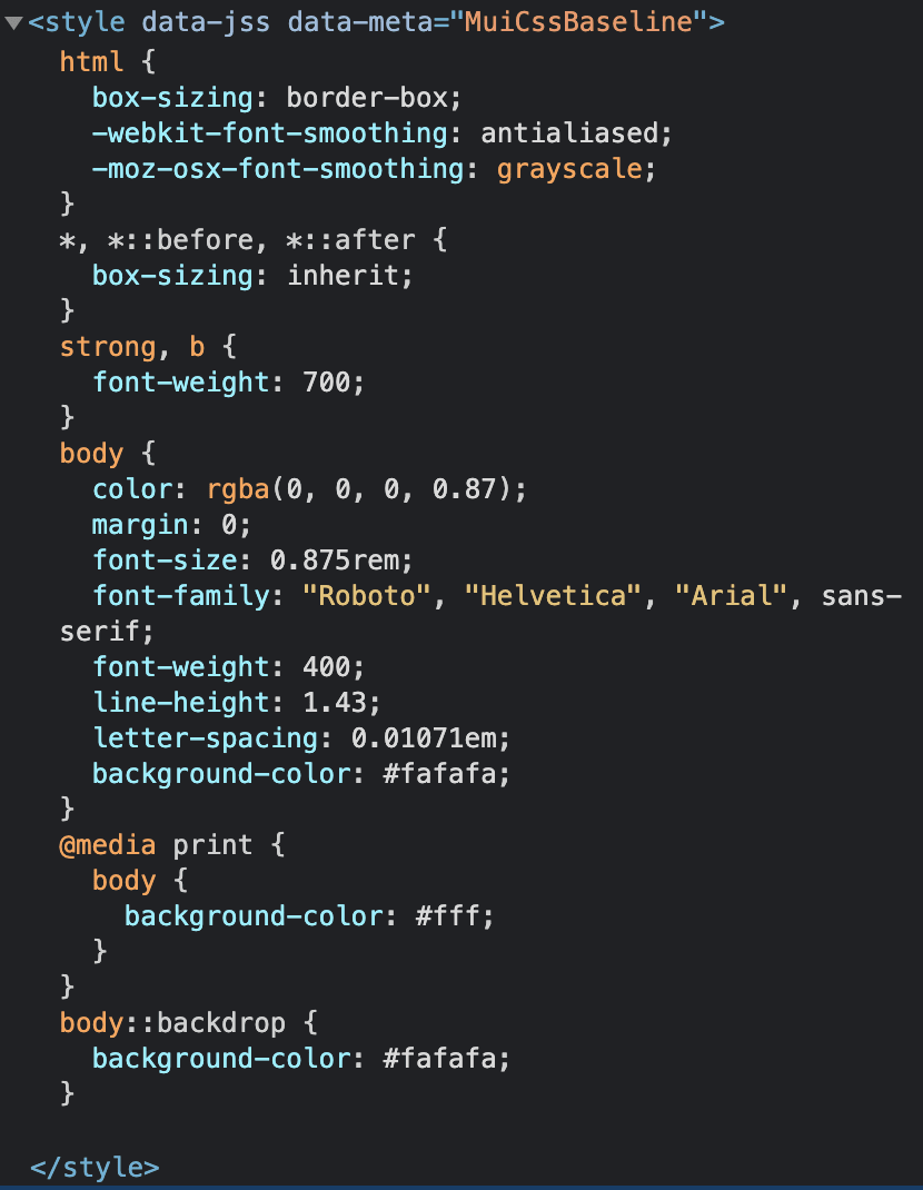
Upon saving those changes and loading your App, you’ll notice a new <style> tag being injected in the <head>:
This is configuring the browser to print as consistent as it can across all browsers.
Page
The<html>and<body>elements are updated to provide better page-wide defaults. More specifically:
- The margin in all browsers is removed.
- The default Material Design background color is applied. It's using theme.palette.background.default for standard devices and a white background for print devices.
Layout
box-sizing is set globally on the
<html>element to border-box. Every element—including *::before and *::after are declared to inherit this property, which ensures that the declared width of the element is never exceeded due to padding or border.Typography
No base font-size is declared on the
<html>, but 16px is assumed (the browser default). You can learn more about the implications of changing the<html>default font size in the theme documentation page.Set the theme.typography.body2 style on the
<body>element.
Set the font-weight to theme.typography.fontWeightBold for the<b>and<strong>elements.
Custom font-smoothing is enabled for better display of the Roboto font.
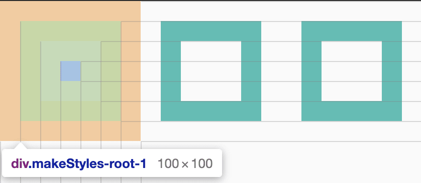
Understanding the “Box Model”
Every element sitting in the Document Object Model (DOM) has been computed in the CSS engine predefined by a set of properties. Selecting elements using the browsers Developer Tools → Inspect function, you’ll noticed the element’s Box Model being rendered as:
Note how the box has been defined, described from outside working in:
margin → border → padding → content
Each time you create a new element or update some styles try to think about how the changes can disrupt the Box Model, thus, the content flow.
💡 Whilst you’re working on styling an element, try to visualise the box-model output in your head, then see if it your guess is right!
What does "box-sizing" actually do?
You may have noticed the CSSBaseline style printed some box-sizing style declarations. I've created the following example so you can visually see the differences.
Let's say we have 3 square boxes flowing in a row with all the same dimensions.
The following boxes will be rendered:

And its box-model will look like:
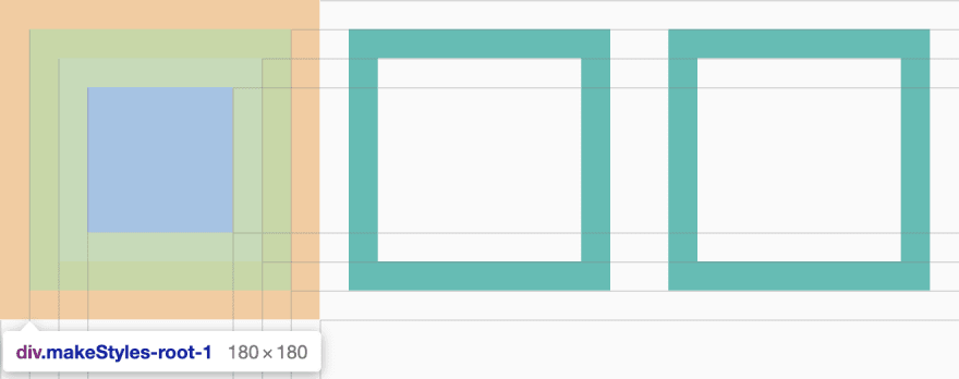
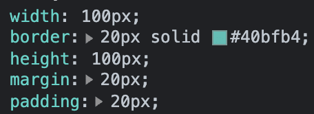
Isn’t it strange how the div grows beyond its explicitly defined width/height of 100px?
By default the browser uses box-sizing: content-box, this means the width/height are a calculated value of the elements width (100px), padding (20px left, 20px right), border (20px left, 20px right), totaling 180px in this case.
By appending the box-sizing: border-box; property to each of the 3 boxes, the following will be rendered:
Notice the content area itself shrinks (blue square), but everything else stays the same? That’s the power of applying box-sizing: border-box; across the app. It sets an opinionated view on how content can be constructed throughout the app. I use this implementation as it stops me from having to calculate dimensions in my head, all I have to do now is provide a width and height and we’re good to go.
💆 Heads Up!
It’s important to keep your webpage’s Meta information up-to-date as a lot of the information in the <head> help define the webpage’s meta-data. This data can be used for many things such as:
- Describing your page’s content to Web Crawlers (description, author, content type). This is to help with Search Engine Optimisations (SEO)
- Declaring your documents
charset - Setting your browser tab
TitleandFavicon - Setting your App as a Progressive Web App (PWA)
- Configuring Social Media outputs (og:) and Search representations
Open and edit the following file public/index.html
Charset
Charset stands for Character Sets, it instructs the browser to compute the rest of the document with the defined charset. Example charsets are: Numb, ASCII, ANSI, 8859, UTF-8.
The HTML5 specification encourages web developers to use the UTF-8 character set!
This has not always been the case. The character encoding for the early web was ASCII.
Later, from HTML 2.0 to HTML 4.01, ISO-8859-1 was considered as the standard character set.
With XML and HTML5, UTF-8 finally arrived and solved a lot of character encoding problems.
<head>
  ...
  <meta charset="UTF-8" />
</head>
Title
The title tag is a mandatory, text-only tag which sets the document’s title and is visible in your browsers Tab, History & Bookmarks.
🌶️ Hot Tips!
- Go for a longer, descriptive title (avoid one- or two-word titles)
- Search engines will display about 50-60 characters of the title, so try not to have titles longer than that
- Do not use just a list of words as the title (this may reduce the page's position in search results)
So, try to make the title as accurate and meaningful as possible!
<head>
  ...
  <title>Design System | QuinTRON</title>
</head>
The following will output:
Favicon
A favicon is where you have the ability to brand your website/application. A well defined favicon gets used in browser Tabs, Bookmarks, PWA Install-to-desktop files, PWA Loading Screens, Offline files. They may seem like such a little thing, but all the little things add up to making your brand stand out!
I use realfavicongenerator to generate my favicon set. It’s a great online tool because it emulates how it would look in all devices and browsers. Taking it further, their website also allow you to customise the PWA manifest file, better declaring things like your brand’s colours.
After following their generation process you’ll be provided a zip file which have all the static resources required for you to host it in your public/ folder.
You are then required to update your public/index.html file’s head tag with the following:
Replace the former meta tags and links with their generated code.
<head>
  ...

  <link rel="apple-touch-icon" sizes="180x180" href="/apple-touch-icon.png">
  <link rel="icon" type="image/png" sizes="32x32" href="/favicon-32x32.png">
  <link rel="icon" type="image/png" sizes="16x16" href="/favicon-16x16.png">
  <link rel="manifest" href="/site.webmanifest">
  <link rel="mask-icon" href="/safari-pinned-tab.svg" color="#40bfb4">
  <meta name="msapplication-TileColor" content="#40bfb4">
  <meta name="theme-color" content="#40bfb4">
</head>
I end up with this:
Viewport
Last thing to cover is the viewport meta tag.
The viewport is the user's visible area of a web page.
The viewport varies with the device, and will be smaller on a mobile phone than on a computer screen.
Before tablets and mobile phones, web pages were designed only for computer screens, and it was common for web pages to have a static design and a fixed size.
Then, when we started surfing the internet using tablets and mobile phones, fixed size web pages were too large to fit the viewport. To fix this, browsers on those devices scaled down the entire web page to fit the screen.
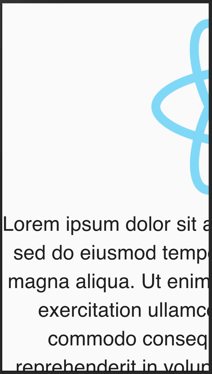
| Mobile: without viewport declaration | Mobile: with viewport declaration |
|---|---|
 |
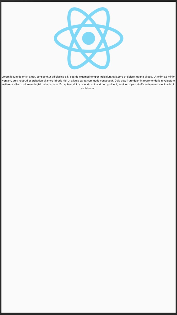 |
As you can see the screenshot on the right neatly fits the maximum content into the devices viewport width. Obviously you’ll need to better style content for mobile, but that’s beside the point.
<meta name="viewport" content="width=device-width, initial-scale=1" />
This gives the browser instructions on how to control the page's dimensions and scaling.
The width=device-width part sets the width of the page to follow the screen-width of the device (which will vary depending on the device).
The initial-scale=1 part sets the initial zoom level when the page is first loaded by the browser.
🙏 Closing
At this stage you should have the shell of a prosperous React App and have gained foundational knowledge of its make-up.
You are now ready to move onto the next episode where I’ll be walking you through how to implement a Theme provider in your app, covering everything from:
- Typography,
- Colours,
- MUI theme and component overrides,
- Responsive design
Don't be shy, get in touch with us!









Top comments (0)