This article was created by the UX/UI Designers Szymon Wiśniewski and Maria Krupskaya. Our UI/UX Designers are highly specialized in creating a unique user experience for any software. Seek the expertise of a UI/UX design agency and ensure the best quality of your product.
About
Tarot Routing uses state-of-the-art algorithms to plan more efficient last-mile driving routes faster than humans can.
Customers reduce their driving time by 30% and, of course, reduce their CO2 emissions, petrol consumption, driver salaries, and maintenance costs.
Challenge
Tarot Routing was in the MVP stage when Profil Software, an outsourced development team, began working on it. They needed to develop substantial new features in order to create an offering sufficient for Enterprise clients. Additionally, as Tarot Routing’s user base increased, they needed to address platform resiliency and scalability more and more.
Solution
Profil Software’s full-stack team has developed many substantial features in Tarot Routing, including** Map-Based Drag & Drop Route Adjustments, Websockets for real-time updates, Real-Time Driver Tracking, Cross-Platform Mobile App, and Frontend Unit Tests.**
UX Review
The web service and the app Tarot Analytics lose the love of users, due to a myriad of reasons. *Along with the competition, one major factor for the losing users is a clumsy design.
*
- No trust through communication with the user
- Lack of connection with the real world
- No consistency within the product
- No error prevention whatsoever
- Ancient, inconsistent, hideous visuals
- Issues with compatibility and responsiveness
The goal was to deliver mobile-friendly, responsive design to create a seamless and attractive user experience across all devices.
Our Approach and process:
Context Study
Our client struggled with the outdated look and feel of his service. Our task was to refresh the appearance and the experience.
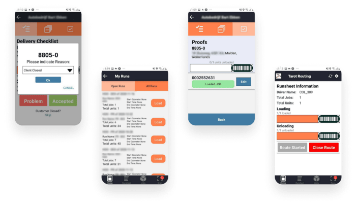
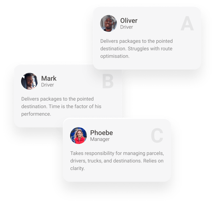
We had to remember about 2 user profiles — the drivers and the managing people. The drivers were supposed to use mainly the mobile application.
Target Audience
Using the results of the information given and the analysis, we created three personas that embody the traits of the target audience.
Our workflow
Rebranding
Creating the Style Guide
The goal is to make people aware that our client updated his brand.
We have developed a design system to establish the brand’s identity in the minds of users and product owners.
*2. Website redesign
Changing and updating the content, structure, format, and navigation of the service to improve performance.
*
Timeline
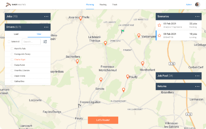
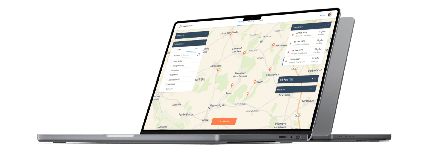
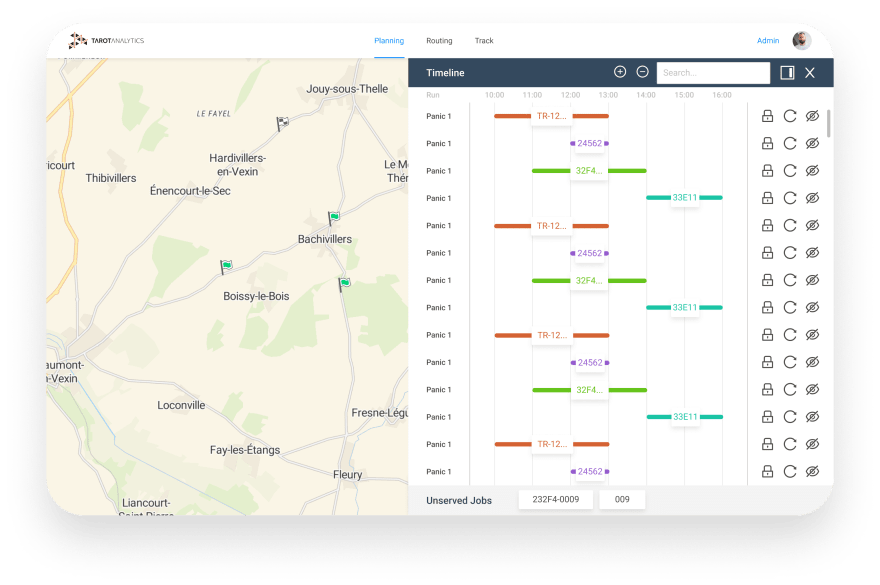
This feature lets you Drag and Drop to reallocate or reorder your jobs. Watch the map update automatically and see the impact on your ETAs. We made sure the user can choose their favorite timeline’s position.
Tracking
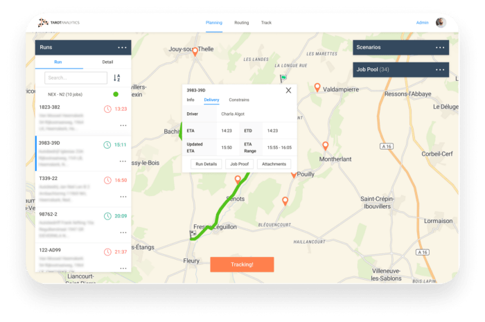
Tarot Analytics let its customers track the driver to the door, just like Uber.
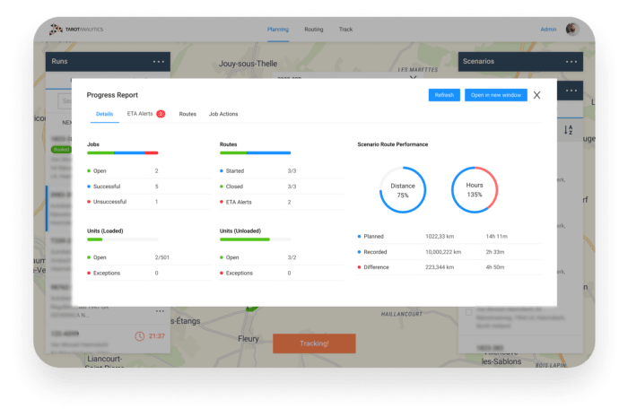
The customers also get real-time ETAs, and self-service PoD so they don’t have to call them 100x per day anymore.
3. App Redesign
We applied all the rebranding decisions to keep the application up to date and make it look and feel fresh.
Themes
Light & Dark Mode
The research carried out revealed a frequent problem faced by drivers was the poor visibility and contrast of the application due to their shifts.
To prevent this from happening, we came out with a solution in the form of screen modes (Light & Dark).









Top comments (1)
A UX/UI development for mobile app redesign case study showcases how importance is given to the recognition of user needs and behaviors by driving design improvements. Taking into consideration the user's feedback, pain points, and design trends, such a case study depicts an effective redesign as enhancing user usability, engagement, and satisfaction. This well-executed redesign can further boost performance, simplify navigation, and make the visual experience easier.