
Nowadays a lot of startups and business software face the problem of losing users. And we are not talking about quick unsubscriptions that happen when the product is really bad, but about the loss of regular users who have been with you for some time.
Let’s take a look at this problem.
It seemed to be a great start — you attracted an excellent dedicated software development team and UI and UX design agency who created a beautiful and useful product, you spent time and money on promotional materials, videos, advertising, and landing pages, then you got the first users, first paid subscriptions and good reviews. Success! Some time has passed, six months, a year or two… and you begin to notice that users are leaving you. What hurts the most is that those who have been with you from the very beginning are leaving as well. Why is this happening? Based on my experience, there are usually two possible reasons:
- User behaviour.
The fact is that it is not enough to create a cool project. The user is not a robot, but a person with feelings and emotions, which means that their interest needs to be maintained.
- Product development.
It’s not enough to launch a product and only engage in technical support. Today the IT industry is developing so rapidly that sometimes products lose relevance before they hit the market. It may seem like a joke, but there’s a lot of truth to it.
What can we do to stop our users from leaving and multiply them instead?
I combined 7 short tips into a small checklist:

Now, let’s get into the details:
- Make your users feel important
Have you ever wondered how to reduce customer churn rate? Here are a few things that you can do. Send out information about new updates, ask users for their opinion, and set up useful tips according to their preferences and previous behavior. Knowing what they want, need, and look for in your application will help you find a way to personalize the content and connect with your user. This will in turn make them feel valued and increase their attachment to your product.
This goal can also be achieved by sending a newsletter.
If you don’t feel that you will be able to continuously add new content for newsletter purposes, you could prepare a 90-day onboarding strategy and automate it. User onboarding is a process that can be very crucial for the success of your app and it can prevent you from losing users in the first week after your app’s launch. Studies show that there is a huge decrease in users over the first 90 days after launch. Typically, users will install an app and then lose interest in it in the coming weeks, which can be seen on the graph prepared by Google Play Store for a study on users’ behavior:
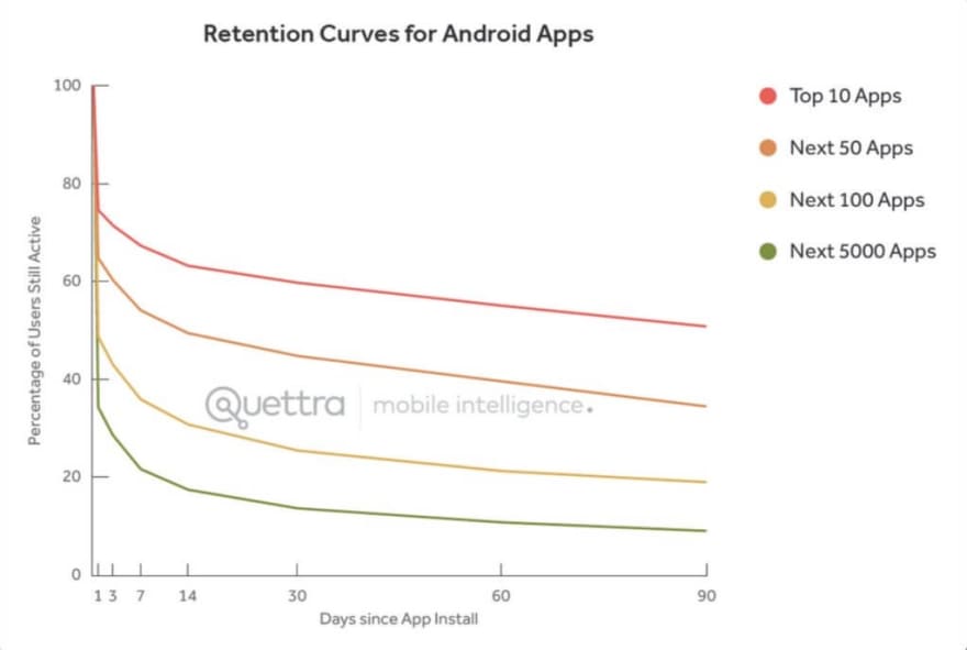
So, what can you do to keep these users even after this 90-day period and prevent customer churn? Create a user onboarding experience that will bring your customer and product closer together. You need to introduce your product, activate the user, and then make sure that you retain them to the point which your product becomes a part of their lives. You can achieve this with a user-friendly design and personalization.
It will make them stay during those first few weeks, and if you complete the process in the right way, it will make them stay for a longer period of time.
Enjoying this article? Need help? Talk to us!
Receive a free consultation on your software project
Another good idea is to send re-engagement emails to inactive subscribers.
You can use Mailchimp https://mailchimp.com/ to do it — it is a very popular service with a large community, or e.g. Woodpecker https://woodpecker.co/ — an alternative solution that is less complex but also a bit more basic. It has a lot of necessary functions such as importing users in xls files, creating AB campaigns, great functions that facilitate personalization, and even the ability to send messages to people in relation to their time zone so they will be receiving emails at the time that will guarantee the highest level of response.
In addition to addressing users personally, the newsletter/90-day onboarding strategy/re-engagement emails should also include in a graphic form (if available) the avatar of the user that we are addressing our mailing to. Thanks to this there will be an even greater feeling of personalization. For example, this technique is used by Linkedin, which also recently enabled users to create newsletters. The graphic form used in a newsletter should be minimalistic and simple. If you want to learn more about creating a newsletter on Linkedin, you can find more information here: https://www.linkedin.com/help/linkedin/answer/a517925/create-a-newsletter-on-linkedin?lang=en
- Shower users with benefits
Do not treat a user who is with you for a month and one that is with you for a year in the same way. Long-term users should get benefits, discounts, special offers, and unexpected bonuses. Highlight it all with numbers showing statistics and money saved. This will show the user how important they are to you and take attention away from small imperfections of the product. Everyone likes to feel special — preserve this feeling.
In addition to designing your custom solutions to provide benefits, you can use ready-made software to manage them. I do not want to give a specific example here, but after entering “SaaS Customer Loyalty Management Software” in Google you will find ready-made solutions to be implemented in your SaaS product. I have also found a lot of interesting articles on this subject and I would like to recommend you this one especially: https://userguiding.com/blog/loyalty-management-program-software/

- Build a personal connection with the user.
It is necessary to show a personal attitude to your user. Your product should not be “cold”, but friendly and inviting. Recently there has been a lot of talk about the importance of personalization of products.
It might seem obvious, and to a certain extent it is, but sending personal messages to users, calling them by their names, and wishing them a good day in a welcome message is a practice that can help you build a connection with your users and thus make them more open to the idea of investing in your product or service. You’ll find a few examples of this kind of message below. The first one is a welcome message that not only restates the purpose of the app, making sure to let you know that by registering you’ll be doing something good by taking your “first step towards the sustainability of the public eco-transport”, but also welcomes you warmly and offers to answer any questions you might have.

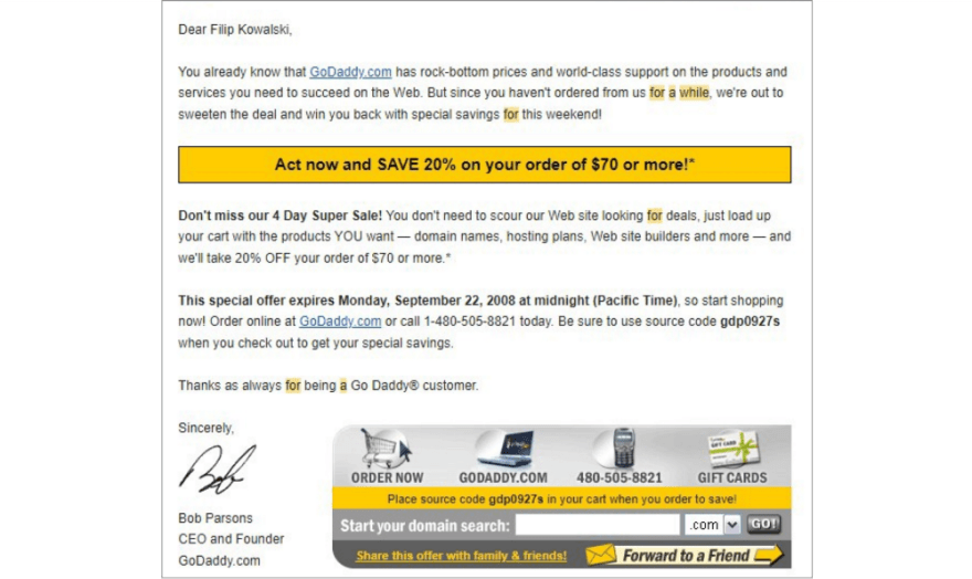
The second is a personalized message that encourages the customer to keep investing in the product. Notice how they use the customer’s name, remind them that they have already used the products offered by the company, and that the products offered by the company are very much needed, cheap, and of the highest order. It clearly states that the customer should load the cart with the product THEY want, making it all about their needs, and it ends with a thank you note (“Thanks as always for being a customer”).
Personal plans and algorithms are also used by a lot of companies. There’s a trend to allow a customer to choose a theme — set the app on dark/light mode, or even use your own background to make it even more personal. You can see that on Google, among other places. It offers many different themes that you can choose from, like the ones below:

The other great example is Slack, which you can set for either dark or light mode or even create your own custom theme:

You may also incorporate your logo and company colors (if this is a business application).
What is even more interesting is that some companies offer special promo gifts for birthdays. For example, if you have a Starbucks app on your phone, you’ll get offered a free coffee on your birthday. Some of the other birthday offers that you may see in different apps include promo codes for half-priced or free products, free monthly subscriptions for up to even 3 months, and discounts on services on your birthday. This is a trend that can be mostly observed in a lot of restaurants, coffee shops, etc. that offer free meals or drinks on your birthday but only if you have downloaded their application and signed up.
This helps to strengthen the connection with the product and to see the product as your “friend”, not just software for daily tasks. Thanks to this, the user will “feel” the people behind the software who are trying to make them happy. As you know, it is much more difficult to break off a relationship with a friend than with a stranger :)
So, if you are worried about your SaaS retention rate, you might want to take some of these ideas into consideration and include them in your strategy.
Interested in working for our software development company in Poland?
Check out our current job offers now
- Maintain up-to-date product design.
Trends change rapidly, so at the initial stage I am always afraid of using the “freshest” trends; usually, they become irrelevant after a year at the most. Design should be as “timeless” as possible.
Some of the things that can help make your design “timeless” are the things that we’ve already talked about above. Some of them may also seem obvious, but that doesn’t make them any less important. Here are a few tips on how to do this:
Keep it simple and user-friendly — users need to be able to accomplish what they need from your app as quickly and easily as possible. The design has to be user-friendly and the navigation should be as easy and straightforward as possible. Otherwise, it can put users off. Make sure your layout is clear and that there are not too many toolbars, buttons, or other features that can distract or confuse the user.
Get to know your user — and what I mean by that is do your research on what people want. You can learn about your users’ needs through surveys, focus groups, and other feedback. Don’t just guess what users want — ask them. User and market research can keep your product from failing.
Don’t waste your time on something that has already been done well — There are patterns and practices for UX designs that are well-honed and familiar to users. This applies to things such as icons and the meaning behind them. Changing their meaning or changing them into something else could easily confuse the user and that is not something anyone wants.
Keep your brand consistent — if you want users to recognize your brand instantly after opening your app, keep it consistent. Use the same or similar features: the color palette, voice assistance, pictures, icons, and style across your app shouldn’t change from one site to another or one icon to another.
Personalization — as already mentioned, users love customizing their products. They also love when it is done for them by the service, like Netflix does — the algorithm personalizes the account, giving recommendations based on users’ behavior (with previously watched films and TV shows). It’s wise to include it in your design, if possible.
This is a topic for a separate article, but if you find yourself working with an experienced design agency, they will know how to achieve all of this and more. Such a design can live for three or four years and stay relevant, requiring only small stylistic changes to refresh the interface.
But if your product does not look modern, was made more than two years ago and has not changed since that time, this is a serious reason to start to collaborate with designers.
I often hear from clients that users don’t complain about the design. This is normal — it is hard to find negative comments about the visual design in the AppStore. But believe me, the user subconsciously understands what the trends are now; they see products, websites, and ads every day. If your design is very different from today’s trends, this often creates the wrong experience: outdated look = incompetence.
The truth is that very often when faced with a choice between a beautiful, shiny interface with inconvenient logic and an “old-looking” but thoughtful one, app users will choose the first option. Therefore, we follow the trends and periodically update the design.
Here are some blogs worth following that will help you to stay up to date with changing trends:
https://www.awwwards.com/blog/
- Use the latest interface interaction trends.
Another thing you need to do is to make sure to keep an eye on what is in use now.
From what I’ve seen, the following things are repeated very often in numerous applications even though they should not be.
If you have a mobile application and you still use arrows to scroll through slides, then now is the time to change it to swipe. Use gestures, replace outdated pop-ups with neat toasts, and adapt web applications to all screen resolutions, including having a convenient mobile version, not just scaling.

Also, ensure that all active elements have their own behavior: make the buttons react to mouse hover as well as tabs in the menu and active links, add the ability to collapse the menu bar, and use small animations to make the interface lively and not static. Work on the smoothness of transitions.
If you ignore this, the user will unconsciously get a bad experience, since all the other products around have already introduced it into their applications. It’s like giving a fork with the soup in a restaurant when everyone eats it with a spoon.
Here’s a roundup of some well-designed websites with modern interactive interfaces:
https://www.donnasrunningclub.com/
https://www.mikaelareuben.com/
https://www.nurturedigital.com/
- Improve your product.
Everything is simple here: be sure to increase the functionality and the design by adding new, useful features, constantly analyze user experience and feedback, study competitors, and expand the capabilities of your application.
Everything that is being improved over time is respected by the user. Introducing constant changes does not let users get used to the way the product looks and functions, and by extension, it doesn’t let them get bored. Remember, as the number of features increases, your audience also increases, which means there is a chance to attract more users. Every serious product should not only have developers and testers in the maintenance team but also UX designers who are studying the user experience and constantly working on improving the product.
Here are some popular tools that can help you analyze an app’s user experience:
Woopra
for real-time data-driven analytics www.google.com
Google Analytics
for current and predictive analytics www.google.com
Clicky
for analysing web activities www.clicky.com
Smartlook
for session recording & heatmapping www.smartlook.com
Adobe target
for A/B testing www.adobe.com
Mouseflow
for mouse movement, scrolls, clicks, and forms using analysis www.mouseflow.com
DebugMe
for a visual feedback analysis www.debugme.eu

- Update your expertise.
No outdated data and approaches that were relevant two years ago. Depending on your specialisation you must provide the user with the latest data or algorithms. For example, if this is a business application for job searching or recruiting, update filters and logic focusing on the fact that a lot of work is now 100% remote and recruiting itself is often conducted completely remotely. That way we can make this process perfect and convenient and the user will get the wow effect: “This is exactly what I need to see in the app”. Another example is the choice of gender in lifestyle applications. In many countries it is already mandatory to specify all genders and such things need to be monitored, since you may unknowingly lose a huge group of users who regard the lack of this option as a disloyal attitude. These are just two of many examples. A UX designer will help you do a review and will suggest the changes and updates needed.

Once you go through this short checklist, you will be able to see whether your business process is aligned with all the points. If not, I recommend working on it with a team of professionals. Coming up with a customer churn prevention strategy based on the steps that we went through in this article and introducing them into your application will give your software a longer life.
Your customers will be grateful and you will see an increase in interest and in the number of users, as well as a stable statistical growth.
I wish your product the best of luck! 🚀

Top comments (0)