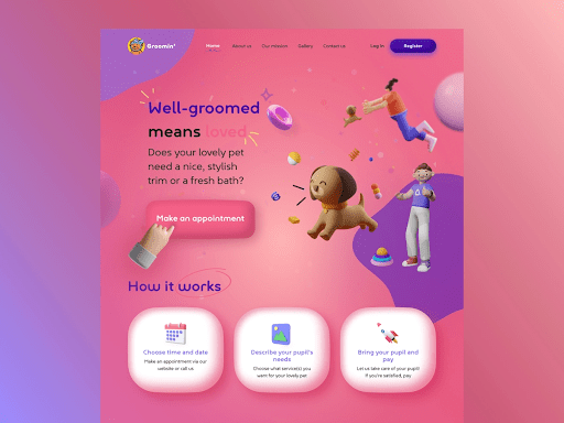
Everything ending with -morphism has been trending in the world of UI design trends for the last couple of years. Glassmorphism, neumorphism, skeuomorphism, you name it. Some of these are popular for a few months only, others are here to stay. Let’s discuss the most recent UI trend — claymorphism.
What is claymorphism?
The very name of this style gives you a little hint — the 3D objects look as if they were made from clay. Often, designers create human figures and various characters in the claymorphic style. Claymorphism takes neumorphism to the next level, making the elements even more expressive and lifelike.
This effect is reached because the elements look somewhat inflated and rounded. One might say that claymorphic UI elements also look like balloons. The objects are usually simple in their shape.
Claymorphism is often referred to as “fluffy 3D”. True: this style gives a touch of friendliness and cuteness to your UI. Clay figures remind us of childhood, games, and the good old times, so claymorphism is perfect for communicating your design as fun and uncomplicated.
How to create claymorphic objects?
The main tool for creating claymorphic elements is shadows. Quite predictable, isn’t it? Using shadows gives the feeling of depths and balloon-like appearance to the elements. You can use your usual design tool, like Figma or Adobe XD for creating claymorphic UIs.
What’s important here is that you won’t only use outer or background shadows, but also the inner ones. That’s exactly how the “clay” effect is created — by two inner shadows.
Additionally, the corners of objects in claymorphism are usually rounded; you won’t find sharp edges in this style. It’s all about being fluffy and toy-like, remember?
Webiste design by Filip Rygucki
Why is claymorphism getting so popular?
After looking at some examples of claymorphic UIs, it’s not hard to guess why everyone likes them so much. They present a new, fresh look and take away the seriousness from the design.
What is more, such style gives feeling of depth and volume to the objects and they don’t seem so abstract and flat.
Interacting with claymorphic design is more like watching an animated movie rather than just clicking through an app or website. In such a way, claymorphism makes your UI more engaging and visually appealing, and isn’t it what you as a designer would want the most?
You can also learn some more 2022 UI/UX design trends — trust us, there is plenty to know about.


Top comments (0)