Good UX design is the only way to make your product convenient and likable for the users. No matter how innovative your idea is or how stylish the UI is, if the digital product is hard to navigate and overall confusing, no one will want to use it in a long run.
So what contributes to a proper UX design? Among other parameters, microinteractions is definitely one of the most crucial elements. The name is pretty self-explanatory: these are small touchpoints that help users achieve a single task at a time. (More about the definition and theoretical part of microinteractions).
Take a look at five ways microinteractions are used in apps to make the UX even better.
Simpler navigation
Microinterations are what help the user figure out how to navigate your app in the first place. You probably know that a golden rule for a UX design is that it should be intuitive.
Microinteractions give this very intuitiveness — for example, a very common swiping action. You don’t have a think a lot before swiping to a new tab, do you? Often enough, users can get through the whole app with swipes alone.
What are some other examples of navigation microinteractions? For instance, pressing a “+” button or a hamburger menu causes several action options to appear on the screen. It lets you avoid a screen cluttered with too many buttons.

Source: Sandhya on Dribbble
System feedback
Apart from making the navigation through an app smoother, microinteractions can also provide your users some feedback about their actions. In fact, system feedback is one of the most common microinteraction use cases, even if you don’t know about it yet.
For example, when an action, such as sending a payment, is successful, the color of a button might change to green. As a result, this color change alone is enough for the user to understand that the transaction is completed.
Imagine sending a money transfer in a banking app. After you click “Send” or “Confirm” nothing happens, you just get back to a home screen. This will make you wonder whether your transfer was successful, won’t it? As users, we always need confirmations and reassurance when completing any actions in the apps.

Source: Uma Sankar on Dribbble
Animations for loading pages
Waiting for a page to load is frustrating in most cases. How can it not be, right? Well, there is one way to make your users entertained rather than irritated. Add an animation to the loading screen. It’s a great way to increase user engagement and make sure that they won’t close the app in the meantime.
The easiest example of a loading screen animation is loading progress. In such a way, you keep your users informed as to how long do they still have to wait. Talking about more fun options, it all goes down to your creativity.

Source: Oleksandr Pronskyi on Dribbble
Calls to action
Microinteractions are not limited to pure functionality. Believe it or not, but they are also a powerful marketing tool. You can add various calls to action in the app to encourage users to get the most from the app or try out some external services.
For example, a CTA microinteraction can be an animated chatbox button. In such a way, a user will see that there is a chat option to use. What is more, a simple animation will highlight this button on the screen.

Source: Nabil Mir on Dribbble
Brand communication
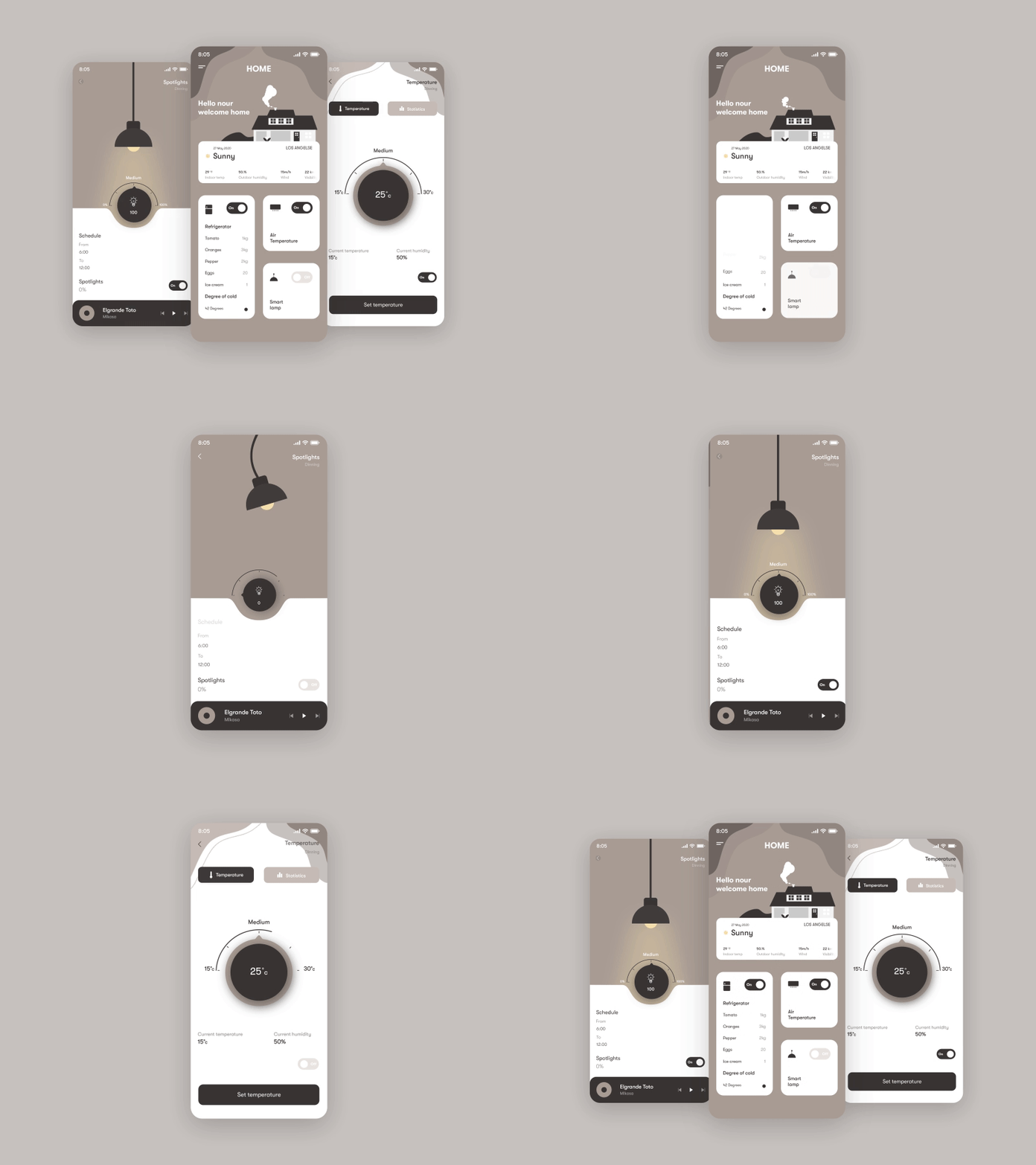
Finally, microinteractions can also help with communicating the brand voice and its values. If, let’s say, a banking service is positioning itself as a fun and easy to deal with one, then why not add an animated microinteraction here and there to reflect it?
Apart from making an app design usable, convenient, and good-looking, it’s also a must to make it humane. Bringing some emotion and personalization is a sure way to establish a better connection with your users and, as a result, get higher engagement rates.

Source: Nour Kada on Dribbble
Summing up
You might have been using microinteractions in your products without really knowing about it. Still, it is better to be aware of the power of your design to get the best of it, right?
You can find more examples of microinteractions and some theoretical information in our recent blog post — click on the link to read it.


Top comments (1)
Dive into the fascinating world of micro-interactions in UI design by reading this detailed blog post: Micro Interaction UI. It’s a must-read for designers looking to enhance user engagement and refine their interfaces with subtle, impactful interactions.