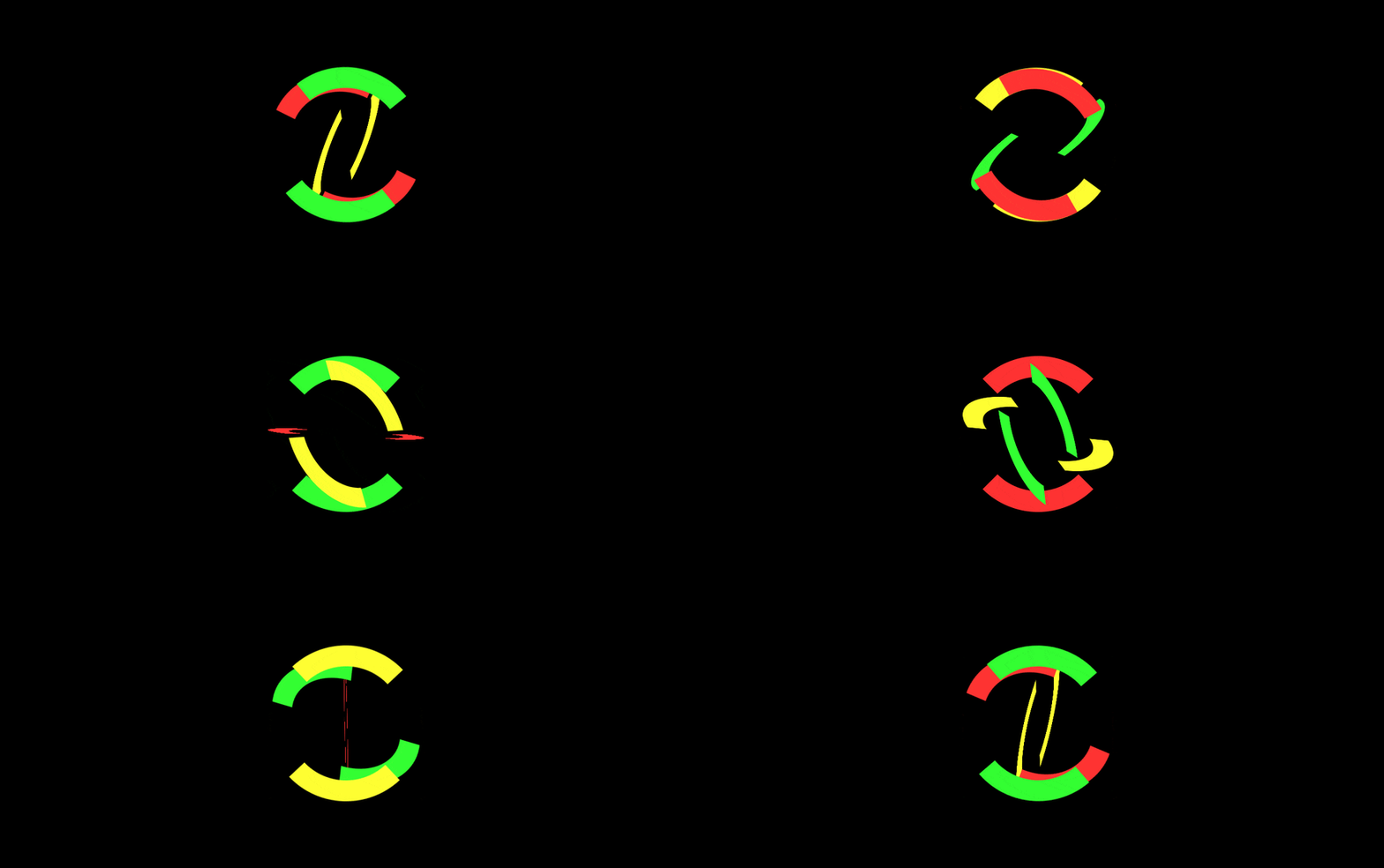
Preloaders are the way to improve the user experience significantly.
Instead of nervously staring into the blank page, the user will prefer to leave the page. And if your page has a preloader, it is cool. Chances that the user will stay and wait for your content to load are much higher!
It is worth to mention that the preloader is a wide area for creativity and experiments!
In my previous article, I've been talking about 3D effects in CSS. Here I want to evolve those ideas in a bit another direction.
In this article, I will share the idea of how to build a fancy version of the preloader.
This is a reprint of the original article.
Idea
The idea behind this version of the preloader is to rotate several colorful objects to create an illusion of 3D animation.
Layout
<div class="container">
  <div class="spinner"></div>
  <div class="spinner two"></div>
  <div class="spinner three"></div>
</div>
The layout is pretty simple. All the magic happens in the CSS.
CSS
Container
The container does nothing special. Its only purpose is to take all the space available and to center its content.
.container {
  width: 100%;
  height: 100%;
  margin: 0;
  padding: 0;
  display: flex;
  justify-content: center;
  align-items: center;
}
Spinner
The spinning object looks like this.
In this example, I've highlighted normally hidden parts with a semi-transparent color.
Now let's take it to step by step.
Initially, the entire border is invisible:
border: 4vmin solid transparent;
This rule turns a square into the circle:
border-radius: 50%;
Next two lines are defining the visible parts:
border-top-color: var(--border-color);
border-bottom-color: var(--border-color);
Here the CSS variables are used to define the color of the visible parts.
We'll talk about them later.
Finally, there is a CSS rule telling the browser how to calculate the width and height of the content:
box-sizing: border-box;
You can read more about box-sizing.
Ok. Now let's deal with the animation.
In this example, I've used separate animation rules instead of the shorthand version.
Let's take a look at them. First, the name of the animation:
animation-name: rotate;
After that, let's calculate the duration of the animation like this:
animation-duration: calc(var(--delay) * 3);
The explanation of the CSS variables will be a bit later.
Next rule defines how the animation will be applied:
animation-timing-function: ease-in-out;
The explanation of the animation-timing-function.
The last CSS rule tells the browser to play the animation forever:
animation-iteration-count: infinite;
The keyframes for this animation are very simple.
@keyframes rotate {
  0% {
    transform: rotate3d(0, 0, 0, 0deg);
    z-index: 3;
  }
  50% {
    z-index: 2;
  }
  100% {
    transform: rotate3d(1, 1, 1, 360deg);
    z-index: 1;
  }
}
This animation aims to rotate an object from 0 to 360 degrees around all axes. Also, it switches z-indexes for a more organic look.
Let's wrap it up.
.spinner {
  --size: 30vmin;
  --border-color: #ff3333ff;
  --delay: 0.9s;
  width: var(--size);
  height: var(--size);
  animation-name: rotate;
  animation-duration: calc(var(--delay) * 3);
  animation-timing-function: ease-in-out;
  animation-iteration-count: infinite;
  border: 4vmin solid transparent;
  border-radius: 50%;
  border-top-color: var(--border-color);
  border-bottom-color: var(--border-color);
  box-sizing: border-box;
  position: absolute;
}
CSS Variables
Now it's time to dive a bit deeper into the CSS variables.
The declaration looks like this:
--size: 20vmin;
You can read about the CSS measuring units.
The initial declaration of the variable can be placed anywhere up the CSS elements tree from the point of implementation. Also, it is possible to declare variables in the global scope.
In the latter case it will look like this:
:root {
  --delay: 0.2s;
}
Keep in mind that the names are case sensitive.
The next useful thing is that the value of the variable can be altered.
Here is an example:
.spinner {
  --border-color: #ff3333ff;
  border-color: var(--border-color);
}
.spinner.two {
  --border-color: #ffff33ff;
}
With the above example we can build a layout like this:
<!-- border color here is #ff3333ff -->
<div class="spinner"></div>
<!-- and here it will be #ffff33ff -->
<div class="spinner two"></div>
One more feature is that variables can be used in the CSS calculation clause:
.spinner {
  --delay: 0.9s;
  animation-duration: calc(var(--delay) * 3);
}
Let's summarize:
.spinner {
  /* size declaration */
  --size: 30vmin;
  /* initial border color */
  --border-color: #ff3333ff;
  /* delay declaration */
  --delay: 0.9s;
  /* applying the size*/
  width: var(--size);
  height: var(--size);
  /* calculating overall length of the animation */
  animation-duration: calc(var(--delay) * 3);
  /* applying the border color */
  border-top-color: var(--border-color);
  border-bottom-color: var(--border-color);
}
.spinner.two {
  /* altering border color */
  --border-color: #ffff33ff;
  /* applying the delay of the animation */
  animation-delay: var(--delay);
}
.spinner.three {
  /* altering border color */
  --border-color: #33ff33ff;
  /* calculating and applying the delay of the animation */
  animation-delay: calc(var(--delay) * 2);
}
Thus, the CSS variables are a great alternative to CSS preprocessors (such as SASS or LESS). The only downside is that these features are supported only by the latest versions of browsers. Because an example from this article won't work in the Internet Explorer.
So, if your project is aimed to support only the latest versions of the browsers - go ahead and add additional flexibility to the CSS rules you are using!
Conclusion
There are plenty of ways to improve the user experience and make your clients happy.
Adding a preloader to your page is only one of the possible ways to impress your visitors.
Despite the simplicity, the preloader is a wide area for experiments and creativity.


Top comments (0)