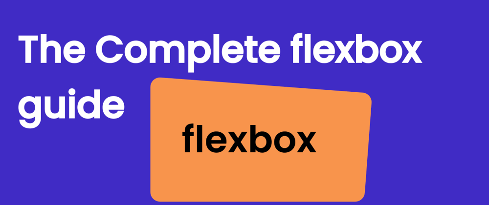
flexbox
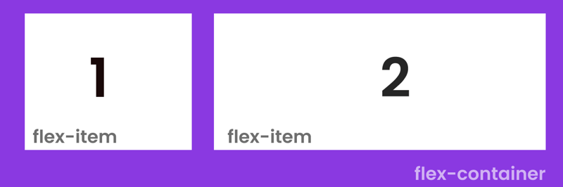
The Responsive website development with the help of flexbox is easy to use and implement. Flexbox is container which contain blocks inside the container with properties and main content.
flexbox Properties
1.Display
This defines a flex container inline or block depending on the given value. It enables a flex context for all its direct children.
.container {
  display: flex;
}
2.flex-direction
flex direction define the direction for children the default value is row you can change with column, column-reverse and row-reverse.
.container {
  flex-direction: row | row-reverse | column | column-reverse;
}
3.flex-wrap
flex-war use for responsive area its works for all type of devices. It contains four properties wrap ,no-wrap and wrap-revers.
.container {
  flex-wrap: nowrap | wrap | wrap-reverse;
}
4.flex wrap
flex items will all try to fit onto one line. You can change that and allow the items to wrap as needed with this property.
.container {
  flex-wrap: nowrap | wrap | wrap-reverse;
}
5.flex-flow
This is a shorthand for the flex-direction and flex-wrap properties, which together define the flex container’s main and cross axes.
.container {
  flex-flow: column wrap;
}
6.justify-content
This defines the alignment along the main axis. It helps distribute extra free space leftover when either all the flex items on a line are inflexible, or are flexible but have reached their maximum size
.container {
  justify-content: flex-start | flex-end | center | space-between | space-around |
}
7.align-items
This defines the default behavior for how flex items are laid out along the cross axis on the current line. Think of it as the justify-content version for the cross-axis
.container {
  align-items: stretch | flex-start | flex-end | center | baseline | first baseline | last baseline | start | end | self-start | self-end
}
8.align-content
This aligns a flex container’s lines within when there is extra space in the cross-axis, similar to how justify-content aligns individual items within the main-axis.
.container {
  align-content: flex-start | flex-end | center | space-between | space-around | space-evenly | stretch | start | end | baseline
}
This is not the end of flexbox properties and use but the main properties which are mostly used in web development are listed above with used. Start with flexbox its easy and important in web development field.
Hey everyone I am Ganesh from India web developer | content write connect with me on twitter for content related to freelancing | web development and content writing.
Check out my recent articles


Top comments (0)