
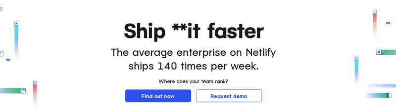
This is just a way and probably neither the best way nor the way Netlify does it. There are lots of things not thought about like accessibility. Here is the code pen link, in this article I will try to walk you through this recreation.
Recreating this effect
Let’s dissect this animation, we have 3 different parts that we can see
- Grow Animation ( the gradient underline also grow with the div)
- Elevator go-up animation
- Shrink
- Background Gradient Dance. Let's start with arguably the main animation — The elevator animation.
Elevator Go-Up Animation
The list items are moving up in animation. We create an element that moves up .train nested within .shaftelement where overflow-y is clipped. To do this .train have position:absolute within .shaft which have position:relative to contain .train element within itself. Here is the HTML
<div class="content">
    I can pet
      <div class="shaft">
        <ol class="train">
            <li>Cats</li>
            <li>Dogs</li>
            <li>Parrots</li>
            <li>All my pets</li>
          </ol>
      </div>
    !!!!!
  </div>
Also here are a few things we need to take care of
- The first child is visible when the animation is not playing. We do this by adding
top:0pxto the.trainclass - The animation stays in its final state once it's over. We simply set the
animation-fill-modeto forwards
Here is the CSS for .trainand for its animation go-up
.train {
  position: absolute;
  animation: go-up 3s linear 3s forwards;
  top:0px;
  margin: 0;
  padding: 0;
  list-style: none;

}

@keyframes go-up {
  from {
    transform: translateY(0);
  }
  to {
    transform: translateY(-100%) translateY(1lh);
/*translateY(1lh) so the animation stops before last element goes up*/

  }
}
Here is the CSS for .shaft and .content
.content {
  height: 1lh;
  display: flex;

}

.shaft {
  display: inline-block;
  min-width: 10ch;
  margin-left:1ch;

  /*Important lines */
  height: 1lh;
  overflow-y: clip;
  position: relative;
}
Codepen just for the elevator go-up animation only.
Gradient underline
Ideas that didn't work for this
- Add an underline: CSS doesn't support gradient underlines yet
- Adding an ::after pseudo-element to the
.shaftdoesn't works due to theoverflow-y: clipthing.
I propose we add a new element .elevator which is a parent of .shaft and with the sole purpose of gradient underline.
Here is the new structure
<div class="elevator">
      <div class="shaft">
        <ol class="train">
            <li>Cats</li>
            <li>Dogs</li>
            <li>Parrots</li>
            <li> Hamsters </li>
            <li>any pet ever</li>
          </ol>
     </div>
  </div>
The animation is simple here
-For the pseudo-element just use Scale(0) and scale(100%)
-For the .elevator use change the width property.
code for .elevator and its gradient grows and shrink animation for the ::after pseudo element and itself.
.elevator{
  position:relative;
  min-width: #{$--starting-width};
  margin-left:1ch;
  animation: grow #{$--expand-anim-dur} linear #{$--init-dur} forwards,  shrink-to-final #{$--shrink-anim-dur} linear #{$--shrink-anim-delay} forwards;

}
@keyframes grow{
  from{
      width:  #{$--starting-width};
  }
  to{
    width:#{$--largest-width};
  }
}
@keyframes shrink-to-final{

  to{
    width:#{$--final-wdith};
  }
}


.elevator::after{
  content:"";
  display:block;
  position: absolute;
  width:100%;
  height:10px;
  background: var(--gradient-bg);

  transform-origin:left;
  transform:scaleX(0);
  animation:  expand #{$--expand-anim-dur} linear #{$--init-dur}   forwards, shrink #{$--shrink-anim-dur} linear #{$--shrink-anim-delay} forwards ;

  bottom:-0.5ch;
}
@keyframes expand{
  from{
  transform:scaleX(0);

  }
  to{

    transform:scaleX(100%);
  }
}
@keyframes shrink{
  from{transform-origin:right;
    transform:scaleX(100%)}
  to{
    transform-origin:right;
    transform:scaleX(0);
  }
}
Gradient Dance
Firstly we need to design a gradient that
- Turns black at the end
- Has a lighter tone in between Here is what I used —
linear-gradient(90deg, rgba(0,0,0,1) 0%, rgba(1,1,11,1) 33%, rgba(9,9,121,1) 33%, rgba(0,212,255,1) 66%, rgba(9,9,121,1) 100%);
- 0–33% solid black is here so when we set the background size to 300%. The black is able to cover the complete text.
- Rest of the gradient goes from dark shade to light and then dark again. This part will be 2X the size of the text. so there is enough space for the effect to be seen.
We cannot animate gradients in CSS but add the gradient to the background, set text-color to transparent, use background clip now we have gradient text. We animate this by moving the background. Here is the animation and element.
.train > li:last-child{
  background:var(--gradient-large);
  -webkit-background-clip:text;
  background-size:300%;
  color:transparent;
  animation:  gradient-move #{$--bg-dance-anim-dur} ease-in  #{$--shrink-anim-delay};
}
@keyframes gradient-move{
  from{
    background-position:right;
  }
  to{
    background-position:left;
  }
Orchestrating this animation
There is a lot going on and we need to tie it all up. Basically setting the animation duration and adjusting the animation delay accordingly is important here. This example uses SCSS variables to track duration and to calculate delays.
Here is the order of animations happening
- expansion of .elevator + the expansion of gradient underline.
Delay- $ — init-dur
Duration- $ — expand-anim-dur
- The going-up effect
Delay- $ — go-up-anim-delay:$ — init-dur+$ — expand-anim-dur
Duration- $ — go-up-anim-dur
- Shrinking of .elevator + the shrinking of gradient underline.
Delay- $ — shrink-anim-delay:$ — go-up-anim-delay+$ — go-up-anim-dur;
Duration-$ — shrink-anim-dur
- Gradient text animation
Delay- $ — shrink-anim-delay:$ — go-up-anim-delay+$ — go-up-anim-dur;starts with the previous animation but lasts longer.
Duration- $ — bg-dance-anim-dur
Here is the end product
Thanks for reading this article please provide feedback on it, and comment if you find a better way to do any of these parts.
orignal published at medium.com


Top comments (0)