
Dark mode is quickly becoming an essential feature on the web — Twitter’s recent redesign has the much-requested feature baked in, as does Facebook’s (beta) redesign, not to mention numerous smaller sites adding support.
Wanting to keep up with the cool kids, I decided to have a go at adding dark mode to my own personal website. After a night of picking out some colours and procrastinating over the technical approach, piecing together a working implementation turned out to be much quicker and easier than I had expected. I’ve detailed the approach I took here, in the hope that someone else might find it useful!
Note: this approach is great for smaller sites, but for more complex cases you might need to combine it with other techniques — there are some resources that might be handy linked at the end.
So what are we actually trying to build here?
Great question. The key features I’ll outline are:
- Detecting if a device is set to dark mode at the system level
- Switching the theme whenever the system-level setting changes
- A simple system (using CSS variables) to swap colours throughout the site
- A toggle to let people manually switch between dark and light themes
- A SCSS mixin to support more complex theming, for when you need to do more than just swap out a colour.
Here’s a quick example of what this can look like — if you’re in a hurry feel free to jump into the code to see how it all fits together:
Detecting dark mode with Media Queries
First up, let’s use some CSS to detect when someone has their device set to dark mode. To do this we’ll use a media query.
CSS media queries are most commonly used to alter styles based on the size of the browser. But recently they’ve been becoming much more powerful, with an impressive list of detectable features making it into recent specifications.
The media query feature we care about is prefers-color-scheme. As the name suggests, it lets us detect what kind of colour scheme the user prefers — one of dark, light or no-preference. Using it looks something like this:
    @media (prefers-color-scheme: dark) {
      /* dark theme styles go here */
    }
Any styles within that media query will only be applied if the user’s system is set to dark mode. That alone is enough to start adding a dark theme to your site! Here’s a quick example of what that might look like (in plain CSS) for a simple component:
    .TextCard {
      background: white;
      color: black;

      margin: 0;
      padding: 10px 20px;
      border-radius: 20px;
    }

    @media (prefers-color-scheme: dark) {
      .TextCard {
        background: black;
        color: white;
      }
    }
For simplicity I’m using named colours here like “black” and “white”. In the actual implementation I extract my common colours to SCSS variables to keep them consistent.
Awesome! This is good progress. But after doing this for a few components you might notice a lot of repetition: you’ll likely be swapping the same colours in and out over and over. For example, if most of your text is a particular dark grey, you’ll likely be adding an identical media query everywhere you use that colour, to swap it for a (different) particular shade in dark mode.
This is where the next bit of the puzzle comes in: CSS variables ✨
Swapping colours with CSS variables
With CSS variables we can define our default (light mode) colours in single place, then set them up to swap to different colours when dark mode is active. If you’re familiar with SCSS variables then these are similar, except that we can dynamically change their values at runtime — this is key for using them as part of our theming system.
As a simple example, we might define primaryTextColor and primaryBackgroundColor as variables. For our default light theme we would set them like this:
    html {
      --primaryBackgroundColor: white;
      --primaryTextColor: black;
    }
Setting the variables on the html element means they will be accessible to everything else on our page, since everything will be a descendant of the html element.
To use these variables we would then swap out the relevant hardcoded colours throughout our styles with a var() value:
    .TextCard {
-      background: white;
+      background: var(--primaryBackgroundColor);
-      color: black;
+      color: var(--primaryTextColor);

      margin: 0;
      padding: 10px 20px;
      border-radius: 20px;
    }
Now we need to make the value of the variables change when dark mode is active. To do that we can use our query selector from earlier, but instead of applying it to each individual component, we’ll just use it once, targetting the html element:
    html {
      --primaryBackgroundColor: white;
      --primaryTextColor: black;
    }
+
+    @media (prefers-color-scheme: dark) {
+      html {
+        --primaryBackgroundColor: black;
+        --primaryTextColor: white;
+      }
+    }
Note that within the query selector the values of the two variables have swapped. When dark mode is active this change will propagate to everywhere we use the variables, instantly switching the colours of those elements.
Extending this to other areas of your site is as easy as defining new variables, setting them to a different value within the dark mode media query, then swapping hardcoded colour values throughout your code for variables.
Here’s a quick demo of this approach:
Adding an override button to toggle the theme
At this point we’ve built out a pretty manageable, extremely lightweight way to respect a user’s system colour preferences. But what if want to give users more control and let them manually select the theme? Maybe they’re on a device that doesn’t support system-level dark mode, or maybe they want everything dark except our website.
To do that we’ll add a toggle button that not only allows the theme to be switched manually, but also automatically reflects the system-level preference.
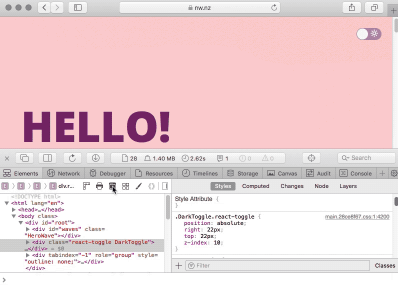
I chose to use the react-toggle library for the actual toggle button, but this should work with any toggle component — whether it’s from a library, a custom component you’ve built, or even a trusty <checkbox> element.
Here’s the code I started with:
    import React from "react";
    import Toggle from "react-toggle";

    export const DarkToggle = () => {
      return (
        <Toggle
          className="DarkToggle"
          icons={{ checked: "🌙", unchecked: "🔆" }}
          aria-label="Dark mode"
        />
      );
    };
We’ll start by adding some state that controls whether the toggle is set to dark mode and connecting it up to the toggle:
+   import React, { useState } from "react";
+   import Toggle from "react-toggle";

    export const DarkToggle = () => {
+     const [isDark, setIsDark] = useState(true);

      return (
        <Toggle
          className="DarkToggle"
+         checked={isDark}
+         onChange={event => setIsDark(event.target.checked)}
          icons={{ checked: "🌙", unchecked: "🔆" }}
          aria-label="Dark mode"
        />
      );
    };
If you’re not familiar with React’s useState hook, it’s definitely worth having a look at the official hooks documentation.
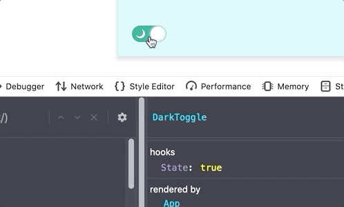
If you jump into the React dev tools you should be able to see the isDark state updating when you click the toggle:
Now let’s add in some standards-based magic so that the toggle automatically matches the user’s system dark mode setting. To do that we’ll use a great little React library called react-responsive. This lets you get the result of a CSS media query and have the value automatically update whenever the query result changes. It’s super useful stuff, all built around the standard JavaScript matchMedia function.
As you might’ve guessed the media query we’ll use is prefers-color-scheme: dark. The code for that looks like this:
    import React, { useState } from "react";
    import Toggle from "react-toggle";
    import { useMediaQuery } from "react-responsive";

    export const DarkToggle = () => {
      const systemPrefersDark = useMediaQuery(
        {
          query: "(prefers-color-scheme: dark)"
        },
        undefined,
        prefersDark => {
          setIsDark(prefersDark);
        }
      );

      const [isDark, setIsDark] = useState(systemPrefersDark);
    };
The useMediaQuery hook takes two important arguments: the media query (the first argument), and a function (the third argument) to call whenever the result of the media query changes. We want to update our isDark state whenever the media query changes, so that’s exactly what the code does.
Now if you switch your system dark mode on and off, the toggle should automatically switch at the same time. Sweet!
…But it’s not connected up to our CSS yet, so the toggle is pretty useless. To remedy that we’ll need to run some code whenever our isDark state changes. React’s useEffect hook is perfect for this — we give it an function, tell it what properties it depends on (isDark in this case), and then React handles calling the function whenever the property changes:
    [...]

      const [isDark, setIsDark] = useState(systemPrefersDark);

      useEffect(() => {
        // whatever we put here will run whenever `isDark` changes
      }, [isDark]);

    [...]
The other half of the puzzle requires a slight tweak to our CSS. There's no way our code can change the value of prefers-color-scheme, which makes it hard to force dark mode with our current set-up. Instead, we're going to make our colour variables change whenever the HTML element has dark class (which we'll dynamically add to the element in just a second):
    html {
      --primaryBackgroundColor: white;
      --primaryTextColor: black;
    }

    html.dark {
      --primaryBackgroundColor: black;
      --primaryTextColor: white;
    }
Finally, let’s update the body of the useEffect function to add (and remove) the dark class based on whether isDark is true:
    import React, { useEffect, useState } from "react";
    import { useMediaQuery } from "react-responsive";
    import Toggle from "react-toggle";
+
+   const DARK_CLASS = "dark";

    export const DarkToggle = () => {
      const systemPrefersDark = useMediaQuery(
        {
          query: "(prefers-color-scheme: dark)"
        },
        undefined,
        prefersDark => {
          setIsDark(prefersDark);
        }
      );

      const [isDark, setIsDark] = useState(systemPrefersDark);
+
+     useEffect(() => {
+       if (isDark) {
+         document.documentElement.classList.add(DARK_CLASS)
+       } else {
+         document.documentElement.classList.remove(DARK_CLASS)
+       }
+     }, [isDark]);

      return (
        <Toggle
          className="DarkToggle"
          checked={isDark}
          onChange={event => setIsDark(event.target.checked)}
          icons={{ checked: "🌙", unchecked: "🔆" }}
          aria-label="Dark mode"
        />
      );
    };
🎉 And we’re done! The page’s theme should now automatically change whenever the toggle’s value is changed, either by clicking the toggle directly or by changing the system’s dark mode setting.
Optional finishing touches
Handling more complex styles
I found that CSS variables were powerful enough to handle nearly all the tweaks I needed to make on my website. However, there were still a few edge cases they couldn’t handle (or would be inconvenient for) — things like adding a subtle border or ever-so-slightly changing a shadow opacity so it would show up better in dark mode.
For these cases I created a SCSS mixin that only applies styles when dark mode is active (similar to what we were doing before we introduced variables, where we had a media query directly in the CSS for each component). Using it looks like this:
    .Card {
      background: var(--backgroundPrimary);
      box-shadow: 0 4px 20px rgba(darken($mint, 15%), 0.22);

      @include whenDark {
         // styles to apply to the element when dark mode is active
         box-shadow: 0 4px 20px rgba(#000, 0.5);
      }
    }
The code for the mixin itself uses the & SCSS feature to reference the selector the mixin is called from, plus @content to allow content to be passed into it:
    @mixin whenDark {
      html.dark & {
        @content;
      }
    }
(If you dive into the sandbox code you’ll see I’m also using the mixin to set the colour variables, so all the CSS is using the same code to determine whether dark mode is active).
Supporting users without JS
By switching our CSS away from using the prefers-color-scheme media query to instead relying on a class set from our JavaScript code, we inadvertently broke dark mode support for any users with JavaScript disabled. (if you’re not pre-rendering your site this won’t be an issue, since the site the site probably won't display for non-JS users anyway).
Fortunately bringing back support is fairly straight forward if you’re using the mixin above — simply update it to also apply any styles when the media query is active:
    @mixin whenDark {
      html.dark & {
        @content;
      }

      @media (prefers-color-scheme: dark) {
        & {
          @content;
        }
      }
    }
Additional tips + resources
Emulating dark mode
Chrome’s dev tools let you emulate prefers-color-scheme values via the Rendering tab.
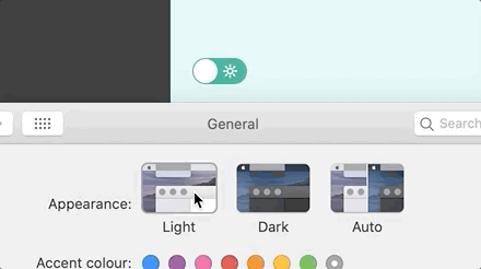
If you’re on a Mac, Safari’s dev tools also lets you flip to dark mode with the click of a button:
Remembering the user’s preference
This isn’t something I’ve done, but it’s certainly something worth exploring. If your site doesn’t already have a data-persistence solution, the use-persisted-state hook would be a great fit for the dark mode toggle.
Querying dark-mode from outside the toggle
In the set-up I’ve described the only thing that really knows if dark mode is active is the toggle component. For simple cases that’s all good and fine, but what if other pieces of your JavaScript need to behave differently based on the theme? Again, this isn’t something that I’ve needed, but any common option for sharing state should do the trick — whether it’s the Context API, Redux or whatever your site is already using.
Browser support
Bad news: our old friend Internet Explorer doesn’t support CSS variables. That means this approach isn’t going to look great there — all your variable-ized properties will fall back to their default/inherited values (e.g. probably black for text colour). If you do need to support IE, there are a few options — the main ones being css-vars-ponyfill and SASS-based fallbacks.
Resources
Here are some other resources that you might find useful (I certainly did):
Let’s Say You Were Going to Write a Blog Post About Dark Mode — even if you’re not writing a blog post about dark mode, this is an excellent starting point for diving into the edge cases, accessibility concerns and other points I haven’t really covered (sorry Chris!)
Color.review —my absolute favourite site for choosing accessible colour combos.
A Strategy Guide To CSS Custom Properties — A great article on how to strategically use and think about CSS variables.
How to design delightful dark themes — handy things to keep in mind when designing a dark theme.
Supporting dark mode in web content —some useful tips in here for dealing with images in dark mode.
Wowee, what a journey! Thanks for making it this far, and if you found any of this useful I’d love to see what you’ve built!


Top comments (1)
Had some problems with sass version but finally node-sass@4.14.1 worked