This is an archive of the second email from the series - “PhpStorm, But Better!”. In the emails, I’m sharing thoughts, news and more about PhpStorm, so make sure you’re not missing anything by signing up for the newsletter!
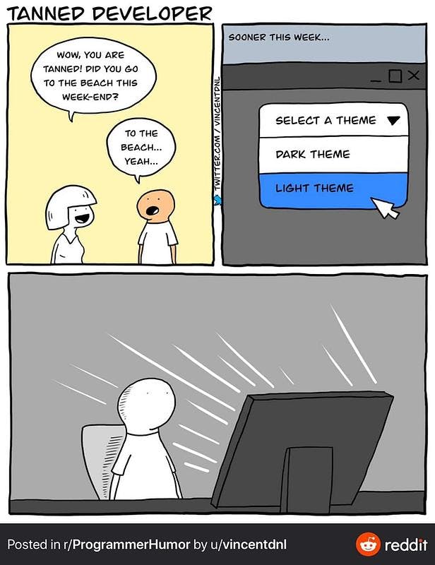
Today, we’ll explore one of the most interesting topics for me - making the IDE look good. As I mentioned in the last email, having a good theme and font is essential. You’ll be staring many hours at that exact screen, so you need to take your time and make it look appealing. However, it’s not only for you to look fancy in front of colleagues, but you also need a theme that will suit your environment and a font that is easy to read. For example, if you are in a bright environment, you need a light theme that will help you relax your eyes. If you are working late and it’s dark, you might prefer a dark theme. When switching from dark to light, or the other way around, it takes some getting used to, however, always consider it as a fresh start which might even motivate you to write more code!
Note: This is a controversial topic, all of the information given here is just suggestions that you might or might not follow. Everything is up to you!
Table of contents
Topic I - Aestetics
Removing the Panels and Floating ToolsMoving The Sidebar (Projects Explorer)- Picking Up A Theme
- Picking Up Font
- Better Icons
Picking Up A Theme
We’ll start with deciding on a theme. I’ll first give you few suggestions for a light theme and the reasons behind using one. Then, the same procedure for a dark theme. Lastly, I’ll finish off with a suggestion for a theme that is in between dark and light.
Light Theme
Now, leaving jokes aside, there are many benefits for using a light theme and there are some misunderstandings about it. You can check Brent Roose’s video on this topic. He explains the difference between contrast and brightness, colours, visual patterns and much more. I’ll summerise some of the information related to the themes.
Many people prefer dark themes invoking the reason that light themes hurt their eyes. However, this is simply not true. Brightness is what hurts your eyes, not the contrast of the theme. Many studies have shown that having dark text on a light background is much easier to read than having the opposite (especially for prolonged periods).
Introducing to you, Photon colour scheme for PhpStorm by none other than Brent himself. It is a high contrast scheme based on the colour palette of Firefox’s dev tools.
Photon
The easiest way to import the colour scheme is by opening your preferences dialog ( macOS: PhpStorm > Preferences… or Windows, Linux: File > Settings ), then Editor > Color Scheme > Import Scheme….

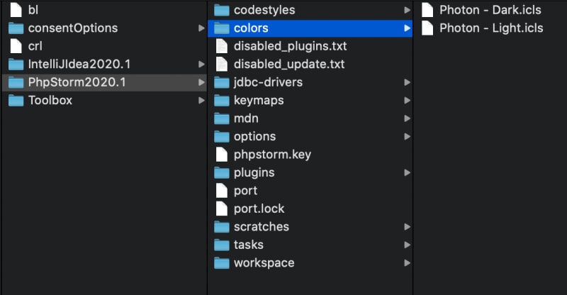
If you prefer to do all of this manually, download the .icls files from the repository and place them inside your PhpStorm preferences directory. The location depends on the OS and the version of PhpStorm. You can check more on their website. For version 2020.1 and above (I assume you are on the latest one), you can do this (where <product> is PhpStorm):
- Windows:
%APPDATA%\JetBrains\<product><version> - macOS:
~/Library/Application Support/JetBrains/<product><version> - Linux:
~/.config/JetBrains/<product><version>
Inside the directory, you’ll need to place your .icls files in the /colors folder (if you don’t have it, just create it).
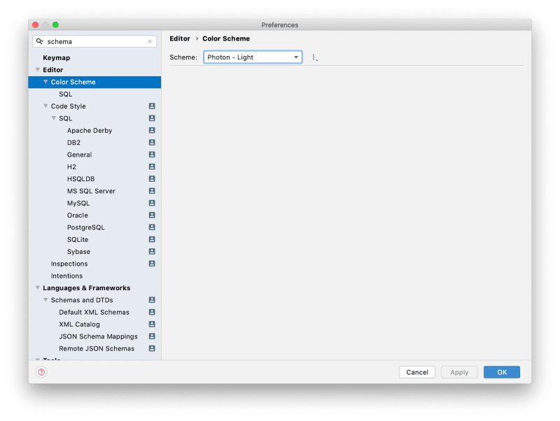
Then, restart PhpStorm, open your preferences dialog ( macOS: PhpStorm > Preferences… or Windows, Linux: File > Settings ), from there Editor > Color Scheme and select the Photon - Light scheme.
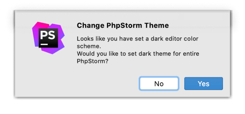
If you are switching from a dark scheme to a light one, or the other way around, PhpStorm will ask whether you want the theme to also be changed.
Now, there is a difference between a scheme and a theme in PhpStorm. This is intuitive, however, I’ll still mention it. The scheme is considered to be the syntax highlighting, while the theme is simply the colour of the dialogs, panels etc. So it goes without saying, having them match is better looking than having a huge contrast, though, you are free to experiment!
If you are not a fan of the colours of the previous colour scheme, you can check Light Lite. I often find myself switching between those two. Light Lite is again made by Brent and it’s based on the colours of Google’s logo. You might have seen it already on some of Freek’s streams or his feed when posting a screenshot of a snippet.
Light Lite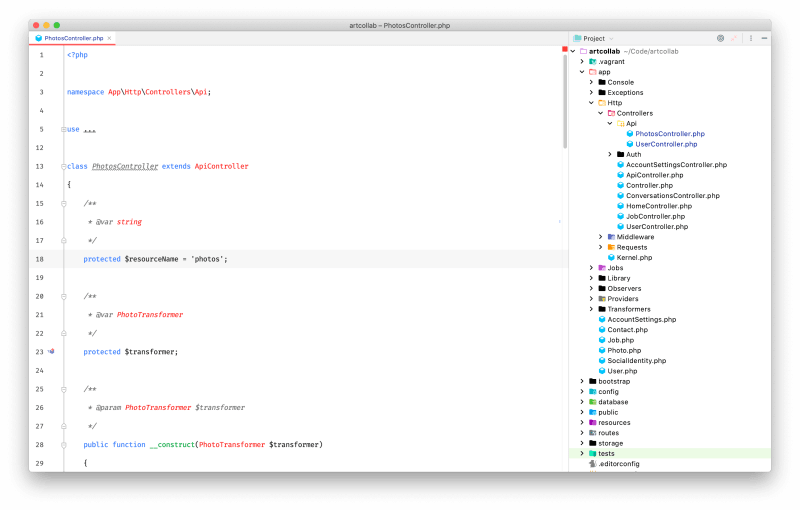
Dark Theme
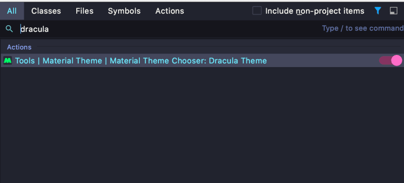
If you are still not convinced about trying a light theme, I got you! I do use dark themes as well, especially when I’m working late on a dim light. I find it easier to write code on a dark background when it’s dark around me (personal preference). I won’t be talking too much about the popular Material Theme UI that probably you’ve seen more than once. If you want to find more on how to set it up, I advise you to check Christoph’s video on it. My go-to dark theme, at the moment of writing, is Dracula + Material Theme UI.

Just download the plugin and restart PhpStorm. After the restart, the plugin will be enabled, then you can do the trick I’ve shown you last time - Navigate > Search Everywhere > type “dracula” and toggle it.
Something In Between (Kinda)
Material Solarized Light
If you don’t want a dark theme, but you also find the light themes a bit too light, then this material theme + solarized light colour scheme is just for you.
If you followed the steps from above and you already have the Material Theme UI enabled, then you are pretty much set. Just search for “solarized light” in the “Search everywhere…“ dialog and toggle it.
Picking Up Font
Picking up font is the second most important thing after getting a nice theme on. I’ll stick to the free fonts since not everyone is willing to pay for a premium and I’m one of those people - I easily get bored with fonts, and I tend to switch them from time to time. Paying any amount of money for a font that I might change in a month is not ideal.
Now, with the pricing out of the way, legibility is the most important thing! There was a trend recently where using a font with italic styling was the mainstream, and yes, while it looks nice, there is a reason why monospace fonts are better for programmers. The programmer needs to easily distinguish each letter - one extra symbol can break everything. You’ll probably know the fonts that I’ll mention, but that goes without saying that they are top in this niche.
- Fira Code (Retina) - Yes, you’ve probably seen it countless times and you might be even bored from it, however, this front stands out for its premium look which you get for free! Just head to the repository and try it out!

- Jetbrains Mono - This font is my second top pick. It’s clean, it stands out and it is a really good alternative to Fira Code.
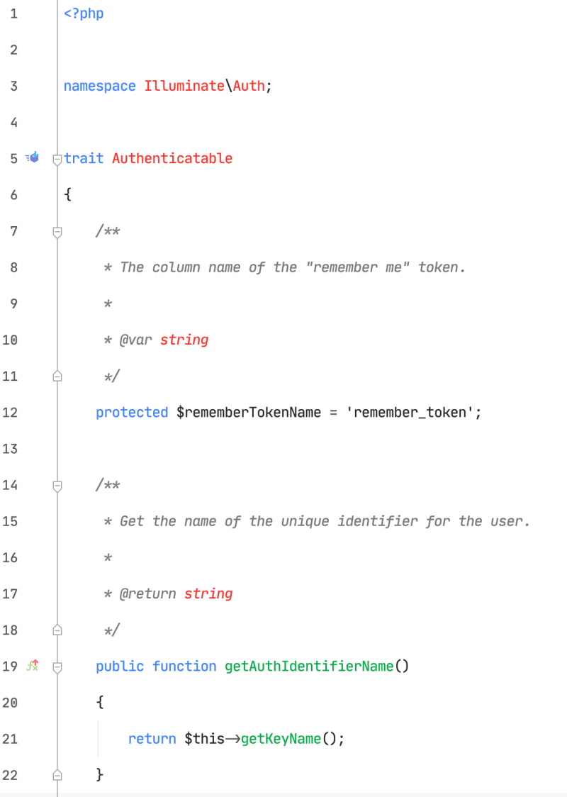
As you can see, the difference is almost unnoticeable, but trust me you’ll see it! To set up the font, go to the PhpStorm’s preferences > Editor > Font. I like having enough space between the lines, so I always go for something higher such as 2.0. On my screen, 14px font size looks perfect, so I’m keeping it like that. You can play around and see what suits you the best!

Some people love font ligatures, some don’t. That’s up to you again! You can enable them with selecting the “Enable font ligatures” checkbox. You’ll get these nice-looking symbols for !=, ==, === etc. Setting up a fallback font is also a good practice, however, if you are using Fira Code, pretty much everything is supported.
Better Icons
We’ll need to show some love to the sidebar. Even if you are not using it that much, you’ll still have to toggle it at one point. The default icons are a bit too bland for my taste.
Sidebar Before ‘Better Icons’
Sidebar After ‘Better Icons’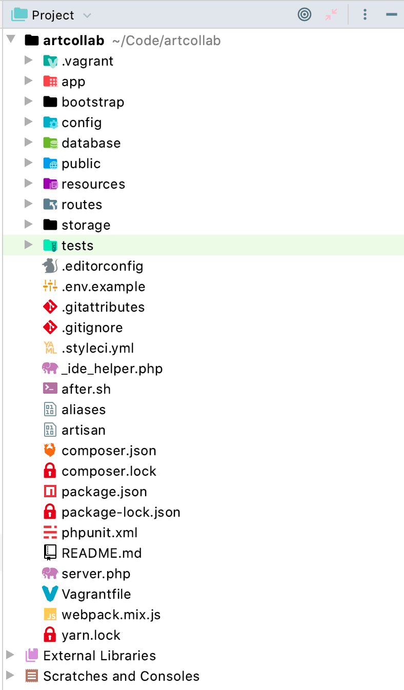
To achieve this, head to the plugins’ marketplace and get the Atom Material Icons. Install it (just like you did with the Material UI plugin), enable it, and everything will be set for you out of the box.
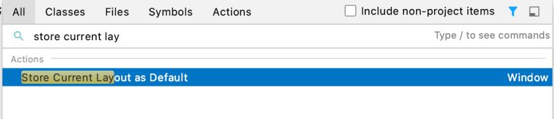
Now, we are pretty much done with our layout. We’ve organized the panels, we’ve picked up a theme and font, and we also have nice looking icons! However, as mentioned by Jorge González on Twitter, after reorganizing the various aspects of the layout (especially placing the sidebar on the right), we need to store it as default, otherwise, when creating a new project your panels might look out of place. To do that, simply select Window > Store Current Layout as Default or Navigate > Search Everywhere > type “store current layout as default”.

News
- PhpStorm 2020.2 has been released! Check out more on their website.
- Alex Vanderbist added a nice live template for quickly writing PHP arrow functions. Check out the gist he posted (we’ll be exploring live templates later in the series).
Thank you once more for the great feedback!
If you want to contribute to the newsletter, don’t hesitate to contact me either on Twitter or via email!
Next time, we’ll explore plugins for PhpStorm that will make a huge difference in your daily workflow and more!

Top comments (0)