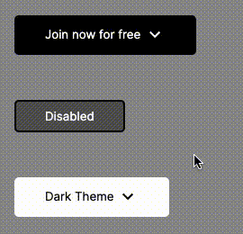
Progress to Date
In terms of the progress made by my teammate and I, we have come a very long way from 4-5 weeks ago when we were first introduced to Lit and Web Components. To date, we have been able to create a Call to Action (CTA) button extended from this example we found on Teuxdeux's homepage. We started out by constructing a very basic button composed of a <button> nested in an <a> tag, and were able to grow our visual API to support various CSS styling designs. We have developed distinct visual and funtional support for four main button states: hover, focus, active, and disabled. We have tested for accessibility concerns regarding tab order and are continuing to leverage Storybook to investigate color contrast and support for other theming styles like our "dark" mode. Finally, out button uses some cool CSS transitions and rotations to allow out button to feel more animated and interactive. This is done when the user is hovering to dissipate to a transparent background while having our caret icon spin 90 degrees.
Difficulties Along the Way
My teammate and I certainly faced a few difficulties along the way, as is common for any new learning process. There were a few nuances within LitElement that took some additional research and instructor clarification to truthfully understand how certain functions should be used. Things like the Shadowroot, the <slot> tag, reflecting properties in the constructor, and using bindings like @click just did not really click with me initially. I am used to vanilla JS where these do not exist, so wrapping my head around where the Shadowroot lies in the DOM Tree and why it is so awesome definitely took some time. Now that I have a better understanding of why reflecting properties makes data binding a breeze, it has helped situate me in my current development style as well.
TIL
After really digging deep over the past few weeks into Web Components and Lit, it really has come down to one major theme for me: Accessibility is King.
There is really no reason that anyone from major corporations to small start-up could not prioritize their online websites and products following an accessibility-first mindset. While there is an initial learning curve, web components make it incredibly straight forward and explicit in order to handle events, select attributes, and ultimately leverage the CSS cascade to meet the varying needs of my group's button. For myself, I think the idea that you have the power to influence any and all component states and properties was a really humbling fact to understand once I could comprehend it. For example, working to have the same stylistic behavior appear both when a user hovers over the button as well as when it receives tab focus was a fact I wouldn't have thought about coming in. But now that I understand why this consistency is preferable, I find myself motivated to apply this notion elsewhere in my code. Another big realization I came to is the true value in writing succinct and logical code. Things like consistent CSS variable naming and carring those styles dynamically through different button properties and states is crucial for the readability of one's code. This is definitely something I need to work on further, but the division of styles, properties, and the rendering of the component make it very easy to comprehend how a component works if the logic is succinct.
Here's a link to our Button if you are interested! https://github.com/table-in-the-corner/invisi-button

Top comments (0)