

Yesterday, I got my first ever product based coding challenge. The challenge was to develop a web app that allows for accessible nav bar usage. I used to think that making something web accessible meant that I used a good color scheme. And that’s all. I believed it was that simple. Here's my crappy, old accessibility thought process:
Use high contrast between the text and background color. The nav, main content area, and footer counted as one background.
Use Alt-Text for things I wanted to be indexed.
That's incorrect and not what web accessibility is about at all.
Here's the challenge ToDo's from VetsWhoCode's "code-challenge" slack channel:
- Add correct ARIA rules
- Ensure text is a readable size
- make the tabs on the navigation bar focusable
- Foreground/Background color ratio is at least 4:1
- Make sure that there is action to let users know which parts of the navigation bar is interactive
- Ensure that drop-down is focusable, also dismissable while on hover/focus.
I was an hour late seeing the challenge and noticed no one had posted solutions. I wanted to be the first student to get something up that worked. I dove into the deep science of web accessibility protocols, rules, and tools. Here's what I've learned so far:
ARIA stands for Accessible Rich Internet Applications. These applications assign roles, controls, and state definitions. ARIA is a set of attributes that work with a subset of the DOM known as the accessibility tree. The accessibility tree is not seen. It is keyboard controllable and screen reader friendly. It can also have nonvisible features that provide an even more unique experience.

ARIA supplements HTML by telling the accessibility tree where items are. The ability to interact with a web page element is also indexed. Here's an example of a nav bar with ARIA roles, tabindex, and the expanded attribute.
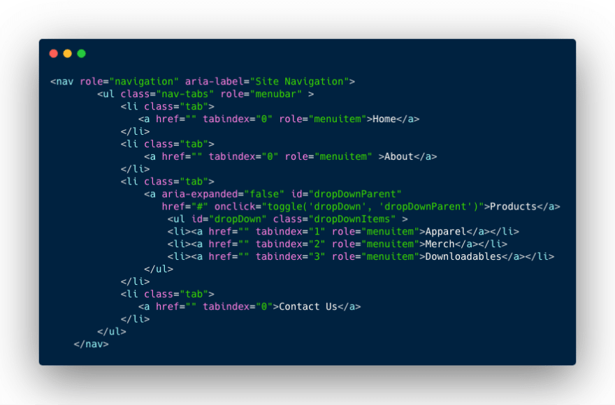
Tabindex gives the user the ability to tab over to and select menu items with their keyboards. The values that tabindex can be set to determine which order the items are listed in.
Aria-roles lets the accessibility tree know what functionality an element has. What if I used an icon as a button? I would set the role="button".
For the challenge, I had to create a dropdown nested inside of the nav bar. I used aria-expanded="false" as a default state for the items I did not want visible until the user interacts with it. Expanded true false is a unique attribute that calls for toggling using JavaScript. Here's a sample of a function that accesses two HTML elements and sets their attributes:
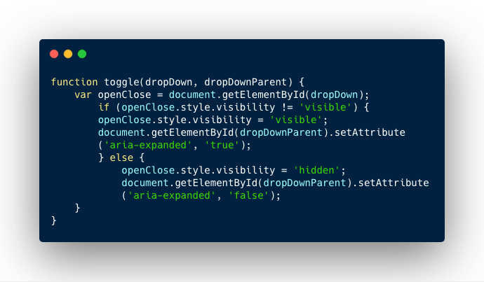
This function passes two arguments; "dropDown" and "dropDownParent". The arguments go through an if/else loop that changes the CSS visibility state of the drop down. The truth or falseness of aria-expanded is also changed at the same time.
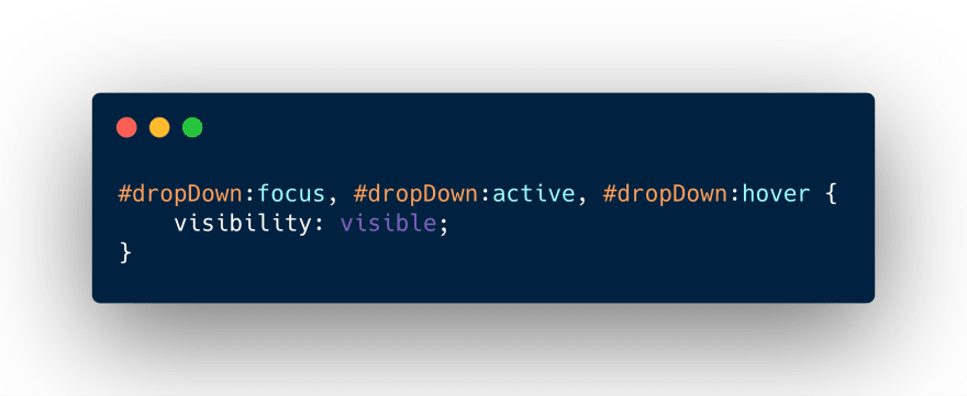
The corresponding CSS for the focused, active, and hovered states set the drop down to visible.
There are better working examples of ARIA and web accessibility. Although its a work in progress, check out my navbar on CodePen.
I still haven't completed the challenge. I would like to discuss and learn more about how to provide the best user experiences to all users. Please tell me stories about and share examples of how you've used ARIA.
Where I learned about ARIA roles:
https://www.w3.org/WAI/PF/aria/states_and_properties#aria-controls
https://developer.mozilla.org/en-US/docs/Web/Accessibility/ARIA
https://www.youtube.com/watch?v=qdB8SRhqvFc
Coding Challenge from #VetsWhoCode's slack channel. They're a veteran-owned non-profit that teaches veterans JavaScript. Learn more about them, apply for their program, or donate here: www.vetswhocode.io
 My latest cry for help includes a 5-day obsessive-compulsive water fast over a book and an unfinished code challenge. Read or watch about it in my latest post dev.to/njericooper/a-…01:00 AM - 14 Jun 2019
0
0


Top comments (6)
It's kind of sad actually how little focus is put on web accessibility in many courses teaching web development. Even that initial 'use a good color scheme' part is more than some web developers learn when they're starting out.
I think the best way to learn about this stuff though is to actually use it yourself. Just like many other things involving coding, you can read documentation all day, but until you actually have to use it yourself, it's quite often hard to understand it (or to confirm that you understand it correctly). Learning to use a screen reader when you have no vision issues whatsoever is definitely frustrating, but in going through this myself, I've learned more than I could have ever imagined about how all this stuff actually works in reality.
Also, even if you don't use Bootstrap, their documentation actually has a lot of good advice about accessibility for their own components that translates pretty well to the equivalent components in other frameworks (things like remembering to put
tabindex='-1'on the top level element of a modal, or ensuring you have properaria-labeledbyattributes on stuff).This assignment was extremely eye-opening to how little I know about web dev period. I'll certainly check out the Bootstrap documentation, turn on VoiceOver, and continue to implement more accessible coding practices into my projects. There certainly should be more conversation (vlog/ blog) posts about this. Thank you for kicking off the discussion! In your opinion, or from your experience, what are the most important ARIA attributes to include in a web app?
The first answer that comes to mind is 'all of them, used correctly', but that's obviously not very helpful.
The big thing here is figuring out on an element-by-element basis 'What is this element doing or being used for that doesn't fit it's standard usage in a web page?' Especially make a point to audit all your
<div>and<span>attributes like this, they're the most widely abused markup tags in HTML, so they're also the most likely case to be missed.The other big one is making sure that buttons that are normally just icons when accessing the app or page visually are handled properly. In particular, make the icon itself it's own element with
aria-hidden='true', and then wrap that in the actual button (or whatever you're hooking the button logic up to) and make sure that the wrapper has an appropriatearia-labelset on it so that the screen reader will announce what the button actually is without spouting useless information about the icon.I like the answer 'All of them, used correctly'! I tried to respond to this using my screen reader and, woah. Super difficult.
FWIW, DEV is actually not particularly bad when it comes to accessibility with a screen reader (they're not great either, but I've see quite a few sites that were much worse). A lot of the issue is just learning to use the screen reader effectively, as it requires a very different mental paradigm from interacting with a computer visually. The best analogy I can come up with is that it's like learning to use the Linux command-line on an old VT100 serial terminal (not an emulator, but an actual VT100) when you're used to using Windows 10 on a brand-new computer. I would suggest first getting used to using just the keyboard to interact with the web (this is also a good way to test accessibility), as it will help you get used to navigating the page in the way a screen reader usually presents it.