Objectives
- create custom bulma's css
- create home banner with header
Steps
Honestly, the guideline in the official documentation is confusing me. Probably because I am not familiar with the package manager. So I tried it based on what I am understanding.
Create folder for the custom style file
- create new folder under
srcfolder, namedstylesor anything - create new folder under
stylesfolder, namedsass - create new file named
index.scss - add following script in the file
@charset "utf-8";
@import "../../../node_modules/bulma/bulma.sass";
make sure to locate the bulma.sass correctly. since I created the index.scss under the src folder, then I defined it as script above.
Add scripts to package.json
- add following script to existing package.json
"scripts": {
  "css-build": "node-sass --omit-source-map-url src/styles/sass/index.scss src/styles/css/index.css",
....
}
define the url to your own preferences. this is to create css file based on scss file that I created previously.
Build the css
- in the terminal, run following script
npm run css-build -- --watch
This is to build the css file. After you run this script, there will be new css file created under the defined folder.
The --watch attribute is for real-time preview whenever we modified the scss file.
Import the css to the project
- import the css into
index.jsdelete the originalimport bulmafrom the file, because it will be overlapped.
Start the react project
- open new terminal and run
npm start
Modify the scss file
- custom the bulma attribute
@charset "utf-8";

// Import a Google Font
@import url('https://fonts.googleapis.com/css?family=Nunito:400,700');

// Set your brand colors
$purple: #8A4D76;
$pink: #FA7C91;
$brown: #757763;
$beige-light: #D0D1CD;
$beige-lighter: #EFF0EB;
$azalea: #FBC2C2;

// Update Bulma's global variables
$family-sans-serif: "Nunito",
sans-serif;
$grey-dark: $brown;
$grey-light: $beige-light;
$primary: $azalea;
$link: $purple;

// $widescreen-enabled: false;
// $fullhd-enabled: false;

// Update some of Bulma's component variables
$body-background-color: $beige-lighter;
$control-border-width: 2px;
$input-border-color: transparent;
$input-shadow: none;
$footer-color: true;
$footer-padding: 1rem;

// Import only what you need from Bulma
@import "../../../node_modules/bulma/sass/utilities/_all.sass";
@import "../../../node_modules/bulma/sass/base/_all.sass";
@import "../../../node_modules/bulma/sass/elements/button.sass";
@import "../../../node_modules/bulma/sass/elements/container.sass";
@import "../../../node_modules/bulma/sass/elements/title.sass";
@import "../../../node_modules/bulma/sass/form/_all.sass";
@import "../../../node_modules/bulma/sass/components/navbar.sass";
@import "../../../node_modules/bulma/sass/layout/hero.sass";
@import "../../../node_modules/bulma/sass/layout/section.sass";
@import "../../../node_modules/bulma/sass/layout/footer.sass";
when you save the file, the new custom style will be applied directly.
Add Header and Footer File
- create
Header.jsxandFooter.jsxunder thecomponentfolder.
import React from 'react';
// import 'bulma';

class Header extends React.Component{
    render(){
        return(
            <nav class="navbar is-primary is-fixed-top">
                <div class="navbar-menu">
                    <div class="navbar-end">
                        <div class="navbar-item">
                            <div class="buttons">
                                <a class="button is-light">
                                <span class="icon">
                                    <i class="fab fa-twitter"></i>
                                </span>
                                <span><strong>Tweet</strong></span>
                                </a>
                            </div>
                        </div>
                    </div>
                </div>
            </nav>
        );
    }
}
export default Header;
import React from "react";

class Footer extends React.Component{
    render(){
        return(
            <footer class="footer is-primary">
                  <div class="content">
                      <p>Created by Me</p></div>
            </footer>
        );
    }
}
export default Footer;
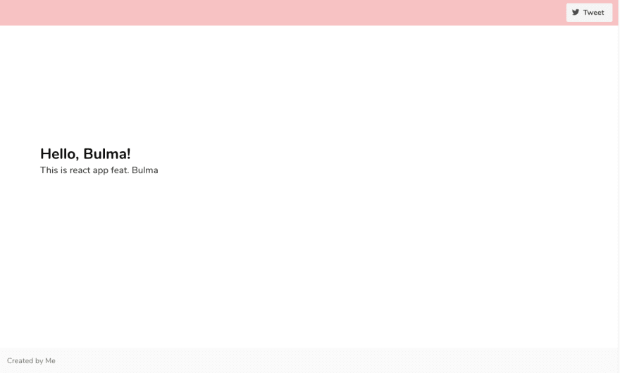
Modify the Banner.jsx file
- add the Header and Footer component
<div>
        <Header/>
        <section class="hero is-white is-fullheight">

        <div class="hero-body is-primary">
          <div class="container has-text-centered">
            <h1 class="title">Hello, Bulma!</h1>
            <h2 class="subtitle">This is react app feat. Bulma</h2>
          </div>
        </div>

      </section>
      <Footer />
      </div>
Notes
import only required library is nice if you know what you want from the library, otherwise import the complete library would be more convenient. It happened to me a lot. I keep losing some class from Bulma, and keep adding it one by one which is troublesome.
Please note that to apply the customisation, put the import script after you declare all the customisation variables.


Top comments (0)