
Welcome to part 4 of the series.
This series is inspired by this awesome YouTube series by The Net Ninja.
Create a new folder web and two files pop-up.html and style.css inside it. Also, a folder img inside it. You can get the images from my github link.
The content of pop-up.html are below.
 Basic Html
The content to show a styled pop-up are below in style.css
body{margin: 0; position: relative;}
body.pop-up{background: #222;}
*{
font-family: Calibri, sans-serif;
font-weight: normal;
color: #333;
}
h1{
font-size: 48px;
margin: 10px 0;
}
p{
margin-bottom: 40px;
}

pop-up{
position: relative;
top: 200px;
width: 500px;
margin: 0 auto;
text-align: center;
}

pop-up .container{
background: #f0e4d4;
padding: 30px;
position: absolute;
top: 50px;
width: 100%;
box-sizing: border-box;
}

pop-up input{
padding: 10px;
border: 0;
border-radius: 10px 0 0 10px;
border: 1px solid #333;
font-size: 18px;
}
button{
padding: 10px;
border: 0;
color: #fff;
background: #333;
margin-left: -5px;
margin-left: -5px;
border-radius: 0 10px 10px 0;
border: 1px solid #333;
font-size: 18px;
}
.cross{
position: absolute;
top: 10px;
left: 10px;
background: #555;
color: #ddd;
font-weight: bold;
width: 22px;
height: 22px;
text-align: center;
border-radius: 11px;
}
This will show the basic styled pop-up in web-browser.
 The pop-up
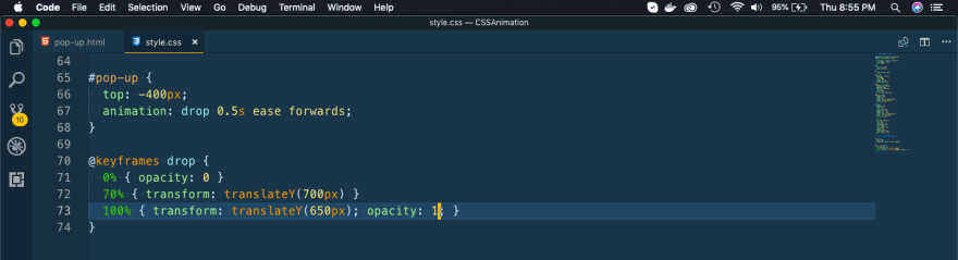
Now, we will animate our pop-up. Here we are first hiding the pop-up and then running the animation drop.
 Animating
In the drop animation, we have 3 states. At 70% we are bringing it to 700px — 400px = 300px and at 100% we are bringing it up by 50px, so creating a bounce effect. Also, changing it’s opacity for a smooth transition.
 The dropping pop-up
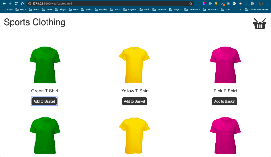
Next, we will do a eCommerce shopping cart animation. Here, if we click on any it to Add to Basket, it will animate before moving to basket.
In the same web folder create a basket.html and put the basic content in it.
<!DOCTYPE html>
<head>
  <title>Basket Example</title>
  <link href="style.css" rel="stylesheet" type="text/css">
  <script src="[https://code.jquery.com/jquery-1.12.3.min.js](https://code.jquery.com/jquery-1.12.3.min.js)" integrity="sha256-aaODHAgvwQW1bFOGXMeX+pC4PZIPsvn2h1sArYOhgXQ=" crossorigin="anonymous"></script>
</head>
<body class="basket">
  <header>
    <h1>Sports Clothing</h1>
    <div class="basket-icon"><img src="img/basket.png"></div>
  </header>
  <ul class="products">
    <li>
      <img src="img/t-1.jpg">
      <h2>Green T-Shirt</h2>
      <button>Add to Basket</button>
    </li>
    <li>
      <img src="img/t-2.jpg">
      <h2>Yellow T-Shirt</h2>
      <button>Add to Basket</button>
    </li>
    <li>
      <img src="img/t-3.jpg">
      <h2>Pink T-Shirt</h2>
      <button>Add to Basket</button>
    </li>
    <li>
      <img src="img/t-1.jpg">
      <h2>Green T-Shirt</h2>
      <button>Add to Basket</button>
    </li>
    <li>
      <img src="img/t-2.jpg">
      <h2>Yellow T-Shirt</h2>
      <button>Add to Basket</button>
    </li>
    <li>
      <img src="img/t-3.jpg">
      <h2>Pink T-Shirt</h2>
      <button>Add to Basket</button>
    </li>
  </ul>
  <script>
      $("button").on("click", function(){
          $(this).closest("li")
            .find("img")
            .clone()
            .addClass("zoom")
            .appendTo("body");
            setTimeout(function(){
                $(".zoom").remove();
            }, 1000);
      });
  </script>
</body>
Now, also put the basic style in style.css to show the layout.
header{
  padding: 10px 20px;
  border-bottom: 1px solid #eee;
  background: #fff;
}
header:after{
  display: block;
  content: "";
  clear: both;
}
.basket ul{
  padding: 0;
  margin-top: 40px;
}
.basket li{
  display: inline-block;
  list-style-type: none;
  width: 30%;
  margin: 30px 1.5%;
  text-align: center;
}
.basket button{
  border-radius: 10px;
  cursor: pointer;
}
.basket header div{
  float: right;
  position: relative;
  z-index: 1;
}
.basket header h1{
  float: left;
}
It will show this awesome layout.
 t-shirt store
You might have also noticed that we are using the below jquery in our page. It is used to create a class zoom, when the user click on any item and also remove it after 1000 ms.
 jquey
jquey
Next, we will add animation in our css and will target the zoom class.
 zoom
zoom
Now, when we click any Add to Basket button a small t-shirt is shown for 1000ms at the top.
 Small image
Now, we will complete our animation to slowly fade and also move towards the cart.
 Our animation
This will show this awesome animation, every-time we click on any Add to Basket button.
 Awesome animation
Next, we will do a nice flip card rotate animation.
Create a new rotate folder and create a panels.html and put the basic content in it.
<!DOCTYPE html>
<head>
  <title>Basket Example</title>
  <link href="style.css" rel="stylesheet" type="text/css">
</head>
<body>
  <div class="wrapper">
    <h1>Pick a Card</h1>
    <ul class="panels">
      <li>
        <div class="front" style="background: #267df4">Hello</div>
        <div class="back" style="background: #4c8fea">World</div>
      </li>
      <li>
        <div class="front" style="background: #9126f4">Get to</div>
        <div class="back" style="background: #a144f7">The chopper</div>
      </li>
      <li>
        <div class="front" style="background: #21bf3b">foo</div>
        <div class="back" style="background: #4dd763">bar</div>
      </li>
      <li>
        <div class="front" style="background: #c3333d">tempus</div>
        <div class="back" style="background: #e74853">fugit</div>
      </li>
      <li>
        <div class="front" style="background: #c3333d">html</div>
        <div class="back" style="background: #e74853">rocks</div>
      </li>
      <li>
        <div class="front" style="background: #21bf3b">A</div>
        <div class="back" style="background: #4dd763">B</div>
      </li>
      <li>
        <div class="front" style="background: #9126f4">Super</div>
        <div class="back" style="background: #a144f7">Mariokart</div>
      </li>
      <li>
        <div class="front" style="background: #267df4">j</div>
        <div class="back" style="background: #4c8fea">Query</div>
      </li>
    </ul>
  </div>
</body>
Also, create a style.css and put basic styles in it.
body{
  background: #333;
  font-family: verdana;
}

.wrapper{
  width: 100%;
  max-width: 1200px;
  margin: 40px auto;
}

h1{
  color: #fff;
  font-weight: normal;
  text-align: center;
  font-size: 48px;
}

.panels{
  list-style-type: none;
  padding: 0;
}

.panels li{
  position: relative;
  width: 25%;
  margin: 0;
  display: block;
  box-sizing: border-box;
  float: left
}

.panels li div{
  width: 100%;
  padding: 50% 0;
  text-align: center;
  color: #fff;
  font-size: 20px;
  text-transform: uppercase;
  letter-spacing: 2px;
  line-height: 0;
  cursor: pointer;
}
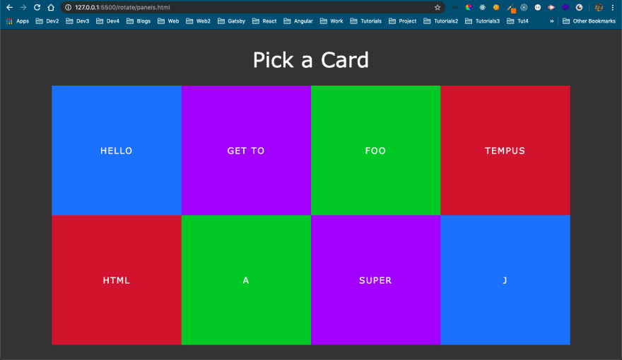
We will get this nice looking, pick a card in the browser.
 Pick a Card
Now, every li back a front and back div. We want to hide them at the start.
 Hiding
We are making them to rotate on y-axis by 90 degrees and as we know, it will make the 2D item hide.
 Hiding back element
Now, we will also have the front div have a position of absolute, to get rid of the empty spaces.
 absolute
Now, the back div are sort of hidden behind the front div.
 All hidden
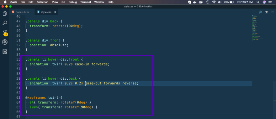
Now, we will add the animation in our front div, to rotate to 90 deg on y-axis on hovering.
Also, we are doing the opposite in our back div with an added delay.
 Animation complete
Now, this completes our nice flip animation.
 Nice one
This completes our CSS Animation Series. You can find the code for the same here.
Hope you liked it.


Top comments (0)