Using feature flags to manage releasing and operating software is giving companies a competitive advantage, and feature flags are slowly becoming an industry standard. Albeit, the testing approach to feature flags in deployed applications has been somewhat uncertain considering feature combinations, deployments and the statefulness of the flags. After all, we have a different version of the application with the same suite of tests. At unit / component test level things are easy; stub and test the possible combinations. With a served or deployed app, the flag state in fact changes the app and having a different e2e suite per deployment is impractical. How can we handle this kind of complexity? What are some effective test strategies?
In this series we will talk about setting up a mid size front end app with LaunchDarkly (LD) feature flags (FF) , using every flag variation. Then we will focus on test strategies for releasing with minimal cost and highest confidence.
We are assuming you have been signed up, skimmed thorough Getting started and have access to the LaunchDarkly dashboard. Throughout the guide we will be using this repo, a mid-size React app with Cypress e2e, Cypress component tests, CI in GHA etc.. Mind that LD trial period is 2 weeks, therefore signing up will be required to fully reproduce the examples. A version of the app without feature flags can be checked out at the branch before-feature-flags. The PR for this post can be found here. This example uses React SDK to setup the flags, however testing a front end application is the same regardless of the framework.
- Setup the project at LD interface
- Identify the flaggable features of the application
- Connect the app with LD
- Use a boolean variant FF in a component
- Use a number or string variant FF in a component
- Use a boolean variant FF to wrap an effect
- Use a Json variant FF for complex logic
Setup the project at LD interface
We will start by creating a new project, and switching to it.

The critical items to note are the SDK key - since we are using React - and Client-side ID. These will connect our app to the LD service.

Identify the flaggable features of the application
While going through the book React Hooks in Action - Manning Publications, adding tests, taking all kinds of liberties, a few additions were identified that would be good use cases for feature flags. We can start with date-and-week.

We can create a boolean flag for it. By default we want it off.

Here is how the component would look with the flag off. In the snippet we are running a Cypress component test and commenting out the code, no magic:

Here is how it would appear with the flag on:

Connect the app with LD
We can follow the React SDK reference. Start with installing yarn add launchdarkly-react-client-sdk; mind that it is a dependency vs a devDependency. The reference guide talks about using withLDProvider vs asyncWithLDProvider. My friend Gleb already did an example with the former, so we will try the async version here to ensure that the app does not flicker due to flag changes at startup time.
All we need to do is to create the async LD provider, identify our clientSideID (https://app.launchdarkly.com/settings/projects), and wrap the app.
import ReactDOM from "react-dom";
import App from "./components/App.js";
import { asyncWithLDProvider } from "launchdarkly-react-client-sdk";

// because we are using await, we have to wrap it all in an async IIFE
(async () => {
  const LDProvider = await asyncWithLDProvider({
    clientSideID: "62346a0d87293a13********",
    // we do not want the React SDK to change flag keys to camel case
    // https://docs.launchdarkly.com/sdk/client-side/react/react-web#flag-keys
    reactOptions: {
      useCamelCaseFlagKeys: false,
    },
  });

  // wrap the app with LDProvider
  return ReactDOM.render(
    <LDProvider>
      <App />
    </LDProvider>,
    document.getElementById("root")
  );
})();
When we launch the app, we should already be seeing a GET request go out to LD, and the flag data is in the preview.


LD provides two custom hooks; useFlags and useLDClient. Let's see what they do.
// WeekPicker.js
...
import { useFlags, useLDClient } from 'launchdarkly-react-client-sdk'
...

export default function WeekPicker() {
...
  const flags = useFlags()
  const ldClient = useLDClient()

  console.log('here are the flags:', flags)
  console.log('here is ldClient:', ldClient)
...
}
We can utilize useFlags to get all feature flags, and useLDClient to get access to the LD React SDK client / LDProvider.

useFlags makes a lot of sense, but why would we ever need the whole useLDClient? The possibilities are vast but maybe one use case is when rolling out features to a subset of users. Let's add an optional user property to LDProvider.
For reference, here is the full list of LD React SDK /
LDProviderconfigurations.
// index.js
...
const LDProvider = await asyncWithLDProvider({
  clientSideID: '62346a0d87293a1355565b20',

  reactOptions: {
    useCamelCaseFlagKeys: false
  },

  user: {
    key: 'aa0ceb',
    name: 'Grace Hopper',
    email: 'gracehopper@example.com'
  }

...
Let's see what we can do with useLDClient.
// WeekPicker.js
import { useFlags, useLDClient } from "launchdarkly-react-client-sdk";

const flags = useFlags();

// let's see if we can filter the flags by the user
const user = {
  key: "aa0ceb",
  name: "Grace Hopper",
  email: "gracehopper@example.com",
};

console.log("here are flags:", flags);
console.log("here is ldClient:", ldClient);
// new lines
console.log("here is the user", ldClient?.getUser(user));
ldClient?.identify(user).then(console.log);
Would you look at that! Looks like we can do plenty with useLDClient. Good to know.

Use a boolean variant FF in a component
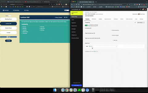
A boolean flag is the simplest variant out of the four possible variants. We will turn targeting off, we will leave the final field If targeting is off, serve ____ as empty. For now we will log the flag, wrap the section of the component with conditional rendering, and navigate to Bookings tab.
// WeekPicker.js

...
import { useFlags } from 'launchdarkly-react-client-sdk'
...

export default function WeekPicker() {
...
  const flags = useFlags()
  console.log(flags['date-and-week'])
...

return (
  ...
  {/* @featureFlag (date and week) */}

  {flags['date-and-week'] && (
   <p data-cy="week-interval">
    {week?.start?.toDateString()} - {week?.end?.toDateString()}
    </p>
  )}
)
We set default value as false and turn on the targeting. As expected we get a console false and we do not see the p getting rendered.

And when switching the default value to serve true, we get true with a visible p. Brilliant!

If we turned off Targeting, we would get null for the flag value, and p would not render.

Before we end the section, we can refactor the code a bit. The below is our preferred convention. Prefixing a custom local variable with FF_ will make flagged features easy to search later.
// WeekPicker.js

...
// use destructuring to assign the FF to a camelCased local variable
const { 'date-and-week': FF_dateAndWeek } = useFlags()

...

// use the variable
// (instead of the clunky object property reference in array format)
{FF_dateAndWeek && (
  <p data-cy="week-interval">
   {week?.start?.toDateString()} - {week?.end?.toDateString()}
  </p>
///// the clunky object property reference in array format - Do not prefer ////
...

const flags = useFlags()

...

{flags['date-and-week'] && (
  <p data-cy="week-interval">
   {week?.start?.toDateString()} - {week?.end?.toDateString()}
 </p>
)}
Use a number or string variant FF in a component
The next example is perfect for demoing what can be done beyond a boolean on/off flag.
On the Users page we have Previous and Next buttons for switching the currently selected user. We can think of four possible states these two buttons would be in (2^2).
| Previous | Next |
|---|---|
| off | off |
| off | on |
| on | off |
| on | on |
There are 4 flag variations in LD; boolean, string, number and Json. We could use Json or string too, but since the states represent a binary 4 let's use number for now. Here is the LD configuration:


In the component we import the hook and assign the flag to a variable. Then in the return we can use any kind of conditional rendering logic. 0 means both are off, 3 means both are on. 1 means only Next button, 2 means only Previous button. This way we can represent the 4 possible states of the two buttons as a number variant FF.
// UsersList.js

import { useFlags } from 'launchdarkly-react-client-sdk'
...

const {'next-prev': FF_nextPrev } = useFlags()

...

return(

...

// remember the table
// | Previous | Next |
// |----------|------|
// | off      | off  | 0
// | off      | on   | 1
// | on       | off  | 2
// | on       | on   | 3

     {(FF_nextPrev === 2 || FF_nextPrev === 3) && (
          <button
            className="btn"
            onClick={selectPrevious}
            autoFocus
            data-cy="prev-btn"
          >
            <FaArrowLeft /> <span>Previous</span>
          </button>
        )}

        {(FF_nextPrev === 1 || FF_nextPrev === 3) && (
          <button
            className="btn"
            onClick={selectNext}
            autoFocus
            data-cy="next-btn"
          >
            <FaArrowRight /> <span>Next</span>
          </button>
        )}

)
We keep Targeting on and switch the Default rule between the 4 possible flag states. If we turn Targeting off, we turn off both buttons.

For reference, here is how we would configure a string version of the same flag. The saved result of this configuration will look the same as a number variant.

And this is how we would use the string variant FF:
{
  (FF_nextPrev === "on off" || FF_nextPrev === "on on") && (
    <button
      className="btn"
      onClick={selectPrevious}
      autoFocus
      data-cy="prev-btn"
    >
      <FaArrowLeft /> <span>Previous</span>
    </button>
  );
}

{
  (FF_nextPrev === "off on" || FF_nextPrev === "on on") && (
    <button className="btn" onClick={selectNext} autoFocus data-cy="next-btn">
      <FaArrowRight /> <span>Next</span>
    </button>
  );
}
Use a boolean variant FF to wrap an effect
The app has a slide show feature on Bookables page; it scans through the Bookables continuously every few seconds, and also has a stop button. This feature could be for a kiosk mode, for example. We want to remove the stop button and stop the presentation when the flag is off.
The boolean flag setup is the same simple config as before. Here is how the app will behave with this flag:

The noteworthy part of this flag is that it wraps the effect conditionally. Remember, we do not want any conditionals wrapping hooks, we want that logic inside the hook. Here is the initial version of the code:
const timerRef = useRef(null)

const stopPresentation = () => clearInterval(timerRef.current)

useEffect(() => {
  timerRef.current = setInterval(() => nextBookable(), 3000)

  return stopPresentation
}, [nextBookable])

...

return(

...

<button
  className="items-list-nav btn"
  data-cy="stop-btn"
  onClick={stopPresentation}
  >
    <FaStop />
    <span>Stop</span>
</button>

...

)
Here is the flag setup:
import { useFlags } from 'launchdarkly-react-client-sdk'
...

const { 'slide-show': FF_slideShow } = useFlags()

...

// the same
const timerRef = useRef(null)
// the same
const stopPresentation = () => clearInterval(timerRef.current)

// useEffect with feature flag (the noteworthy part)
useEffect(() => {
  if (FF_slideShow) {
    timerRef.current = setInterval(() => nextBookable(), 3000)
  }

  return stopPresentation
}, [nextBookable, FF_slideShow])

...

return(

...
// familiar usage

{FF_slideShow && (
   <button
   className="items-list-nav btn"
   data-cy="stop-btn"
   onClick={stopPresentation}
  >
  <FaStop />
  <span>Stop</span>
  </button>
)}

...
)
Use a Json variant FF for complex logic
The Json variant might look intimidating at first, but it is what sets LD apart, enabling to represent complex logic in a simple way. On the Users page we set the Previous and Next buttons as a number or string variant, declaring that the 4 possible states of the 2 buttons (2^2) can map to the flag configuration either way. On the Bookables page there is the same functionality with the 2 buttons, and we can use the Json variant in a slick manner. Check out this configuration:

At a high level the flag looks the same in the LD interface.

In the UI it works the same as a number or string FF variant.
The neat factor is in the implementation details:
// BookablesList.js

....

const {
  'slide-show': FF_slideShow,
  'prev-next-bookable': FF_prevNextBookable // our new flag
} = useFlags()

...

return(
...

// much simpler to implement the FF this way vs map to numbers / states
{FF_prevNextBookable.Previous === true && (
 <button
    className="btn"
    onClick={previousBookable}
    autoFocus
    data-cy="prev-btn"
   >
   <FaArrowLeft />
   <span>Prev</span>
  </button>
)}

{FF_prevNextBookable.Next === true && (
  <button
   className="btn"
   onClick={nextBookable}
    autoFocus
    data-cy="next-btn"
 >
    <FaArrowRight />
    <span>Next</span>
 </button>
)}

...
)
One could further image possibilities with the Json variant; for example if we had to, we could configure 8 possible states for previous, next, slide show and stop in an over-engineered way. Besides the better developer experience using the Json flag, a suitable application of the Json variant could be when testing a deployed service and providing many possible flags altogether.

Top comments (0)