Last week was very design centric. We got to play in Affinity Designer again, which I always enjoy. Now that we have the tools and experience to build a responsive webpage, we switched gears to learn the more emotional side. How to create a feel for the page using colors, spacing, fonts, image placements and so on.
Mood Boards
Throughout the coarse, everyday we’ve been sharing examples of inspiring visuals. That could be a graphic, photo, layout, font or anything we deem visually appealing and inspiring. It’s been a fun way for us to see each other’s styles and also broaden our horizons as we all have our own tastes.
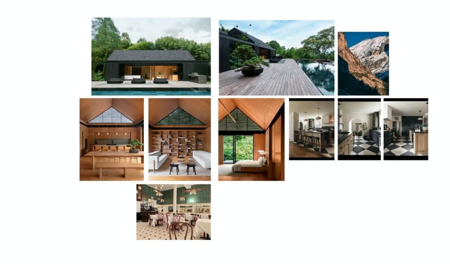
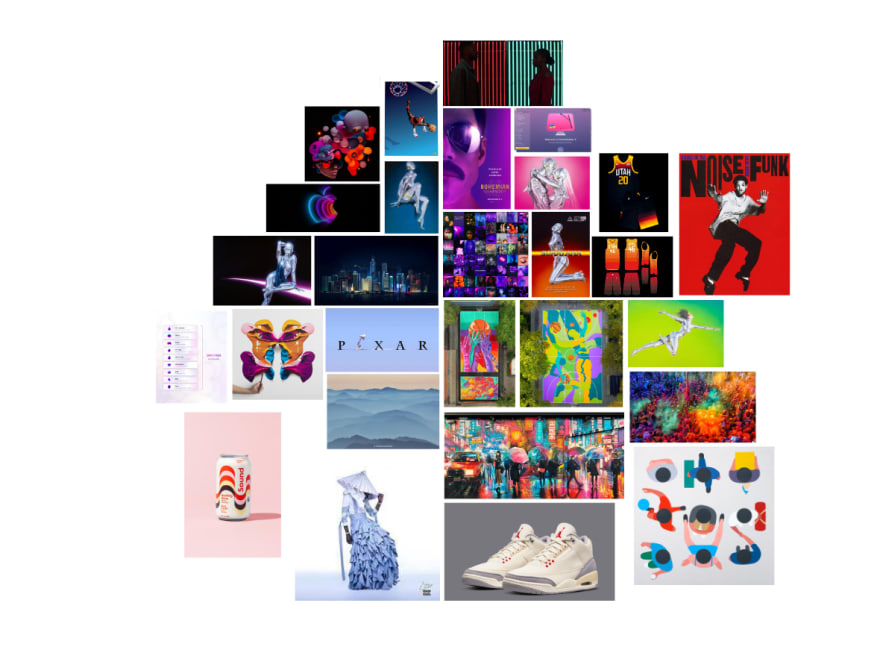
Now that we’ve had a couple month’s worth of visual inspo, it was time for us to slap them onto a canvas (digital of course) and create a Mood board. It was essentially our first step in organizing our content. I separated mine into real world content and colors as shown below. I didn’t put much thought into the placement of my images other than placing similar colors near each other. That’s just what appealed to me.
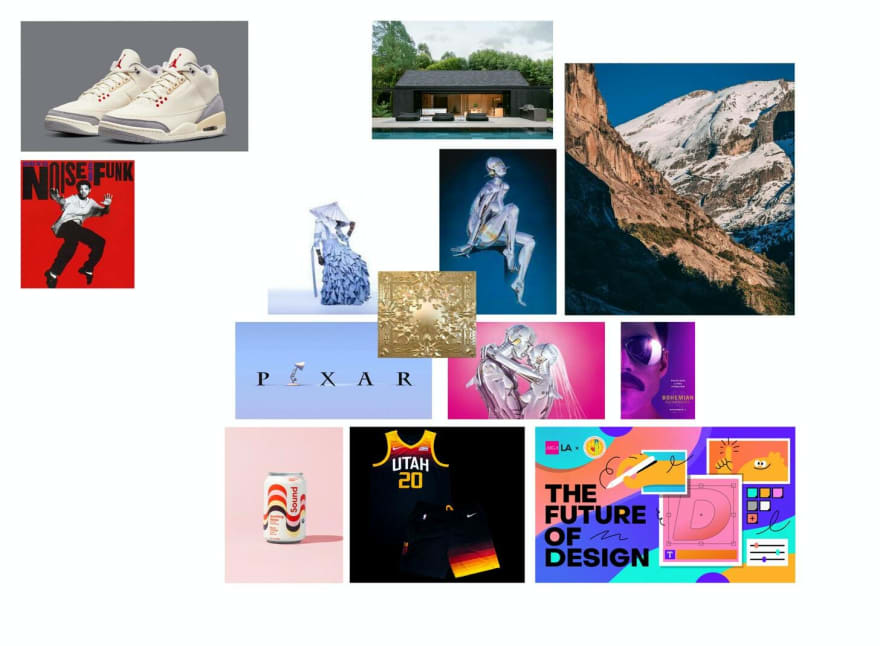
In our second iteration with the mood boards, we played around with size and spacing. This allowed us to see how different images can work together. Some images might harmonize and others may clash, but we have to move them around to find out. When one image is really small next to another that’s really big, what kind of feel does that create and vice versa? In the example above, I placed the cover of Watch the Throne (the gold metallic square in the center) above four other images to see how that might play with the different colors. I kind of like the dark blue, but that’s about it. This was good practice for us to get a feel for creating different moods with our visual inspos.
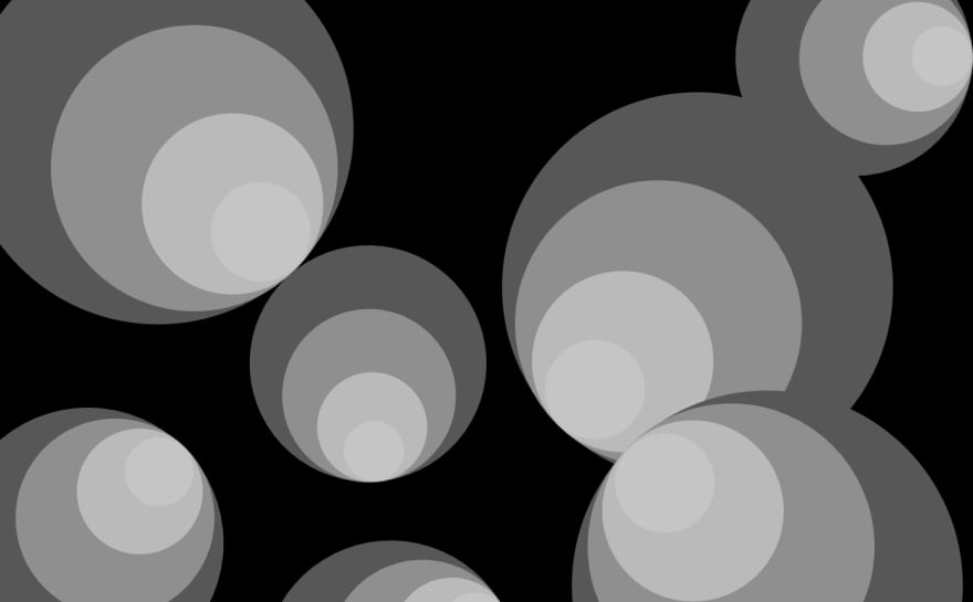
Grayscale
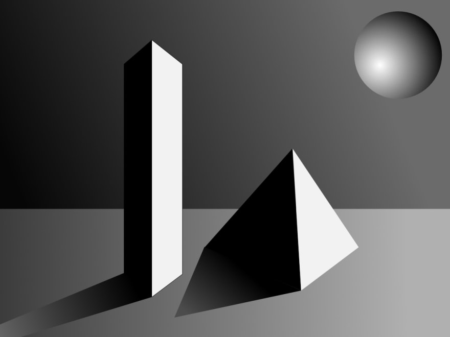
We spent a day creating graphics and layouts in grayscale. The idea was to learn how we can visually create feel in the absence of color. I did not realize how much you can do without color and now I’m convinced we don’t need color. We can all have the vision of canines and be happy. Again, spacing, using black versus white all impact the mood. I had a lot of fun creating the images below. As you can see, I didn’t use any white, which I’m only realizing now.
Fonts and Spacing
We learned all about fonts and spacing. Well, as much as you can learn in a day when there’s entire academic and professional disciplines in this field. You may not realize it, but fonts and spacing play a huge role in the design and feel of a website. For example, this blog uses sans-serif for the headers and a serif font for the body text. It would probably feel different if the headers used a serif font and the body sans-serif.
Through great design, you can intentionally guide the users’s eyes along your designed path. There’s a principle using “small, medium and large”. That could be for both text and spacing.
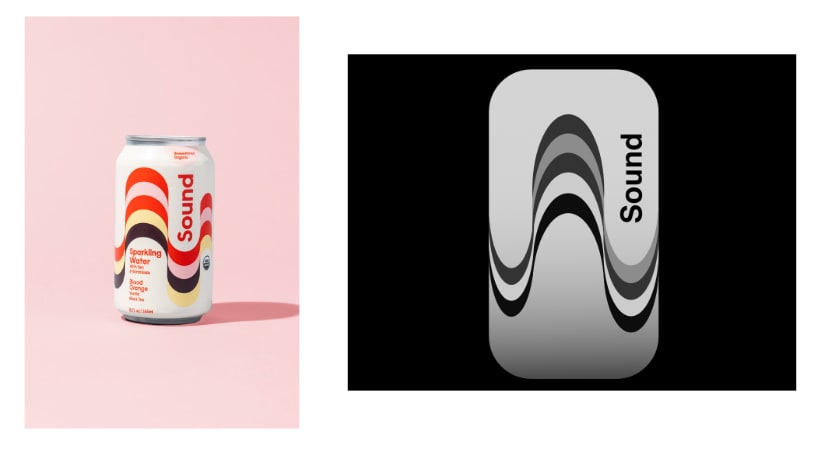
In one of our assignments, we researched a layout that utilizes intentional spacing and size and recreated the layout with HTML/CSS. Here’s the layout I found.
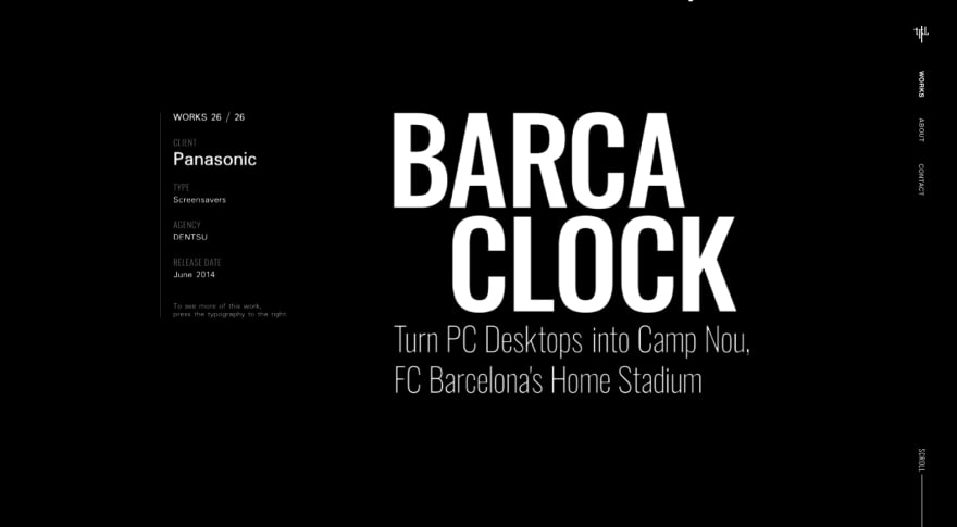
I thought it made great use of the “small, medium, large” principle where your eyes go straight to the “Barca Clock” (large), then below it you read the sub-header (medium) and to the left you read the details of the project (small).
I also liked the way the text lines up with each other. The top of the project details on the left lines up with the top of “Barca”. It kind of centers the content horizontally on the page. Then the middle block of content is packaged together on its own, aligning on the same left line. It appears that the middle block of content has about the same amount of padding all around it. This helps emphasize the content and makes it the “feature” of the page.
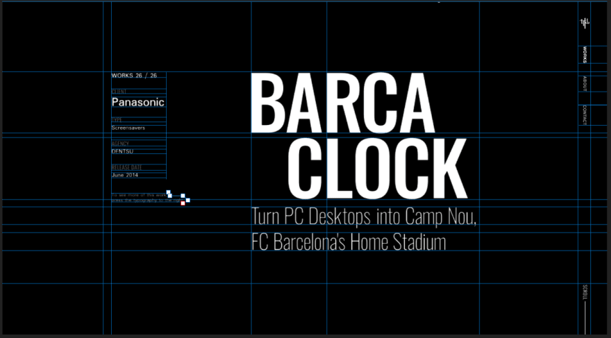
What stood out to me the most was the “R” in “Barca” and the “L” in “Clock” both being left aligned together. It appears that’s that middle of the page vertically. It adds to the focal point. I also think having “Clock” indented and breaking from the left alignment gives the body of text some character.
If you’d like to see my recreation, you’ll have to click here!
Vocabulary word of the week:
Rag: The shape that a body of text makes.
Style Tiles
Every time I type “style tiles” I want to type “style tyles” instead. Is that just me? In any case, we were introduced to style tiles, which is a way for a designer to give you an idea of the general look and feel of a product (in our case a website). It’s like a one-pager for the potential final product. It may include a color palette, different button options, examples of a header, sub-header and body text; basically any of the major components you expect to see or use on a site. It’s all packaged together in one, organized page. Check out this dribble collection for examples.
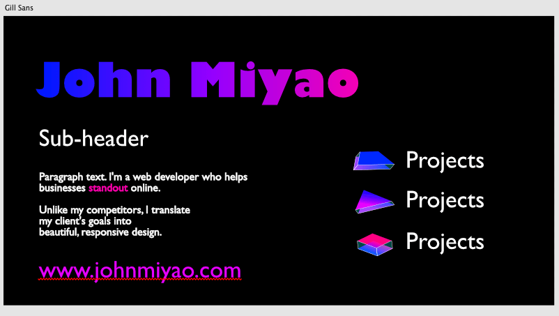
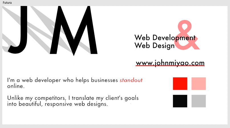
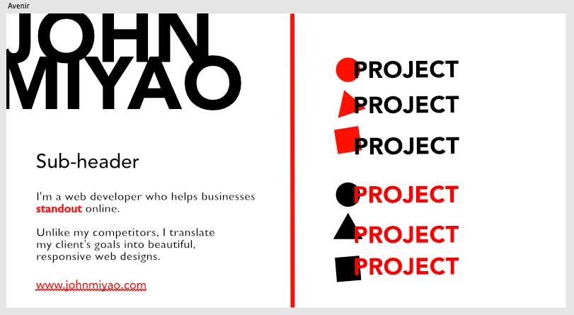
It took me a while to figure out what exactly goes on a style tile and it’s something I’m still learning. Here’s examples of my attempt at some style tiles for my personal project site. You’d likely have more than one style tile to allow for different styles or feels. Below, I was going for clean and modern.
That's it for now! Have a great weekend!

Top comments (0)