
This week we got to take a reprieve to relax, catch up or do whatever we pleased. I knew I couldn’t take a full week off without any sort of practice. I’m still so new that if I don’t practice, I’m liable to forget some things. So you can probably guess what I used this week for, PRACTICE.
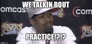
If you don’t get that meme, watch this.
For practice, I decided I would try and replicate a website. Our mentor threw out some sites he thought we could recreate so I chose a Starbucks. It looked relatively simple. Just a header, large footer and the main body section looked like it was split in half vertically with a few different rows all inside an inner-column. Something I know I could accomplish using our trusty flexbox we’ve been learning. Here’s how I broke down the page:
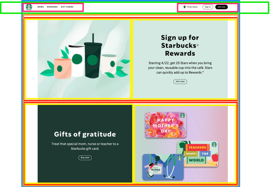
Each color represents a section or div. The blue section is the inner-column that everything is wrapped in. The red sections are flexbox rows. Each row contains two equally sized divs (in yellow). As you can see, the red div change from a column (in mobile) to a row (in web). As far as layout, I think this was a fairly easy one to recreate. Also, it only has two views, mobile and web. We’ve already created more complicated sites that included a tablet-sized view.
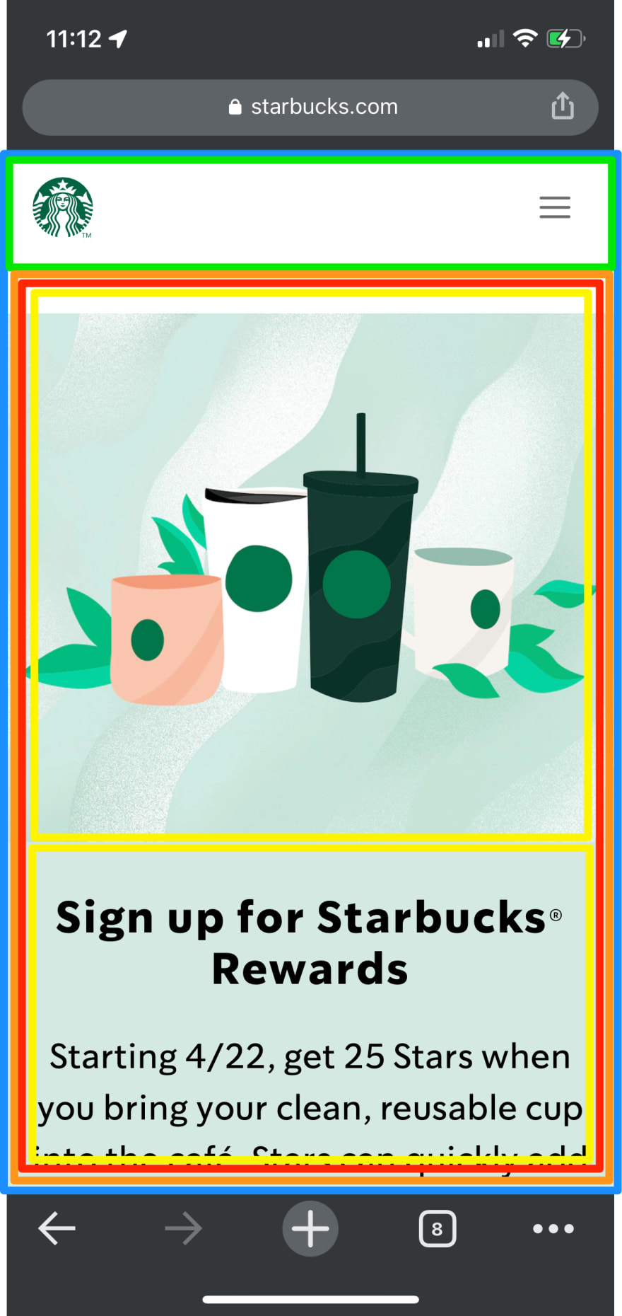
Of course I built this mobile first! (See how quickly I learn?) I built it out section by section starting with the header, which was the most complicated. In mobile it only displays the logo and a hamburger menu icon. That’s fairly simple, but as the width expands the links appear. I initially had some trouble spacing them out, but fortunately we have our resident mentor on call to help us through these issues. A simple flex-grow solved my problem.
Because I wanted my replica site to look exactly the same, I spent some too much time making a lot of tweaks to the padding and margins. I suppose I could’ve looked at the inspect tool to save time, but that would’ve taken the fun out of it and it wouldn’t be nearly as rewarding.
Some CSS Tools
Building this replica Starbucks allowed me to use some CSS tools that we’ve learned over the course.
1. Creating custom fonts
Instead of styling the h1, h2 or p properties directly. I created classes for each type of “voice”. For example, h1 would get a class of “loud-voice” and I would style that class. This proved beneficial when I decided to change the h2’s to h3’s, but didn’t want their style attributes to change. I simply changed the elements in the HTML doc and it was like nothing ever changed :)
2. Creating Custom CSS Properties
This was a very new one we learned. In CSS you’re able to set colors in a parent element. I used two different shades of green a lot throughout the page so I set the colors in the body like so.
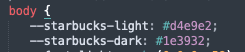
Now anytime I wanted to recall those colors, instead of having to remember the confusing alphanumeric hex number, I just had to recall the name I gave it, “starbucks-light” which was much simpler.
3. Row Reverse
When I did all of my practice flexbox challenges, I could not think of when row-reverse or column-reverse would be useful. Well guys, it was very useful! When you scroll through the Starbucks site, you see that the photos and its pairing of text switches every row, like this:
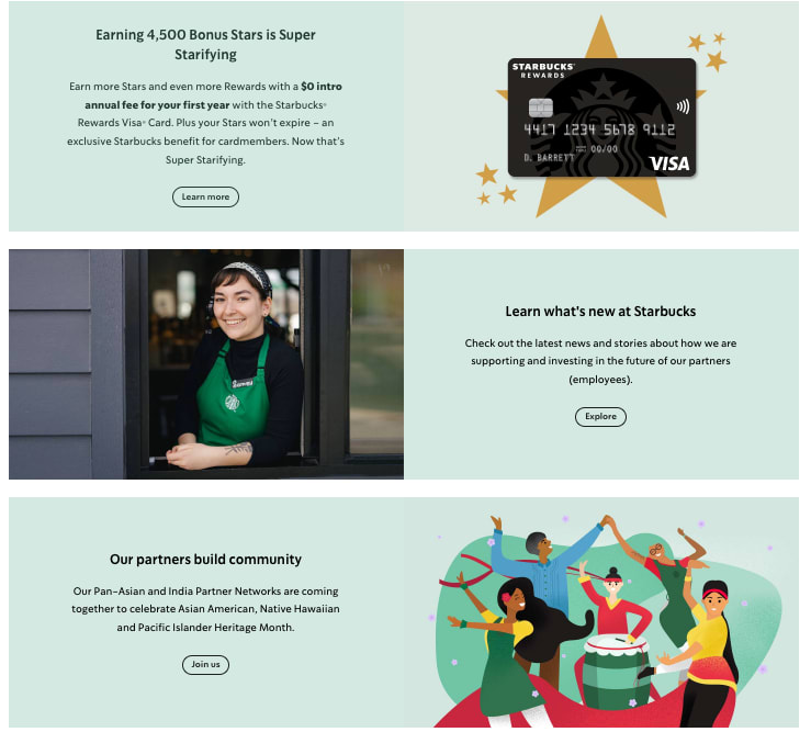
Instead of having to switch the html foreach row, I simply had to display the flexbox as “row-reverse!” It was quite satisfying to have a practical use for it and see it actually work.
4. SVG image
I decided to use an SVG image for the location pin icon. I don’t know if I needed to use an SVG as the icon doesn’t really need to scale, but I thought it would be good practice to incorporate. What lead me to go with an SVG for icon is the hover state. I need it to turn green when hovered and since I knew I could do that with an SVG, i did it.
Overall, getting the structure of the site down was fairly easy. I mostly found trouble in the some of the spacing and figuring out which parent element I thought would be best to style. I also got hung up on the transitions from mobile to web and how the images and text aligned. I know this bit is unimportant as people don’t normally resize their screen views, but for reasons unexplained I needed my replica to interact in exactly the same way.
Now it’s time for the final test. Which is the real site and which is the replica? Top or bottom?
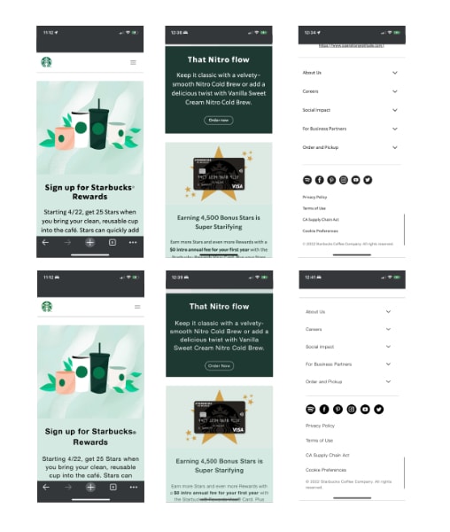
Or you can view it for yourself here and here. But maybe you already visited my replica site as I linked it earlier ;)
A couple notes about my replica. I did not apply any links as I didn’t feel it was necessary to copy/paste every link. There’s probably about 50 or so. I was also unable to create any click-actions such as the drop-downs or hamburger menu as we haven’t learned those functions yet.
In any case, I was quite pleased with the results and it was really good practice for me. It required me to think through the layout for both mobile and web and create class names that were intuitive to the site. What should I build next? Comment below!
I almost forgot! Twitter count remains at 33. I’ll take responsibility as I haven’t been tweeting lately. I don't know what to tweet!

Top comments (3)
Hey thanks for some of these tips, never thought about color coding the div's. Thanks for the share.
Anytime! We did this earlier in our course with @perpetual_education to breakdown a page into its elements. Helps me structure the HTML. Wish I could say it was my own idea!
Most kids draw on the wall - or put mustaches on people. It's not a wildly amazing leap to draw some boxes. I guess we have to get reconnected to our inner child!!! Great job, John.