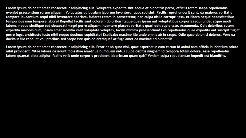
In the last part of this series, we made the Navbar component which returns a nav element that has reactive variables. So in this part, I will explain the Dummy component. You may be wondering why it's called a "Dummy"; this is because this component will return some style dummy text i.e (Lorem ipsum dolor...).
Let's get started!!!
First, make a file called 'Dummy.svelte' in the lib directory.
touch Dummy.svelte
We are going to create two h3 elements that have some text inside them and style the elements.
Dummy.svelte
  <h3>
    Lorem ipsum dolor sit amet consectetur adipisicing elit. Cum quia quas voluptate assumenda quae ipsum incidunt, temporibus ducimus molestias, atque sunt amet sequi distinctio enim nostrum dolorum, culpa deleniti animi!
  </h3>

  <h3>
    Lorem ipsum dolor sit, amet consectetur adipisicing elit. Nulla dolor architecto facere expedita amet ex eum. Odit magni repellendus consequatur beatae. Animi voluptates quo, accusamus consequuntur soluta deserunt eius iure?
  </h3>

  <style>
    h3 {
      padding: 0 20px;
      line-height: 1.3;
      font-family: 'Trebuchet MS';
      z-index: 0;
      position: relative;
    }
  </style>
Notice that the h3 has a CSS z-index property of '0' and a position of 'relative'. In the Navbar component we set the z-index of the 'nav.nav-bar' element to 1. We did this so that the nav element will stay on top of the dummy text when it appears. To better understand what I mean, here's a link to the CSS z-index property.
Tip for VSCode users: type 'lorem' and hit tab to give you some dummy text. Powered by Emmet.
To test this in the browser, we will render the component we just made. Let's go into App.svelte and import 'Dummy', declare and import some styles in App.css.
App.svelte
  <script>
    import Dummy from './lib/Dummy.svelte';
  </script>

  <style>
    main {
      padding: 5px;
    }
  </style>

  <main>
    <Dummy />
  </main>
Notice that we did not declare any exports in the 'Dummy.svelte' file, that is just how svelte works.
App.css
  body {
    background-color: #000;
    color: whitesmoke;
  }
main.js
  import App from './App.svelte';
  import './App.css';

  const app = new App({
    target: document.body
  });

  export default app;
So, we have just made the main element have a padding of 5px to give some space from the sides. Type in the terminal:
npm run dev
Click on the 'localhost:5173/' to see it in your browser.
That is it for the Dummy component, in the next part we will import the Navbar component into App.svelte and finish up the navigation bar.
Thank you for reading and stay tuned for the next part.


Top comments (0)