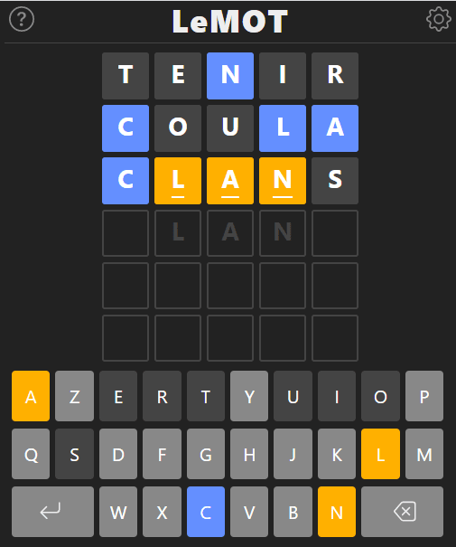
Last Sunday, I added a dark theme to LeMOT, my French Wordle. Some players seemed to want it and it was a good opportunity for me to see how to do it without too many fuss.
Colors for light mode
To start with, I looked for the colors used in my CSS file and I found about ten of them. But in practice, this corresponds to the following 12 use cases:
-
#ffffor the general white background -
#333for the general near-black text -
#888for slightly lighter text in italics -
#dddfor text watermark -
#ccclight gray for the background of unused keyboard keys -
#fffwhite to display the letters once played in the boxes -
#ffb000the famous orange for the background of well placed letters :) -
#648fffthe blue for the background of misplaced letters -
#ddda slightly lighter gray for the background of the letters missing from the word to guess -
#bbbnot very light gray for icons -
#dc267fa purple background for the "unknown word" message -
#fffwhite text for the "unknown word" message
Done!
Colors for dark mode
I then searched what colors to use when in dark mode. It wasn't too difficult, since you just have to look at the original Wordle for inspiration... After a few tries, I came up with these colors:
-
#222for a very black general background -
#333for a very white general text -
#888for a less white italic text -
#444for the watermark text in grey / black -
#888a "medium" gray for the background of the unused keyboard keys -
#fffwhite to display the letters once played in the boxes -
#ffb000the famous orange for the background of well placed letters :) -
#648fffthe blue for the background of misplaced letters -
#444a gray / black for the background of the letters absent from the word to guess -
#888a "medium" gray for the icons -
#dc267fa purple background for the message "unknown word" -
#fffwhite text for the "unknown word" message
As I display links in bright blue (#00f), I had to find another one that would look good in both dark and light modes. I took the blue #2962ff from one of my other sites, but I probably have to improve it because I'm not very happy with it...
Dark colors, done!
Setting light or dark theme
Now, either I was finally starting to code a settings screen, or I was cheating by relying on the prefers-color-scheme media directive. This directive detects the user's choice of theme preference (dark or light).
Of course I did the easiest one. But also the most normal one in my opinion: why force people to repeat in my game what they have already set on their phone or browser!
And so now, my CSS file starts with a bunch of CSS variables.
/* Thèmes
   ========================================================================== */

:root {
  --fond-general: #fff;      /* Fond blanc général */
  --texte-normal: #333;      /* Texte quasi noir */
  --texte-clair: #888;       /* Texte plus clair pour notes */
  --texte-jouee: #fff;       /* Texte blanc une fois la lettre jouée */
  --filigrane: #ddd;         /* Couleur du texte en filigrane */
  --message-fond: #dc267f;   /* Fond mauve pour les messages */
  --message-texte: #fff;     /* Texte blanc pour les messages */
  --touche-fond: #ccc;       /* Fond gris clair pour touche inutilisée */
  --touche-texte: #333;      /* Texte quasi noir pour touche en général */
  --fond-correct: #ffb000;   /* Orange pour les lettres bien placées */
  --fond-present: #648fff;   /* Bleu pour les lettres mal placées */
  --fond-absent: #ddd;       /* Gris clair pour les lettres absentes */
  --couleur-icone: #bbb;     /* Gris pas très clair pour icones */
  --texte-lien: #2962ff;     /* Bleu pour les liens */
}

@media (prefers-color-scheme: dark) { :root {
  --fond-general: #222;      /* Fond très noir général */
  --texte-normal: #eee;      /* Texte très blanc */
  --texte-jouee: #fff;       /* Texte blanc une fois la lettre jouée */
  --texte-clair: #888;       /* Texte moins blanc pour notes */
  --filigrane: #444;         /* Couleur du texte en filigrane */
  --message-fond: #dc267f;   /* Fond mauve pour les messages */
  --message-texte: #fff;     /* Texte blanc pour les messages */
  --touche-fond: #888;       /* Fond gris moyen pour touche inutilisée */
  --touche-texte: #fff;      /* Texte blanc pour touche en général */
  --fond-correct: #ffb000;   /* Orange pour les lettres bien placées */
  --fond-present: #648fff;   /* Bleu pour les lettres mal placées */
  --fond-absent: #444;       /* Gris-noir pour les lettres absentes */
  --couleur-icone: #888;     /* Gris moyen pour icones */
  --texte-lien: #2962ff;     /* Bleu pour les liens */
}}
A good thing done!
A last one for the road...
I use an antiquity to compress CSS (Microsoft Ajax Minifier) and it didn't hold up against CSS variables :( So for now, I went to the first comer, namely CSSO, via its csso-cli version to do the job.
I wonder if it would be possible to compress the CSS variable names, so that --fond-general is shortened to --a, --texte-normal becomes --b, etc...
This is something I'll definitely have to review some day to make an informed decision about what I'll use from now on...
Conclusion
Anyway, another weekend well spent, since it is finally possible to enjoy LeMOT to its fullest, even if you prefer to use a dark mode!
And to play, it's still there: https://www.solitaire-play.com/lemot/ :)
This post was originally published on blog.pagesd.info.


Top comments (0)