Hotspots are visual indicators applied over an image with a call to action (hyperlink, tooltip, modal).
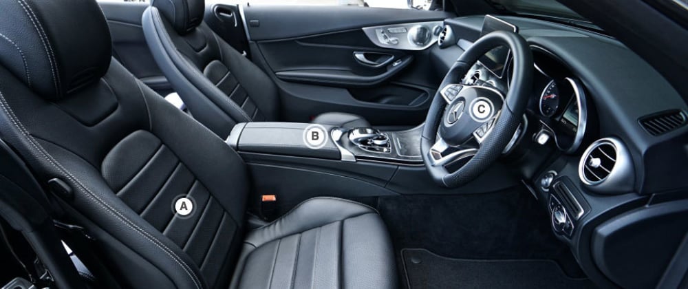
In this example we’ll be using hotspots to highlight some features of a car interior.
Demo -> https://codepen.io/michaelburrows/pen/PoZeJvy
Let’s get started with the HTML.
<div class="hotspots">
  <img src="https://images.pexels.com/photos/1104768/pexels-photo-1104768.jpeg" />
  <a href="#" class="hotspot" id="hs-a">A</a>
  <a href="#" class="hotspot" id="hs-b">B</a>
  <a href="#" class="hotspot" id="hs-c">C</a>
</div>
If you want to add more hotspot just be sure to give them a unique id.
Now for the CSS.
For this to work we need a relative positioned parent (hotspots) and absolute positioned children (hotspot).
.hotspots {
  position: relative;
}
.hotspots img {
  max-width: 100%;
  height: auto;
  display: block;
}
.hotspot {
  position: absolute;
  width: 30px;
  height: 24px;
  padding-top: 6px;
  border: 3px solid rgb(255, 255, 255, 0.8);
  border-radius: 50%;
  animation: fader 2s ease infinite;
  transition: all 0.2s;
  text-align: center;
  text-decoration: none;
  font-weight: bold;
  font-family: sans-serif;
  color: #555;
}
.hotspot::after {
  content: "";
  width: 24px;
  height: 24px;
  background-color: #fff;
  border-radius: 50%;
  display: block;
  margin: -21px auto 0 3px;
  transition: all 0.2s;
}
We can now position our hotspots in the desired locations using percentage based measurements.
#hs-a {
  top: 50%;
  left: 25%;
}
#hs-b {
  top: 32%;
  left: 44%;
}
#hs-c {
  top: 25%;
  left: 68%;
}
If you resize your browser the hotspots will now maintain their position over the image.
To finish we’ll add some simple animation and some hover effects.
The following CSS will make the hotspots green on hover and also fade in and out the border.
hotspot:hover {
  border-color: lightseagreen !important;
  animation-play-state: paused;
  color: #fff;
}
.hotspot:hover::after {
  background-color: lightseagreen;
}
@keyframes fader {
  50% {
    border-color: rgb(255, 255, 255, 0.2);
  }
  100% {
    border-color: rgb(255, 255, 255, 0.8);
  }
}


Top comments (0)