
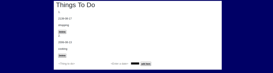
In the previous post, we have built a little "To-do"-App, however, we didn't give it any styling yet. I guess you could call it quite ugly, and definitely not user-friendly:

Now let's apply some CSS and a little bit of logic to it in order to turn it into a proper app!
About CSS and Bootstrap
As you can guess from the title, one of the goals of this tutorial is to create a responsive app, i. e. a design that scales with the screen size of the device. Now it is really not easy to specify all the cases in CSS, therefore I personally prefer to use a framework for that. One of the most famous ones is Bootstrap.
(Read here for a introduction how to use CSS and Bootstrap in PicoLisp.)
I personally don't have much experience in CSS and I'm also not very patient with it, but Bootstrap makes it quite easy to cover the most important aspects of responsiveness "by itself", like this:

And on mobile:

You can find the hosted version here.
To get started, let's add the bootstrap.css file as second css file to the page, and a custom.css file (empty) as last item:
(setq *Css '("@lib.css" "css/bootstrap.css" "css/todo-custom.css" ))
Replace buttons by icons
We can replace the button label text by icons and specify the size in the custom.css field:
(gui '(+Style +Button) "button-icon" T "img/delete.png"

Defining Containers
Now we can define the Containers. From the Bootstrap docs:
Containers are a fundamental building block of Bootstrap that contain, pad, and align your content within a given device or viewport.
What does that mean? It means that setting a container keeps your content inside a certain range, even if your screen is larger. If we are using a super large screen, we still don't want to spread our list items all the way from left to right side. So we pick a nice container to use:

I picked container-sm. This removes any margin if you access the page from a slim viewport, but keeps a frame if the viewport is larger. Furthermore, let's say the background color should be white. So this is what we wrap around the whole content:
(<div> "bg-white container-sm"
   ... )
Next, we put both form sheets in a container-sm as well. Why? Because it will keep a pretty margin to the outer container if the screen is large enough, but skip it if it's too small.
(<div> "container-sm"
   (form NIL
      ... ) )
To make the containers visible, let's give our html form a body-class as well and define it in custom.css. We can set the background color there.
This sets the <body class="todo-body">:
(html 0 "Todo" *Css "todo-body"
and in custom.css, we define the background color:
.todo-body {
   background-color: #000066;
}
On a medium-sized screen, it now looks like this:

Containers also give the possibility to structure the content in the middle or spread it over the whole viewport. Read here for details, it is quite useful.
Structure the list output
At the moment, we're just printing the list as it is. This is not really useful. Let's break the items up into pieces.
Let's say we have this list: ("shopping" 781432 "green"). How can we get the items? If you read the post on List and Strings post carefully, it should be no problem for you:
- "shopping":
(car <List>) - 781432:
(cadr <List>)- converted to date:(datStr (cadr <List>)) - "green":
(caddr <List>)
Also, let's add an index by printing out the iteration variable I of our for-loop. Applied all this on the code we have up to now looks like this:
(for (I . @Item) *ToDoList
   (<p> NIL (prinl I ".")) )
   (<p> NIL (prinl (datStr (cadr @Item)) ) ) )
   (<p> NIL (prinl (car @Item))) )
So far so good, but a real list should be structured in "one row per item", right? So here we come to the Bootstrap rows and columns.
Adding rows and columns
Another very useful feature of Bootstrap are the rows and columns. Per default, any container can be structured into up to 12 columns. You can specify the column size relatively to the complete size - for example col-6 is a column that takes up half the space. Alternatively, you can set col-auto to make it use up the space it needs.
If the content is too large for one column and the size is not specified, a line break is inserted automatically.
So let's add one row per item, and give each item its own column. We set all columns to auto except for the third one which contains the actual text.
(<div> "row "
   (<div> "col-auto "
      (<p> NIL (prinl I ".")) )
   (<div> "col-auto text-align-left"
      (<p> NIL (prinl (datStr (cadr @Item)) ) ) )
   ... )
We can add additional information like the text alignment for the date string as well. Similarly, we add rows and columns to the "adding items" form.
Adding margin and padding
Most Bootstrap classes have margin and padding predefined depending on the viewport. However, sometimes we might still want to add our own margins and paddings. Note that these will not be viewport-dependent, so it makes sense to test it on various screen sizes.
For example, let's add a small margin around each row plus a little padding to the top, and a border:
(<div> "row pt-3 border m-1 border"
Which creates an output like this:

Dynamic coloring of the item description
Maybe you have wondered what happened of our "color" setting that we get from the form sheet. We could use it to directly color the text of our item description. Let's define a local variable Color:
(for (I . @Item) *ToDoList
   (let Color (caddr @Item)
Since css-files are not dynamically reloaded, we cannot specify the dynamic color in a file, we need to do it directly within our source code. As you might remember from the CSS post, we can add specific variables by adding a cons pair, like this:
(<div> '(style . "margin: 60px;")
(<div> '("myClass" (style . "margin: 60px;") ..)
Thus, we need to define our own cons-pair now. We want to create the following output:
(style . "color: green")
where green is the current value of our local variable Color. Since the whole expression is a string, we can use the pack function for this:
(pack "color: " Color)
and wrap the cons function around it to create the cons pair:
(cons 'style (pack "color: " Color))
Now, we also don't want to lose our "col" class. We can add it as a list. So this is the full definition of our <div> class:
(<div> (list "col" (cons 'style (pack "color: " Color))
To show that here's the most important part, let's also make our item text bold and capitalized.
(<div> (list "col" (cons 'style (pack "color: " Color)) )
   (<p> "text-capitalize font-weight-bold" (prinl (car @Item)))

Finished!
You can access the source code here (start with $ pil @lib/http.l @lib/xhtml.l @lib/form.l --server 8080 +)
Of course, to make it a truly useful app, we still lack a number of features. For example, it would be nice to give priorities, add comments, add categories... But most importantly, we need a database to store the items, otherwise they are lost once the session is closed.
So let's stop the web development part for now and take a look into databases.

Top comments (0)