
This post has been originally posted on Getform's Official Blog
Web forms are everywhere and millions of people submit forms every day for different purposes. Forms play such a key role in almost every online transaction - from logging in to a new online platform, event registration, job applications, survey or newsletter signups.
No matter where you go online, you’re bound to run across some little text field requiring you to submit information and this definitely won't change anytime soon.
The more that forms are used, the more users will expect something new and different to hold their attention. The best way to get your form to stand out from the thousands of other similar ones is to create a unique user experience which leads to higher form conversion.
In this article, we will look at 5 tips and best practices that you can use to improve your contact form conversion rate.
How to increase contact form conversion rate
Contact form conversion rate optimization relies on the minor details that you can apply. If you want to effectively reach the maximum conversion rate, then you need to focus on the right techniques. Here are 5 tips that you can get started:
1. Include the right number of fields on your form
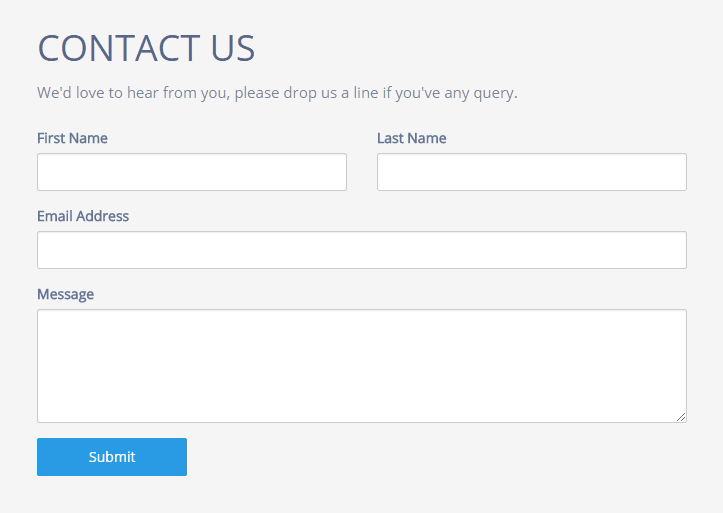
Fewer form fields equal greater conversion for many cases. Your contact form should be simple.
If you take away one thing from this article, that would be eliminating unnecessary form fields that can significantly increase the conversion rate of your contact form.
According to the research by Quicksprout, limiting the number of fields to just three can guarantee a minimum conversion rate of 25 percent. But in some cases such as collecting sales leads, fewer form fields can also lead to low-quality leads and decrease the perceived value from your form.
For example, if you're giving away a free checklist, you might only want to collect basic fields like first name, last name, and email. But if you're giving away something more important like an ebook, you may want to ask for more detailed information with more form fields.
For this reason, we suggest you select the right number of fields according to your specific use case. You can also check Getform's Codepen Page to see ready-to-use simple form templates.
2. Use the right color and the right text for your Form CTA button
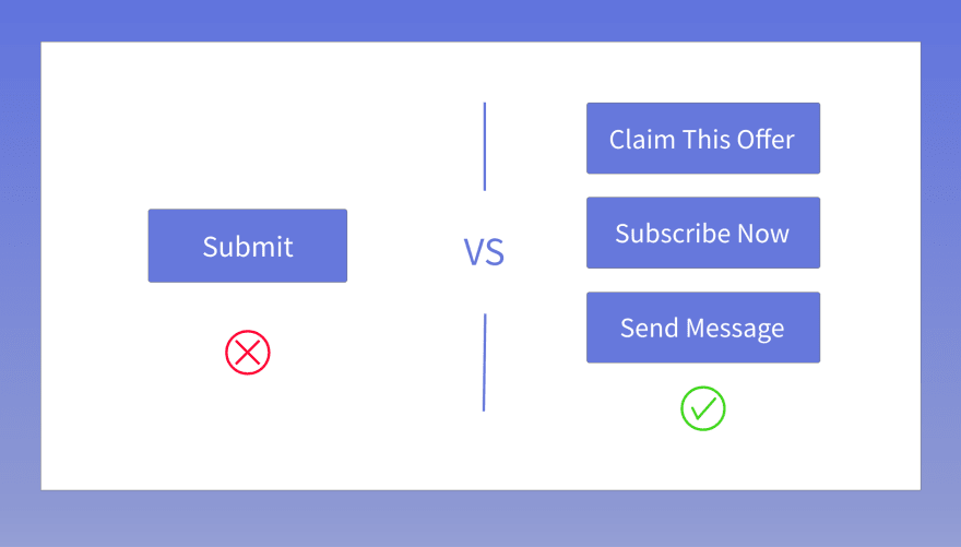
According to studies, the word "submit" is not descriptive enough. Your submit button is more than just a button. It's an opportunity to convince your visitors that they should fill out those last few fields. Leaving "submit" as the submit button text on your form is a missed opportunity.
Here are some examples for your form calls-to-action:
- Download this ebook
- Subscribe Now
- Show me this presentation
- Claim this offer
- Save your seat
By improving the copy of your CTA, you can radically increase your form conversion rates.
Another important aspect is the color you select for your CTA button. The key is to choose a color that fits your current design, but you also want to have a button color that screams “click me.” According to several case studies, red is the highest performing color. But green and orange are other great alternatives to go with.
3. Embrace the mobile-first approach
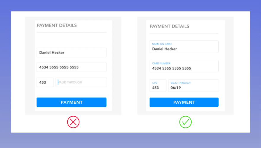
If you’ve ever filled out a form on a phone, you know how painful each additional field can be. Thinking mobile-first is crucial in 2020. (e.g Google's mobile-first indexing approach) and forms should definitely be part of your mobile-first strategy.
There are several important design aspects that you should consider such as whether you put field labels above or to the left of your form elements and what you set as your default options for certain fields.
Coming up with a visually appealing and UX-friendly mobile form is unbeatable and they are easier to use and faster than their alternatives.
4. Make the required fields visible
Research from the Baymard Institute says it’s useful to clearly delineate which fields are optional while also noting which fields are required.
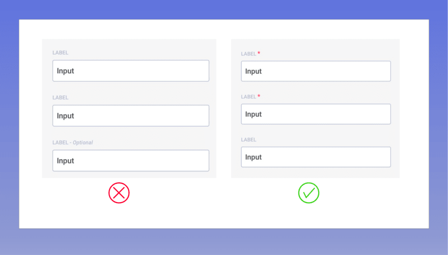
Required fields are typically denoted with an asterisk (*). Optional fields will not have an asterisk. So make sure that on your forms, you denote which fields are required and which are optional.
Check out the full list of HTML5 form validation rules explained on Getform documentation.
5. Get rid of Captcha or use the invisible one
Let's face it! Nobody likes to use Captcha even though they are doing a good job of filtering the spam submitters. According to Moz's study, having Captcha on your forms decrease conversion rates by 3%.
This isn’t to say you should forget about security. It’s a very important component of building trust. Getform provides Akismet powered machine learning spam prevention and also offers invisible reCaptcha to improve your form conversion rates. Checkout Getform documentation to set up a Google reCaptcha v3, aka invisible reCaptcha to improve your form conversion rate.

Don't let robots spam your form :)
Bonus: Consider starting A/B Testing Your Web Forms
As mentioned above, there are many things that you can use to increase your form conversion rates. If you still feel like your conversion rates aren't reaching up to your expectations, you might start testing. your forms to see what causes a negative impact. In that case you might want to dig a little deeper and start A/B Testing your forms.
Here are some factors that you can check:
- The placement of your form on a landing page
- The placement and color of your form CTA
- Colors of surrounding images or the page branding
- Words in your headlines and your surrounding copy
- Form alignment, the number of form fields and form length
- Form labels and text placement
- Form type (full screen, pop-up, etc.)
Final Thoughts
When it comes to improving conversions on your forms, there are several key areas you need to watch out for: number of form fields, copy and color of your CTA button, embrace mobile first approach, indicate required fields and avoid using visible Captcha on your form.
Lastly, no matter what you are doing with your contact form, try to eliminate more friction to increase your form user experience. Reducing friction drives conversion rate.
We hope this article helped you learn the best ways to increase your online form conversion rates.
Ready to Start?
Get started by creating your first form endpoint on Getform and start increasing your form conversion rates while Getform is handling your form backends.
If you like this article, then follow Getform on Facebook and Twitter for more updates from our blog.
Thank you for reading! We keep enhancing Getform by listening to you, leave us your feature requests at Nolt or vote on the existing ones.
Reach me out by sending an email to mertcan@getform.io.
I would be happy to connect with dev.to community!


Top comments (0)