[Last update: October, 12th 2019.]
❥ TLDR; This is the first of the many chapters on a new CSS framework called Toucaan. In this introductory post we talk about the new landscape of the web, consider miniature viewports like that of the Apple Watch 5 and the new Chromium based surface (V9 web browser) on a Tesla Model 3 and Model S as part of the web. Form factors available today are so diverse and different from barely four years ago that design strategies of the past such as "mobile first" or barely responsive are no longer viable. The slate of glass is resizable practically on a continuum, just like the web browser itself.
Modern web browsers too have evolved and gotten so much better that we no longer need a heavy-handed approach to force consistency across vendors. With Toucaan we will try to move away from traditional reset or reboot css and implement a simpler and lighter strategy instead. So, welcome to Toucaan—a tropical new CSS framework for the web, with fewer defaults, newer patterns and a much simpler cascade.
This chapter is available on a book that you can preorder.
Introduction
2020 is almost here.
It is unlikely that you or I are going to blast off to Mars or the Moon on a Spacex Starship anytime soon so we better turn our gaze towards another frontier of technology: CSS. 🙃
Let's take a look at how we will be writing web applications in 2020 and beyond, here on Earth.
Through this post we will revisit the basics of a web page, i.e. HTML & CSS, and develop a clean, intelligent and maintainable CSS framework from scratch. I named our new CSS framework Toucaan and you can join me on the journey of building it together. Here is its official repository and a silly Toucan logo that I made using CSS.

The Tropical CSS Framework.
Qualitatively speaking, the intent of Toucaan is to weed out all the unwanted CSS that your webapp doesn’t need. It is a deep dive into core CSS properties and web standards in a bid to discover new and useful patterns according to the new landscape of the web. We might identify a few anti-patterns in the process that our industry may currently be plagued with too, but we can address those on-the-fly as we go about building Toucaan ground up.
Why call it Toucaan?
Well, quite simply because I owned the pretty domain name.
Besides, Toucan is a beautiful bird. This aggressive little arboreal ramphastidus symbolizes both beauty and strength. We are going to base our CSS framework on this highly social and resilient bird to implement a styling stricture that will cover all the wilderness on the web. Ocassionally—though rarely—we may even spar with other CSS frameworks using our "mean" oversized and colorful bill.
So—say hello to Toucaan—the tropical CSS framework for the web. 😉
[Say it aloud:] CSS may be hard but… if Tou-caan, then you-can-too!

With Toucaan we will revisit every web design and layouting principle that there is. Test our ideas out in the open. No trick or technique, whether old or new is off the table, but we will definitely try to avoid using hacks. There are few other rules that Toucaan will adhere to and those are described here.
Now there are a lot of well established CSS frameworks out there like the Bootstrap, Bulma, Foundation, TailwindCSS and a bunch of strategies like the BEM, OOCSS or SMACSS (and others) to organize the application code but we will not try to imitate or wrestle with those. We will rather write Toucaan on a blank slate and in such a way that we do not take away anything from what most of these tools have to offer finally, but we add more to what's on the table for everyone to consider and use on production.
Let's begin.
The New Landscape of Web
Before we write our first line of code let us take a deep breath and look at the variety of devices that are a part of the web today. With subtle differences in their aspect ratios, device handling & user behavior, browser support and screenwise capabilities it is important to understand what the new landscape of the web looks like today and understand exactly what we are up against for a new CSS framework of 2020.
Here are some of the devices that sport a modern web browser:

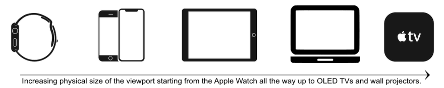
There is the Apple Watch 5 with a web browser, iPhones in numerous sizes instead of just one model that Apple used to come up with earlier, multiple iPads, iPad Pros and Android tablets plus desktops, laptops and TV sets with a stock browser that work surprisingly well. Given that Samsung came out with a foldable phone recently and Microsoft is probably coming out with a foldable Surface tablet very soon, it is safe to assume that physical form is no longer a reliable viewport classifier that is so commonly used by every other framework.
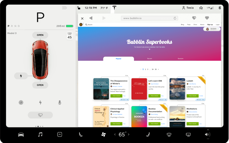
It is rather safe to assume that screen-sizes are available on a linear continuum of form-factors and that a large phone could easily be considered a phablet or a tablet could easily become more than a desktop and so on depending on hardware and options. Whereas there is a large variation in the form factors available on the web, there is also substantial variation in the way each surface exposes the controls and input methods to the user—ala, accessibility over content. Let's not forget that there are cars too on the web now—in that they sport a neat web browser for those who need to be online while being on road. And then there are low-powered devices on the budget end of the market, like the Nokia 2.2 on Android (A53 core) or similar that are very popular in their segment as well.

Credit: Stuart O'Neil, The Noun Project.
Since Toucaan is about living CSS a short distance into the future, we will consider the V9 web browser from Tesla into the scope of our project as well. This is something that I have been meaning to do for sometime and given that people would have nothing to do but surf the web or read a book in a car that's driving itself, this seems like a reasonable thing to do.
Web is way bigger than it ever was.
A cool trivia: I wanted to publish this article three years ago but the rate of change in industry kept me from doing so. With new features being rolled out every week it was hard to track changes and decide on a strategy. CSS grids, ES6 and the whole reactive developer toolchain thing (I am looking at you, the noisy folks of React & Vue.JS!) followed by Apple & Google announcing the non-rectangular notched phones and so on. Web is enormous now, and it is much harder to design and scale websites between the lowest and the highest options that there are.
Notice that we are not even into talking about web browsers yet and yet the range of hardware itself is diverse enough to somewhat trump the very first assumption taken by nearly all the existing frameworks:
"Hardcoded break point values using CSS @media-queries".
Voila, we have our first anti-pattern to go after now! ( ͡° ͜ʖ ͡°)
What's with the hardcoded break points, eh?
Breakpoints are hardcoded on Tailwind CSS like this [1, 2], for example.
// tailwind.config.js
module.exports = {
  theme: {
    screens: {
      'sm': '640px', // Translates to hardcoded break-points in media queries.
      'md': '768px',
      'lg': '1024px',
      'xl': '1280px',
    }
  }
}
On Bulma, the break points [1] are used to silo blocks of code similarly like so:
/* Bulma CSS like any other framework uses hardcoded breakpoints like so: */

@media screen and (max-width: 768px) { /* Some style classes & rules here. */ }

@media screen and (min-width: 769px), print { /* Same classNames but different rules here. */ }

@media screen and (max-width: 1023px) { /* We armtwist the ruleset again… */ }

@media screen and (min-width: 1024px) { /* Are we on the desktops now? */ }

@media screen and (min-width: 1216px) { /* Dang!, what are we supporting here? */ }

@media screen and (min-width: 1408px) { /* Is this the iPad Pro 12.9 inches or something else? */ }
Then for each silo elsewhere on the CSS…
+mobile
  +typography-size('mobile')

+tablet
  +typography-size('tablet')

+touch
  +typography-size('touch')

+desktop
  +typography-size('desktop')

+widescreen
  +typography-size('widescreen')

+fullhd
  +typography-size('fullhd')
…hundreds of classNames are repeated to cater to the behavior desired in each silo of devices. Pretty much every CSS framework follows this pattern and a breakpoint is added every few years to account for industry-level changes. The question is how many hardcoded breakpoints will we continue to add as our industry evolves at a break-neck speed?
At what point will the hardcoded breakpoints become all too many?
Mode driven instead of data driven:
While it would be a nice exercise to plot a graph of all the screen sizes (pixel ratio data) that are available on market, but going down this path to figure out a new set of breaking point values to separate mobile from tablets from watches from desktops from cars to any other new kind of surface that is about to come on the web is anything but scalable. Or even practical.
In my opinion using hardcoded values on CSS media queries is an artifact of the tunnel vision of mobile web that we have held since the very first iPhone. It is rather a simplistic solution of a simpler time that is no longer valid, and therefore an anti-pattern that we should move away from. We need something smarter to handle the diversity of web devices now.
So, is there a way to implement layout responsively without using hardcoded break-points?
Turns out, yes there is!
We can build any kind of responsive application using a really simple and smart set of rules that we will talk about in the next section.
The 'Two States' of Web Design.
Let's create a blank page on your machine and load it on a desktop browser first.
This is easy, simply jump into your terminal and:
$ touch example0.html     // Create a new file but do not write anything on it.

$ chrome example0.html    // Open this 0 byte files on your favorite browser.
What do you see on this blank page?
Of course nothing, it is an all-white or an all-black blank page depending on your browser's defaults. Did you know that this blank web page is the most responsive web page in the whole world wide web?
No CSS or media query is required to adapt the UX/UI of a blank page on mobile or desktop or any other device on web. You can resize the browser to any aspect ratio and the blank web page will continue to scale perfectly and responsively.
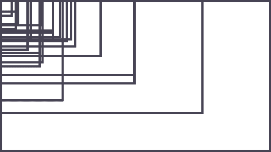
Viewport rectangles of the browser window on resize.
Well, of course a blank page is going to be responsive you'd say but this is a hypothetical situation Marvin, so let's turn the table over and orient the desktop in portrait mode instead:
Now the desktop in portrait orientation is going to reveal a browser window that is longer in height and shorter in width—kind of like a mobile phone but on a much bigger piece of glass. In reality a very small group of people use desktops in portrait mode (mostly developers) but the usage is possible nevertheless. Use of portrait mode grows on tablets—with about 60% iPad users preferring landscape over portrait where as the story flips completely on a smartphone where about ~96% people prefer the portrait mode over landscape depending on content. With Apple Watch, the tiniest of screens on web, I suspect that nearly 100% of usage would be in portrait mode given that the device is physical tied to the wrist that way.
Here are some graphs & stats if you're interested.
On Tesla Model S the browser open in portrait orientation just like a desktop in portrait mode while on Model 3 it does so in landscape mode. Well this discussion kind of uncovers that all of the web is viewed in only two modes of orientation—portrait or landscape—and square is the geometric point of inflexion where the media query needs to switch from portrait to landscape and vice-versa. Interesting.
This also means that there are only two states of design on web no matter which device or orientation one may choose to consume web on. It is a hard cold fact that electronic screens are rectangular in shape—well, almost—and therefore, the point of inflexion for all style rules to switch mode should be where the viewport itself becomes a square and starts flexing in the other direction. Since there are hardly any devices in shape of a perfect square, mathematically speaking we can take it for granted that a webpage will either render in portrait mode or landscape.
And oh, oh, ICYMI, there is a lot more math coming into CSS in the near future so we'll have trigonometry at our disposal eventually!
<blockquote class="twitter-tweet" data-lang="en">
The CSS Working Group agreed this morning on adding many math functions. We now have:
• calc()
• min()
• max()
• clamp()
• sin()
• cos()
• tan()
• acos()
• asin()
• atan()
• atan2()
• hypot()
• sqrt()
• pow()
The face of CSS is rapidly changing.
Kickstarting the code
Now that we have covered some ground for Toucaan to work on let's start wiring up all the ideas discussed above into code. Since a webpage can be rendered in only one of the two states of the viewport, either portrait or landscape, we'll begin with the following ruleset for our new framework:
@media only screen and (orientation: portrait) {
  :root { /* Portrait variables go here.  */ }

  @import url('toucaan/portrait/portrait.css') only screen and (orientation: portrait);
}

@media only screen and (orientation: landscape) {
  :root { /* Landscape variables go here. */ }

  @import url('toucaan/landscape/landscape.css') only screen and (orientation: landscape);
}
The twin code blocks above may not seem like much at this stage but this dual state switch is exactly what we are going to use to go about scaling our layout across all the web devices on the planet. Notice that we are using a standard asynchronous @import call to request only so much CSS that a given "viewport state" will require. On the desktop, this state of a given render will not change unless the browser window is resized or if the user decides to swivel the monitor over.
Organizing your CSS this way ensures that both "states" of every element that will render on the DOM have been considered and then we can be sure that the webpage will scale desirably across the entire spectrum of devices that are on the web. It also helps avoiding a gigantic reset.css/reboot.css which can be a pain on low-powered devices. So hang in there for a little bit and stand by for the next chapter on Toucaan in which we will take up baselining CSS across vendors and introduce scalable responsive typography without use of javascript.
I have setup a tiny repository for Toucaan and checked-in all that is under experimentation right now. Feel free to star, jump-in, offer sage advice or contribute to Toucan!
Written by: Marvin Danig, CEO & Cofounder of Bubblin Superbooks. Follow me on Twitter or Github perhaps?
Super thankful to Sonica Arora, Abigail Rennmeyer, Varun Singh and Nilesh Trivedi for helping me review this post for accuracies.
This article was originally published at Bubblin

Top comments (2)
Doesn't this break accessibility. For font sizing specifically if the user requests that they want to increase their base font size. Say 200 percent or whatever it is.
Sure the viewports units will scale but does this not implicitly affect the scaling and so it's not really what the user wants.
This is the problem i see with every framework that tries to do things like this and go outside of. Old school rem units.
thank you, this seems just great to me!
looking forward for the book - will we learn then more about your css rule —„fs: ...“ too..?!