This is the second chapter on my series on Rethinking CSS Frameworks with Toucaan.
❥ TLDR; Modern web browsers have evolved to a point where a heavy-handed reset or reboot css is no longer required. In this chapter, we will implement a fundamentally different and a much lighter reset strategy by uncovering only the bare minimum set of rules that are needed for consistency according to the new landscape of the web. We will tackle two beasts—an intrinsically responsive layout using CSS grids and blockscoped typography, both of which in my opinion will form the basis of user interfaces (UX/UI) on the web in future.
Baselining CSS
In the last chapter we created a blank file to test the responsiveness of an empty page. That worked perfectly and was easy enough to implement. We simply touched a new file and opened it on a browser like Chrome, like so:
$ touch example0.html     // Create a new file but do not write anything on it.

$ chrome example0.html    // Open this 0 byte files on your favorite browser.
Now let us take our work on the Toucaan CSS framework forward from this point. Let's inspect this 0 byte blank page on the console of the browser. Press ⌘+⌥+I keys if you are on the Mac with Google Chrome:
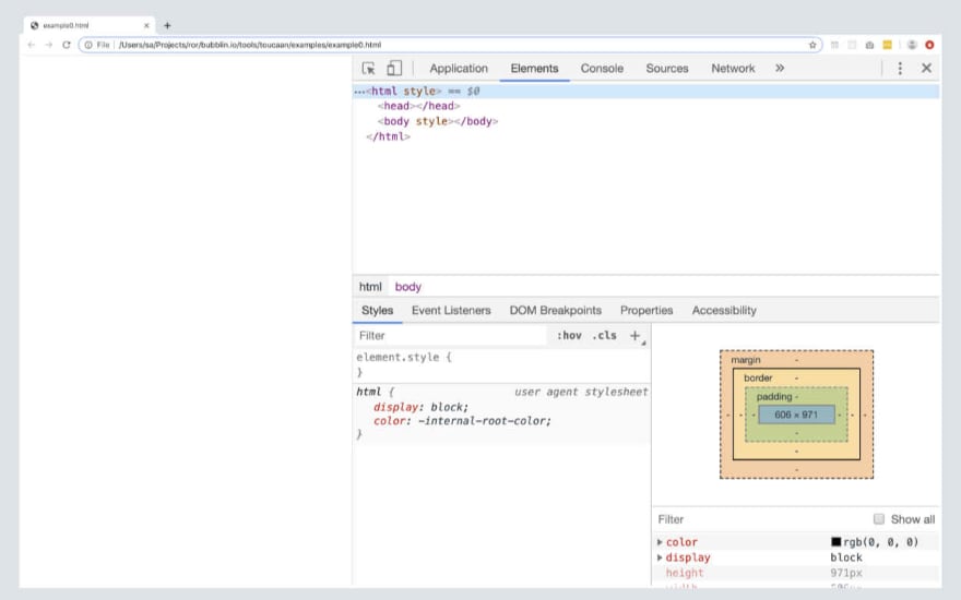
Blank webpage on the browser window.
You will see that even though we loaded a blank file on to the browser, there still are a few html elements that are rendered on the DOM. Every web browser will render these elements, just to display the blank page correctly.
Browsers will "fix" the html on page because it is in the nature of HTML to be forgiving, and modern browsers are smart enough to handle issues like missing or unmatched tags quietly.
<!-- Blank page as rendered on desktop Chrome, Firefox, Brave & Safari. -->
<html>
  <head></head>
  <body></body>
</html>
Notice that the browser also applies a default user-agent* stylesheet called html.css under the page. See the 'Styles' block (screenshot above) of your browser's console. This html.css file is a default set of rules that each browser is shipped with upon install. Up until a few years ago it was this html.css file that used to contain several inconsistencies across vendors but that is no longer the case today.
We can assume that html.css—the unset cascade—itself is practically the consistent reset.css for our daily use.
A very interesting example of reset was shared by developer Andy Bell last week for a blog type of application. While their reset may be limited in scope it does help us establish the fact that there is very little arm-twisting required over a browser's own set of rules to establish consistency. This is great news and one of the main reasons why we will try and keep Toucaan a loosely coupled CSS framework for 2020.
Head over here to see what the latest
html.csslooks like on major browsers today:Webkit html.css@ Chrome & Safari
Quantum html.css@ Firefox
Chromium html.css@ Blink or Edge browser
Getting back to the DOM, given that there are only three html elements required for a webpage to be valid, we will start with baselining Toucaan for only three baseline elements of html, namely:
1. <html> tag or the **:root** element,
2. <body> tag, and the…
3. <head> tag.
The <head> element is always set to display:none;, so effectively there are only two html tags <body> and <html> for us to play with. Given below is how we will structure our baseline reset for Toucaan:
<style>
    /* The following is pure css and not sass/scss. */
    @import url('toucaan/portrait/portrait.css') only screen and (orientation: portrait);

    @import url('toucaan/landscape/landscape.css') only screen and (orientation: landscape);

    @media only screen and (orientation: portrait) {
        :root {
            /* Portrait variables go here.  */
        }
    }

    @media only screen and (orientation: landscape) {
        :root {
            /* Landscape variables go here. */
        }
    }

    /* Bare minimum elements required for a valid webpage */
    html { }

    body { }
</style>
That's it. This is what a modern reset.css would look like on Toucaan.
What it also means is that everything else that goes into designing an application, the other html elements and their corresponding styles, can be covered using optional CSS helpers to support the entire spectrum of devices and browsers. My guess is that there wouldn't be much rules to import even for the most sophisticated web applications out there, but who knows? Let us see where we can go with Toucaan before committing.
Note that on the reset above I have inlined the portrait ⇋ landscape switch along with baseline tag selectors for html and body elements each and put everything inside a <style> … </style> tag. We do this to ensure that all the critical above-the-fold css is available for the first contentful paint (FCP) as soon as possible and it helps to declare all global css variables from one place.
Some of you pointed me towards Steve Souder's article don't use @import from 2009 but I can confirm that this position is no longer valid. The fact that almost 50% of the web is on http/2 and that there is a possibility of hardcaching all CSS locally using a serviceworker, I think we are good to go with imports in 2020 and beyond. Besides, our little CSS import switch will request only one external CSS file for a given 'viewport state', just like a <link> url does.
Feel free to dissect the position I have taken on using CSS @imports on Toucaan but for now I am gonna happily report that not using CSS imports to separate critical from non-critical CSS is an anti-pattern that should do be done away with. Toko, toko!
Great, so we now have a foundation for a new reset file on Toucaan. Let us add some meat to it next.
Layouts with CSS Grids.
One of the things that I'm (super!) chuffed about using for layouts on Toucaan is the CSS grids. Layouts on Toucaan are exclusively going to be based on CSS grids. Period.
To enable grids we simply apply the following rule on the body element of our inline-reset:
    body {
        display: grid;
    }
That's it. We are all set for any kind of responsive layout with Toucaan now.
Enabling grid on the body ensures that every direct child on page can now behave as part of a larger blueprint specified under a grid system. Not only that, we can also specify different layouts for portrait and landscape switch and swap out the layout according to the new state of the viewport.
I don't think there is any other way that I would do layouts in 2020.

Support from CSS grids is substantial in 2019.
As you can see the support for CSS grids has grown sufficiently with nearly every major browser having implemented the newest specification. Here is what our inline-reset with CSS grids would look:
<style>
    /* The following is pure css and not sass/scss. */
    @import url('toucaan/portrait/portrait.css') only screen and (orientation: portrait);

    @import url('toucaan/landscape/landscape.css') only screen and (orientation: landscape);

    @media only screen and (orientation: portrait) {
        :root {
            /* Portrait variables go here.  */
        }
    }

    @media only screen and (orientation: landscape) {
        :root {
            /* Landscape variables go here. */
        }
    }

    /* Bare minimum elements required for a valid webpage */
    html { }

    body {
        display: grid; /* Semantic layouts! */
    }
</style>
We have a very simple reset.css that is grounded in the realities of the web today. In the next chapter we will move the display: grid rule into its own separate class named .layout-palette, which will describe how the header, the footer and the main body on a webpage will be laid out in a given context.
CSS grids aren't anything new but they certainly are a new 'standards' tool that is available at our disposal. After having dabbled with CSS floats, flexbox and whatnot for years, I am convinced that CSS grids are the only logical way to do layouts. It is simple, semantic and much easier to reason about than anything else on market.
Why no CSS float or no flexbox? = Why CSS grids only!
Thing is that if you want to do modern layouts in 2020 (and beyond) you shouldn't be using flexbox or floats anymore. It is just plain wrong. This of course doesn't mean that you shouldn't use flexbox or floats on your CSS at all, but using those element level properties for sitewide layouts is an anti-pattern—it is almost like a hack that we have had to live with in absence of grids. I feel very strongly about this, so let me explain this a little more:
The body element on an empty webpage is like a raw piece of land waiting to be cut-up into smaller rectangles to form the foundation of a house. Each of these tiny rectangles have a different meaning or a purpose, like a kitchen or a bedroom or a living space, but are also a part of a larger blueprint of a building that is yet to be built.
A set of rectangular jigsaw pieces on a website that sit next to each other in harmony with shared edges.
CSS grids are an ideal tool to break down this whole patch of land—the body—into smaller rectangles because it is a very top ↝ down view of the land. Whereas with flexbox you are more at the element level. Flexing is like the kitchen saying 'hey, I am a DIV and I am going to be stretching all the way leftwards to occupy whatever space is available'. Flexbox adds a certain behavior to the HTML element that needs to be counter balanced by another element (often sibling) with a behavior in the opposite direction.
It is like two little men trying to flex their muscles against each other and in process locking themselves in to form a layout. As sort of dynamic equilibrium instead of harmony. Not a very ideal situation because if the viewport were to go ultrawidescreen suddenly, the layout will fail.
<img src="https://raw.githubusercontent.com/marvindanig/assets/master/traffic-jam.jpg" alt="Blank web page." width="100%">
A soup of elements in a traffic jam.
Credit: <a href="https://unsplash.com/photos/o1eDaWJanpA" rel="nofollow">Joline Torres</a>, Unsplash.
Similarly, using CSS floats with a left or right momentum on the element turns a webpage into a 'traffic jam.' Almost always there is at least one element that is trying to get ahead of others. Such a layout too, like with the flexbox, is locked in a dynamic equilibrium that can easily fail on ultra-widescreens or some weird orientation towards one side. CSS floats for layouts are an absolute no-no!
Not to mention the amount code required to deliver the results with floats or flexbox is almost always higher than with CSS grids. In my opinion since layout is the boundary of control, the blueprint of proportions and meaning, the basis foundation on which a house with a function will be built, it is better to use CSS grids to split the view into meaningful part that fit together naturally.
Doing anything else like using the flexbox or CSS floats or tables (does anyone?) is just plain wrong.
Blockscoped Typography.
The second beast that we are going to go after with Toucaan is blockscoping typography. It is possible, but before we deep dive into it, let us look at one of the common memes that gets thrown around about CSS. About how difficult it is to fit text inside a box:

It has been traditionally been difficult to scale text within a box.
Unsurprisingly, there is quite a lot of developer merchandise available out there that sells this meme printed on coffee mugs or t-shirts. I'm afraid those are gonna have to go away with the new powers of CSS.
Let us first try and solve "'CSS is Awesome' in a box" problem using our portrait ⇋ landscape switch and then we'll use that solution to introduce blockscoped typography on our framework for everyone else to use. Scaling text is obviously a hard problem so I'm going to pin more on maths instead of design sense here. We will try and reconcile engineering with design principles later on.
Shown below is the code I penned using our orientation switch along with some responsive typography:
See the Pen CSS is Awesome by Marvin Danig (@marvindanig) on CodePen.
Try and scale the viewport on your desktop, mobile or tablet to test it. The contents inside the box will (should) scale naturally, down to subpixel accuracy, without use of any JavaScript or special font or hardcoded CSS locks or newer properties like clamp(), minmax() etc. A simple orientation switch is enough to fit the text reliably.
Does it 🤯 your mind? Well, it did for me!
Let us look at the step-by-step solution next:
Step 1.
I started with the following HTML and CSS:
<div class="box">
  <p>CSS</p>
  <p>is</p>
  <p>awesome.</p>
</div>
We didn't have to separate the words into three separate lines (p tags) but it offers better control, so I did it.
/* CSS */
*,
*:after,
*:before {
  box-sizing: border-box;
  margin: 0;
  padding: 0;
}

@media only screen and (orientation: portrait) {
  :root {
    --bu: calc(100vw/100);
  }
}

@media only screen and (orientation: landscape) {
  :root {
    --bu: calc(100vh/100);    /* Axiom: 100vh of landscape === 100vw of portrait. */
  }
}
Note that we have used CSS variables to define font size according to the orientation of the viewport and we are banking on the shorter side of the screen, breadth, for reliable scaling. We are thus relying on following two axioms:
- Axiom 1: "100vh of landscape === 100vw of portrait."
- Axiom 2: The shorter side of the rectangle i.e. breadth has less potential of variation upon resizing.
I must reiterate here that no special formulae or CSS locks or clamp() with minmax() has been used or is required to scale text accurately. Hardcoding safe values on code feels like an anti-pattern anyway, an aberration that we can avoid to align ourselves better to the idea of writing scalable software.
Step 2.
We know that the box around the text is a square, so its sides are equal. To start I am going to use viewport width to specify dimensions of our I set the sides of the square to 50% of breadth by using 50 bu's (breadth units), where each div.box inside the portrait part of our orientation switch:--bu css variable defined on the :root element stands for the viewport width or height depending on device orientation:
*,
*:after,
*:before {
  box-sizing: border-box;
  margin: 0;
  padding: 0;
}

@media only screen and (orientation: portrait) {
  :root {
    --bu: calc(100vw/100);
  }
}

@media only screen and (orientation: landscape) {
  :root {
    --bu: calc(100vh/100);    /* 100vh of landscape === 100vw of portrait. */
  }
}

.box {
    text-transform: uppercase;
    font-family: arial, sans-serif;
    font-weight: 600;
    text-align: center;
    width: calc(50 * var(--bu));    /* 50% of breadth */
    height: calc(50 * var(--bu));
    border: calc(2 * var(--bu)) solid black;

}

/* Simple blockscoped typography based on breadth of the rectangle . */
p:nth-child(1) {
    font-size: calc(1/4 * 50 * var(--bu));              /* 25% of the width of the box. */
    line-height: calc(1.25 * 1/4 * 50 * var(--bu));     /* Line height = 1.25 */
}

p:nth-child(2) {
    font-size: calc(50/4 * var(--bu));
    line-height: calc(1.25 * 50/4 * var(--bu));
}

p:nth-child(3) {
    font-size: calc(50/6 * var(--bu));
    line-height: calc(1.25 * 50/4 * var(--bu));
}


/* Required on Codepen: */
body {
  min-height: 100vh;
  display: -webkit-box;
  display: flex !important;
  align-items: center;
  justify-content: center;
}
Step 3.
Great, so now we have square with width and height of calc(50 * var(--bu)). This is the 100% width or height of the box. To blockscope typography inside the box, we will use the dimensions of the box to arrive at text sizing elements like font-size and line-height, like so:
/* 25% of the width of the box. */
font-size: calc(1/4 * (50 * var(--bu)));

/* Line height = 1.25 times font size */
line-height: calc(1.25 * 1/4 * 50 * var(--bu));
That's it.
The text in the box will now scale responsively with subpixel accuracy as the browser is resized or the orientation is changed. Scaling is so accurate that even reflow isn't be triggered in 99% of the time!
Ala, welcome to blockscoped responsive typography with Toucaan. 😎
Feel free to test the demo by resizing your browser to its extremes and by going on any device between an Apple Watch 5 to OLED TVs. Report issues on Github if you bump into one.
Given that there is so much that can happen with typefaces I'll keep my ideas about blockscoped typography in an evaluative mode for now. It is yet to be seen if Toucaan can nail intrinsic layouts with blockscoped typography, especially for some more complex layouts. So look out for another chapter on this topic soon!
A note about vocabulary in use today:
Height and width is how we usually refer to the dimensions of a screen or the browser window. But what we are doing here, in mathematical speak, is referring to a simple rectangle with a length and a breadth. The labels height and width are all but an accurate description in the context of the desktop. Where the monitor is mounted in a way that the contents are displayed along the vertical plane. But height and with become somewhat invalid as soon as we start surfing content on a mobile or a tablet that is not held up vertically.
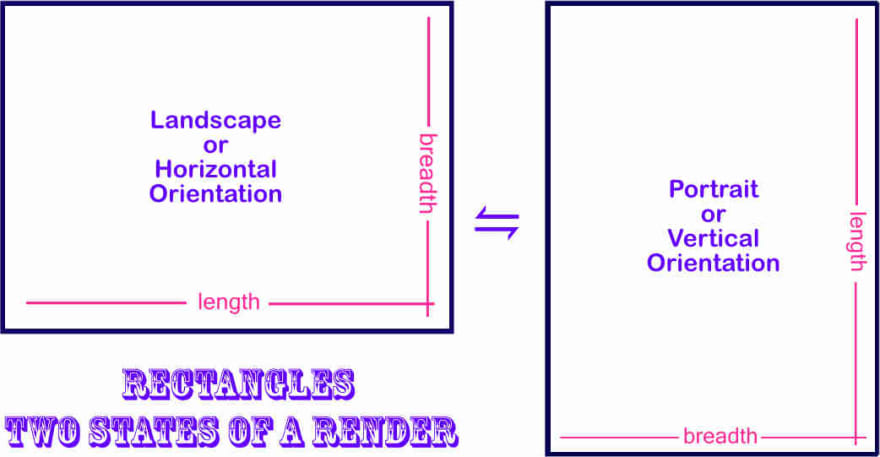
Use length & breadth instead of height & width?
One could be lying down on a sofa looking up towards the ceiling into the phone. Or looking down on a tablet lying flat on a desk, meaning parallel to the floor. Since the screen is no longer restricted to displaying content along the vertical plane, using height and width to specify its dimensions isn't always a 100% accurate. Labeling it with length and breadth however will be, no matter what the orientation of the screen is. 🤯
*For sake of clarity on Toucaan I'll often use mathematical labels length and breadth instead of height and width to refer to the dimensions of the rectangular display. There is an added advantage of doing this—we exactly know that the shorter side of the rectangle is the breadth, which could be viewport width or viewport height depending on orientation.
The final reset:
This is what our final reset.css on Toucaan looks like:
/* Modern reset using CSS Grids for layouts,    */
/* a typography pallete with block scopes and   */
/* a few accessibility-first media queries.     */

<style>
    @charset "UTF-8";   /* Recommended reading: https://www.w3.org/International/questions/qa-css-charset.en */

    /* Option 1. Use system fonts */

    /* Option 2. Use 'privacy safe' self-hosted typefaces with subsetting, or use…  */
    @font-face {
        font-family: "Font Family";
        src: url(data:font/opentype;base64, _font_subsetted_string_);
        font-style: normal;
        font-weight: 300;
    }

    /* Option 3. Hosted typefaces such as from Google Fonts. */
    @import url(https://fonts.googleapis.com/css?family=Font+Family:300,300i&display=swap);

    @import url('toucaan/portrait/portrait.css') only screen and (orientation: portrait);

    @import url('toucaan/landscape/landscape.css') only screen and (orientation: landscape);

    @media only screen and (orientation: portrait) {
        :root {
            --bu: calc(100vw/100); /* Tentative */
        }
    }

    @media only screen and (orientation: landscape) {
        :root {
            --bu: calc(100vh/100);  /* Tentative */
        }
    }

    /* Sane defaults below */s
    *, *:after, *:before   {
        box-sizing: border-box;
        /* I have a feeling that using margin & padding on elements instead */
        /* of the flexbox is somewhat an anti-pattern now but I am not sure. */
        /* We will come back to this topic in sometime. */
        margin: 0;
        padding: 0;
    }

    html {
        background-color: white; /* Always set the background color */
        -moz-osx-font-smoothing: grayscale;
        -webkit-font-smoothing: antialiased;
        overflow-x: hidden;
        overflow-y: scroll;
        text-size-adjust: 100%;
    }

    body {

        /* Move this into font-family. */
        font-size: calc(4 * var(--bu)); /* Theoretical a.t.m */
        font-family: 'Font Family', system-ui, -apple-system, BlinkMacSystemFont, Segoe UI, Roboto, Oxygen, Ubuntu, Cantarell, Droid Sans, Helvetica Neue, Fira Sans, sans-serif!important;

        font-smooth: always;
        font-weight: 300;
        font-style: normal;
        font-synthesis: none;
        font-stretch: ultra-condensed;
        font-variant: no-common-ligatures proportional-nums slashed-zero;
        font-kerning: normal;
        text-rendering: geometricPrecision; /* Why not: text-rendering: optimizeSpeed;?… in light of PWA. */
        font-display: swap;
        font-display: optional;

        -webkit-tap-highlight-color: rgba(0, 0, 0, 0);
        -webkit-backface-visibility: hidden;

        -webkit-font-smoothing: subpixel-antialiased;
        -moz-osx-font-smoothing: grayscale;
        -webkit-osx-font-smoothing: antialiased;


        line-height: calc(1.5 * 4 * var(--bu));  /* Or 1.5 */

        /* Colors + contrast (This will go into the color palette.) */
        color: rgba(0, 0, 0, 0.95);
        background-color: white;

        /* Dimensions */
        border: none;
        min-height: 100vh;


        /* Behavior */
        overflow: auto;
        -webkit-overflow-scrolling: touch;
        scroll-behavior: smooth;
        touch-action: auto;
        display: grid; /* Grids are meant for layouts, flex are meant for element behavior! */
    }


    /* Accessibility specific media queries go below. */

    /* 1. Dark mode (or light) depending on requirement. */
    @media screen and (prefers-color-scheme: dark) {
        body {
            background-color: #343434;
            color: #fff;
        }
    }

    /* 2. Override animations for users with motion sickness or other vestibular disorders. */
    @media (prefers-reduced-motion: reduce) {
        * {
            animation-duration: 0.01ms !important;
            animation-iteration-count: 1 !important;
            transition-duration: 0.01ms !important;
            scroll-behavior: auto !important;
        }
    }

</style>
Welcome to intrinisically scalable layouts using CSS grids, responsive blockscoped typography and an orientation based design behavior separated along portrait & landscape css to gracefully adapt according to the new landscape of the web.
We will refactor the above shown reset with more explanatory notes in the future chapters. Onwards to typesetting and more CSS grids in the next chapter!
I have updated the Toucaan repository with this article and the latest code. Please note that everything on this repo is currently experimental in nature, so feel free to question, star, jump-in or offer sage advice. Contributions to Toucaan are also super welcome. Toko, toko!
Written by: Marvin Danig, CEO & Cofounder of Bubblin Superbooks. Follow me on Twitter or Github?
I am super thankful to Sonica Arora, Satyendra Sharma and Abigail Rennemeyer for the edits and helping me check the code for accuracies.

Top comments (0)