In part one of this series I laid out my plans to document the development process of a side project called Bioledger and showed my (poorly) hand-drawn sketches for a user interface. In this post I plan to share my digital mockup of the UI that I built using Figma. One of the main motivations for starting this series is to build a project using a plan. So before diving into the design, here’s how that is going so far…
Planning is hard. I’m the type of person who wants instant gratification and I love being in the code editor writing, editing, and thinking about the code. While I appreciate great visual design, I’m not a designer. Similarly, pseudo-coding and white-boarding code seems like a great idea but my instincts are still to dive into the code editor and start hacking away. Thankfully, pushing myself to stop and make a plan for this project is already paying off.
Moving the UI design from paper to Figma
Figma is a design tool that you can try out and use as a solo developer for free. It has a robust community with tons of free assets, plugins, and tutorials to utilize directly in the app. It’s also utterly confounding to use if you have no experience with design tools of this type. I highly recommend working through some tutorials when starting out in Figma to avoid the frustration of trying to use it as a painting program. It’s a tool built by designers for designers and so you have to understand how a designer thinks before getting the most out of the tool.
Figma allows you to not just mock up a UI but to simulate programmatic features including animations, clickable navigation, and much more. My app is pretty simple and with my limited experience with the tool I decided to focus on building a more polished digital version of the sketches I made in my sketchbook until I have more experience using Figma’s more complex features. After watching some tutorials and reading some articles on the fundamentals of web design, I was able to create a basic UI that I felt comfortable would look good and function well as a finished product for this project.
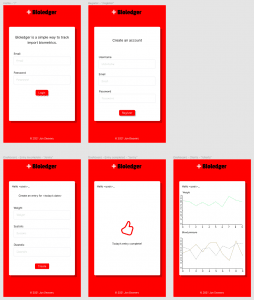
The picture above displays the 5 main views my minimum viable product should include:
- A landing/user login view
- User registration view
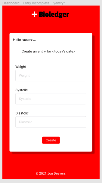
- A form for entering daily metrics
- A screen that displays once that day’s metrics have been logged
- A data visualization view with some mock charts
A closer look
Notice at the very top of the image, the screen view is labled with the name of the component to eventually be rendered using React, a short description of the view, and a URL endpoint. Labeling the views allows me to easily refer to each one during the development process and know exactly where it fits in the UI flow. I used a community plugin that easily lets you incorporate forms in your design. Congratulations to user @OneBlinq for the intuitive and easy to use plugin. It worked great and only took a few minutes to design all of my project’s forms. I also labeled dynamic data in the view using arrow brackets. I don’t know if this is a common practice or not but it made it easy for me to identify what needs to be dynamic when coding the project.
Summary
All in all, Figma comes with a steep learning curve, especially if you don’t have a background in design. However, I’m really happy with the design and feel confident that the effort it took to put this design together will help make my development process move more smoothly with better final results.
Next up is laying out a plan for my back end and database. Instead of adding data properties to a schema as I run across the need during the coding process, I want to have a reference and think through how the data will be stored, retrieved, modified and deleted. If you have feedback or suggestions on this process feel free to connect with me on Twitter @jondeavers. I’d be gratful for the feedback and happy to help!
Originally published on my blog at https://jondeavers.net


Top comments (0)