Recap
This is part 2 in the series of stories that I am writing about my struggles with front end design. You might want to start in the beginning here.
Last week, I came up with a very rudimentary style of homepage for my web-site after thinking about the contents I wanted to keep on my homepage. But there were some problems with that page.
Scaling was completely off. Login page seems too big.
There was no marketing material on the page which will tell user why this CV Builder is different from others.
The way CV's previews were stacked on the left side were ugly.
New Strategy
I went back to drawing board and thought a little harder on things I needed on my homepage. Here are things I came up with :
Marketing material - as I discussed above
Request a new template - The main feature of this website is ability to request new templates.
Contribute - This is a call to action for developers, so that they can contribute new templates as requested by users. This will good opportunity for anyone looking to learn CSS and React as a newbie.
Templates - Showcase of CV Templates.
Login/Register - Login/Registration screen
Inspiration
By this time, I am sure that I will not be able to build something from scratch until after 2 weeks. So it was time to look for an inspiration and steal a good design.
I did some research and landed on land-book.com and after going through some of the templates I decided to go with traditional layout and came up with something like this :
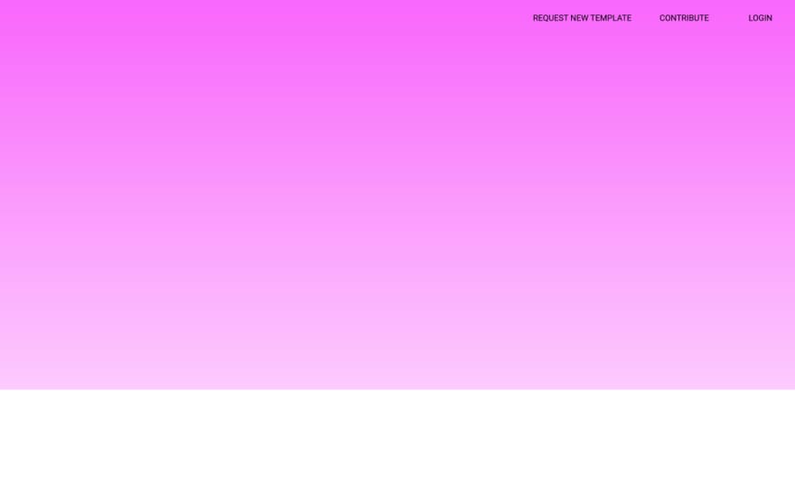
Although, I am not happy with the colour but it is okay for now. And I have discovered that I am pretty bad at it.
To talk about typography, I went with very safe Roboto font(Lato is again very similar), It is still fluid and may change in future. For now, it is good as a placeholder.
There are now 2 things left.
- CV template showcase
- Marketing material.
Here also I decided to divide the main coloured section in 2 parts as below :

Things I liked about this design
- Layering : I liked the layering in Resume templates and I am happy that shadows came off fine. Curves on the corner are pretty good.
Things I don't like about this design
Everything : Coloured section is ending abruptly which is not at all eye pleasing.
**Marketing Material Layout ** : There is no boundary on this layout, I think Righteous font is looking pretty nice.
That's it for today, It is not really very good but it is evolving well. Let's see how we proceed on this next week.

Top comments (0)