If you're a developer, most of your time is spent on building and improving functionalities.
It's easy to forget that not everyone is using Chrome.
I recently spotted a major cross-browser bug on LinkedIn.
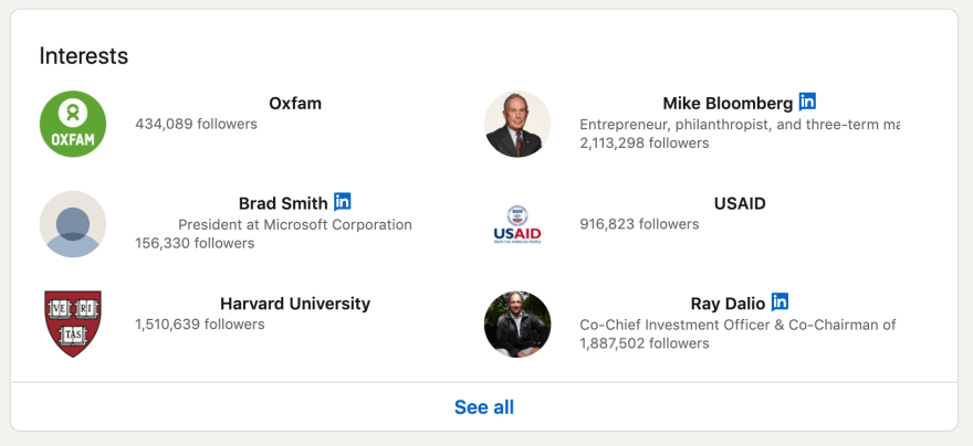
This is how the Interests section looks like on Chrome:
And this is how it looks like on Firefox:
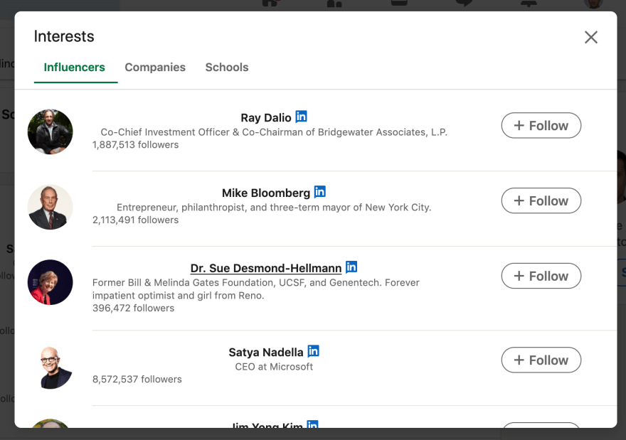
It gets worse if you click on the See all button.
Chrome:
Firefox:
You'll find plenty of articles online about how LinkedIn has a complex workflow with scalable technologies to deliver to best experience for their users.
Not even the latest and most scalable frontend technologies can prevent cross-browser issues from appearing.
Nowadays, it's a lot easier to build automated tests than it was 5 years ago.
A defect like the one I just showed you could have been easily prevented with a simple automated visual test.


Top comments (0)