
As someone new to data science, just now beginning to grok the possibilities of what I can do with a lot of data and a bit of programming, there are parts that are intensely gratifying and parts that make me feel a bit in over my head.
There are plenty of times that I set out to solve something, try something, or write something and get stuck. Horribly, inextricably, I-don’t-even-know-where-to-start levels of stuck. This is inevitable, and I’m building up a solid toolbox of resources to use when I find myself in these situations.

But the flip-side of this is pretty awesome. Any time I set out to do something and it actually does what I intended, it’s extremely rewarding. Even if it’s something basic, I love pushing through blockers and getting to a solution that I created - it’s a huge reason I am positioning myself to move into data science and a technical career.
So! When I wanted to map out a dataset for a project, got frustrated with the clunkiness of the tools I knew, taught myself how to work with a new mapping library, and made a gorgeous map that conveyed exactly what I wanted, I was pretty pleased with myself. Allow me to share Folium with the other python beginners out there, because it’s a forgiving and accessible way to play around with mapping techniques. It also looks slick, is interactive by default, and made me feel like I’d leveled up my data visualization effortlessly.
Before You Begin
Folium does have some caveats. The dataset I was working with was one which provided data on homes sold in King County around Seattle. That dataset already had columns for latitude and longitude, which made mapping aspects of this data pretty natural. From everything I’ve gathered from the Folium documentation, you need lat/long pairs in order to use their map, so other location data will present a data cleaning challenge at the start.
Additionally, Folium only works well up to a certain point - on my system, it would not process and map all 21,000 rows of the pandas data frame I tried to pass through it (fair). After playing around with it, about 1000 rows appeared to be the sweet spot for me, and any more than that would not work nearly as well, if at all. In my dataset, I focused on the 1000 most expensive homes as a way to narrow in on a subset of my data (and to answer other questions as part of the project I was working on), so I’ll be showcasing that subset.
So, set yourself up for Folium success by targeting smaller datasets with accessible location data, then get in there and play around!
Follow along with my code here: https://github.com/lindseyberlin/Blog_FoliumMaps
Where Is Everything?
Perhaps there are magical people out there who can look at a lat/long pair and know exactly where it is, or look at two pairs and know how they’re related, but I am no such person. When I was working with this data, I had some initial questions. Were all of these houses within the same few blocks? Were they really spread out? Were there any obvious clusters? Only one way to find out - make those lat/long pairs work for me!
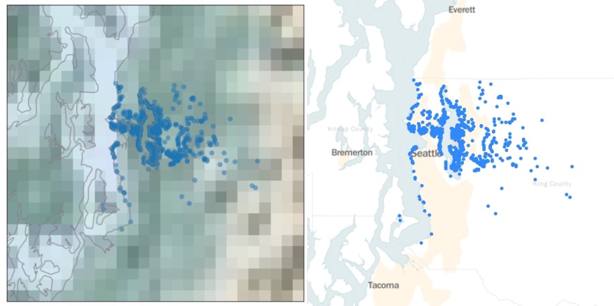
The introductory Folium map I created provided a scatterplot over a map background. The most complex part of the code was the for-loop, which mapped each row as its own dot on the map. The second hardest part was using a mean function on my data set to get an average of the latitude and longitude columns, where I focused my map.
This basic configuration answered those above questions - I could clearly see where each house was sold, and how each house was spaced. Hooray! But my initial success led me to wonder what else I could do with Folium, so I went a little deeper.
Adding Layers of Meaning
From the basic map, I took three additional steps to make my map more complex and to make sure it conveyed more meaning than just the locations of the homes in my dataset.
Note! These are just screenshots - the actual maps I'm creating in python are interactive. Check out that github repo I linked above to see what I mean.
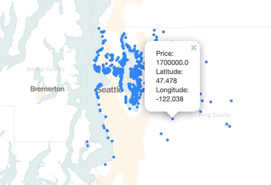
First, I added pop-up text, which displays the exact latitude and longitude of the house as well as the price at which it was sold. Adding the pop-up text was a bit more complex, but still straightforward - I added the code within the for-loop, so it would create pop-up text specific to each row of data. I formatted the text using .format, but could have also used an f-string. Now my map provided a bit more detail!
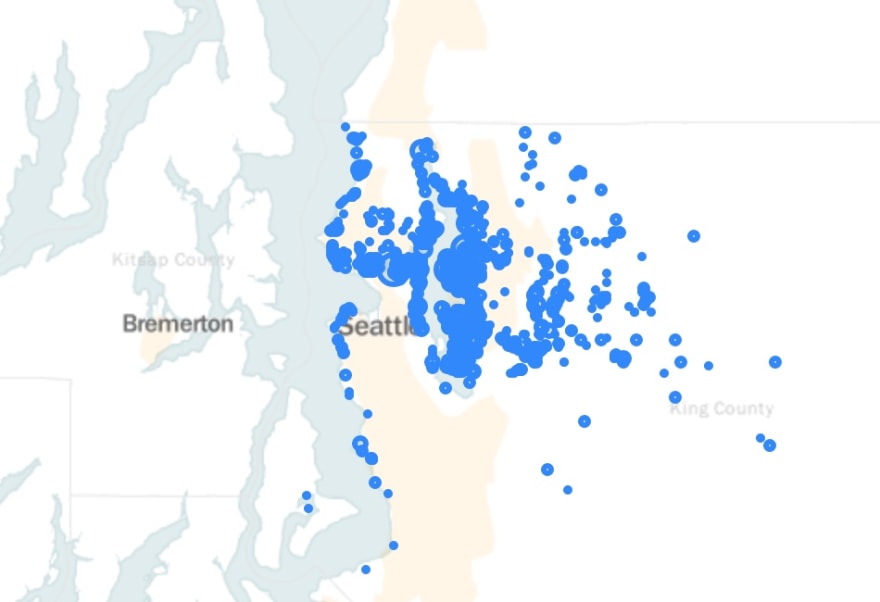
Next, I changed the size of each dot to correspond with the price at which each home was sold. This involved changing the radius of each dot based on the price for that row. Easy-peasy!
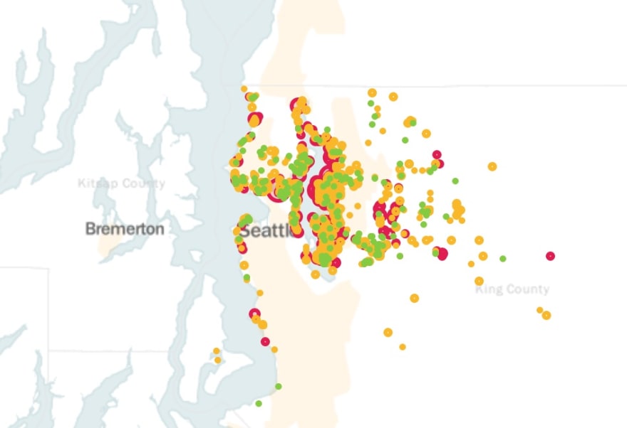
Last, I changed the color of each dot to correspond with different buckets of price, so that the most expensive homes showed up as a bright, obnoxious pink and the least expensive homes (of the 1000 most expensive homes within the original data set) were a gentle green. This involved integrating if/elif/else statements based on those cost buckets, still within the for-loop, to change the color of each dot. Slightly more complicated than anything else so far, but still straightforward.
Other Options
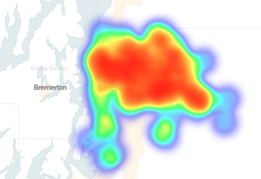
Another easy way to examine this kind of data is to add a heat map instead of adding points to the map. This conveys the concentration of data in a different way, useful if you want to explore concentration more than the details of each individual row of your dataset.
There are dozens of other ways you can map things in Folium, and probably better ways I could’ve answered the initial questions I posed. Play around with it and see what you find! And if you have any useful Folium tips or tricks, or questions that are best answered with a map, please share!
Useful Tutorials:
Folium for Maps, Heatmaps and Time Analysis
Creating Interactive Crime Maps With Folium

Top comments (4)
I really liked to read your article, I find data science fascinating even though I have no knowledge in the domain. I tried to check out your example repo, but unfortunetaly the readme does not provide any instructions for noobs.
I will absolutely need to go in and update my ReadMe! I've never written one before, it'd be great practice for me. I'll flag you when I've done so!
A good resource for README templates
Hi Jim! I updated the README - let me know if the links I provide, which reference the Python libraries I use in this repo, are helpful at all! If not, happy to keep improving the repo, just let me know. :)