
Wouldn't it be nice to be able to do without those ugly media-queries in CSS?
Just a class for the respective width and that's it?
No problem with a little Javascript!
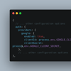
First, we define the desired screen widths and the corresponding class names in an object:
const breakpoints = [
  { width: "36em", class: "small" },
  { width: "64em", class: "medium" },
  { width: "99em", class: "large" }
];
With the following query, we find out the appropriate width of the screen:
if (window.matchMedia(`(max-width: ${breakpoint.width})`).matches)
Now just add the class (don't forget to delete the old one first) to the body tag:
document.body.removeAttribute("class");
document.body.classList.add(breakpoint.class);
Put all this into a small function and call it at the beginning and at every change of the viewport:
window.addEventListener("DOMContentLoaded", mediaClasses);
window.addEventListener("resize", mediaClasses);
A small example here in this codepen.
A somewhat larger one in this template on GitHub.


Oldest comments (0)